


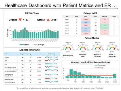
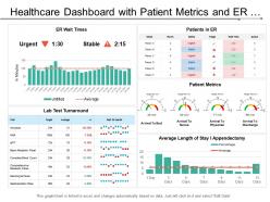
Healthcare dashboard with patient metrics and er wait times




Try Before you Buy Download Free Sample Product
 Impress Your
 Audience
 100%
100% Editable
 Save Hours
 of Time


Bring about an artistic feel with our Healthcare Dashboard With Patient Metrics And Er Wait Times. It helps choreograph the event.
People who downloaded this PowerPoint presentation also viewed the following :
Healthcare dashboard with patient metrics and er wait times with all 6 slides:
Bring back the feel good factor with our Healthcare Dashboard With Patient Metrics And Er Wait Times. Everyone feels bright and cheery again.
FAQs for Healthcare dashboard with patient metrics and
Start with patient flow stuff - bed occupancy, length of stay, ER wait times. Those hit patient experience directly. Quality metrics are critical too: readmissions, infections, patient satisfaction scores. Finance will definitely bug you about cost per patient and revenue cycle data (they always do). Don't forget staffing ratios and employee satisfaction - unhappy nurses make everything worse. Honestly, pick maybe 5-7 metrics that match your biggest problems instead of tracking everything. You'll go crazy otherwise.
Honestly, data visualization is a game changer for healthcare decisions. You can spot patient trends and resource issues instantly instead of drowning in spreadsheets (which is the worst). Real-time dashboards show you exactly which departments are swamped and help catch problems early. Way better than hunting through endless rows of data. I'd start with whatever decisions you're making most often each day - maybe patient flow or staffing? Then build charts around those specific pain points. You'll actually enjoy looking at your data for once.
Dude, real-time data is a total game changer - you can actually catch stuff before it hits the fan. Your dashboard shows live vitals and med timings, so you're intervening right away instead of finding problems hours later. The best part? You'll spot trends early. Oxygen dropping slowly, infection markers creeping up, pain getting worse. Patients get better faster and go home sooner. Just don't go crazy with alerts or you'll hate your life from all the notifications. I learned that one the hard way lol.
So basically you want different dashboard views for each type of user. Admins care about stuff like bed counts, staffing numbers, budget performance - the operational side. Clinicians need patient data, treatment results, clinical alerts right there when they need it. Then patients want their own health info, appointments, test results but in normal language they can actually understand. That patient view is honestly such a pain because you can't just dump medical terms on people. Oh and definitely set up role-based access so everyone only sees what's relevant to their job. Customizable widgets help too.
Dude, healthcare workers are literally sprinting between patients, so make everything stupid obvious. Put your most important stuff right up top. Red = bad, green = good - keep that color system consistent throughout. Here's what I learned the hard way: group similar info together and give everything room to breathe with white space. Nobody wants to squint at tiny text when someone's life might depend on it. Oh, and definitely test this with actual nurses or doctors, not just your design team. They'll call out weird quirks you'd never notice. Trust me, I've watched people struggle with dashboards that looked great but were impossible to use quickly.
So basically you'd pull in all the patient data - vitals, labs, whether they're actually taking their meds, social stuff too. Then ML models crunch those numbers and spit out risk scores for things like readmissions or sepsis. Start simple with fall risk or infection alerts, then get fancy later. The dashboard shows these scores plus what your team should actually DO about it - that's the crucial part. Nobody wants an alert that just says "patient might die" without next steps, you know? It's pretty wild how accurate these predictions can get once you dial them in right.
Focus on the big three first: encryption, access controls, and audit trails. Encrypt everything - data moving around and data sitting still. Set up role-based permissions so people only access what they actually need. Two-factor authentication is a must, trust me on this one. Log every interaction for compliance stuff. Session timeouts help too when users walk away from their computers. Oh, and run security assessments regularly. But honestly? The hardest part isn't the tech - it's getting your team to actually stick to these rules instead of finding shortcuts.
Track your key metrics before and after - patient wait times, how fast staff respond, decision-making speed. Measure how long it takes to spot at-risk patients or flag critical alerts, then compare post-launch. The dashboard will show you what people actually use (hint: never the cool features you obsessed over). Survey your clinical staff directly - they'll be brutally honest about whether it helps or just gives them another screen to babysit. Oh, and start measuring within 30 days or you'll forget what things were like before. Trust me on that one.
Four main data sources will get you there. EHR systems are obvious - you need patient records and clinical stuff. Financial data's next for billing and revenue tracking. The operational metrics really matter too (wait times, staffing, bed counts) - patients notice this stuff way more than we think. Quality and outcomes data rounds it out so you can see how you're actually performing. Honestly, start simple with these four. You can always bolt on pharmacy or lab systems once you've got the basics humming. Don't overthink it at first.
Oh dashboards are amazing for this! You get to see the whole picture instead of just individual patients. Disease patterns jump out at you, plus you can track vaccination rates and spot high-risk groups easily. The real-time aspect is honestly game-changing - you'll catch concerning trends way earlier. I'd start with automated alerts for stuff like diabetes rates or flu outbreaks. That way you're actually preventing problems instead of just responding to them after they've already blown up. It's kind of like having a helicopter view of your entire community's health status.
Honestly, the data quality stuff will drive you nuts - everything's messy and nothing talks to each other properly. Getting doctors on board is rough too since they're already sick of random alerts popping up everywhere. Integration between systems is a total pain, like seriously budget way more time for that than you think. Oh and keeping dashboards updated when workflows change? That's a whole ongoing thing. HIPAA compliance adds another layer of fun obviously. My advice - pick one department first and focus on what they actually give a shit about. Don't try to boil the ocean right away.
Honestly, mobile dashboards are a lifesaver. You can pull up patient data while you're walking between rooms or grabbing coffee. Lab results, updating records, messaging your team - all from your phone. Way better than hunting down a computer every time you need something. The trick is finding one that's actually built for mobile, not just some terrible desktop version squeezed onto a tiny screen (been there, suffered through that). Since we're on our phones constantly anyway, might as well make them work for us. Just makes everything so much smoother when you're not chained to a workstation all day.
So basically you want to slice your data by demographics - race, income, zip code, all that stuff. Then put everything side by side on your dashboard. Trust me, the visual comparison hits different when you actually see the gaps. Set up alerts for when disparities get too crazy so your team knows to jump in. Honestly I'd start small though - maybe just track 2 or 3 key things monthly like readmissions or who's actually getting preventive care. You don't want to overwhelm yourself with data right off the bat.
So dashboards are like your compliance headquarters - they track how you're doing with HIPAA, Joint Commission stuff, all that regulatory mess. Real-time alerts pop up when things go sideways. During inspections? Total lifesaver, I can't even tell you. You'll spot problems way before they blow up because everything's visual. The audit trails and reports basically generate themselves, which is honestly amazing since I used to hate scrambling for paperwork. Set up those automated scorecards now. Trust me on this one - being audit-ready beats panic mode every single time.
Just add surveys and rating buttons straight into your dashboard - make it dead simple for patients to give feedback right after appointments. Those airport smiley face things but actually helpful, you know? Track stuff like wait times, how well staff communicated, treatment satisfaction alongside your medical data. Real-time charts showing satisfaction trends and complaints give you the full patient experience picture, not just clinical results. Honestly, set up alerts when ratings tank so you can jump on problems fast. Way better than finding out patients were pissed off weeks later.
-
Awesome presentation, really professional and easy to edit.
-
Very well designed and informative templates.