


Healthcare dashboard with customer satisfaction and patient metrics





Try Before you Buy Download Free Sample Product
 Impress Your
 Audience
 100%
100% Editable
 Save Hours
 of Time


Display intense determination with our Healthcare Dashboard With Customer Satisfaction And Patient Metrics. Demonstrate that you are driven by ambition.
People who downloaded this PowerPoint presentation also viewed the following :
Content of this Powerpoint Presentation
Description:
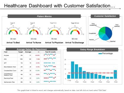
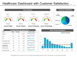
The image depicts a slide from a healthcare dashboard focused on customer satisfaction and patient metrics.
The dashboard is divided into various sections, each representing different data points:
1. Patient Metrics:
This section contains gauges displaying time metrics such as 'Arrival to Bed', 'Arrival to Nurse', 'Arrival to Physician', and 'Arrival to Discharge'. Each gauge has a target time and shows the actual time in minutes, with color coding representing the performance relative to the target.
2. Customer Satisfaction:
Here, a pie chart illustrates patient satisfaction levels, ranging from 'Very unsatisfied' to 'Very satisfied'. The size of each slice indicates the proportion of responses in each category.
3. Average Salary By Department:
A table lists various tests or departments, their target and average salary figures, and a visual representation of the past 30 results. The '+/-' column shows the percentage difference from the target.
4. Salary Range Breakdown:
A bar graph combined with a line graph (likely indicating a trend over time) shows the salary range distribution across a timeline.
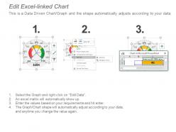
The slide also notes that the graph/chart is linked to Excel and changes automatically based on data, indicating that it is dynamic and can be updated by editing the linked data source.
Use Cases:
Data-driven dashboards are indispensable across industries for monitoring performance, enhancing decision-making, and driving customer satisfaction.
1. Healthcare:
Use: Tracking patient care and satisfaction metrics
Presenter: Hospital Administrator
Audience: Medical Staff, Department Heads
2. Retail:
Use: Analyzing customer feedback and sales performance
Presenter: Retail Manager
Audience: Sales Teams, Store Managers
3. Manufacturing:
Use: Overseeing production efficiency and worker productivity
Presenter: Operations Manager
Audience: Production Supervisors, Quality Assurance Teams
4. Hospitality:
Use: Gauging guest satisfaction and service delivery times
Presenter: Hotel General Manager
Audience: Service Staff, Department Leads
5. Finance:
Use: Monitoring transaction processing times and client feedback
Presenter: Bank Manager
Audience: Customer Service Reps, Financial Analysts
6. Education:
Use: Tracking student services and satisfaction levels
Presenter: University Registrar
Audience: Academic Advisors, Administrative Staff
7. Technology:
Use: Measuring support response times and user satisfaction
Presenter: Customer Support Director
Audience: Support Teams, Product Managers
Healthcare dashboard with customer satisfaction and patient metrics with all 6 slides:
Our Healthcare Dashboard With Customer Satisfaction And Patient Metrics are aesthetically designed to attract attention. We guarantee that they will grab all the eyeballs you need.
FAQs for Healthcare dashboard with customer satisfaction
Definitely track patient satisfaction scores, readmission rates, and mortality - those are your big ones. Length of stay matters too. Infection rates can bite you if you're not paying attention, trust me. Also keep an eye on medication errors and clinical stuff like blood pressure control (depending on what kind of patients you see). Oh, and make sure whatever system you use lets you break things down by department and time periods. You'll go crazy trying to figure out problems without decent filtering options.
Real-time dashboards show you what's happening with bed occupancy, patient flow, and staffing right now. No more guessing games. When the ER starts backing up or surgeries run late (which, let's be honest, happens constantly), you'll actually know about it before it becomes a disaster. Your teams can jump on problems fast instead of scrambling later. Plus you start seeing patterns - like when admissions spike or how long discharges really take. That helps with planning who needs to be where. I'd tackle whatever's driving you most crazy first, then build from there.
Honestly, visual analytics are a total game-changer for healthcare dashboards. They take all that overwhelming data and turn it into something you can actually work with. No more staring at endless spreadsheets - you get interactive charts and heat maps that make patterns jump out immediately. Like patient bottlenecks or med errors happening on specific shifts. The cool part is drilling down and filtering in real time. I'd start by figuring out what's driving your team crazy about current reporting, then build visuals that solve those exact problems. Way more effective than whatever clunky system you're probably using now.
So healthcare dashboards are honestly a game-changer for compliance stuff. They automate all that tedious reporting work and make audits so much less stressful. Real-time monitoring becomes super easy - HIPAA logs, CMS quality metrics, patient safety indicators, you name it. When regulators show up, you're not frantically digging through files because everything's already there and visual. Set up alerts too so you'll catch problems before they turn into actual violations. I'd probably start with whatever compliance requirements stress you out most and build from there.
Oh man, data integration is gonna be your biggest nightmare - nothing talks to each other properly. Staff will push back hard if the system slows them down or feels clunky. Can't really blame them though, right? Privacy compliance stuff is a whole other beast. Costs add up fast too with training and maintenance. Honestly, I'd start with just one department first. Get the user experience really smooth before expanding. Make sure your IT people are actually on board for the long run, not just saying they are. Way easier than trying to fix everything at once.
Look, real-time data integration basically turns your healthcare dashboard from some boring static report into something that actually helps you make decisions. You're getting instant updates on patient vitals, bed availability, staffing - all as it's happening. No more staring at yesterday's useless numbers. Honestly, it's perfect for emergencies. You'll catch patients going downhill way faster and can move resources around immediately instead of scrambling later. The tricky part is getting all your different data sources to actually work together - which is harder than it sounds, trust me. I'd start by figuring out which real-time feeds would make the biggest difference day-to-day.
So basically you can move stuff around to fit what each person actually needs day-to-day. Cardiologists want patient vitals right up front, but administrators are gonna focus on bed counts and staffing instead. Most people just stick with the default colors tbh - nobody has time for that. You can drag widgets around, set up alerts, change layouts, whatever works. Primary care docs need totally different patient views than specialists do. Honestly, just start with the stuff you check first thing every morning and build from there. Don't try cramming everything onto one screen or you'll go crazy.
So healthcare dashboards - man, they can turn into total disasters if you're not careful. Your users are stressed out and need info immediately, so clarity is everything. Give them tons of white space and clean layouts. Make your color coding actually mean something (red = urgent, green = all good) and stick to it everywhere. The critical stuff needs to be right at the top where they can scan it fast. Navigation should be dead simple - like, zero training required. I'd definitely test this with real clinicians super early because they'll spot problems you'd never even think about. Trust me on that one.
Dashboards are actually pretty game-changing for getting patients more involved. When people can see their own health data visually - like blood pressure trends or how they're doing with taking meds - they get way more invested. There's something about watching your numbers improve that just clicks, you know? You can build educational stuff right into them too, which is smart because patients learn while they're checking their progress. The trick is keeping it simple enough that people don't get overwhelmed and just give up on using it.
Trend lines are your best friend for tracking patient outcomes over time. Heat maps work awesome for showing geographic health patterns, and basic bar charts let you compare departments easily. Skip pie charts - they're honestly trash with medical data. Interactive drill-downs are clutch since doctors need to dive deep fast. Color coding helps a ton - that red/yellow/green system just makes sense for alerts. But seriously, keep things clean because decision fatigue is brutal when lives are on the line. Put your main KPI right up front, then build everything else around it. Oh, and cognitive overload is definitely a thing to avoid.
So you can build predictive models right into your dashboard - stuff like forecasting readmissions or spotting high-risk patients. Machine learning runs behind the scenes and pops up alerts when things hit certain thresholds. But here's the thing - those predictions need to be actionable. Don't just flag someone as "high risk" without telling staff what to actually do about it. Honestly, I'd start small with something like predicting bed capacity for the next couple days. Once your team gets the hang of it, then you can add more complex stuff. The fanciest algorithms are useless if nobody knows how to act on them.
Okay so first thing - set up role-based access so people only see what they're supposed to. Encrypt everything, both stored data and stuff moving around. Multi-factor authentication is a must (seriously, passwords alone are garbage). Log all user activity because auditors will ask for it later, trust me on that one. Anonymize data whenever you can get away with it. Oh and run security assessments regularly - like actually schedule them, don't just say you'll do it. Think about it this way: would you want someone messing around with your own medical info? That's how seriously you need to take this.
Dashboards give you real-time visibility into your revenue cycle instead of waiting around for those monthly reports that are already useless by the time you get them. You can track accounts receivable aging, claim denials, department spending - all in one spot. Honestly makes such a difference when you're trying to spot financial issues early. They'll show you which services actually make money and where you're hemorrhaging cash on dumb inefficiencies. Plus you can see how changes in payer mix mess with your bottom line. My advice? Don't go crazy trying to track everything at once. Pick your top 3-5 financial KPIs first and build from there.
Dude, mobile healthcare dashboards are seriously clutch. You can check vitals, labs, med schedules - all from your phone while making rounds or rushing between facilities. No more being stuck at a desktop computer. Real-time alerts pop up for urgent stuff, so you won't miss anything critical. The secure messaging helps you stay in touch with your team too. Honestly, being able to update patient records right away instead of trying to remember everything later? Total lifesaver. Oh, and definitely set up push notifications for your high-priority patients once you download your facility's app.
Dude, you absolutely have to talk to the actual users first - doctors, nurses, admins, whoever's gonna use this thing. I've watched so many pretty dashboards just sit there unused because nobody asked what people actually needed. Here's the thing though - everyone wants different stuff. Nurses need real-time patient info while administrators are obsessed with cost metrics. Do user interviews before you build anything (trust me on this), then keep checking in while you're developing it. Otherwise you'll end up with something that looks great but serves nobody's actual workflow.
-
Unique and attractive product design.
-
Good research work and creative work done on every template.