


Health and safety kpi metrics dashboard




Try Before you Buy Download Free Sample Product
 Impress Your
 Audience
 100%
100% Editable
 Save Hours
 of Time


Our Health And Safety KPI Metrics Dashboard are topically designed to provide an attractive backdrop to any subject. Use them to look like a presentation pro.
People who downloaded this PowerPoint presentation also viewed the following :
Content of this Powerpoint Presentation
In 2019, hospital care spending made up the largest share of personal health care expenditures in the US at 37.2%. It implied that nearly 40 cents on every dollar that a person spent on health went towards meeting hospitalization expenses.
With nature putting up new forms of challenges in our lives everyday and the unwillingness of humans to adopt healthy lifestyles, it's highly likely that the percentage today is the same, if not risen. This also means that hospitals and healthcare units will be in business for a long time. However, even then the kind of healthcare quality that is offered will determine the maximum attraction for patients. As such, medical institutions and hospitals must manage and inspect their day-to-day work to ensure a greater pie of the business comes to their establishments.
To achieve this, hospital management must ensure that the hospital is equipped with modern technologies, their tools and drugs FDA approved, and patient care, their top asset, is always top-performing with no room for casualness or errors.
Healthcare facilities also have the obligation to refine their operation or else costly legal repercussions could throw them out of business.
With this concern well-understood, SlideTeam offers the remedial tool to practice caution and efficient management. With our Health and safety KPI metrics dashboard, you can have a business compass of your hospital management to guide your operations.
Let’s explore the highlights of this dashboard template.
Template 1: Health and Safety KPI Metrics Dashboard
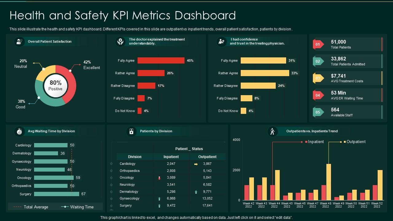
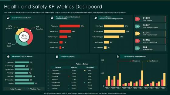
Employ this powerful compilation of Excel-linked graphs, charts, and tables to report hospital KPI metrics on a single dashboard template. Monitor l customer satisfaction and their trust in your medical services. Assess the capabilities of your staff and the patient care perceived from the customer's point of view. You can even track customer waiting time department-wise and track the daily population of patients rush. The cherry on top is that by linking this content-rich dashboard to a real-time software, you can track these parameters in real time. Track loopholes and improve customer satisfaction by the insights derived from this PPT Layout.
Track the injury cost for accidents reported to the hospital management with this PPT Layout.
Monitor Health And Safety Metrics That Matter
Grab this power-packed PPT Layout and monitor the performance of your healthcare unit and its utility for the customer. You can also forecast profitability and plan your expenses with this dashboard.
PS: Prepare a manual of safety and caution for the staff to help them take responsive, urgent action with this PPT Presentation.
Health and safety kpi metrics dashboard with all 7 slides:
Use our Health And Safety KPI Metrics Dashboard to effectively help you save your valuable time. They are readymade to fit into any presentation structure.





FAQs for Health and safety
You'll want to focus on LTIR, TRIR, and near-miss frequency - those are your bread and butter for tracking safety performance. Days away from work matters too because honestly, not all injuries are created equal. A paper cut vs a broken arm, you know? Leading indicators help a ton - stuff like training completion rates and hazard reports. Monthly reviews work well for most places. Oh, and get your floor supervisors set up with dashboards they can actually check in real time. Makes a huge difference when they don't have to wait for reports.
Track completion rates and test scores first, but don't stop there. Follow up with assessments to see if people actually retain stuff - that's where most programs fail honestly. Look at your incident rates before vs after training. Near-miss reports should spike initially (good thing - means awareness is up). Watch for behavioral changes during safety audits too. Employee feedback matters because crappy training nobody enjoys won't stick. The real win? Connecting those training metrics to actual safety outcomes instead of just marking attendance boxes.
So basically, leading indicators are the stuff that prevents accidents - like how many people finished safety training or reported near-misses. Lagging indicators? That's your injury rates and incidents that already happened. Think of lagging indicators like checking your rearview mirror while driving (probably a weird comparison but it works). You definitely need both to see how you're actually doing. Here's the thing though - put most of your energy into those leading indicators since they're about prevention. But don't totally ignore the lagging ones because they'll tell you if your prevention stuff is even working.
Dude, stop just counting total incidents - that's basically useless. Dig into those reports and find the actual patterns. Which departments keep popping up? What times of day? Most companies just shove these reports in a drawer somewhere, which drives me crazy because there's gold in there. Break it down into stuff like incidents per department monthly, or how long between near-misses and real injuries. Oh, and set up some kind of simple dashboard that pulls the key trends automatically. Otherwise leadership will never actually look at this stuff. Trust me, the patterns will surprise you.
Look at your past data and what others in your industry are hitting - don't just throw out "zero accidents" because honestly, that's just setting everyone up to fail. Mix trailing stuff like injury rates with leading indicators (training completion, near-miss reports, that kind of thing). I've watched way too many places pick these impossible numbers that just crush morale. Your frontline people should help set these targets since they actually know what's dangerous out there. Make them specific with real deadlines. Oh, and connect everything back to business results or leadership will lose interest fast and your budget disappears.
First thing - figure out which regulations actually hit your industry. OSHA, local codes, whatever applies to you specifically. Then build your KPIs around those compliance requirements and mandatory reporting stuff. I know it's a total slog to read through all that regulatory text, but you gotta do it. Your metrics need to track what regulators actually want to see, not just random safety numbers that look good on paper. Run quarterly audits comparing your data against their benchmarks. Oh, and definitely set up alerts before you hit compliance limits - way better than scrambling after.
Heat maps are honestly game-changers for spotting risk areas - way better than staring at spreadsheets all day. Interactive dashboards where people can click through specific incidents get tons of engagement. Real-time displays showing "days without accidents" work surprisingly well too. What really makes data stick though is mixing photos or quick stories with your numbers. People connect with actual narratives, you know? Oh, and some teams use AR on phones to overlay safety info right where workers are standing. Pretty cool stuff. I'd pick whatever feels most natural for how your team already looks at info, then expand from there.
Dude, wearables and IoT are game-changers for safety tracking. Instead of waiting days for incident reports, you get real-time alerts when someone enters a danger zone or their heart rate spikes during risky work. Sensors automatically catch things like gas leaks too. Honestly, it's so much smarter than the old manual way of doing things. The data feeds straight into your dashboards - you'll start seeing accident patterns before they actually happen. I'd say start small though, maybe just get basic wearables for your riskiest crews first.
Dude, this is huge for safety numbers. Engaged employees actually follow protocols instead of cutting corners. They'll report near-misses too, which is clutch. When people give a damn about their job, they stay more alert and speak up about sketchy stuff - rather than just putting their head down and grinding through. Plus they actually pay attention during safety training (wild concept, right?). The numbers don't lie either - high engagement companies see like 40-50% fewer incidents. Honestly, forget pouring money into fancy safety programs if your team doesn't care. Get them invested first, then watch your metrics improve.
Honestly, tracking remote work safety is way different than office stuff. Forget the usual injury reports - now you're dealing with people's weird home setups. I mean, my coworker literally works from her kitchen counter. Monthly surveys work best for checking workspace comfort and any neck/back issues. Virtual ergonomic check-ins help too, since you can't exactly show up at everyone's house. Don't forget internet problems - bad connections mess with safety communications. RSI incidents and eye strain are big ones to watch. Mental health surveys matter more now too.
So for benchmarking your safety KPIs, I'd start with OSHA and BLS data - they've got solid industry averages. Industry associations are goldmines too, though sometimes you have to dig around their websites a bit. The tricky part? Getting other companies to actually share their real numbers. People get weird about safety data for some reason. Once you find willing peers, don't just compare against anyone - match similar company sizes and risk levels. Oh, and pick maybe 3-5 key metrics to focus on first. Your industry association probably has this stuff ready to go if you ask.
Dude, tracking safety KPIs is actually brilliant for business. Your workers' comp costs drop, people aren't calling out sick constantly, and turnover goes way down. Nobody wants to work somewhere they might get hurt, you know? Plus productive teams happen when people aren't stressed about unsafe conditions. The ROI is crazy good - executives eat this stuff up. I'd focus on the predictive stuff though, like near-miss reports and training completion rates. Don't just count injuries after they happen. Safe employees stick around longer and actually give a damn about their work.
Honestly, data quality is your biggest nightmare - people submit stuff inconsistently or not at all. Getting buy-in is brutal too since everyone sees it as just more paperwork on their plate. Don't even get me started on leadership wanting immediate results when culture shifts take forever to show up in numbers. You'll waste time tracking everything instead of focusing on what actually moves the needle. Different departments report things totally differently, which makes comparing anything impossible. My advice? Pick 2-3 metrics that matter most and make the tracking process ridiculously easy for your frontline people.
Share those safety metrics with everyone, not just the suits upstairs. Transparency actually works. When you spot trends in the data, get your team involved in figuring out solutions - they're the ones doing the work anyway. Too many places just collect numbers and call it a day, which drives me nuts. Set up monthly reviews where you dig into what's really happening. Short sentences work. Your frontline people need to see their suggestions making real changes, or they'll stop caring. Honestly, treat the KPIs like they're starting conversations about fixing problems, not just boxes you're checking for compliance.
Honestly, you've gotta match your message to who you're talking to. Executives want those fancy dashboards with trends and benchmarks, but your frontline folks just need simple visuals showing how they're doing right now. Mix up your channels - team meetings, digital boards, newsletters, whatever works. Here's the thing though: stories beat raw numbers every single time. Connect your KPIs to actual incidents or close calls people remember. Way more effective than data dumps. Keep your timing consistent too - weekly huddles, monthly reports, whatever rhythm you pick. The whole point is making it relevant to what each group actually does. Otherwise you're just talking to yourself.
-
I discovered this website through a google search, the services matched my needs perfectly and the pricing was very reasonable. I was thrilled with the product and the customer service. I will definitely use their slides again for my presentations and recommend them to other colleagues.
-
Unique and attractive product design.