


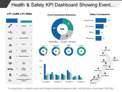
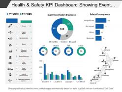
Health and safety kpi dashboard showing event classification breakdown





Try Before you Buy Download Free Sample Product
 Impress Your
 Audience
 100%
100% Editable
 Save Hours
 of Time


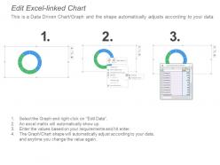
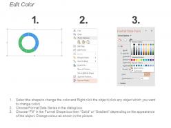
This modern dashboard PPT template is a single slide template which can be used for tracking the health and safety of the employees. Through this creative PPT template, the user can easily track and manage the safety of the employees in the business organization. This template is completely data-driven which means the presenter can modify the values with the help of excel. The benefit of a data-driven chart is that it automatically adjusts the design according to the change in numerical values. On the main slide of this health and safety presentation slide, you can see a map, colorful bar charts. This whole design comes with the flexibility to edit which means the user can modify the design without the degradation of the quality. This is achieved with the help of high-resolution PowerPoint graphics. This KPI dashboard PPT template is perfect for the health and safety department of any business organization. Adapt this slide according to your need and create a cool yet professional presentation. Download this modern dashboard PPT template to impress your audience and compile the important data in the best way possible. Enter the fray with your ideas. Our Health And Safety Kpi Dashboard Showing Event Classification Breakdown help give an exceptional account.
People who downloaded this PowerPoint presentation also viewed the following :
Health and safety kpi dashboard showing event classification breakdown with all 6 slides:
Discredit haphazard attempts with our Health And Safety Kpi Dashboard Showing Event Classification Breakdown. Ensure errant folks don't get the desired acknowledgement.
FAQs for Health and safety kpi dashboard showing
For your H&S dashboard, I'd start with the basics - incident rates like TRIR and LTIR, plus near-miss reports. Training completion rates are huge too. Days since last incident is kinda old school but people still love seeing that number go up. Safety audit scores and how fast you close corrective actions will show if you're actually being proactive. Employee perception surveys are gold if your budget allows it. The whole point is mixing the "oh shit, something happened" metrics with the predictive stuff so you're not always playing catch-up. Start with maybe 6-8 metrics and add more later.
Look at your past incident reports first - that's where you'll spot the real patterns. Construction? Falls and struck-by incidents are your biggest nightmares. Healthcare deals with needlesticks and patient handling injuries. Manufacturing usually sees machinery accidents and chemical stuff. Don't go crazy trying to track everything though - I made that mistake early on. Pick maybe 5-7 solid metrics that actually matter. Mix leading indicators like safety training completion with lagging ones like injury rates. Your workers' comp claims will tell you exactly what's hurting your people most. Start there and build out.
Dude, you absolutely need real-time data for your H&S dashboard. Spotting safety issues as they happen beats finding out weeks later in some boring monthly report. Think about it - you can catch patterns like increased near-misses in one area before someone actually gets hurt. Nobody wants to be the person who sat on a problem for three weeks, right? Speed matters here. The faster you get data, the quicker you can jump in with training or fix broken equipment. Oh, and automate those data feeds if you can - manual updates are just asking for delays.
Historical trends are honestly your best friend for setting realistic targets. Pull your incident rates, near-miss reports, and leading indicators from the past 2-3 years to build solid baselines. You'll spot seasonal patterns and improvement cycles that current data won't show you. I've watched too many dashboards crash and burn because they ignored historical context - ends up being useless for everyone. Compare your current performance against those historical averages. That's how you catch issues early instead of scrambling later. Oh, and make sure your benchmarks actually mean something, not just arbitrary numbers someone pulled out of thin air.
Red/yellow/green coding is your friend here - super intuitive for status stuff. Put your biggest safety metrics like injury rates right up front where people can't miss them. I swear, half the dashboards I see are such a mess that nobody bothers looking at them. Bar charts and trend lines work great for tracking incidents over time. Don't forget to show targets or benchmarks though, otherwise people won't know if a number is actually concerning or not. Oh, and make sure you can click through to see specific incident details when something looks off.
Honestly, these dashboards are game-changers for safety stuff. Instead of waiting weeks to dig through spreadsheets (ugh), you get real-time alerts when things go sideways. Near-misses, training completion, hazard reports - it's all right there. What's cool is you can actually see if your safety programs are doing anything or just burning budget. Set up alerts for sketchy metrics and compare different sites easily. My advice? Don't go crazy with data at first. Pick maybe 3-4 metrics that actually matter and build from there. Way less overwhelming for everyone.
Oh man, getting everyone to agree on which KPIs matter is brutal. Safety wants incident rates, operations cares about compliance stuff, and leadership just wants pretty numbers for board meetings. Different priorities everywhere. Data consistency becomes a total mess too - every location tracks things their own way. You'll waste so much time arguing over what counts as a "near miss" vs actual incident. Honestly, I'd say pick maybe 3-5 metrics everyone can live with first. Build some trust before you try expanding. That whole "boil the ocean" approach never works with this stuff.
Honestly, pulse surveys are your best bet here - ask about safety stuff, near-misses, workplace hazards, then stick those scores right next to your incident data. Anonymous suggestion boxes are clutch too (seriously underrated IMO). Track how many people actually show up to safety meetings while you're at it. The trick is getting all this feedback visible to the higher-ups by creating dashboard sections for survey results and trends. Oh, and participation rates in training work as engagement metrics. This way you'll catch problems before they turn into real incidents.
So the system pulls data straight from your incident reporting - no manual entry to screw things up, which honestly saves so much hassle. It runs validation checks every 24 hours and flags weird stuff like sudden injury spikes or missing updates. Everything gets timestamped so you'll know exactly when it last refreshed. The dashboard connects directly to your source databases, so it's pretty reliable. Oh, and definitely turn on those alert notifications - you don't want to walk into a safety meeting with outdated numbers. That's awkward for everyone.
Dude, go visual with it - color charts and infographics work way better than spreadsheets. Red means bad, green means good, super simple. I swear, throw a bunch of numbers at people and they just zone out completely. Tell them what it actually means for their day-to-day stuff, like "hey, injuries dropped 20% this month" instead of getting all technical about it. The storytelling angle really works. Make your presentations interactive too so they can ask questions. Half the battle is just helping them see why the data matters to them personally, you know?
Track your dashboard with both leading and lagging indicators. First, check if people are actually using it regularly - engagement matters. The real win? Watching safety incidents drop over time. I get genuinely excited seeing those downward trend lines! Also monitor response times to incidents and near-miss reporting (weirdly, more reports usually means it's working since people feel safer speaking up). Oh, and quarterly reviews help catch what's actually helping teams vs just looking pretty on screen.
Honestly, I'd go with Power BI first - it plays nice with Microsoft stuff most companies already have. Tableau's solid if you need fancy charts and visualizations. Qlik Sense lets people dig into data themselves without bugging IT constantly, which is nice. Google Data Studio's decent on a budget but kinda basic. Here's the thing though - figure out what safety systems you're pulling data from first. That'll save you headaches later. Some tools connect better to certain databases than others, so knowing your data sources upfront will make the choice pretty obvious.
Honestly, the trick is showing executives how safety directly hits their bottom line. Put injury rates right next to productivity numbers on your dashboard - when they see how accidents tank efficiency and cost them in downtime, suddenly they care way more. Employee retention is another big one to track alongside safety metrics. Pick maybe 2-3 safety measures that obviously connect to your company's main priorities. I've watched this approach completely flip how leadership views safety spending. Instead of seeing it as just regulatory stuff, they start treating it like profit protection. Display the safety data AND the business impact together - that visual connection is everything.
Track both your leading and lagging stuff. Leading indicators are things like safety training completion, how often people report near-misses, participation in safety committees - basically shows if people actually care vs just checking boxes. For lagging indicators, look at injury rates dropping, fewer workers' comp claims, faster return-to-work times. Honestly, the best combo is high near-miss reporting with low actual incidents. That means people feel safe speaking up before shit hits the fan. I'd start with benchmarking your current near-miss rates - it's usually the best early warning system you've got.
Honestly, dashboards are a game-changer for compliance stuff. They automatically track all your safety metrics in real-time, which is clutch. You can set alerts when numbers get close to regulatory limits - no more surprise audit disasters. I learned this the hard way at my last job lol. Everything's in one spot so generating those reports regulators always want becomes super quick. The automatic audit trail also shows you're actually paying attention to safety, not just pretending to. Set up monthly automated reports now. Trust me, you'll be so grateful when inspection season hits and you're not scrambling.
-
Very well designed and informative templates.
-
Very well designed and informative templates.