


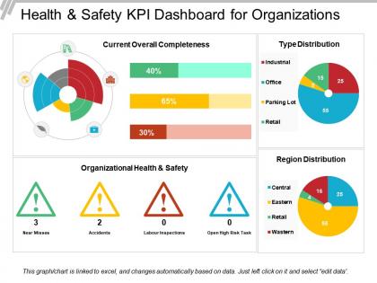
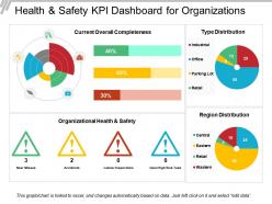
Health and safety kpi dashboard for organizations


Try Before you Buy Download Free Sample Product
 Impress Your
 Audience
Editable
of Time


Presenting the health and safety presentation layout. This dashboard design is 100% customizable and is professionally designed. You can edit the objects in the template like font size and font color without going through any fuss. This presentation template is fully compatible with Google Slide and can be saved in JPG or PDF file format without any hassle. Fast download this at the click of the button. Get added durability with our Health And Safety Kpi Dashboard For Organizations. Your thoughts and ideas get a fresh boost.
People who downloaded this PowerPoint presentation also viewed the following :
Health and safety kpi dashboard for organizations with all 6 slides:
Your thoughts have brought you a long way. Set course for the future with our Health And Safety Kpi Dashboard For Organizations.


FAQs for Health and safety kpi
Start with incident rates - both actual injuries and near misses. Lost time frequency and severity rates are huge too. But here's what's actually smart: track leading indicators like training completion and how often people report hazards. Way more helpful than most places realize since you can catch problems early. Oh, and don't skip compliance audits or those employee perception surveys - they tell you if people actually feel safe or just say they do. Honestly, nail down your incident tracking first. Everything else builds from there, but that's your foundation.
Look, start with OSHA's basic formulas - TRIR and Lost Time Incident Rate. Track them monthly if you can. Honestly, most places mess this up initially because they don't stay consistent with how they log incidents. Put everything in the same system and categorize stuff the same way every time. Build dashboards showing 12-24 month trends so patterns jump out at you. Here's the thing though - when your numbers spike, dig deeper. Don't just stare at charts all day. Figure out what's actually causing the increase so you can fix it before someone else gets hurt.
Honestly, training is what'll make or break your safety numbers. Your team needs to actually know how to spot hazards and use equipment right - otherwise you're just hoping for the best. Most companies do some half-hearted orientation and call it done, which is nuts. Better reporting, fewer incidents, higher compliance scores - it all flows from people knowing what they're doing. You want this to be ongoing though, not just day-one stuff. I'd start by figuring out where your training sucks compared to your worst KPIs.
Track your PPE usage rates first - what percentage are actually wearing their gear correctly? Then look at audit scores from inspections and incident rates in those areas. Training completion matters too since that's usually where things fall apart. Honestly, observed compliance beats self-reported surveys every time - people lie about following safety rules. Break everything down by department and shift so you can see patterns. Oh, and don't forget equipment type. Some gear gets ignored more than others. Focus your fixes where the data shows the biggest problems.
Track the hard numbers - incident rates, near-misses, training completions. But honestly? The real insights come from actually talking to people. Do safety surveys, exit interviews, casual check-ins. Numbers tell you WHAT happened, but conversations tell you WHY. I always tell people to put both together when reporting up. Show leadership that 95% compliance rate, but also mention workers feel rushed because of crazy deadlines. Create dashboards with metrics next to actual employee quotes - makes it way more real. My old boss used to say "data without context is just math," and he wasn't wrong.
Check out OSHA and NSC first - they've got solid benchmark data for most industries. Their websites are kinda messy but you can usually find free reports if you poke around enough. Compare your injury rates and training metrics against their averages. Joining those anonymous benchmarking groups is honestly pretty useful too since you get way better details than the public stuff. Just make sure you're comparing apples to apples - a tiny office shouldn't stress about hitting manufacturing plant numbers, you know? Set up quarterly check-ins to see how you're doing.
Track your near-miss reports - both how many you're getting and if they're actually useful. Most places I've worked, people skip reporting close calls because "eh, nothing happened." That's such backwards thinking though! Those reports are gold. Check where near-misses keep popping up - same equipment breaking down, certain shifts having issues, whatever. Set some reporting targets and actually celebrate when teams hit them. Shows people care about prevention instead of just scrambling after accidents. The patterns will tell you everything you need to know before something actually goes wrong.
Ugh, the worst part? Getting everyone to actually stick with it. People hate change and will treat it like busy work. Data gets messy when folks rush through it half-assed. Your existing systems probably won't play nice together either - that integration stuff is always more painful than expected. Plus leadership wants results yesterday even though the data's garbage at first. Training drags on forever too. Honestly, just pick like 3 metrics and test it with one team first. Once you've got some wins to show off, then roll it out wider. Way less headache that way.
Dude, tech can totally transform how you track safety KPIs. IoT sensors monitor air quality and stuff automatically. Wearable devices track if workers are getting too tired or moving unsafely. Mobile apps let people report incidents instantly instead of filling out boring paperwork later. Real-time dashboards are actually pretty cool - you see everything happening live rather than waiting weeks for reports. AI analyzes patterns to spot potential problems before accidents happen. Honestly, the time savings alone make it worth it. I'd start small with just one tool and expand from there.
LTIR tracks how many workplace injuries cause people to miss work days - calculated per 100 full-time employees each year. What makes it useful is that it ignores the small stuff like minor cuts and focuses on injuries bad enough to keep workers home. Way more telling than total incident rates that count literally everything. You can compare your numbers against industry benchmarks to see where you stand (honestly, most companies are surprised by what they find). Check it monthly and when you spot increases, that's your cue to dig deeper. Those spikes usually point you toward specific problems worth fixing.
So you gotta make those H&S metrics actually visible - dashboards, posters, whatever works for your setup. Don't just dump quarterly reports on people that'll sit unread. Break the big company numbers down so each team can see their own impact. Honestly, some places do this gamification thing that sounds super corny but it actually gets people engaged. Have quick safety huddles where you talk through the numbers and celebrate wins. The trick is making it ongoing conversation, not just crisis mode when stuff goes sideways. Real-time data beats stale reports every time.
So for high-risk stuff like construction, you'll want to track leading indicators - safety training rates, near-miss reports, hazard spotting. Catch issues before they blow up into real problems. Office environments can stick with basics: ergonomic checks, wellness program participation, general incident tracking. Though I've seen some pretty gnarly office accidents too, honestly. The main thing is high-risk industries need real-time monitoring and predictive metrics, while offices can focus more on prevention and employee wellness stuff. I'd start by figuring out what your actual risks are first.
Start with your actual H&S goals, then figure out which KPIs will tell you if you're getting there. Most companies just copy the same tired metrics - honestly, half are probably useless for your specific situation. Get your frontline people involved when picking these. They see the real problems daily. Each KPI should connect directly to an objective, otherwise why bother tracking it? Also review quarterly since priorities shift as your safety culture changes. What seemed critical six months ago might not matter much now.
Quarterly reviews are the bare minimum, but I'd go monthly if possible. Mix up your metrics - don't just track incident rates after stuff happens. Near-miss reports and training completions can catch problems early, which is way smarter. Your frontline people have the best insight here since they deal with this stuff every day, so actually ask them what they're seeing. Oh, and definitely set those calendar reminders or you'll forget (we all do it). Check if your targets still make sense compared to industry standards too.
Honestly, engaged employees are the ones who'll actually report stuff and follow safety rules instead of just pretending to care. When your team feels heard, they speak up about near misses and hazards - disengaged people just stay quiet or ignore protocols completely. Your KPIs become way more accurate because you're getting real data from people who actually give a damn. I've seen teams where nobody reports anything vs ones where everyone's involved - it's crazy different. Start by asking for their input on safety processes and then actually do something with their feedback. That engagement piece has to come first.
-
Awesome presentation, really professional and easy to edit.
-
Visually stunning presentation, love the content.