


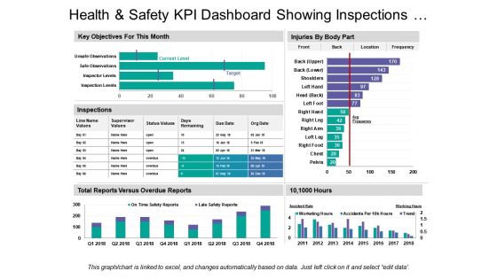
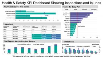
Health and safety kpi dashboard showing inspections and injuries


Try Before you Buy Download Free Sample Product
 Impress Your
 Audience
Editable
of Time


Our Health And Safety Kpi Dashboard Showing Inspections And Injuries enable you to freely experiment with fresh ideas. You will display an enterprising attitude.
People who downloaded this PowerPoint presentation also viewed the following :
Health and safety kpi dashboard showing inspections and injuries with all 6 slides:
Investigate exaggerated claims with our Health And Safety Kpi Dashboard Showing Inspections And Injuries. Elaborate on flawed calculations.
-
Health and safety kpi dashboard showing inspections and injuries
-

Health and safety kpi dashboard showing inspections and injuries
-
Health and safety kpi dashboard showing inspections and injuries
-

Health and safety kpi dashboard showing inspections and injuries
-
Health and safety kpi dashboard showing inspections and injuries
-
Health and safety kpi dashboard showing inspections and injuries
FAQs for Health and safety kpi dashboard showing
Track both lagging stuff (TRIR, DART rates, near-misses) and leading indicators. Leading ones are way more useful though - safety training completion, how many hazards people spot, audit scores, how fast you close corrective actions. Honestly, employee perception surveys are gold if you can do them. Days since last recordable injury is classic but still works. Oh, and definitely track incident costs - management loves seeing those numbers go down. Start with maybe 6-8 key metrics max. I've seen companies try tracking like 20 different things and then nobody actually looks at the data regularly.
So for tracking safety training, definitely watch your completion rates and assessment scores first. Incident rates before/after training rollouts are huge too - that's where you'll see real impact. Near-miss reports actually go up initially when training works (people spot more stuff). Assessment scores are honestly my favorite metric because they show if people actually retained anything or just clicked through. Time-to-competency for new folks matters too. The goal is connecting all these dots back to actual workplace incidents to show it's worth the investment. Oh, and set alerts when completion drops below whatever threshold makes sense for you.
Honestly, real-time data is what separates a useful dashboard from just another screen nobody looks at. You need to know about incidents immediately - not next week when it's too late to fix anything. Historical stuff shows trends, which is cool, but live feeds catch patterns as they happen. Like if you're getting a bunch of near-misses in the same spot during one shift? That's actionable intel right there. The whole point is responding fast before small problems blow up. Oh, and definitely set up alerts for your key metrics - otherwise you'll just be staring at charts all day instead of actually preventing issues.
Look, you gotta speak their language - money. Connect your safety stuff to what they actually watch: operational costs, downtime, insurance rates. Show them how incidents mess with productivity and drain the budget. Track things like near-misses and training completion, then prove those predict real accidents. One company I know started measuring "safety-related productivity hours lost" instead of just injury counts - way more effective honestly. Put safety metrics right next to revenue on their executive dashboards. Set targets that match business cycles. Once it's staring them in the face every meeting, they can't pretend it doesn't matter.
Ugh, the data consistency thing is a nightmare - everyone enters stuff differently and uses their own random categories. Half your teams won't even report near-misses, just the big incidents that can't be ignored. Then you're stuck with data that's basically useless because site A calls something a "minor injury" while site B logs the exact same thing as a "first aid case." Real-time reporting is another headache since most safety data comes in way too late. Honestly? Start with mobile tools that are dead simple to use and nail down standard categories first. That alone fixes like 70% of your headaches.
Honestly, charts and heat maps are total game-changers for safety data. Raw spreadsheets just hurt my brain, but when you visualize the same numbers? Boom - you can instantly see which shifts have more incidents or spot departments with sketchy near-miss patterns. Leadership actually pays attention to dashboards too, way more than boring tables. I'd start simple - just pick your top 4-5 metrics and throw them into basic charts. You'll be shocked how obvious the trends become once they're visual. It's like the data suddenly starts making sense, you know?
So basically, leading indicators predict future stuff - like how many people finished safety training or reported near-misses. Lagging indicators are what already went wrong, like actual injury rates. Honestly, you'll want way more leading indicators on your main dashboard since those actually help prevent problems. I'd do like 70/30 split. Put trend lines on the leading metrics so you can catch patterns early - that's where the real value is. The lagging stuff matters for compliance and all that, but maybe stick it on a separate tab? Your team will thank you for not drowning them in backwards-looking data.
Track your incident rates and near-miss reports first - those are huge. Also monitor training completion and audit scores. The key is catching problems before they blow up, not just counting accidents after the fact. Set up alerts for concerning trends like missed certifications or protocol violations. Days since last incident is a solid metric too. Real-time dashboards work way better than discovering issues during some random regulatory visit. Honestly, most companies I've worked with are terrible at this proactive stuff. They just scramble after something goes wrong.
Regular pulse surveys and safety suggestion boxes are your best bet - they feed right into your dashboard. Anonymous works way better since people won't sugarcoat things. Track stuff like "percentage of safety concerns reported" and employee satisfaction scores as actual KPIs. Also measure how fast you respond to reported hazards and whether you actually implement suggestions (this one's huge for trust). Honestly, most companies collect feedback then do nothing with it. Make sure yours doesn't just disappear into the void.
So there's actually a bunch of good ways to automate this stuff. SafetyCulture and Cority are solid - they're built specifically for safety tracking and handle incidents, compliance, all that. If you want something more customizable, Tableau or Power BI let you build whatever dashboards you need (though honestly, they're a pain to set up initially). Some places just use Microsoft Forms hooked up to Power Automate for basic tracking. Works fine if you're not doing anything too complex. The real trick is finding something your people will actually use - I've seen expensive systems fail because nobody wanted to deal with entering data.
Honestly, weekly reviews are ideal but monthly's fine if you're just starting out. Thing is, you don't want to miss those early warning signs - trends can sneak up fast with safety stuff. For the serious metrics like incidents or near-misses, I'd set up real-time monitoring. Your dashboard needs daily updates though, nobody's making good decisions with old data. Automated alerts are clutch for anything critical - way better than waiting around for your next scheduled check-in. Monthly beats nothing, but weekly's where you'll actually catch problems before they blow up.
Honestly, data accuracy comes down to three things. Get your team standardized on how they collect and enter stuff - nobody should be winging it. Monthly audits are your friend too, cross-checking incident reports with actual records. Bad data makes dashboards completely pointless, trust me on that one. Train people properly so they actually get why this matters. Oh, and set up alerts for weird outliers or missing info. Always have someone double-check the important metrics before they go live on your dashboard.
Honestly, putting up a safety KPI dashboard is like magic for changing behavior. People can't ignore problems when the numbers are staring them in the face every day. Teams actually start caring about their metrics instead of just pretending to follow safety rules. The whole thing shifts from "ugh, another safety meeting" to people genuinely wanting better scores. Display it somewhere everyone walks by daily and bring up the numbers in team meetings. Oh, and definitely tie improvements to team recognition or goals - that really gets people invested. The transparency alone makes such a difference.
Honestly, visual design can make or break your safety dashboard. I've watched so many companies create these number-heavy monsters that everyone ignores. Your dashboard needs to tell the story instantly - use red for incidents, green for good stretches, that kind of thing. Make your critical KPIs jump off the screen first. The layout should feel logical, not like someone just threw charts everywhere. Here's the thing though - you can design something that looks amazing to you, but if your actual users can't figure it out in 5 seconds, you're back to square one. Test it with real people.
Grab industry benchmarks from OSHA, Bureau of Labor Stats, or your industry association first. TRIR and Lost Time Injury rates are the big ones everyone tracks. Make sure you're comparing similar company sizes though - no point benchmarking against massive corporations if you're running a smaller operation. I'd set up your dashboard to show your numbers right next to industry averages. Maybe add some color coding when you're doing better or worse than expected. Honestly, stick with 3-4 metrics to start. You can always add more later, but too many numbers just gets overwhelming fast.
-
Health and safety
-
Excellent design and quick turnaround.
-
Excellent design and quick turnaround.