


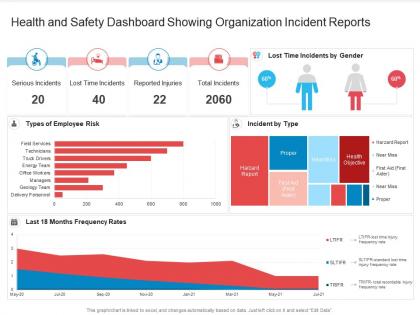
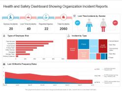
Health and safety dashboard showing organization incident reports




Try Before you Buy Download Free Sample Product
 Impress Your
 Audience
 100%
100% Editable
 Save Hours
 of Time


Our Health And Safety Dashboard Showing Organization Incident Reports are topically designed to provide an attractive backdrop to any subject. Use them to look like a presentation pro.
People who downloaded this PowerPoint presentation also viewed the following :
Health and safety dashboard showing organization incident reports with all 2 slides:
Use our Health And Safety Dashboard Showing Organization Incident Reports to effectively help you save your valuable time. They are readymade to fit into any presentation structure.
FAQs for Health and safety dashboard showing
Honestly, I'd start with leading indicators - near-miss reports, training completion, inspection scores. That stuff shows problems before they blow up. Obviously you still need the lagging ones too (injury rates, lost time, workers comp costs) because nobody wants to get blindsided in meetings. Behavioral stuff matters - like who's actually showing up to safety meetings and reporting hazards. Pick maybe 5-7 metrics your team will genuinely use, not just collect. Oh, and set up alerts when numbers get sketchy so you can jump on things quickly.
So basically, a health and safety dashboard shows you what's happening right now with incidents and trends. Instead of just scrambling when stuff goes wrong, you can actually see patterns emerging. Honestly, the visual aspect is huge - way easier to get leadership on board when you're showing them charts instead of just talking at them. You'll catch problems before they blow up and figure out where to actually spend your safety budget. I'd say start small though - pick maybe 3-5 key metrics first, then expand. It beats flying blind and hoping for the best.
Honestly, it totally depends on your workplace setup. IoT sensors are pretty sweet for monitoring air quality and noise levels in real time. Wearable tech can catch falls or track if someone's been exposed to nasty chemicals. Mobile apps work well for reporting incidents - though good luck getting everyone to actually download them, right? I'd probably start with automated chemical monitoring since that stuff's dangerous. Emergency alert systems are solid too. Focus on your biggest safety headaches first, then expand once people get comfortable with the tech. No point rolling out everything at once if nobody uses it.
Daily updates are your best bet, but real-time is even better if you can swing it. Critical stuff like incidents? That needs to show up immediately - I mean, what's the point of a dashboard if the data's old, right? Weekly updates are totally fine for things like training completion rates though. My old team learned this the hard way when they made a safety call based on week-old numbers. Honestly, just start with daily and see what works. You'll figure out pretty quick what your team actually pays attention to and needs to act on fast.
Oh man, user engagement is everything with dashboards. People won't check it if it doesn't matter to their daily grind. I've literally watched beautiful safety dashboards collect digital dust because nobody cared about the metrics shown. The good ones? They spark conversations. Teams actually debate the trends and change how they work based on what pops up. Design it for real humans doing real jobs - stuff they can quickly scan and actually do something about. Honestly, just ask your people what safety data they'd want to see every morning.
Okay so first thing - set up some automated checks that catch weird data or missing stuff. Your team needs super clear instructions on how to enter everything, because I swear, people will find the most creative ways to mess up data entry! Have someone review it weekly and compare against your actual incident reports. The whole point is making sure what you're seeing on screen actually matches what's happening out there. Oh and definitely assign specific people to own this - otherwise everyone thinks someone else is handling it and nothing gets done.
Honestly, just stick to the basics - red for bad stuff, yellow for warnings, green when things are good. People get that instantly. For icons, go super simple like hard hats or whatever makes sense at first glance. Clean charts are your friend here because messy graphs are useless when someone's panicking. Put your most critical metrics right at the top where they can't be missed. Keep everything formatted the same way so it feels familiar. Oh, and definitely test it with real people first - if they're confused or squinting at your dashboard, you've overcomplicated it.
So basically you just tweak the metrics to match whatever industry you're in. Construction folks care about fall protection and equipment checks. Manufacturing? More about machine safety and chemical tracking. Healthcare is all infection control and patient incidents - that kind of stuff. Honestly I'd just start with your biggest 5 safety headaches and work backwards from there. Map those to whatever regulations you're actually dealing with day-to-day. It's way easier than trying to build some perfect dashboard from scratch, trust me.
Skip the generic tutorials - they're useless honestly. Jump straight into real scenarios your team actually deals with. Show them the dashboard sections that matter, how to read the metrics, set alerts, spot important trends. Focus on what they need for their specific jobs, not every single feature. I've watched people get totally overwhelmed by features they'll never touch. Let them practice clicking around without breaking anything. Pick a few "dashboard champions" to help with questions later. Oh, and make a quick reference guide they can bookmark - you'll thank me later when they stop asking the same questions.
So basically you can set up dashboards that track all your compliance stuff automatically - incident deadlines, training rates, audit schedules, safety inspections, whatever. Way better than those nightmare spreadsheets we've all dealt with! The dashboard pulls from different systems and shows where you stand with regulations. When deadlines get close or your numbers drop, you'll get alerts. Honestly though, start small - pick your top 5 requirements first and build widgets for those. Don't try to do everything at once or you'll go crazy.
Track near-miss reports, safety training completion, overdue maintenance alerts, and incident trends. These actually warn you before accidents happen - way better than just counting injuries after the fact. Set up your dashboard with automated alerts when things hit warning levels. Color-coded charts help spot deteriorating patterns, and you can build predictive scores from multiple risk factors. Honestly, the notification setup is crucial here. Flag issues early when near-misses jump in a department or training compliance drops below 85%. Don't wait until you're looking at actual injuries to react.
Oh nice! So basically you get all your incident data dumped into one spot where you can actually make sense of it. Filter by department, injury type, dates - whatever you need. Way better than drowning in Excel hell, trust me. The charts show you patterns super clearly, like if third shift keeps getting hurt or if one location's a mess. You can track whether your fixes are working too, which is honestly pretty satisfying. Main thing is catching trends before more people get hurt instead of just documenting disasters after they happen.
Honestly, most people try to cram way too much into one dashboard and it becomes this mess nobody wants to look at. Focus on maybe 3-5 metrics that actually matter - the ones that help you catch problems before they blow up, not just count how many times you already screwed up. Also, talk to the people who'll actually use this thing daily (hint: probably not the VP who asked for it). I've seen so many fancy dashboards that look great in boardrooms but are completely useless on a phone when you're out on the floor. Keep it simple at first - you can always add more bells and whistles later once people are actually using it.
Honestly, mobile access is a game-changer for safety dashboards. Your team can report stuff right from wherever they are - the factory floor, job site, whatever. Incidents don't exactly wait for you to get back to your computer, you know? Real-time notifications mean you're not finding out about problems hours after they happen. Plus people can quickly check protocols or update logs without hunting down a desktop. Just make sure it actually works well on phones, not just technically loads. I've seen too many "mobile-friendly" dashboards that are basically unusable on smaller screens.
Honestly, user feedback is what separates dashboards that actually work from ones that just look nice. People will tell you straight up what's broken or confusing - that's way more valuable than guessing what they need. I've seen so many projects where designers thought they nailed it, but then field workers couldn't even read the charts on their phones. Pretty embarrassing, right? Talk to your users regularly - surveys, quick interviews, whatever works. Short sentences hit different sometimes. Their complaints become your to-do list for updates that'll actually help with safety stuff instead of just adding random features nobody uses.
-
Appreciate the research and its presentable format.
-
Out of the box and creative design.