

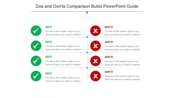
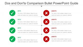
Dos and donts comparison bullet powerpoint guide





Try Before you Buy Download Free Sample Product
 Impress Your
 Audience
 100%
100% Editable
 Save Hours
 of Time


Handle the intricacies with our Dos And Donts Comparison Bullet Powerpoint Guide. Guide folks on dealing with complications.
People who downloaded this PowerPoint presentation also viewed the following :
Dos and donts comparison bullet powerpoint guide with all 5 slides:
Build an atmosphere for change with our Dos And Donts Comparison Bullet Powerpoint Guide. They will hail your fresh approach.
FAQs for Dos and donts comparison
Start with something that hooks people right away, then lay out your agenda clearly. Between major sections, throw in transition slides - seriously saves you when your brain goes blank mid-talk. Font size matters too, nothing under 24pt or people will squint. I'd stick to maybe 3-4 colors max so it doesn't look like a rainbow exploded. Build in spots for your key data and definitely end with next steps plus Q&A time. The real trick? Make it flexible enough that you can tweak it for different crowds without rebuilding the whole thing every single time.
Honestly, good visual design is a game-changer for templates. Pick consistent fonts and colors so people aren't getting distracted by random styling choices. White space is your friend - cramped slides are the worst. High contrast makes everything more readable too. I'd swap out text blocks for simple icons or graphics when you can. Visual learners will thank you for it. Don't go crazy with colors though - nobody needs rainbow slides burning their retinas! Start simple, then add visuals that actually help your message instead of just looking "pretty."
Ugh, where do I even start? First off, don't stuff your slides with tiny text - anything under 24pt is evil. Keep your colors simple, like 2-3 max, because rainbow slides are painful to look at. Those cheesy stock photos from 2005? Skip them entirely. I learned this the hard way, but test everything on different screens before you're done. Consistent spacing is your friend. And please, resist going crazy with animations - less is more. Oh, and start with a basic grid system. Trust me, it'll save you so much frustration later when you're trying to align everything perfectly.
Your audience basically controls everything about your template design. Executives? Keep it super clean with tons of white space and big headlines - they hate clutter and want info fast. Technical teams can handle way more detail and smaller text since they're already used to complex stuff. Oh, and age definitely plays a role here - younger crowds usually dig dynamic layouts while older people tend to stick with traditional formats. I always think about how each group actually reads content, you know? Like, what do they care about most and how do they usually take in information? Match your layout complexity to how their brains work.
Honestly, less is more with branding on slides. Stick your logo in one corner and call it good - I've sat through so many presentations where logos were plastered everywhere like wallpaper. Use your brand colors for headers or accents, but don't go crazy. Two fonts max, maybe three if you're feeling wild. The tricky part? Make sure your colors work on different backgrounds since conference rooms are unpredictable lighting disasters. Set up a few master slide templates with your brand stuff already built in. Saves you from recreating the wheel every time. Your content should shine, not get buried under a pile of branding elements.
Hey! So build your templates around structure, not specific topics. Use neutral colors and basic fonts that work for everything. Generic slide layouts are your friend here. Modular sections you can move around or delete? Game changer. I learned this the hard way after making templates that only worked for one type of presentation - what a nightmare. Placeholder content should be super flexible too. Oh and honestly, quarterly reviews and project updates can use the same flow if you set it up right. Way easier to pivot when you're not locked into topic-specific designs.
Colors totally mess with people's heads in presentations - it's crazy how much they matter. Blue makes you look trustworthy (classic corporate move), red screams urgency, green says "growth" or "safe choice." Orange? Pure energy. Match your vibe to the room though. Conservative executives will judge you for hot pink, trust me. Go navy or gray instead. Pick one main color first that fits your goal, then build everything else around it. I learned this the hard way after bombing a pitch with terrible color choices lol.
Honestly, stick to like 70% visuals, 30% text max. People literally can't read and listen at the same time - I bombed so many presentations before figuring this out lol. Use bullet points instead of paragraphs. Your visuals should actually back up what you're saying, not just look pretty. Don't cram everything together either. White space helps! Start with your main points first, then find images that support them. Way easier than trying to build a presentation around some random stock photo you found.
Ok so here's the deal - stick to just 2 fonts max. One for headers, another for body text. Arial, Calibri, Helvetica are your best friends because they actually show up clearly on screens. Skip anything decorative or script-y (your audience will literally squint and zone out). Times New Roman? Hard pass unless you want that dusty 2003 energy lol. Body text needs to be at least 24pt - bigger than you think! Oh and test your slides from way in the back beforehand. Trust me on this one, I learned the hard way when half my presentation was basically invisible to anyone past row 3.
Think of templates as your storytelling backbone - they keep everything flowing smoothly and your audience actually paying attention. You get consistent visual cues for transitions, proper story structure, and this nice rhythm between slides. Honestly saves you from looking like you designed everything in 2003 PowerPoint. The good ones have layouts that naturally fit different story moments (problem, conflict, resolution) so you're not wrestling with the design. Oh, and pick something that matches your vibe. Use the built-in structure - it's there for a reason.
Honestly, good templates save you so much time with their pre-built layouts and drag-and-drop stuff. You'll want ones that come with color schemes and font pairings already done—seriously, I've seen people pick the worst font combos and it looks awful. Icon libraries are clutch too. Look for image placeholders that resize automatically, plus clear instructions for swapping things out. The spacing and alignment guides are huge because everything just clicks into place. Oh, and find ones with sample content you can replace with your own. Way easier than staring at a blank page wondering where to start.
Pick high-res images that actually connect to what you're talking about. Those stock photos of people fake-smiling at laptops? Skip them - they're so overdone at this point. Your images should vibe with your brand colors too. Check that there's good contrast so your text doesn't disappear into the background. Oh, and leave room for words in the composition - I learned that one the hard way lol. Consider your audience and setting obviously. Test everything on a projector first because images look totally different when projected versus on your laptop screen.
Build feedback collection right into your iteration cycles - get input every time you update a template before moving forward. People give way better feedback after they've actually used something vs just looking at it, honestly. Set up regular check-ins once users have tried templates in real scenarios. Make it feel seamless though, not like another task. A shared doc works great, or maybe a 2-minute survey max. The response rates drop off a cliff if it's longer than that. Oh, and focus on getting stakeholders to quickly flag what's broken vs what's working - that's usually more actionable anyway.
Online presentations need way bigger fonts and bolder colors - people are dealing with screen glare, bad wifi, whatever. Small details just disappear through video compression anyway. Live presentations can be more subtle since everyone's actually there focusing on you. I've seen gorgeous in-person decks that look like garbage on Zoom, so don't use the same template for both. High contrast is your friend online. Also throw in more interactive stuff because attention spans are shot when people are at home. Oh, and fewer elements per slide - cluttered slides are death on video calls.
Start with high contrast colors and readable fonts - Arial or Calibri work great. Font size needs to be at least 14pt, and honestly, skip Comic Sans because screen readers hate it. Give your content room to breathe with plenty of white space. Don't forget alt text for images! Clear headings help structure everything, plus bullet points beat giant text blocks every time. Here's a trick I learned: view your slides in grayscale to check if the contrast still holds up. Oh, and run it through an accessibility checker before you're done.
-
Appreciate the research and its presentable format.
-
Design layout is very impressive.