

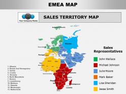
Emea powerpoint maps




Try Before you Buy Download Free Sample Product
 Impress Your
 Audience
 100%
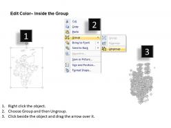
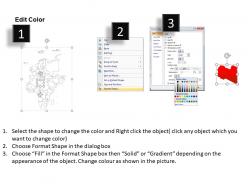
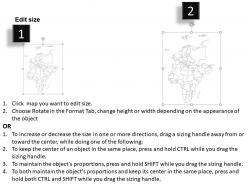
100% Editable
 Save Hours
 of Time


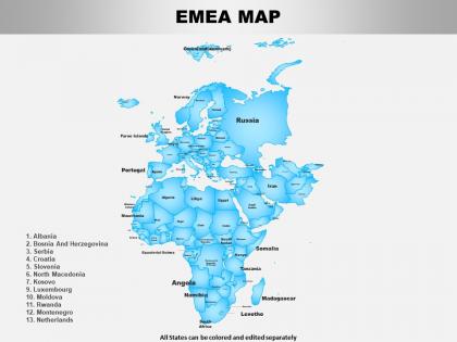
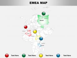
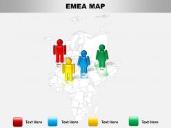
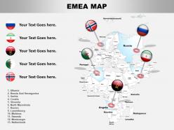
Our Emea Powerpoint Maps are topically designed to provide an attractive backdrop to any subject. Use them to look like a presentation pro.
People who downloaded this PowerPoint presentation also viewed the following :
Emea powerpoint maps with all 15 slides:
Use our Emea Powerpoint Maps to effectively help you save your valuable time. They are readymade to fit into any presentation structure.



FAQs for
Honestly, the best thing about EMEA PowerPoint maps is how clean they look compared to regular charts. You can edit everything - country borders, colors, whatever matches your company's style. Vector format means no weird pixelation when you present (learned that the hard way once). What's really cool is dropping your data straight onto the map instead of making people stare at boring spreadsheets. Regional sales, market share, expansion plans - it all becomes super obvious at first glance. Definitely grab a few templates and mess around with the color coding. Your stakeholders will actually pay attention for once.
Color coding is your best friend here - use different shades to show performance levels or whatever metrics you're tracking. Drop some icons on specific countries too, like little charts or flags. Keep it simple though, nobody wants a rainbow mess on their screen. I learned that the hard way once lol. Build your story gradually instead of throwing everything at them upfront. Start with the biggest regional insight first. Then layer on more complexity as you move through slides. Consistent legends are clutch so people don't get lost trying to decode your map halfway through.
For corporate stuff, country-level maps showing individual nations are everywhere - you'll see them in basically every quarterly deck. Regional breakdowns by sales territories are super common too. City maps focusing on major hubs like London or Frankfurt get used a lot, though honestly Amsterdam ones seem to be having a moment this year for some reason. Population density overlays work great for presentations. Industry-specific ones are getting more popular - like tech corridors or manufacturing zones. I'd just grab a basic country outline template first, then customize it based on whatever data you're trying to show.
Honestly, those EMEA map visuals are a game changer for strategy decks. Your audience gets the geographic context instantly instead of staring at boring bullet points. Market penetration, sales numbers, expansion plans - whatever data you're showing just clicks better when people can actually see the hotspots and gaps on a map. It's way easier to spot patterns that way. Stakeholders immediately understand which markets you're focusing on too. I mean, it's like showing someone directions vs just telling them street names, you know? Tables are fine I guess, but maps will definitely keep people more engaged during your presentation.
Start with colors that actually make sense for your brand and don't make people squint to tell regions apart. Borders should be clean but not crazy thick. Text needs to be readable from way back - I swear half the presentations I've sat through have tiny labels you can't even see. Keep your styling consistent across similar data points, and honestly? Not everyone knows EMEA geography as well as you think they do. Oh, and definitely test it on a projector first because colors look completely different when projected. Learned that one the hard way.
Dude, animated maps are game-changers because they actually make your data interesting instead of boring people to death. Movement keeps people focused - which honestly, good luck doing that these days without some visual tricks. You can control how the story unfolds too, like fading in different regions or changing colors to highlight your biggest markets. Way better than just throwing up a static map and hoping for the best. People will actually pay attention instead of checking their phones every two seconds. Try progressive reveals where you build the story piece by piece - it's so much more engaging than traditional bullet points.
Stick with blue or green for EMEA maps - they're clean and professional. Blue gradients work really well for showing data hierarchy. I'd avoid those crazy rainbow color schemes, they just make everything harder to read tbh. Save red for negative stuff since people automatically think "problem" when they see it. For multiple categories, try blue/orange or green/purple combos - they contrast nicely without being jarring. Oh, and definitely check how your colors look in grayscale first. Trust me on this one - you don't want to find out your beautiful map is completely unreadable when someone prints it out.
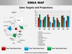
Heat maps work really well for this - just color-code your regions based on sales data or whatever metric you're tracking. PowerPoint's gotten surprisingly decent for data viz lately, honestly better than I expected. Try pie charts for market breakdowns, or make your icons bigger/smaller to show volume differences. Bar charts can overlay right onto specific countries too. Keep it simple though - one data point per map max or people get overwhelmed. I always start there and add more layers if needed. The goal is spotting trends quickly, not cramming everything possible onto one slide.
Ugh, EMEA mapping is such a pain. Political changes mess with boundaries constantly - Brexit totally scrambled everyone's definitions. Some datasets include Russia and Turkey, others don't. Middle East borders? Good luck with that mess. Free map data is usually garbage or super outdated too. Natural Earth is solid if you want something reliable, or just bite the bullet and buy licensed data. Honestly though, whatever you use, double-check everything before you show it to anyone because there's always some weird edge case.
EMEA maps are perfect for this! Color-code each country based on your metrics - sales, growth, whatever you're tracking. Dark colors for high performers, lighter shades for markets that need work. Way better than staring at endless spreadsheet rows, trust me. Your stakeholders will actually pay attention during presentations. Throw in some callout boxes or icons to flag weird outliers or interesting trends. Oh, and pick your main metric first, then choose colors that tell the story instantly. You'll be surprised how much clearer everything becomes when it's visual.
Check out add-ins like Maps for Office first - super easy to use. Microsoft killed MapPoint unfortunately, but PowerMapper and SimpleMappr are solid alternatives for EMEA stuff. They handle European boundaries way better than the basic options. Honestly, start with Microsoft's free PowerPoint map templates though. Their EMEA ones are actually decent and might save you time. You can pull your sales data straight from Excel into most of these tools too. If PowerPoint feels too limiting, Tableau or Power BI create much slicker visualizations. But that's probably overkill depending on what you're presenting.
Yeah, regional preferences are pretty huge for map design. Northern Europeans love that clean, minimal look with tons of white space. But go south to Mediterranean countries? They want vibrant colors and way more detail. Eastern Europe tends to be more traditional - conservative colors, formal layouts, that whole thing. The UK (shocking nobody) wants data crammed everywhere, while Middle Eastern clients are all about visual storytelling. Honestly, I'd just make 2-3 different regional templates that hit these cultural sweet spots, then swap out the data for each presentation. Way easier than starting fresh every time.
Don't cram everything onto one map - seriously, it gets messy quick. Double-check which countries you're including because EMEA definitions are all over the place (some count Russia, others don't). Your fonts need to be readable when projected, and pick colors that work for colorblind people too. Skip the crazy animations - they look cool but totally derail your presentation flow. I learned that one the hard way. Keep legends simple and make sure your data actually covers the regions you're showing. Less stuff = better map.
So basically it depends who you're presenting to. Stakeholders can handle the heavy stuff - detailed metrics, technical terms, all that complex data they need for decisions. But public audiences? Totally different story. Keep it super simple - like 2-3 main points max, basic colors (skip the rainbow explosion), and ditch the jargon. I learned this the hard way at a community meeting once... yikes. Also think about colors differently. Red/green works fine for business folks, but regular people respond better to blues and oranges. Just figure out your one key message first, then build around that.
Honestly, EMEA maps are perfect for presentations because people can actually see what you're talking about. Way better than just rattling off country names or showing boring spreadsheets. Your audience gets the geographic context right away, which is super helpful if they don't know all the European, Middle Eastern, and African markets by heart. You can point to specific regions while explaining trends or growth plans - makes everything click better. I'd definitely color-code your data points too, maybe by performance or opportunity level? It's one of those simple tricks that actually works. The visual storytelling just flows more naturally when you've got that map as your foundation.
-
Professional and unique presentations.