

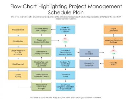
Flow chart highlighting project management schedule plan




Try Before you Buy Download Free Sample Product
 Impress Your
 Audience
 100%
100% Editable
 Save Hours
 of Time


This slides cover will help the project managers in planning all the complex tasks in a project. It will also help in executing all the task of the project with respect to project objectives.
People who downloaded this PowerPoint presentation also viewed the following :
Flow chart highlighting project management schedule plan with all 2 slides:
Use our Flow Chart Highlighting Project Management Schedule Plan to effectively help you save your valuable time. They are readymade to fit into any presentation structure.
FAQs for Flow chart highlighting project
Definitely include the main stages: project kickoff, planning, execution, monitoring, and wrap-up. Those diamond decision points are super helpful for showing where approvals happen. Map out how tasks connect to each other, and honestly, build in some feedback loops because stuff always breaks or changes. Stakeholder reviews and risk checks should be in there too. The whole point is making something visual that your team can actually follow without getting lost. Oh, and don't make it so detailed that you're constantly tweaking the flowchart instead of doing actual work - been there, not fun.
Honestly, flow charts are game-changers for cutting through project chaos. Everyone literally sees the same picture instead of having those "wait, what are we doing first?" moments that drive you crazy. New people can figure out the workflow super fast without sitting through boring meetings. When things go wrong, you can point to the exact step and be like "here's the problem" rather than having vague conversations about what's broken. I'd start with your messiest process first - the one that always confuses people. Turn it into a simple chart and your next stakeholder meeting will actually make sense for once.
Lucidchart and Visio are your best bets for complex stuff - they're pretty robust and great for team collaboration. Miro's awesome if you want that whiteboard vibe (seriously, I waste so much time just playing around on there). Simple projects? Figma or Canva work fine and won't make you want to pull your hair out learning them. Oh, and check if Monday or Asana already have flowchart features built in first - no point adding another subscription if you don't need to.
Flow charts map out your actual workflow - like what happens next and where things could go wrong. Gantt charts are totally different - they're all about timing and deadlines. So flow charts = the "how" of your project. Gantt charts = the "when." I always think of flow charts as like drawing a map of your process, while Gantt charts are more like your project calendar with those bar things showing task duration. Honestly, you'll probably end up using both. Start with a flow chart to figure out your steps, then throw it into a Gantt chart to see if your timeline actually makes sense.
Ugh, don't overcomplicate it! Seriously, I've seen flowcharts that look like someone threw spaghetti at a wall. Focus on the big stuff - major milestones and deliverables. Skip the tiny details that nobody cares about. You definitely need those diamond shapes for decision points though, like approvals or when you hit a fork in the road. Keep your arrows flowing in a way that makes sense. Honestly? Walk through it with someone else first - if they get confused, you know it's too messy. Simple beats fancy every time.
Honestly, flow charts are perfect for this stuff. Map out your main risks at each project stage, then create branches showing what you'd actually do if things go sideways. Think of it like a decision tree for when everything hits the fan. The visual aspect is clutch - you'll spot connections and domino effects that aren't obvious when it's just text. Your team won't be running around like headless chickens either since they can just check the chart. I'd start small though, maybe pick your worst 3-5 risks first and see how it goes.
So decision points are basically those "what now?" moments in your flowchart. You know, the diamond shapes where you check if stuff's done right or if you need to backtrack. They're like forks in the road - did we hit our quality standards? Is this task actually finished? Without them, your project just barrels forward with zero checkpoints, which honestly sounds like a disaster waiting to happen. Each one needs super clear yes/no rules so your team isn't guessing what comes next. They're what keep you from steamrolling past problems you should've caught earlier.
Flow charts are a game changer for project planning - seriously. You can actually see how everything connects instead of just having random task lists floating around. Dependencies become super obvious, and you'll catch bottlenecks way earlier. I used to wing it with basic to-do lists and always wondered why my timing was off. Now I map things out visually first and it's so much clearer what can happen at the same time vs what has to wait. Plus you can spot your critical path without squinting at spreadsheets for hours. Definitely try it on your next project.
Honestly? Stick with the basics - rectangles for tasks, diamonds for decisions, circles for start/end. Color coding saves your life here. I usually assign different colors to team members or phases, whatever makes sense for your project. Keep fonts big enough that people aren't squinting at their screens (learned that one the hard way). Consistent spacing between everything helps too. Clear shapes and directional arrows are clutch - they make the whole thing readable at a glance. Oh, and grab a simple template first. Way easier than starting from scratch and ending up with something that looks like a toddler's art project.
Start by listing your main milestones - those become decision diamonds in your flowchart. Then map out deliverables as process rectangles between them. Each milestone acts like a checkpoint where you decide if you're ready to move forward or not. Color-coding is honestly a game changer here - makes it super easy to see what's done vs what's still pending. I always build the flow around milestones first, then fill in the steps. You'll catch delays way earlier this way, and your team can spot dependencies without squinting at a messy timeline.
Honestly, color coding is a game changer for project charts. Your brain picks up colors way faster than text, so people can spot their tasks or bottlenecks instantly. I always use different colors for priority levels or team responsibilities - saves everyone from reading every single box when deadlines are tight. Makes it super hard to miss critical steps too. Just don't go crazy with it. Stick to maybe 3-4 colors tops or you'll end up with something that looks like a rainbow threw up on your flowchart.
Add feedback arrows that loop back to earlier steps - like from your review phase straight back to design when stuff needs fixing. I always throw in diamond decision boxes asking "feedback good?" after big deliverables. Yes moves forward, no loops back. Honestly, most people forget this part and wonder why their projects go sideways. Build in weekly or monthly checkpoints too where stakeholders can actually redirect things. The trick is making these feedback spots super obvious on your chart so everyone knows exactly when input happens. Start with your three biggest review moments first.
Oh absolutely! Most project management tools have templates broken down by industry - construction, software dev, marketing, healthcare, you name it. Construction ones are super detailed (honestly almost overwhelming) because of all the regulatory stuff they have to deal with. Microsoft Project and Lucidchart have good industry-specific options, though I've seen people use Canva too if you want something free. Each field has its own weird requirements, so using a template that already accounts for that saves you tons of time. I'd grab one that matches your industry first, then tweak it from there.
Curved arrows are your best friend for this - just loop them back to earlier steps. Add a decision diamond asking "Does this meet requirements?" with "No" shooting back to wherever you need to revise. Honestly, most people forget this part and their flowcharts look way too neat and linear. Try dotted lines for informal feedback too, or throw in a "Review & Revise" box that connects to multiple stages. The whole point is showing that real processes are messy and cyclical, not some perfect straight line from start to finish.
Oh there's tons you can throw in there! Timeline milestones and task dependencies are obvious ones. Critical path stuff is honestly the most useful though - shows you exactly where delays will mess up everything else. Resource allocation and completion percentages work great visually too. I always do color-coding by status or priority because it makes patterns super obvious when you're presenting to people. Bottlenecks and workload distribution are smart to track. Budget burn rates at different stages help too, though that gets a bit messy sometimes. Dependency mapping is clutch for catching risks early.
-
Excellent template with unique design.
-
Innovative and attractive designs.
-
Excellent products for quick understanding.
-
Wonderful templates design to use in business meetings.