

France country and states map powerpoint template




Try Before you Buy Download Free Sample Product
 Impress Your
 Audience
 100%
100% Editable
 Save Hours
 of Time


Unveil a captivating presentation with our France country and states map PowerPoint template. This France plan PPT deck showcases the most fascinating cities of the country such as- Paris, Bordeaux, Lyon, Marseille, Toulouse, and many more. Reflecting the visual plans of Paris city, this France depiction PowerPoint layout focuses on the marker image of Paris city which shows different places such as Eiffel tower which was constructed on the Champ de Mars. This France chart creative PPT set presents the viewers with the overview of the city Rennes which includes- The grand Rennes Cathedral, Vilaine river, and Cathedrale Saint-Pierre. Attracting philosophical viewers with its beauty, this France nation PowerPoint bundle gives detailed information on Bordeaux city landmarks which reflects the Part of the Moon located in south-west France that represents the philosophers’ success. The visual depiction of some of the prominent cities of the European country is very eye-appealing to the audience which leaves a long lasting impact on everybody around. Incorporate it now to gain that feather in your hat.
People who downloaded this PowerPoint presentation also viewed the following :
Content of this Powerpoint Presentation
Slide 1: This slide introduces FRANCE Country and States Map. State Your Company Name and begin.
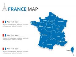
Slide 2: This slide shows FRANCE MAP with- Strasbourg, Dijon, Lyon, Marseille, etc.
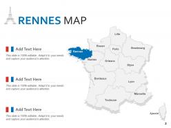
Slide 3: This slide presents RENNES MAP with- Toulouse, Bordeaux, Nantes, etc.
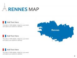
Slide 4: This is another slide showing RENNES MAP.
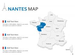
Slide 5: This slide displays NANTES MAP with- Lyon, Toulouse, Nantes, etc.
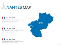
Slide 6: This is another slide showing NANTES MAP.
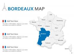
Slide 7: This slide represents BORDEAUX MAP describing- Paris, Orleans, Ajaccio, etc.
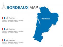
Slide 8: This is another slide showing BORDEAUX MAP.
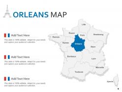
Slide 9: This slide showcases ORLEANS MAP with- Strasbourg, Toulouse, Orleans, etc.
Slide 10: This is another slide showing ORLEANS MAP.
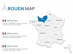
Slide 11: This slide shows ROUEN MAP with- Dijon, Marseille, Ajaccio, etc.
Slide 12: This is another slide showing ROUEN MAP.
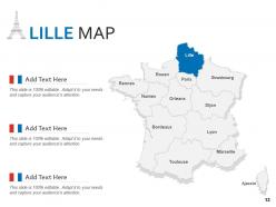
Slide 13: This slide contains LILLE MAP with- Lyon, Marseille, Nantes, etc.
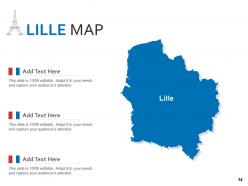
Slide 14: This is another slide showing LILLE MAP.
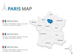
Slide 15: This slide presents PARIS MAP with- Rennes, Rouen, Orleans, etc.
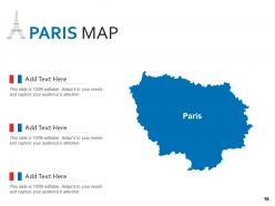
Slide 16: This is another slide showing PARIS MAP.
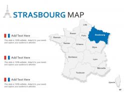
Slide 17: This slide displays STRASBOURG MAP with- Marseille, Nantes, Paris, etc.
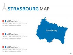
Slide 18: This is another slide showing STRASBOURG MAP.
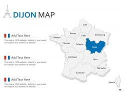
Slide 19: This slide represents DIJON MAP with- Lille, Lyon, Rouen, etc.
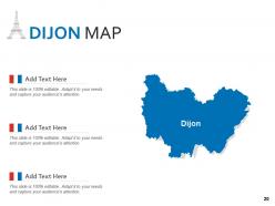
Slide 20: This is another slide showing DIJON MAP.
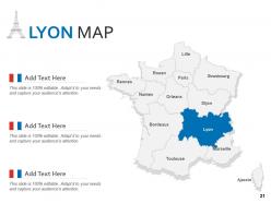
Slide 21: This slide showcases LYON MAP with- Bordeaux, Orleans, Ajaccio, etc.
Slide 22: This is another slide showing LYON MAP.
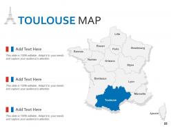
Slide 23: This slide shows TOULOUSE MAP with- Marseille, Rennes, Paris, etc.
Slide 24: This is another slide showing TOULOUSE MAP.
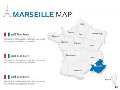
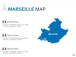
Slide 25: This slide presents MARSEILLE MAP with- Strasbourg, Toulouse, Ajaccio, etc.
Slide 26: This is another slide showing MARSEILLE MAP.
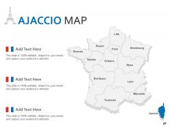
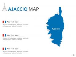
Slide 27: This slide displays AJACCIO MAP with- Lille, Marseille, Rouen, etc.
Slide 28: This is another slide showing AJACCIO MAP.
Slide 29: This is a Thank You slide with address, contact numbers and email address.
France country and states map powerpoint template with all 29 slides:
Use our France Country And States Map Powerpoint Template to effectively help you save your valuable time. They are readymade to fit into any presentation structure.

FAQs for France country and states
Definitely grab one with the big cities marked - Paris, Lyon, Marseille for sure. Regional boundaries for all 18 regions are pretty essential too. The coastlines need to be accurate since France's got some really distinctive coastal shapes that actually matter for context. Neighboring countries should be on there as well, helps with orientation. Major rivers like the Seine and Loire are good to have, plus mountain ranges - Alps, Pyrenees, you know the deal. Oh and pick based on what you're using it for. Simple outline's fine for presentations, but if it's educational stuff you'll want more detail.
Honestly, maps are so much better than cramming bullet points everywhere. Your audience will actually pay attention instead of zoning out at another text wall. Geographic relationships just make more sense visually - people remember where things are way easier than random data points. Color-code different regions or add your data right on top. I always think maps make you look like you actually planned ahead instead of just copying from Excel. Oh, and they're perfect for showing location-based stuff obviously. Way more professional than those spreadsheet screenshots everyone dumps in their slides.
Definitely get blank outline maps - kids can fill them in for quizzes and stuff. You'll also want labeled reference ones so they can check their work. Simple is key here, trust me. Thematic maps are super useful too, like ones showing population or climate patterns. Way better than just memorizing city names all day. Make sure whatever you print is high-res though, nothing worse than fuzzy coastlines. I'd start with basic departmental outlines since those cover most of what you'll need in class.
So basically you just use layers and selection tools to pick out whatever regions you want to highlight. I always duplicate the base layer first - learned that the hard way after accidentally ruining a template once. PowerPoint's honestly pretty decent for this stuff, or Illustrator if you want to get fancy. Just select the départements or cities you need and change colors, add labels, whatever. You can totally remove areas too if they're not relevant. Way better than making a map from zero. Figure out which regions matter first, then modify those while keeping the rest as background.
Adobe Illustrator is honestly your best bet for editing France map templates - it handles all that complex vector stuff really well. Most map templates come in SVG or AI format anyway. If you don't want to pay for Adobe, try Inkscape instead. It's free and does pretty much everything Illustrator can do, though the interface is kind of clunky at first. You could use Canva I guess, but it's super basic. Like you can change colors and add simple text, but that's about it. Really depends how detailed you want to get with your edits, but I'd definitely stick with vector-based software either way.
Interactive France maps are totally different - people can click around, zoom in on regions, hover for data popups, filter stuff. Way more engaging than static maps that just sit there looking nice but doing nothing. You can layer different datasets, throw in some animations, make it actually respond to what users want to see. Honestly, static maps feel pretty outdated now unless you're just doing a basic presentation. For websites or dashboards where you want people to actually explore your French regional data instead of zoning out? Go interactive every time.
Oh these are perfect for sales stuff - breaking down where your customers are by region or department. Marketing teams love them for showing campaign performance across France too. Distribution routes, delivery zones, that kind of logistics thing works great. Honestly, I've seen some really clean competitive analysis maps where you color-code your market share vs competitors by area. The key is finding one that makes data points super obvious - you don't want people squinting at tiny details. Also works well for office locations if you're doing internal presentations. Just pick colors that actually make sense together!
Oh man, France map templates are perfect for this kind of thing! You just drop your data onto the geographic layout and boom - patterns jump out immediately. Way better than staring at endless spreadsheet rows. Color-code different regions based on whatever you're tracking - sales numbers, population stuff, you name it. Honestly beats tables every time for spotting weird outliers or trends. Your boss will actually understand what's happening geographically instead of glazing over. Just grab one with the right boundaries (département vs région depends on your data detail) and you'll skip hours of annoying setup work.
Match your France map to whatever colors you're already using - looks way more professional that way. Size it so people can actually read it without squinting. Contrasting colors work great if you're highlighting certain regions. Oh, and seriously don't overdo the animations! I've sat through too many presentations with spinning maps that made me dizzy. A simple fade-in is perfect. Test everything on the actual screen you'll use since colors always look different than your laptop. Trust me on that one.
So basically, French map templates are super influenced by cultural stuff. Different regions get their own color schemes - like Provence has that Mediterranean vibe while Brittany goes full Celtic. Designers love throwing in landmarks (hello, Eiffel Tower) and highlighting wine regions because... France. The typography is usually pretty traditional too. What's interesting is they'll show cultural boundaries that don't actually match the official administrative lines. Regional pride is no joke over there. When you're picking a template, just think about what story you want your map to tell first.
You'll usually find France map templates in SVG, PNG, PDF, and AI formats. Go with SVG for web stuff - scales perfectly without getting blurry. PNG's fine for presentations but looks terrible when you blow it up (learned that the hard way). PDF works well for printing and keeps everything crisp. AI files are only worth it if you actually have Illustrator and want to mess around with customization. Honestly though, SVG handles most situations. It's lightweight and works for both web and print, so you won't need to hunt down different versions later.
Honestly, France map templates are pretty genius for presentations. Instead of drowning people in bullet points, you're showing them actual geographic patterns. Color-code regions by performance - way easier to spot where you're crushing it vs. struggling. You can track expansion over time, highlight your biggest wins by location, or show market penetration across different areas. People love visual stories they can follow along with. Plus regional breakdowns make growth patterns super obvious at a glance. Way better than just rattling off numbers. Maybe add some icons for major milestones too.
Honestly, go with vector every time. They resize without getting all pixelated like regular images do - you know that gross blurry effect when you zoom in too much? Vector maps stay crisp no matter what size. File sizes are smaller too, which is clutch for websites. The best part though is editing individual pieces. Want to highlight just Provence or change the border color? Easy. You can tweak specific regions without messing up the whole map. Perfect for presentations where you might need different versions. Raster images are just too limiting once you start customizing stuff.
You'll definitely want the big tourist spots - Paris, Lyon, Nice, Bordeaux. Transportation stuff is key too: highways, TGV lines, airports. Regional boundaries help clients visualize everything. Loire Valley and French Riviera are must-haves, obviously. Wine regions are honestly goldmines for bookings - people go crazy for those. Oh, and ferry ports if you're doing UK connections. The whole point is making clients look at it and think "yeah, we can totally pull this trip off." Keep a legend for different attractions. Clean but not boring, you know?
Honestly, maps just make everything better than boring bullet points. Your audience can actually *see* what you're talking about instead of zoning out. People absorb visual stuff way faster anyway. You can color-code regions, drop pins on cities, highlight areas as you go - makes you look way more professional. Oh, and don't just let it sit there looking pretty. Point to different sections while you're presenting and use it like you're telling a story. Trust me, it'll keep people awake way better than another text-heavy slide.
-
Out of the box and creative design.
-
Excellent work done on template design and graphics.
-
Designs have enough space to add content.
-
Great quality product.