The US News & World Report, a major news magazine in the US, compared 87 countries based on a survey of 17,000 global citizens just six months ago, in September 2023. Respondents gave views on dozens of variables, with sub-rankings of about a dozen. These included perceptions of power, influence, social purpose, and even something as esoteric as adventure and culture. The fascinating report went into many numbers to generate a cohesive picture of the best 25 countries in the world. The US has slipped to 5th spot, with Switzerland bagging the top ranking. The news outlet generated hundreds of country comparison graphs and visuals to arrive at the final rankings.
What is the significance of this mammoth exercise, you ask?
Even if you want to know more about the rankings and the comparisons as a global business or are an aspirant to expand markets and areas of operations, a country comparison is your first requirement. Will my toy business do well in Japan, as all your life you have in the US? Or will the country of South Africa be a better choice? Will the vast Indian subcontinent accept your business offering of a new fabric technology, or is Saudi Arabia better suited to your product?
In the supply chain for any business, vendors play a critical role. Understand how you can compare vendors with our well-researched and educative templates here.
To decide on these and even more nuanced questions, you need country comparison templates for your tracking variable. For a business to make environmentally-conscious products, it makes perfect sense to enter a country that is grappling with pollution and is known to be working on policies to check it. Hence, you need to look at environmentally polluted countries and offer your business products and services as a viable solution to policymakers.
Businesses, however, face the pain of not knowing where to start when it comes to getting presentations that make their points in a visually engaging way. The top brass usually has the facts and figures at their fingertips, but they need the support of a presentation to ensure they are seen, remembered and heard.
Comparisons over time are invariably the most valued, as time-tested is a phrase that carries much weight. Explore timeline comparison templates that you can use in your business with a click here.
To resolve this issue, SlideTeam offers expert-curated templates that provide country comparisons to how they should be for a professional, elite audience. Our templates offer a structure, a starting point, and a list of countries’ comparisons on variables you need. These 100% editable and customizable templates are also 100% content-ready and need you to add your own numbers and names, and you are ready to go within minutes. What’s even more impressive is that we take care that the templates are up to date, current, and relevant, and you save enormous amounts of time and money, not to mention tedium, with a download.
Let’s explore these PPT Templates now!
Template 1: Stacked Graph for Country-wise Medal Comparison During International Tournament
This PPT Template is a testament to the power of well-designed visuals in telling the story. The slide isn’t just about comparison; it helps you understand the situation. This slide gives the event dates, with the X-axis representing the countries and the Y-axis representing the medals that each bagged. Intelligent design means that the bar graph depicting the total number of medals is divided into three color codes to represent gold, silver, and bronze. The intelligent and clutter-free design is well suited for analysts attached to the national teams, for distribution to media personnel, and for wider amplification and use by the public. From understanding each country’s performance to creating a timeless record, this PPT Template is your go-to resource for sports performance.
Template 2 Yearly Country-wise Comparison Graph for Environmental Issues
This is a PowerPoint Template designed to inform your audience of the problems countries around the world face in terms of environmental issues. Two groups of countries are identified for ease of convenience and to ensure the environmental issue is highlighted properly for a year. The groups of countries are the Organization for Economic Co-operation and Development (OECD) countries and other regional councils represented by the two shades of the region. Remember, though, these can be your own groupings due to the editable nature of the template. The severity of the problem is indicated in percentage on the Y-axis, with six problems highlighted on the X-axis. Note that a special segment on key insights is provided in the top upper right corner to ensure the template speaks to people in simple language. Download this PowerPoint Template to design a continuous cycle of improvement in the world environment after comparison and clarity.
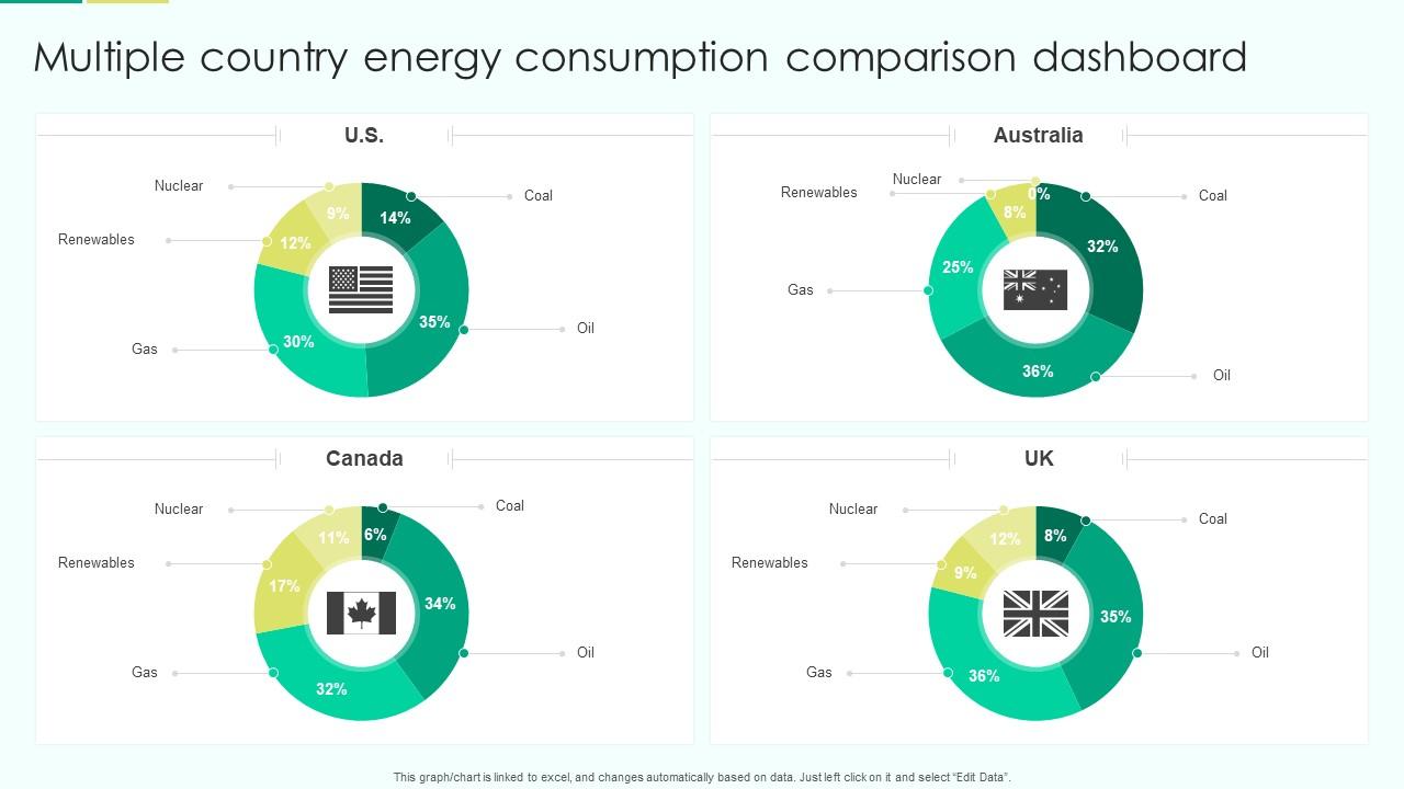
Template 3 Multiple Country Energy Consumption Comparison Dashboard
Use this PowerPoint Template as the ultimate resource to understand how the world’s major energy-consuming countries source their power needs. The slide offers a comparative analysis of four countries in terms of their use of coal, oil, gas, nuclear, and renewable sources of energy. After much research, color-coded pie charts were chosen as these are the best tools to compare each of the countries that essentially make up over 20% of the world’s area. This slide helps you compare countries and understand each other’s progress toward greener fuels. After this comparison, raising issues affecting the world’s energy supplies is easier. Get this template that can change the world now!
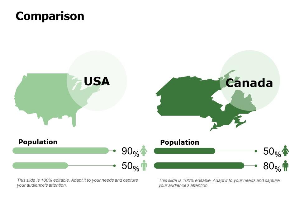
Template 4 Comparison Country Map PPT Presentation Designs Download
This presentation template on comparison of country maps is a resource that helps you compare their populations (as in this case), mineral wealth, forest resources, etc. Ultimately, the idea is to boost your business with real-time, quality comparison information available at your fingertips to make your million-dollar business call. This PPT Template compares the US and Canada in terms of their populations, gender, and any diversity you may wish for. The icons on the male and female sides add to the easy understanding once derived from the template, with the attractive signal (again color-coded) ensuring stakeholders get the point being made. Use this download to ensure your audience is clear on the numbers involved before a major business call, like a new market entry, and coming up with a strategy for it.
BUSINESSES BEYOND BORDERS
Even the most global of businesses are not present in every single country, and expansion fuels commerce, logistics, and transport. Hence, country comparison templates remind businesses that there is always a choice for where they want to set up shop and gain additional value and margins. Managers must conduct a country comparison to ensure their choice is rational and profitable. For this, SlideTeam is a truly global, world-class resource. Don’t even think of expanding beyond borders without using our PPT Templates!
PS Businesses need to give time to their plans to bear results. Hence, a year-over-year comparison template is always needed to provide results. Find these best-in-class templates here.



 Customer Reviews


