

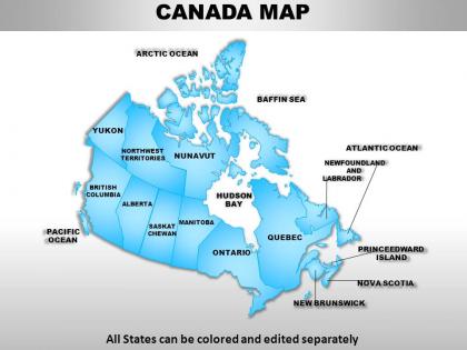
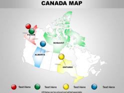
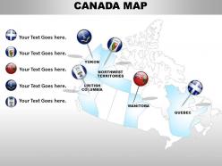
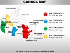
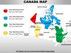
Canada country powerpoint maps




Try Before you Buy Download Free Sample Product
 Impress Your
 Audience
 100%
100% Editable
 Save Hours
 of Time


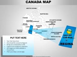
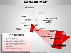
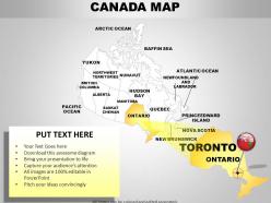
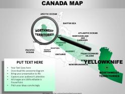
Do you know why you need to use Canada Country Powerpoint Maps created by pros for your presentations? Because they understand the effects of colours and they use them to suit the purpose.
People who downloaded this PowerPoint presentation also viewed the following :
Canada country powerpoint maps with all 62 slides:
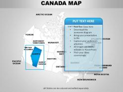
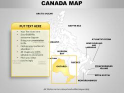
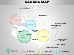
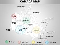
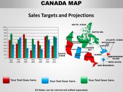
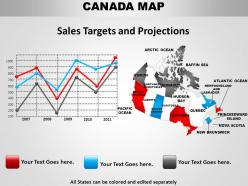
Delve into your past performance. Analyse it with our Canada Country Powerpoint Maps.
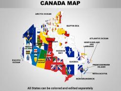
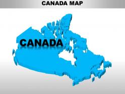
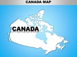
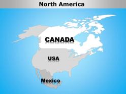
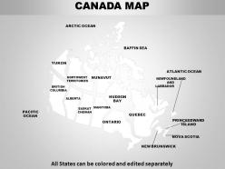
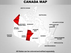
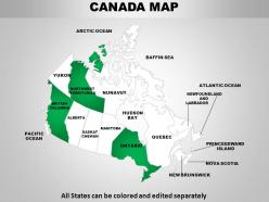
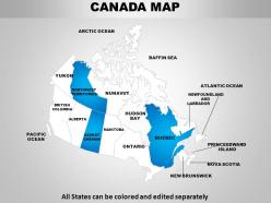
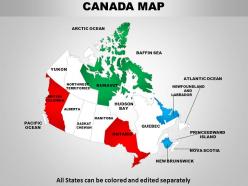
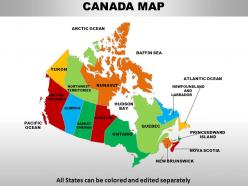
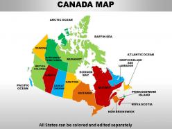
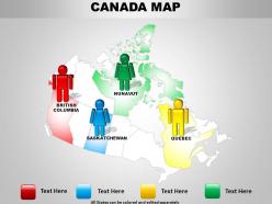
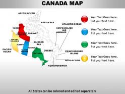
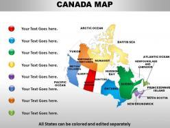
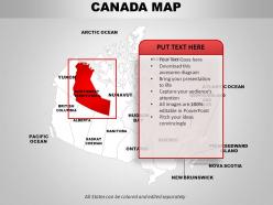
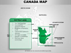
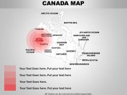
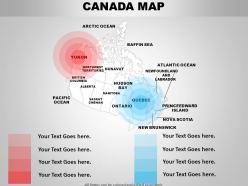
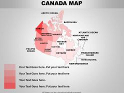
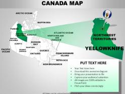
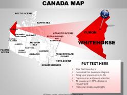
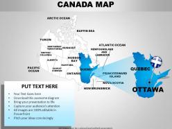
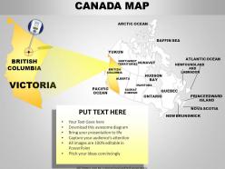
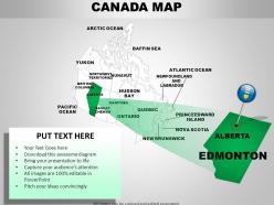
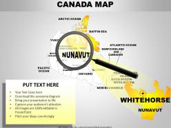
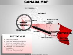
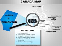
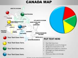
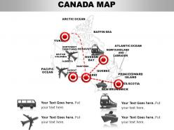
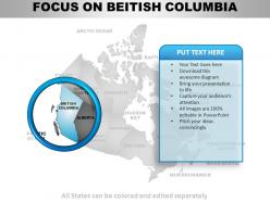
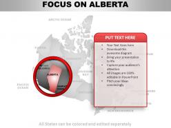
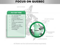
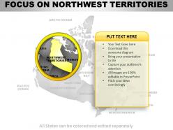
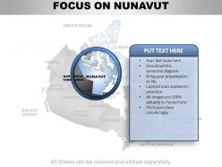
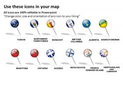
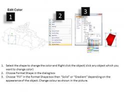
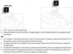
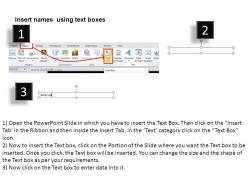
FAQs for Canada
So there's like physical maps that show mountains and terrain - perfect if you're hiking. Political ones have all the provinces and cities marked out for travel planning. Topographic maps are crazy detailed with elevation stuff, though they can be pretty intense to read. Road maps are obvious for driving trips. Oh, and thematic maps show specific data like weather patterns or population density - kind of niche but useful sometimes. Honestly though, doesn't everyone just pull up Google Maps now? But yeah, if you need something more specialized, just think about what you're actually using it for first.
Honestly, thematic maps are game-changers for this stuff. You'll see income gaps and unemployment hotspots way clearer than staring at endless spreadsheet rows. Regional patterns jump out immediately - like how northern resource towns deal with totally different problems than Toronto or Vancouver. What's cool is layering multiple datasets on one map. Suddenly correlations you'd never notice become obvious. Start with Stats Canada's census mapper (it's free, which is nice). Pick whatever indicators matter for your project and just start exploring. The visual clustering alone will probably surprise you with what patterns emerge.
Dude, definitely get topo maps for Canadian backcountry. Your phone's gonna be dead weight once you're out there anyway - cell service is basically non-existent. The contour lines show you what you're actually getting into before you're halfway up some brutal climb. They mark water sources, campsites, and portage routes that your GPS will never know about. Plus you can spot potential sketchy areas ahead of time. Natural Resources Canada makes solid 1:50,000 scale ones - detailed but not crazy overwhelming. Honestly saved my ass more times than I can count when weather rolled in unexpectedly.
Tech has totally changed how we map Canada. GPS and satellites made everything super accurate - no more waiting years for hand-drawn surveys. Now you've got real-time maps right on your phone, which is honestly pretty wild when you think about it. GIS lets people stack different data layers like terrain and demographics. You can customize maps for hiking, city planning, whatever you need. The best part? No more hunting down expensive atlases at the library. Natural Resources Canada has these free online tools that are actually way better than I expected - definitely worth checking out if you're into maps at all.
Focus on clear provincial boundaries with readable labels first - that's gonna make or break it. Add major cities, capitals, and big geographical stuff like the Great Lakes and mountain ranges. But honestly, don't overdo the tiny details or it'll look messy. Since Canada's huge, pick your map projection carefully or everything looks weird and stretched out. A good legend, scale, and compass rose are must-haves. Oh, and depending what you're teaching, throwing in time zones or natural resources gives students way more context to work with.
Dude, indigenous maps are wild - they focus on relationships between places instead of just measuring distances. Like how rivers connect communities or where old hunting grounds cross modern borders. Way more dynamic than our boring static maps. Their oral traditions preserve geographical knowledge going back centuries too, stuff about environmental changes and land patterns. Honestly blows my mind how detailed it gets - seasonal patterns, migration routes, resource spots that Western cartography totally misses. If you're doing any Canadian geography work, definitely throw in some indigenous place names and traditional knowledge. Adds so much depth beyond what satellites can show you.
Check out the Samuel de Champlain maps from the early 1600s first - they're incredible for seeing how Europeans figured out the St. Lawrence and Great Lakes. Hudson's Bay Company maps are gold too, showing all those fur trade routes. The early Pacific coast stuff is hilariously wrong though, like they were just guessing half the time. Library and Archives Canada has tons of these digitized online. Oh, and don't miss the Geological Survey maps from the 1800s - they track westward expansion and resource discovery. You can literally watch Canada transform from wilderness to actual country through these things.
Dude, interactive Canada maps are a game changer for presentations. Instead of everyone glazing over at static slides, people can actually click around provinces and zoom into different regions. Way better than those soul-crushing PowerPoints we've all endured, honestly. Your audience stays awake because they're doing stuff, not just sitting there. You can pivot based on whatever questions pop up too. Oh, and real-time data updates are pretty slick. Just try adding one interactive thing to your next presentation - you'll be surprised how much more people pay attention.
Honestly, just start with QGIS - it's free and handles Canada's weird shape really well with all the projection stuff. The community around it is solid too. ArcGIS is probably better if you've got money to throw around, but QGIS does everything you need. Statistics Canada and Natural Resources Canada have tons of free data you can download. Oh, and if you're doing more design-heavy work, Mapbox or even Illustrator can work fine. I've been using QGIS with the government data for years now. Trust me, that combo will get you way further than you'd expect before you need anything fancier.
Dude, climate change is seriously messing with Canada's maps right now. Cartographers can't keep up because everything's shifting so fast. Glaciers are retreating, coastlines are changing from ice melt, and lake boundaries keep moving around. The Arctic's going crazy - islands that used to be frozen year-round now show up seasonally, plus there's new shipping routes opening through what used to be solid ice. Honestly makes you wonder what maps will look like in ten years. Forest fires and permafrost lines are also all over the place now. Just make sure you're using recent maps if you're planning anything long-term up there.
City maps are all about transit lines, street grids, and where to find hospitals and schools - tons of detail crammed into small spaces. Rural ones? Completely different story. They show mountains, forests, mining spots, and those endless highways that make you wonder why you didn't just fly instead. You'll also see indigenous territories and resource areas that city maps skip entirely. Really depends what your project needs - are you tracking population stuff or more geographic/natural resource info? Both have their place but they're designed for totally different purposes.
Oh totally! Canadian maps are wild for showing cultural stuff. You'll see bilingual place names everywhere in Quebec, plus Indigenous territory boundaries marked out. Most maps come in both French and English versions, which is kinda cool. There's also specialized ones for First Nations, Métis, and Inuit communities. The demographic overlays get really detailed - like ethnic breakdowns in Toronto neighborhoods and stuff. Territorial maps especially highlight Indigenous land claims. Honestly, Statistics Canada's mapping tools are amazing if you need this for something - you can toggle different cultural layers on and off.
Canada's just too damn wide - we're talking 5,500 km coast to coast. Any single map either squishes the Maritimes into nothing or makes the Arctic look totally warped. It's that whole "flattening a globe" thing that never quite works. I tried finding one good overview map forever and honestly gave up. Most decent atlases just use separate regional maps instead of cramming everything together. Really depends what you need it for though - are you planning a road trip or just want something for your wall?
So basically, those boundaries determine which government controls what in your area. Municipal lines decide your local voting and where property taxes go. Provincial boundaries affect your healthcare and school funding. Federal ones handle EI and national stuff. Here's the thing though - it gets messy when you're doing community planning because crossing boundary lines means totally different rules, funding, and approval processes. I learned this the hard way on a project last year! You'll save yourself major headaches by checking jurisdictional maps first before starting anything.
Dude, maps are seriously clutch for tourism stuff in Canada. Think about it - you can mark all the cool attractions, show off scenic drives, maybe highlight how close you are to other amenities people want. Canada's huge, so helping visitors actually find you is half the battle. Tourism boards are always creating these themed trail maps and regional guides. Honestly, interactive ones work best these days. If you've got a business, definitely try partnering with local tourism sites or mapping services. It'll boost your visibility big time, especially when tourists are just wandering around looking for something to do.
-
Easy to edit slides with easy to understand instructions.
-
Illustrative design with editable content. Exceptional value for money. Highly pleased with the product.