


Gantt Chart For Application Migration Project




Try Before you Buy Download Free Sample Product
 Impress Your
 Audience
 100%
100% Editable
 Save Hours
 of Time


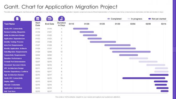
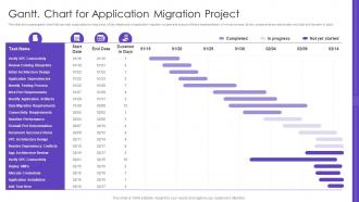
This slide showcases gantt. chart that can help organization to keep track of key milestones of application migration project and ensure efficient implementation of whole process. Its key components are starts date, end date and duration in days.
People who downloaded this PowerPoint presentation also viewed the following :
Gantt Chart For Application Migration Project with all 6 slides:
Use our Gantt Chart For Application Migration Project to effectively help you save your valuable time. They are readymade to fit into any presentation structure.





FAQs for Gantt Chart For
So a Gantt chart is basically this visual timeline thing that maps out all your project tasks with horizontal bars showing how long each one takes. Pretty handy for seeing which tasks depend on others and where you might hit roadblocks. I use them all the time to plan schedules and keep stakeholders in the loop - honestly saved my butt more times than I can count when deadlines got crazy. The bars show duration and overlap, so you can track progress easily. If you're dealing with complex projects or tight timelines, definitely give one a shot. Asana makes them super easy to set up.
Honestly, Gantt charts are lifesavers for keeping everyone on the same page. You can see exactly who's doing what and when - like if Sarah's running behind, you'll know immediately how it affects your deadline. No more awkward "hey, where are we on this?" messages every five minutes. It's basically a really detailed shared calendar that actually makes sense for bigger projects. The best part? When someone updates their progress, everyone sees it right away. I'd definitely show one during your next project kickoff - people get their role in the whole thing way faster when they can see it mapped out visually.
Okay so the basics you can't skip: task names, start/end dates, how long stuff takes, and which tasks depend on others. Milestones are clutch too. I'd definitely assign people to tasks so everyone knows their role. Progress tracking helps but don't go overboard - I've watched teams create these massive charts that just sit there collecting digital dust. Make your timeline actually doable. The whole point is spotting where things might get stuck because one task is waiting on another. Should be simple enough that someone can glance at it and immediately know what's happening this week.
Most PM tools like Asana or Monday already have Gantt charts built right in. They'll sync with your calendars and dashboards automatically. Connect them to time tracking or your CRM and everything updates when deadlines inevitably shift (because they always do). APIs work great for custom setups, or just use Zapier if you don't want to get technical about it. Export to Excel works too for reports. Honestly, check what your current tools can do first - you might already have more integration options than you realize without buying anything new.
Dude, you should totally try Gantt charts instead of those basic timeline things. They show you everything at once - like which tasks depend on others, who's doing what, and how far along stuff is. Regular timelines are just dates sitting there being useless when deadlines start moving around (which they always do, let's be real). The cool part is seeing how one delayed task screws up everything else down the line. You can spot problems way earlier and actually do something about them. Seriously, switch to Gantt view next time and you'll get why PMs are obsessed with them.
So basically you just draw lines between your task bars to show what needs to happen first. Most Gantt tools let you drag these connector lines around or set them up in the task settings. The main one you'll use is finish-to-start - pretty self-explanatory, right? Task A wraps up, then Task B can kick off. There's also start-to-start and a couple others, but honestly those are less common. The cool part is when you move dates around, everything shifts automatically. Just don't accidentally create a loop where tasks depend on each other - learned that one the hard way!
Yeah, Gantt charts are actually perfect for this! I use them all the time to see who's doing what and when. Super easy to spot when someone's drowning in work or totally free. The visual layout makes it obvious - like you'll immediately notice Sarah's booked solid while Mike has nothing next week. Color-coding by person helps too, though honestly I sometimes forget to set that up. You can shuffle tasks around before things get crazy and plan realistic timelines for new stuff. Way better than trying to keep track in your head or some random spreadsheet.
Don't overcomplicate the thing - I see people trying to map out every tiny detail and it just becomes a mess. Time estimates are always wrong (mine definitely are lol), so pad them. Dependencies matter way more than most people think. Here's the real kicker though: you actually have to update it when stuff changes. I've made gorgeous charts that turned into total lies because I never touched them again. Build in buffer time, keep milestones realistic, and make sure your team can actually read what you're showing them. Otherwise you're just making pretty decorations.
Here's how I'd tackle Gantt charts in agile - shorten everything to 2-4 week sprints instead of those crazy long timelines. Make them super flexible too. Color code different story types and maybe add swimlanes for team members. The trick is updating them constantly during standups and after retrospectives. Dependencies don't need to be perfect from day one, honestly that's impossible anyway. I used to stress about keeping them rigid but now I treat them more like rough guides that change all the time. Works way better when you're not fighting the tool.
Color code everything - seriously, it's a game changer. Different colors for teams, project phases, whatever makes sense. Keep task names short but clear because squinting sucks. Progress bars are clutch so people can see what's actually done. Don't jam everything together either, white space prevents headaches. Oh, and throw in some milestone markers with little icons or shapes. I learned this the hard way after making charts that looked like rainbow spaghetti. Start simple with these basics and you'll actually have something useful instead of a mess nobody wants to look at.
Honestly, Gantt charts are lifesavers for this stuff. You get this visual timeline showing exactly when tasks should happen and how they're all connected. The bars track planned vs actual progress, which is clutch when your boss keeps asking if you're hitting deadlines (and trust me, they will). Bottlenecks become obvious way earlier. You'll see which delays actually matter for your final date and spot tasks that can run at the same time to speed things up. Plus you can update it as work happens so everyone knows what's realistic. Way better than those endless status emails nobody reads anyway.
Oh, tons of places use them! Software teams are obsessed with Gantt charts for sprint planning. Manufacturing uses them for production schedules too. Marketing agencies basically live by them when juggling campaign deadlines - honestly makes sense since they're always coordinating like five things at once. Event planners swear by them, and I've seen them in healthcare project management, film production, even consulting firms tracking client stuff. If you're dealing with tasks that depend on each other, just try making a basic one for your next project. You might actually find it helpful.
Hey! So for Gantt charts - Microsoft Project is crazy powerful but honestly way too much unless you're managing like massive construction projects or something. Asana's my go-to because teams can actually update stuff without getting frustrated. Monday.com works great too, just feels a bit flashier. Smartsheet's basically Excel that doesn't suck for project planning. If you're broke, GanttProject is free and decent enough. I'd probably start with Asana though - your team won't hate you for it.
First thing - set your actual project dates and break tasks down to whatever detail makes sense for your team. Custom columns are super helpful for tracking priority, who's doing what, or budget stuff. Colors make everything way clearer, trust me. Use different ones for departments or task status - whatever works. You can customize those milestone dots and the lines showing task dependencies too. Oh and most tools let you show different views to different people, which is clutch. Stakeholders don't need to see every tiny detail that your team does.
Ugh, scope changes are the worst for Gantt charts. They basically create this whole domino effect where everything gets knocked out of whack. New requirements? You're probably looking at longer timelines or having to pull people off other stuff. Scope cuts are way easier to deal with (though honestly, when does that ever happen lol). But yeah, even then you've gotta update everything. The trick is jumping on those dependencies and critical path updates right away when changes hit. That way you can actually see how screwed your timeline is and give stakeholders realistic dates instead of just hoping for the best.
-
Such amazing slides with easy editable options. A perfect time-saver.
-
Topic best represented with attractive design.