


Internet of things diagram





Try Before you Buy Download Free Sample Product
 Impress Your
 Audience
 100%
100% Editable
 Save Hours
 of Time


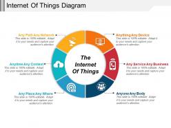
Enable a comprehensive outlook on IoT with the help of this Internet Of Things Diagram template. Employ this IoT gateway PowerPoint presentation to showcase various interlinked technologies such as machine learning, commodity sensors and embedded systems amongst others. Take advantage of this IoT hub background image and depict the practicality of smart manufacturing and energy resource management in your industry. This connected technology infographic is appropriate for students, the corporate sector and the government sector. Take the assistance of this technological web visual and present the commercial applications of IoT components in your respective business field. Employ this automation PPT and find out innovative methods to transfer vital information to the cloud network. Utilize this web of things theme and show interoperability and present various devices that are responsible for the exchange or dissemination of information. Thus, download this appealing interconnected framework graphic and implement the most advanced technologies to have an edge over your competitors.
People who downloaded this PowerPoint presentation also viewed the following :
Internet of things diagram with all 5 slides:
Be allowed entry anywhere on earth with our Internet Of Things Diagram. Your footprints will become global.
FAQs for Internet
So basically you've got sensors collecting data, then connectivity stuff like WiFi or cellular to move it around. Edge and cloud processing handle the heavy lifting, while apps are where people actually see everything. Picture it as data flowing from sensors → networks → processing → your dashboard. Security and device management sit on top of everything (because honestly, a hacked smart fridge would be embarrassing). The trick is figuring out what you actually need first. Half the stuff in those fancy architecture diagrams is just fluff anyway. Map your use case, then build around that.
Honestly, the main thing is making those data flows super obvious with clear arrows. Put your IoT stuff - sensors, smart thermostats, whatever - on one side, then show how data moves to your cloud services with labeled arrows. I'm probably weird but I love using different colored arrows for different data types. It actually makes a huge difference though! Don't forget gateways or edge computing layers if you have them. Label everything - temp readings, commands, updates. Oh and if you're presenting to non-tech people, they'll appreciate seeing the whole picture laid out simply.
Think of communication protocols as the languages your IoT devices use to chat with each other. WiFi, Bluetooth, MQTT, LoRaWAN - they're all different tools for different jobs. WiFi's great for heavy data stuff, while LoRa works better when you need long range but don't care about speed. Honestly, picking the wrong protocol is such a headache later. You'll be debugging connection issues for weeks. Map out what you're using where because it totally changes your power usage and transfer speeds. Getting this right upfront saves you so much trouble down the road.
For IoT diagrams, I usually do circles for sensors and squares for actuators - keeps it simple. Gateways work great as bigger rectangles or hexagons since they're more important. Color coding is honestly a game changer - blue for sensors, red for actuators, green for communication stuff. Icon libraries are clutch too if you can find good ones. Oh, and whatever system you pick, just stick with it throughout the whole thing. Nothing's more confusing than when someone switches styles halfway through. Make a legend so people don't have to guess what anything means.
So basically you've got three main data flows to show. Sensors push data up to the cloud through gateways or edge devices. Then the cloud sends back commands, alerts, or insights down to your devices. Device-to-device communication is getting really popular too - especially when you need things to happen fast without waiting for the cloud. I'd honestly focus on making those arrows super clear with good labels. People need to see exactly how data moves around and where things might get stuck. Bidirectional flows are key here.
Make security a first-class citizen in your IoT diagram, not something you slap on later. Drop firewalls between network segments and show authentication servers. Mark where encryption happens - I'm terrible at remembering the certificate management stuff but it's super important. Intrusion detection goes at key monitoring spots. Don't forget endpoint security on the actual devices themselves. Honestly, half the battle is just making security visible so everyone knows it's built in from the start. Map your data flows first, then figure out what security controls each connection needs.
So edge computing totally flips how you draw IoT diagrams. You can't just have everything pointing straight to the cloud anymore - now you need these local processing boxes sitting between your devices and cloud stuff. Your diagrams get way more complicated, honestly they look like a hot mess when you first start. But you're showing all this smart processing happening locally - data gets filtered, analyzed, decisions made right there at the edge. The trick is labeling everything clearly so people actually understand what's happening where. Otherwise stakeholders just stare at your diagram confused.
So for UI elements in IoT diagrams, I just use rectangles or rounded boxes - usually stick them at the top or edges. Label them something obvious like "Mobile App" or "Web Dashboard." Honestly, color-coding helps a ton since it makes the UI stuff stand out from all your devices and backend services. Then draw arrows showing how data flows between the UI and your cloud platforms or whatever. Oh, and mark if it's two-way communication! The whole point is making it dead simple for people to see how users actually interact with the system. Keep it clean.
Don't cram everything into one messy diagram - I've literally seen ones that look like someone threw spaghetti at a wall. Break stuff into layers instead. Physical devices go here, protocols there, cloud services somewhere else. Use arrows that actually show which way data flows, and honestly? Skip the tech jargon in your labels. Your boss won't know what half that stuff means anyway. Oh, and build in your security elements right from the start - firewalls, encryption points, all that. Nobody wants to retrofit security later. Start simple, then add complexity as you go.
Honestly, IoT diagrams are lifesavers for explaining technical stuff to non-tech people. Show them the visual - how devices talk to each other, where data goes, what breaks when (and stuff *will* break). Way better than rambling about APIs and protocols that'll just glaze their eyes over. They'll finally get why certain changes cost a fortune or take forever. Oh, and definitely start broad first. Give them the big picture, then you can dive deeper based on whatever they're curious about. Trust me on this one.
So for IoT diagrams, I'd probably go with Lucidchart or Draw.io first. Both handle those messy device connections really well. Draw.io is free which is nice, plus it's pretty straightforward to use. Visio's okay if you're already paying for Microsoft stuff, but honestly it feels kind of outdated now. You might also check out Creately or Gliffy - they're more specialized for network stuff. The main thing is you need something that can clearly show how data flows between all your devices and cloud services. I'd mess around with Draw.io first since there's no commitment.
For IoT diagrams, I'd go with directional arrows plus timestamps to show your real-time data streams. Different arrow styles work great - solid ones for real-time stuff, dashed for batch processing. Throw in some color-coded flows between your sensors and gateways too. Animated connectors are pretty slick if you can pull them off. Add little clock icons or "live" badges near the processing points so it's obvious where data gets transformed vs just collected. Oh, and don't forget processing time notes - especially when you've got multiple sensors dumping into your analytics layer at once. Makes everything way clearer.
Dude, that IoT diagram is gonna save your butt when everything breaks. You can trace exactly where data's getting stuck or where stuff's failing. Plus you'll spot those nasty single points of failure before they screw you over. When one sensor goes rogue, the diagram shows you which systems downstream are about to have a bad day. Honestly, it's like having GPS when you're completely lost in a maze of connected devices. Just don't let it get outdated - I learned that the hard way. Old diagrams are basically useless.
Okay so basically you want to stack your IoT system in horizontal layers - device layer, connectivity, data processing, application layer. Makes everything way less confusing since you're not staring at this massive web of connections. I swear it's so much better for presentations too. Stakeholders actually get it when you show data moving up through each layer. Plus you'll spot bottlenecks and security issues easier. Oh and group stuff by what it does, not just how it connects - seriously makes your diagrams readable instead of looking like spaghetti.
Honestly, just make your labels super obvious - like, write what stuff actually does instead of random tech abbreviations. Nobody wants to decode "SRV-DB-01" when you could just say "customer database server." Color-code everything the same way throughout (devices, data streams, whatever) and definitely mark your security boundaries since IoT stuff gets messy fast. Oh, and throw in a legend! I know it seems basic but trust me, you'll be cursing yourself in six months trying to remember what that purple line meant. Keep it simple enough that anyone jumping on your team can figure it out.
-
Commendable slides with attractive designs. Extremely pleased with the fact that they are easy to modify. Great work!
-
Colors used are bright and distinctive.