


Key timelines and deadline powerpoint presentation





Try Before you Buy Download Free Sample Product
 Impress Your
 Audience
 100%
100% Editable
 Save Hours
 of Time


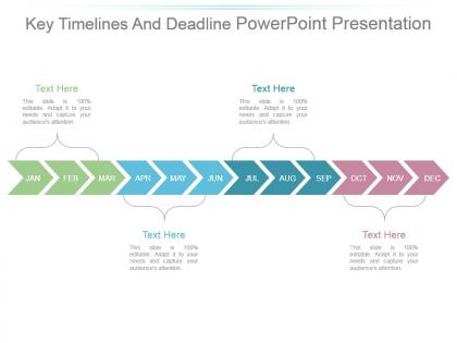
We present the Key timelines and deadlines PowerPoint presentation using which you can give a presentation regarding deadline of a particular task in your organisation. This is a twelve stage process. The stages in this process are jan, feb, mar, apr, may, jun, jul, aug, sep, oct, nov, dec. This Presentation may help you in many aspects. It may lead to your subordinates being more punctual in the submission of their work as they'll be provided with the deadlines in advance and that too very clearly. This aero shaped diagrammatic PPT has been designed in such a way that everything is clearly understood. Managers like you need this ready-made presentation as it will help you save your time and cost. You will no more have to spend hours on making a presentation as the slideshow can be downloaded in a just a single click. This business template will for sure help you achieve your organisational objective. Arrest the decline with our Key Timelines And Deadline Powerpoint Presentation. Get the graph ascending again.
People who downloaded this PowerPoint presentation also viewed the following :
Key timelines and deadline powerpoint presentation with all 7 slides:
Our Key Timelines And Deadline Powerpoint Presentation contain images that are inspirational. It is a cause for joy.
FAQs for Key timelines and
Honestly, start with your dates and major milestones - that's the backbone of everything. Dependencies are crucial too because nothing happens in a vacuum. Build in buffer time because stuff ALWAYS takes longer than you think it will. Who's doing what needs to be crystal clear or you'll have that awkward "I thought you were handling this" moment in meetings. I'm obsessed with color-coding different phases - makes it so much easier to scan quickly. Oh, and throw in a notes section for all the random context that doesn't fit anywhere else but you'll definitely need later. Just don't make it so detailed that people's eyes glaze over.
Timelines work great for presentations because your audience can literally see the journey unfold. I like revealing events step by step - builds suspense naturally. Shows cause-and-effect too, which makes everything more compelling. Don't go overboard with fancy animations though (I've seen some cringeworthy ones). Simple reveals hit better anyway. Each timeline point should be a story beat where something meaningful happens. People will follow along easily since they can see where you're headed. Oh, and add quick descriptions or visuals at major milestones. Makes it way stickier. Your audience won't zone out halfway through.
Canva's probably your best bet to start - their timeline templates are actually pretty decent and you won't spend forever figuring it out. Adobe Express works too if you want something sleek. Timeline JS is where things get fun though, especially if you need it for a website. I got weirdly obsessed with it last time I used it lol. PowerPoint works fine if you're already used to it, or Lucidchart for anything more complex. Tiki-Toki's solid for interactive stuff too. Honestly? Just mess around in Canva first to see what vibe you're going for, then upgrade to something fancier if you need to.
Honestly, it depends on your industry. Tech companies are obsessed with product roadmaps and sprint planning. Healthcare does treatment schedules and patient tracking - makes sense since lives are literally on the line. Marketing goes crazy for campaign launches and rollout dates. Construction? They're all about project phases and hitting milestones. Finance loves their budget cycles and investment timelines. The trick is figuring out what your people actually care about - is it hitting deadlines, managing dependencies, or just making sure everyone knows what's coming next? Match your timeline to that and you're golden.
Honestly, the worst thing you can do is cram everything in there - nobody wants to squint at a cluttered mess. Focus on the big milestones and give them space to breathe. Dependencies will absolutely kill you too (learned this the hard way). Think through what has to finish before other stuff can even start. Oh, and please don't be that person who thinks everything will go perfectly on schedule. I always pad my estimates by like 20% minimum because something always goes sideways. Your team's probably juggling other projects anyway, so be realistic about what they can actually handle.
Your project timeline is basically a roadmap that shows what happens when. It helps you catch problems before they blow up and keeps everyone on the same page with deadlines. You'll be able to see how tasks connect, figure out your resources better, and track if you're staying on schedule. Stakeholders love them too - way easier than explaining every little detail. The visual part makes everything clearer for your team. Oh, and definitely build in extra time because I swear everything takes twice as long as you think it will!
Honestly, less is more with these things - stick to 7-8 key events max or people's eyes will glaze over. Make your text big enough so the kid in the back can actually read it (trust me on this one lol). If you're doing something complex, color-coding different themes helps a ton. Dates need to be specific, and keep descriptions short and punchy. Nobody wants to read paragraphs on a timeline. Interactive stuff is cool if you can pull it off. Oh, and sketch it out first before you get all fancy with software - saves so much time figuring out the flow.
Honestly, you'd be shocked how many people mess this up. Pick maybe 2-3 colors max and stick with them - I've seen way too many timelines that look like someone threw up a box of crayons. Make sure there's good contrast so people can actually read the text. Oh, and boring fonts are your best friend here, trust me. White space helps too; nobody wants to squint at cramped text. Color coding works great for different phases or whatever, but test it in black and white first. That way you'll know if it still makes sense when someone inevitably prints it out.
When you're doing historical stuff, go with detailed chronological layouts - precise dates, clear cause-and-effect chains. Linear works best. Forecasts are totally different though. You need flexible, scenario-based formats that don't pretend everything's set in stone. Honestly, I've watched so many people mess this up by making predictions look like concrete facts. Bad move. Use date ranges instead of fixed points, show multiple possible paths, and add decision points where things might change direction. History proves what already happened. Forecasts just help you think through what might come next.
Honestly, interactive timelines are a game-changer because people actually DO stuff instead of just staring blankly at your presentation. Click through at your own speed, zoom into whatever catches your eye, branch off when something gets interesting. Way better than those boring static slides we've all sat through a thousand times. People retain more when they're in control of the experience. Short bursts work great - let them click on hotspots or vote on which direction to go next. My friend tried this last month and said engagement went through the roof. Makes sense though, right? Active beats passive every single time.
Honestly, timelines are a game-changer for breaking down complicated stuff into steps people can actually follow. Way better than dumping a massive paragraph on someone! You can see the flow from start to finish, and it's super clear what comes next. I use them for everything - project plans, customer journeys, onboarding new people. They're great for spotting where things might get stuck too. Oh, and adding time estimates makes them way more useful for your team. Trust me, once you start using them you'll wonder why you didn't before.
Honestly, timelines are clutch when you're showing stuff that happens in order - like project phases or company history. Charts work better for comparing numbers, and infographics are great for breaking down complicated processes. Here's the thing though: most people sleep on timelines in presentations. They're way more intuitive than cramming a bunch of data into charts that just confuse everyone. Plus timelines naturally walk your audience through things step by step instead of dumping everything at once. I always go with timelines when there's a clear beginning-to-end story. Way cleaner.
Oh man, there's so much cool stuff you can do! Circular ones work great for cycles, and those branching tree formats are perfect when you want to show how one thing leads to another. Interactive ones are clutch for digital stuff - people love clicking around. I'm kinda obsessed with subway map styles lately, they're weirdly satisfying? Spiral designs show progression really well too. You could even do physical timelines with actual props if you're feeling ambitious. Before/after comparisons hit different than regular formats. Just pick whatever feels right for your content - don't overthink it.
Honestly, timelines are like your safety net for big projects. Plot out your major deadlines and milestones so stuff doesn't slip through the cracks. They're a lifesaver when you're dealing with multiple teams - everyone can actually see how their piece fits together. I always forget to update mine regularly though, which defeats the purpose lol. But when you do share updated versions with your team, it keeps everyone on the same page about progress and delays. There's something pretty satisfying about crossing off those milestones too.
Honestly, timelines are clutch for personal development talks. They make your whole growth journey super easy to follow instead of just throwing random achievements at people. You can actually show those before/after moments that hit different, plus highlight when you learned key stuff. Your audience won't get lost trying to piece together your story either. I always map out the big skills and roles chronologically first - way less overwhelming that way. Then you can drop in specific examples and numbers to make each milestone actually mean something. It's just cleaner than other formats, you know?
-
Illustrative design with editable content. Exceptional value for money. Highly pleased with the product.
-
Innovative and Colorful designs.