


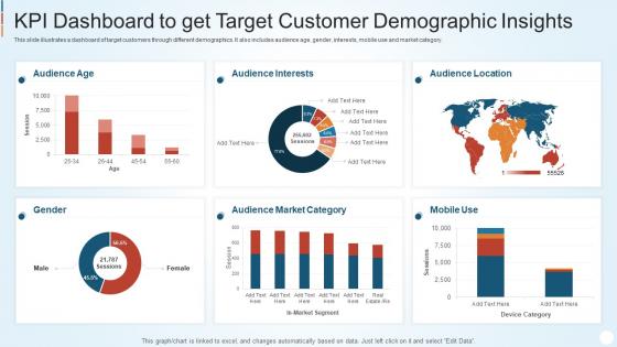
Kpi Dashboard To Get Target Customer Demographic Insights




Try Before you Buy Download Free Sample Product
 Impress Your
 Audience
 100%
100% Editable
 Save Hours
 of Time


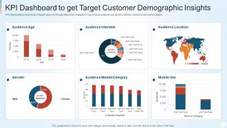
This slide illustrates a dashboard of target customers through different demographics. It also includes audience age, gender, interests, mobile use and market category.
People who downloaded this PowerPoint presentation also viewed the following :
Kpi Dashboard To Get Target Customer Demographic Insights with all 7 slides:
Use our Kpi Dashboard To Get Target Customer Demographic Insights to effectively help you save your valuable time. They are readymade to fit into any presentation structure.





FAQs for Kpi Dashboard To Get Target
Stick to the big ones that actually matter for your business - revenue, customer acquisition cost, conversion rates, customer lifetime value. Those are your bread and butter. Traffic, leads, and customer satisfaction are good supporting players too. But seriously, don't go overboard here. I've seen dashboards that look like airplane cockpits with 20+ metrics everywhere. Total nightmare. Cap it at 6-8 max so you can actually digest what's happening. Pick the ones your team will check every single day, not just metrics that sound fancy but don't drive real decisions.
Monthly reviews are your best bet, though quarterly works if you're swamped. Check if your KPIs still match what your company's actually trying to do this year - not ancient goals from 2022. Toss metrics that aren't helping anyone make decisions anymore. The people using your dashboard daily? Ask them what's helpful vs what's just clutter taking up screen space. I always forget to do this stuff unless I literally put it on my calendar, so set those reminders now. Oh, and add new metrics when priorities shift - happens more than you'd think.
For dashboards that actually work, I'd go with gauges showing progress toward your targets, plus line charts for tracking trends. Number cards are clutch for displaying key metrics at a glance. Heat maps are solid if you're comparing stuff across different departments or time periods. But here's the thing - don't overdo it. People's brains just shut off when there's too much going on. I learned this the hard way after building a dashboard that looked like a spaceship control panel. Keep it to maybe 5-7 metrics max. Start simple with number cards showing current vs target, then throw in some trend lines underneath.
Honestly, I'd go with weekly updates for most KPIs. Daily makes sense if you're tracking stuff like web traffic or sales - you can actually react fast enough to matter. But customer satisfaction? That moves slower, so weekly's fine. I've watched teams obsess over monthly dashboards and it's kinda pointless - you're just staring at old news by then. Match your update schedule to how quickly you can do something about it, you know? Start weekly and see how your team uses it. Some people check religiously, others forget it exists.
Honestly? Stop cramming everything onto one screen - it's just gonna overwhelm people. Stick to maybe 5-7 metrics that actually matter for your business. Simple bar charts beat fancy visualizations every time, trust me on this one. Skip the vanity metrics too - those impressive-looking numbers that don't help anyone make real decisions. I've worked with teams who track literally everything but somehow learn nothing from it! Each number needs context though. People should be able to glance at your dashboard and know what to do next.
It really comes down to who's looking at the data. Execs just want the big picture - trends and summary stuff. They don't care about daily website clicks bouncing around. Analysts though? They need the nitty gritty details they can actually do something with. Here's what works for me - I ask "what should someone actually DO after seeing this number?" That question alone tells you how much detail to include. Start with your main metrics first, then build in ways people can drill down when something looks weird and needs investigating. Keep it simple at first, then let users go deeper if they want to.
Oh dude, accessibility can totally make or break your dashboard! Think about it - what's the point if half your team can't even use it properly? Color contrast matters big time for people with vision issues, plus you need keyboard navigation and screen reader support. Don't just rely on colors to show important stuff either. Clear labels are your friend here. Honestly, I've seen way too many "gorgeous" dashboards that completely bomb when you actually test them with accessibility tools. Just run a quick WCAG check first - it'll save you headaches later.
Dude, real-time dashboards are seriously worth it. You'll catch sales dropping or campaigns tanking before they become disasters. Instead of waiting weeks for reports, you can actually fix stuff while it's happening. I learned this the hard way last year - wish I'd set mine up sooner. The trick is automated alerts for your most important numbers so you're not glued to your computer all day. Figure out what needs your attention NOW versus what can wait until Friday's review. Once you get the hang of it, you won't go back to monthly reporting.
Honestly, just pick whatever your team already knows how to use. Tableau and Power BI are crazy powerful but take forever to learn. Google Data Studio's free and works great if you're already using Google stuff. I've watched so many teams spend months arguing about which tool is "best" instead of actually building anything - such a waste of time. Excel or even Google Sheets work fine for basic dashboards. You can always upgrade later once you figure out what metrics actually matter. Start simple, then get fancy.
First thing - figure out your 3-5 biggest business goals, then connect your KPIs directly to those. The metrics people can actually DO something about? Those go at the top where everyone sees them first. I swear, half the dashboards I've seen look like someone just randomly scattered charts everywhere lol. Group similar stuff together and make the layout guide people's eyes naturally. Supporting data that's less urgent can live further down or on a separate tab. Here's my test: if you can't explain in one sentence why a KPI earned its spot, ditch it. Honestly saves so much headache later.
Honestly, word clouds are surprisingly useful for this - I know they seem gimmicky but they actually work. Convert your qualitative stuff into sentiment scores or those red/yellow/green indicators for employee feedback. Track themes over time too, like how often certain complaints pop up. The trick is making your qualitative metrics play nice with your numbers instead of fighting for space on the dashboard. Oh, and don't go overboard - start with maybe 2 qualitative KPIs max. You can always add more later once you figure out what actually matters to your team.
So basically KPI dashboards work because everyone can see exactly where they stand. Real-time numbers create this weird peer pressure thing - nobody wants their metrics glowing red while everyone else is green. You can set alerts for when people start slipping, which beats waiting months to address problems. Most people actually respond well to the transparency, though some hate it at first. Pick metrics that actually move the needle for your business, not just stuff that looks impressive. I'd start with maybe 3-5 key numbers per person and make sure they get how their daily work connects to those goals. Works way better than those ancient quarterly reviews.
Honestly, mobile access is a game-changer for dashboards. Your team can check numbers while they're out of office, in meetings, or wherever. Real-time decisions become way easier when data isn't stuck on desktop computers. Just make sure it's actually mobile-friendly - not some tiny, impossible-to-tap version of your desktop dashboard. That's the worst. People stay more engaged when they can quickly pull up metrics on their phone. Better engagement means faster, smarter decisions. Quick test: try using your current dashboard on mobile right now. I bet it feels pretty clunky compared to what you'd expect.
So basically, track if people are actually using the thing - like login rates and how much they're clicking around. If nobody's touching it after week two, you've got your answer right there. Check if decisions are happening faster now and whether your key metrics improved. I'd also ask around to see if people find it easy to use or if they're bugging IT every five minutes. The whole point is better decision-making, so see if that's actually happening. Survey everyone after a month - you'll get the real tea on what's working.
Honestly, department-specific dashboards are a game changer. Sales teams want their conversion rates and pipeline stuff right there, but HR couldn't care less about that - they're focused on turnover and engagement numbers. When people see metrics that actually matter to their daily work, they'll actually use the thing instead of ignoring it. Generic company-wide dashboards? Total waste because they're too broad. Everyone just stops looking at them after week one. I'd start by asking each department head what their top 3-5 metrics are that they check every day. Trust me, you'll get way better adoption this way.
-
The service is fast, and I could access any presentation after buying the subscription. I don’t think I’ll ever have to worry about a presentation in my life.
-
Much better than the original! Thanks for the quick turnaround.