

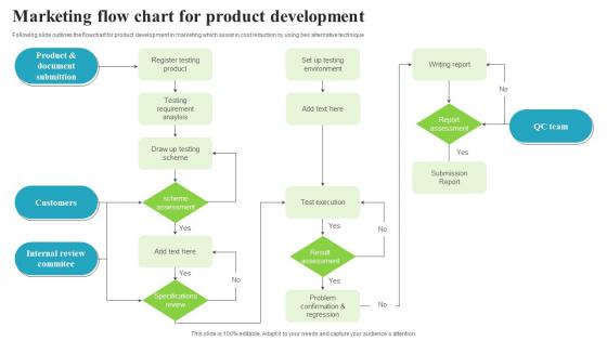
Marketing Flow Chart For Product Development




Try Before you Buy Download Free Sample Product
 Impress Your
 Audience
 100%
100% Editable
 Save Hours
 of Time


Following slide outlines the flowchart for product development in marketing which assist in cost reduction by using bes alternative technique.
People who downloaded this PowerPoint presentation also viewed the following :
Marketing Flow Chart For Product Development with all 6 slides:
Use our Marketing Flow Chart For Product Development to effectively help you save your valuable time. They are readymade to fit into any presentation structure.





FAQs for Marketing Flow Chart
So you need target audience ID first, plus clear goals. Map out touchpoints across different channels - honestly, don't overthink this step though. Build in decision points where paths branch based on what customers do. Measurable outcomes at each stage are crucial. Lead capture, nurturing sequences, feedback loops for optimization - that's your foundation. The real magic? Planning all those "what if" scenarios so different behaviors trigger different paths. Oh, and start with just one main flow. You can always add complexity later once you see what actually converts.
Honestly, flow charts are lifesavers for this stuff. No more awkward Slack threads where everyone's like "wait, who's doing the email blast?" Your team just glances at the chart and knows exactly what's next. Dependencies become obvious too - you can see where things usually get stuck. I've seen so many campaigns crash because two people worked on the same thing or nobody touched it at all. The visual aspect just clicks better than those endless email chains, you know? Map out whatever process you're dealing with right now and I bet you'll spot the problem areas immediately.
For your marketing flowchart, start with researching your market and nailing down who you're targeting. Then build some pre-launch hype while creating content and picking your channels. Launch day is honestly where everything gets crazy - but that's the fun part! After that, track how it's performing and gather customer feedback. Post-launch optimization comes next. Oh, and definitely build in decision points for when you need to pivot - because let's be real, launches almost never go as planned. I'd map out both your ideal scenario and backup plans. Customize this framework based on your specific product and timeline.
So basically you map out every step customers take - from first hearing about you to buying (and after). It's like getting a clear view of your whole funnel. You'll see exactly where people are dropping off or getting stuck. Way better than staring at boring spreadsheets honestly. The visual thing really helps you catch patterns you'd miss otherwise. I'd start with just your main customer type first - don't overcomplicate it. Then use what you find to figure out which parts of your process are actually broken and need fixing.
I'd go with Lucidchart first - it's literally made for this and has tons of marketing templates already. Miro's great too if your team's into that collaborative sticky note thing. Honestly though, you might not need anything fancy. Canva or even Google Drawings work fine for basic stuff. Oh, and Whimsical has this really clean interface that's nice for complex automation flows, though I haven't used it as much. Start with Lucidchart's free version and see how it feels - no point paying for features you won't use.
Your flowchart really depends on what kind of business you're running. B2B needs way more steps since those sales cycles drag on forever - like, multiple meetings and touchpoints before anyone buys anything. E-commerce? Focus hard on conversions and retargeting people who abandoned their carts. Service businesses should build in referral paths since word-of-mouth is huge for them. SaaS companies definitely need trial sequences and solid onboarding flows. Honestly, forget generic templates. Map out how YOUR customers actually behave from first hearing about you to buying, then build around that.
Dude, customer feedback is like your sanity check - it shows you what's actually happening vs what you think is happening. I'd drop feedback collection points right after lead gen, during nurturing, and post-conversion. Can't tell you how many "flawless" flow charts I've watched completely tank because teams weren't listening to their actual customers. It helps you catch bottlenecks and figure out where people bail. Oh, and don't just collect it - actually look at the data monthly. Otherwise you're flying blind and tweaking random stuff that might not even matter.
Honestly, flow charts are a game changer for marketing campaigns. They show you exactly where people are dropping off in your funnel - like, you'll actually see which email or landing page is killing your conversions. Makes it so much easier to fix problems instead of just throwing stuff at the wall and hoping it works. I used to hate making them but they really do help you spot patterns you'd miss otherwise. Map out what you're doing now, then add your actual numbers on top. You'll probably be surprised where the real issues are hiding.
Honestly, most people go way overboard and try cramming every single scenario into one chart. It gets messy real quick. Your decision points need to be super clear too - like actual yes/no diamonds that people can actually follow. I've seen so many pretty flowcharts that are completely useless when you actually try to use them lol. Each step should be one specific thing, not some vague instruction. Oh and definitely test it with someone fresh who wasn't involved in making it - they'll spot the confusing parts immediately. Keep it simple and make sure it reflects how your team actually works.
Honestly, flow charts are a game-changer for this stuff. Your marketing and sales teams can finally see the whole customer journey mapped out - where leads come from, how they get qualified, all that. No more of those super awkward "wait, isn't this your job?" conversations. You'll spot bottlenecks so much faster when it's all visual. The best part though? Team meetings actually become productive. Instead of everyone talking in circles, you're both staring at the same diagram figuring out what's broken. Way less frustrating than trying to explain processes over Slack for the hundredth time.
Focus on conversion rates at each funnel stage, cost per acquisition, and how long it takes people to actually convert. Email open rates and click-throughs matter too. Honestly, the "boring" metrics like bounce rates and form abandonment are where you'll find the real gold - they show exactly where you're losing people. Your MQL to SQL ratio is huge for figuring out if you're attracting the right crowd or just random traffic. I'd say pick maybe 4 key metrics that actually move the needle on revenue first. You can always add more later once you've got those dialed in.
Honestly, flow charts are game-changers for marketing stuff. You can actually see where things get stuck instead of drowning in Excel hell. Map out your current process first - then play around with "what if" scenarios. Like what happens when lead quality tanks or conversions go crazy? Way better than panicking when it actually happens. Stakeholders love them too since they can follow the logic without you explaining every tiny detail. I always get stuck on the decision points part, but once you nail those down, everything clicks. Trust me, visual beats spreadsheet nightmare every time.
Dude, colors totally change the game for flowcharts. I always use green for "go ahead" steps and red when something's wrong or needs to stop. Different colors for each stage just makes sense, you know? Honestly, those boring black and white ones are the worst - nobody even looks at them. Keep your shapes consistent and pick fonts people can actually read. Oh, and make sure the flow goes in a logical direction or people get confused fast. It's like creating a roadmap instead of some stuffy corporate thing. Clean but not boring, that's the sweet spot.
Honestly, quarterly updates are probably your sweet spot, but it really depends on your industry. Tech and social media? Those move so fast you'll want to check monthly - trends die overnight in that world. More traditional stuff can probably get away with every 6 months. Here's what I actually do though: I review mine whenever I launch something new or see conversions tanking. Oh, and definitely when your audience shifts. Set a calendar reminder or you'll forget (I always do). Trust me, it's way too easy to ignore when you're swamped with everything else.
Yeah, flow charts work great for social media! I actually think they're super helpful for mapping out how people move from seeing your content to actually buying something. Like someone sees your Instagram story, then clicks to your profile, engages with a post, visits your website, signs up for emails - you get the idea. Multi-platform stuff can get messy real quick though. That's where the visual really saves you. You'll spot exactly where people are dropping off and can fix those weak spots. I'd start simple - just map out one platform first, then add the others once you've got the hang of it.
-
This visual representation is stunning and easy to understand. I like how organized it is and informative it is.
-
Thank you for offering such helpful pre-designed templates. They are really beneficial to me in my job.