


Organization Chart For Product Marketing Department


Try Before you Buy Download Free Sample Product
 Impress Your
 Audience
Editable
of Time


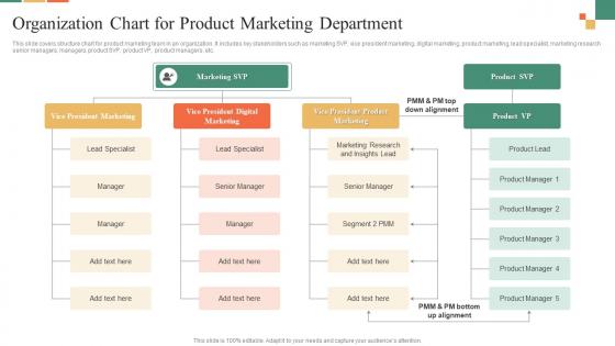
This slide covers structure chart for product marketing team in an organization. It includes key stakeholders such as marketing SVP, vice president marketing, digital marketing, product marketing, lead specialist, marketing research senior managers, managers, product SVP, product VP, product managers, etc.
People who downloaded this PowerPoint presentation also viewed the following :
Organization Chart For Product Marketing Department with all 6 slides:
Use our Organization Chart For Product Marketing Department to effectively help you save your valuable time. They are readymade to fit into any presentation structure.


FAQs for Organization Chart For
You'll want clear reporting lines and accurate job titles for everyone. Contact info helps too. Show department groupings so people actually get how teams connect - dotted lines work great for matrix reporting situations. Keep it visually clean, but honestly the biggest thing is staying on top of updates. I'd say quarterly at minimum because people move around constantly. Half the org charts I see are completely useless since they're missing people or totally outdated. Your best move? Find software that syncs with HR automatically. Way less headache than manually updating every time someone switches roles.
Honestly, org charts are lifesavers for avoiding that whole "wait, who's my boss's boss again?" situation. New people especially love having something to reference when they're trying to figure out who handles what. You can spot where communication gets stuck too - like if there's some middle manager who's clearly a bottleneck. Plus it saves you from awkwardly messaging the wrong person about time off or whatever. I'd say keep yours current though, because nothing's worse than an outdated chart that sends you to someone who left six months ago.
So there are basically three types you'll see: hierarchical (classic pyramid style), matrix (dual reporting - think someone answering to both their department boss AND a project manager), and flat where there's barely any management layers. Most places I've dealt with just go hierarchical because... well, it's what everyone knows. Matrix gets messy but works for cross-functional teams. Flat's great for startups or small companies where people collaborate more directly. Honestly though? Pick whatever actually matches how decisions happen at your company, not what looks pretty in PowerPoint.
Honestly, tech has made org charts so much simpler. Tools like Lucidchart or Visio are solid, but if your HR software already has chart features built in, I'd start there. The best part? No more manually moving boxes around every time someone quits or gets promoted - it updates automatically. You can even make them interactive now with search functions and clickable employee profiles. Everyone can access the latest version instantly. Those giant printed charts from like 10 years ago seem ridiculous now, right? Just pick whatever integrates with your current HR system and you'll save yourself a ton of headaches.
Okay so think of your org chart like a map for strategy stuff. It shows who makes decisions and where info actually flows (or gets stuck). You'll spot bottlenecks fast, plus figure out if someone's missing from leadership roles. Honestly, half the time I use mine just to remember who approves what project. The chart helps you see whether your structure matches your goals or if you need to shuffle people around. Map out who's accountable for each big objective - saves you headaches later when things go sideways.
Oh totally use an org chart for new hires! Walk through it day one so they can see who's who and how teams connect. Way easier than just rattling off a bunch of names they'll forget anyway. Shows them the reporting structure too, which honestly saves you from answering "wait, who's my boss's boss again?" later. New people can spot career paths and figure out where they actually fit in the bigger picture. Keep a digital copy around - they'll definitely reference it those first few weeks when everything feels like chaos.
Honestly? Update it whenever something big happens - new hires, people leaving, promotions, that kind of stuff. Monthly works if you're growing like crazy. Quarterly is probably fine otherwise. Don't worry about every temp or contractor though, that'll drive you nuts. Focus on the permanent people and who reports to who. The whole point is that someone new can look at it and figure out who to talk to without wandering around lost. I learned that the hard way at my last job - our chart was like six months outdated and nobody knew who was actually in charge of what.
Honestly, people overthink these things way too much. Don't try to cram every single person on there - it just becomes this messy web that confuses everyone. Keep the design simple and make sure the reporting lines actually match reality (I've seen some wild ones that made zero sense). Skip the dotted lines and unofficial relationships unless you really need them. Oh, and here's the thing nobody thinks about - you need someone whose actual job it is to update the chart when people quit or switch roles. Otherwise it'll be outdated in like two months and completely useless.
Dude, forget the basic "who reports to who" thing. Add where everyone sits - like "Remote" or "NYC Office" next to their names. Those old pyramid charts are kinda useless anyway when half your team works differently now. Maybe do two versions? One for official reporting stuff, another showing who actually collaborates daily. That second one's honestly more helpful. Make it online so remote people can figure out team connections without playing email tag. Oh, and throw in project teams that cross departments - that's where real work happens these days.
Keep it simple - clear lines showing who reports to whom, consistent box shapes, and don't cram everything together. Readable fonts only (Comic Sans is still a crime). I'd suggest color coding different departments, but maybe stick to 3-4 colors max? Otherwise it looks like a rainbow threw up. Make job titles short and format them the same way throughout. Flow should go top to bottom or left to right - whatever feels natural. Test it on someone who doesn't know your company structure. If they squint or look confused, you've overcomplicated it.
Yeah, so try adding dotted lines between departments that actually work together regularly. Most org charts just show the boring reporting structure with solid lines, but honestly that misses how things really work day-to-day. Different colored connections work great too - I've seen some companies get pretty creative with symbols and matrix layouts. Just throw in a simple legend so people know what your different line types mean. The whole point is showing who collaborates with who beyond the formal hierarchy stuff. Way more useful than those traditional charts that tell you nothing about actual teamwork.
Oh man, there's actually way more legal stuff to think about than you'd expect! Equal opportunity laws are huge - you can't accidentally show bias in titles or who reports to whom. Finance and healthcare are super strict about conflicts of interest and separation of duties. Banks especially need crystal clear accountability chains (learned that the hard way at my last job). Don't publish anything without running it past HR first. Trust me, legal will have opinions you never saw coming. Some of this compliance stuff is industry-specific too, so definitely check what applies to you.
So it really depends on your industry, honestly. Tech companies usually go flat with those cross-functional teams everyone talks about. Manufacturing? Totally different - they need strict hierarchies because safety stuff can't be messy. Healthcare is absolutely wild though, like doctors report to both admin AND clinical supervisors (good luck mapping that chaos). Financial companies love their matrix setups for compliance reasons. Oh and startups just make it up as they go until things break lol. I'd honestly just peek at what similar companies are doing - that'll tell you way more than any textbook.
Totally! Just gotta get creative since standard org charts are pretty limiting. Use dotted lines or different colors to show mentoring relationships and cross-team partnerships. Some folks make separate "influence maps" - honestly that might work better than cramming everything into one chart. Lucidchart or Miro are solid for this stuff, way more flexible than basic org chart tools. Oh, and definitely add a legend explaining your line styles. Otherwise people will just stare at it confused about what all those different connections actually mean.
Honestly, just ask your people directly - they're the ones dealing with the messy reality every day. Run some surveys or grab coffee with folks one-on-one. Focus groups work too, though sometimes people clam up in groups. Ask about weird reporting lines, where communication breaks down, or roles that make zero sense. Trust me, they'll have stories. Your employees spot the gaps way better than executives sitting in meetings all day. Once you've got their input, actually do something with it - don't be that leader who asks then ignores everything. Show them how their feedback changed things.
-
“I really like the convenient operation and professionalism I saw on the SlideTeam website. I want to express my regards and appreciation to the team.”
-
“Love it! I was able to grab an exciting proposal because of SlideTeam.”