

Most commonly used stock pitch deck powerpoint presentation ppt slide template





Try Before you Buy Download Free Sample Product
 Impress Your
 Audience
 100%
100% Editable
 Save Hours
 of Time


Our Most Commonly Used Stock Pitch Deck Powerpoint Presentation Ppt Slide Template are topically designed to provide an attractive backdrop to any subject. Use them to look like a presentation pro.
People who downloaded this PowerPoint presentation also viewed the following :
Content of this Powerpoint Presentation
In The Psychology of Money, Morgan Housel tackles the subject of the stock market and understanding it head-on. His refreshing take and style tell millions of investors to pick quality styles and then lock the lid.
Semiconductors can also be a booming sector. Find out more with SlideTeam's one-page stock pitch for a semiconductor company presentation.
According to Housel, the secret of wealth creation is picking up good ideas and picking stocks that will, over the long term, create wealth. How to pick the stock is also explained in bits and pieces.
Housel's opinion is well-regarded, but companies and businesses need to have a stock pitch deck ready. This needs to be a polished document that showcases everything good about your business and explains why the stock is headed in only one direction—up!
To do this well and professionally, you require a presentation that addresses the investors (both retail and institutional) and showcases the conviction behind the stock price heading north. The idea is to get them to join the party as well, based on a solid business model and great growth potential in the market.
Stock pitching for convenience stores is fun, as there is a perception that their business is never likely to see a downturn. See for yourself in this PPT stock pitch.
SlideTeam offers just the templates you need for this kind of stock pitch deck, presented with flair and a solid grounding in business ethics. Each of the templates is 100% editable and customizable, giving you both a starting point and the structure you craved for.
Let's explore!
Template 1 Company Introduction PPT Template
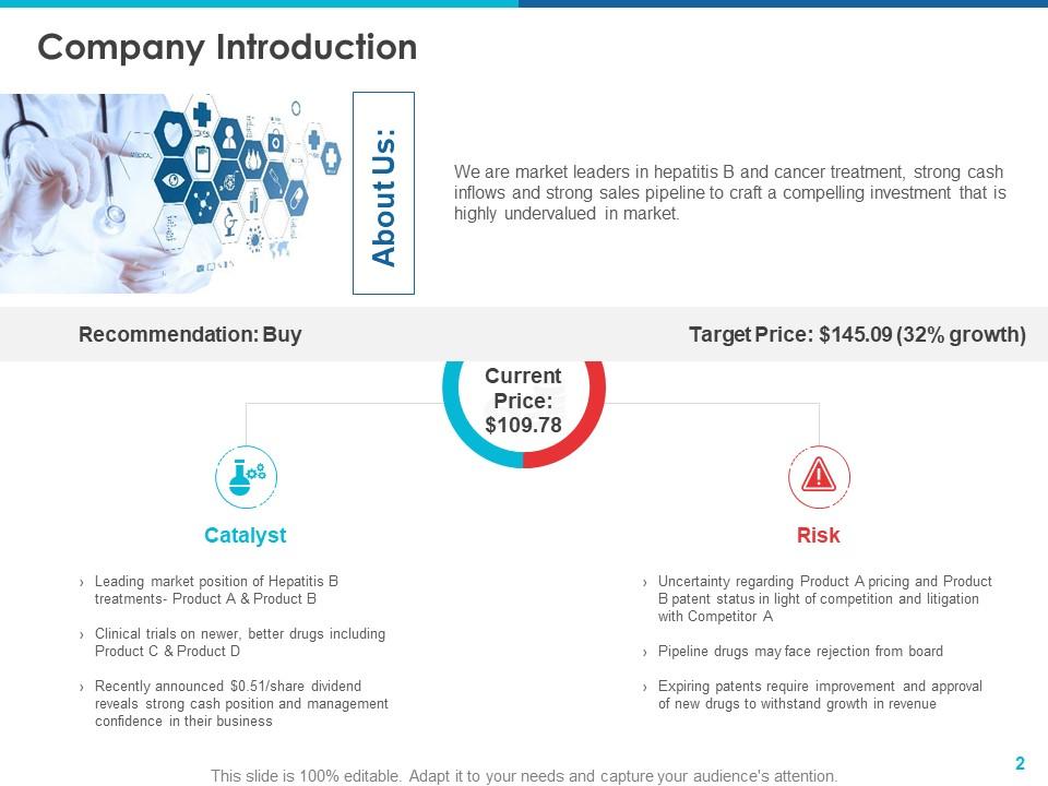
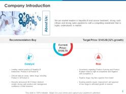
The complete deck represents the whole package of why a stock is recommended for a buy, and the pitch is geared to answer the question about us and explain why the company is a good investment at current rates. The PPT Template gives a target price and the current price of the stock. The strong point of the slide is that it also gives you the reasons, smartly labelled as a catalyst, why the stock price prediction will come true as part of your pitch. To balance it all out and respect the naysayers, the PowerPoint Layout also acknowledges the risk that could impact the stock price.
Template 2 Industry Outlook
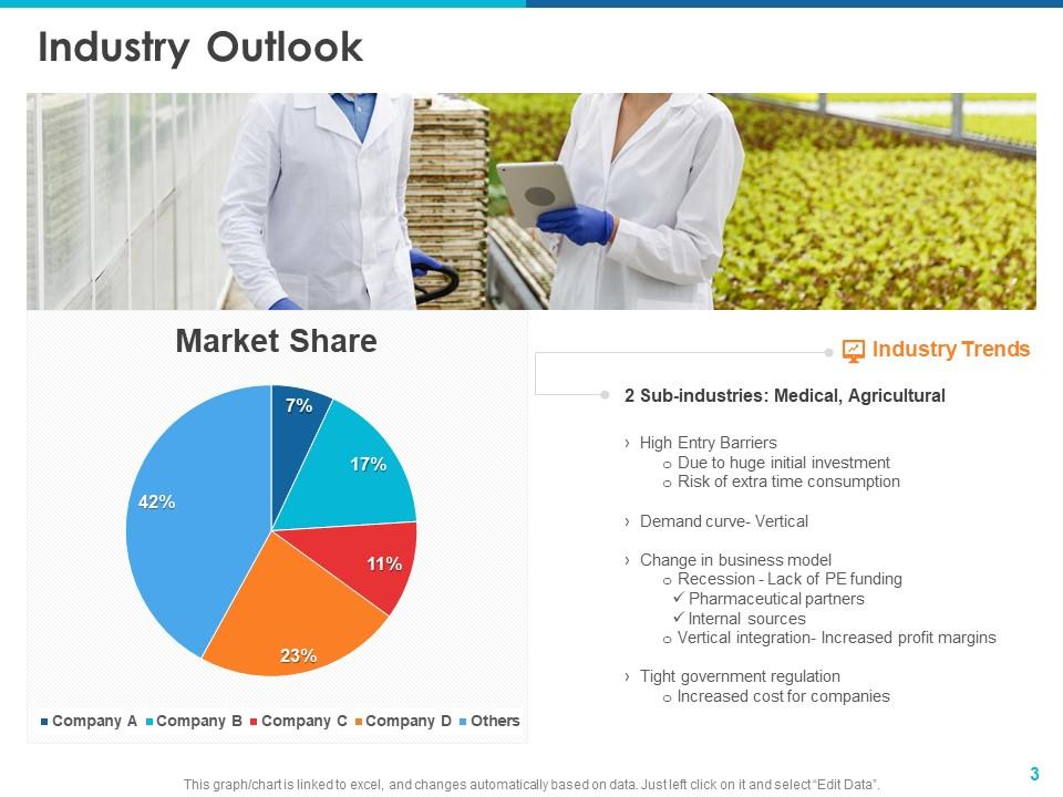
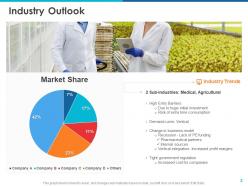
If you are looking for a polished PPT to ensure your stock pitch deck has the solid knowledge needed to get people to invest, this slide is it. In this clutter-free slide, the market share is represented through a pie chart. The two sub-industries are mentioned under Industry trends, showcasing the real opportunities and the significant risks to actualizing that potential. Get it now!
Template 3 Future Industry Growth Outlook

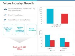
For a stock investment pitch deck, the key is to showcase numbers that work for the investor. Hence, this future-oriented outlook on industry growth has significant numbers that signal a solid, progressive existence in the future. With three bullet points, one also showcases how focusing on diversifying product segments will work. The central figure of profit makes it work as well. The colour-coded bar graphs on annual growth and exports compare four-year periods of the company to illustrate that the stock is meant for the long term.
Template 4 Company Overview

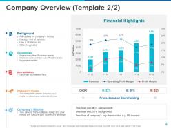
If you want to know how the evaluation of a company is done, this is the best PPT Template that you can ask for. The bar chart and the two-line graphs illustrate how profit margins and revenue moved over the past few years. The revenue is the bar graph, with the colour-coded lines showcasing the operating profit margin and operating margin. The promoter shareholding also indicates the trust founders have in the exponential growth potential and earnings. On the left segment of the slide, depict the background, capabilities, accreditation, the company's vision, and mission as well.
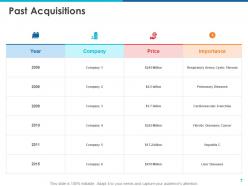
Template 5 Past Acquisitions

This significant slide lists significant company acquisitions over the past decade or so. The PPT Template adopts a tabular format with the year of acquisition, the company bought, and the price listed in the first three columns. The importance is depicted through a couple of operational, critical words. Get this template now to understand how past buys of the company are critical to today's consolidated stock value.
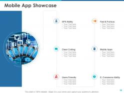
Template 6 Mobile App Showcase
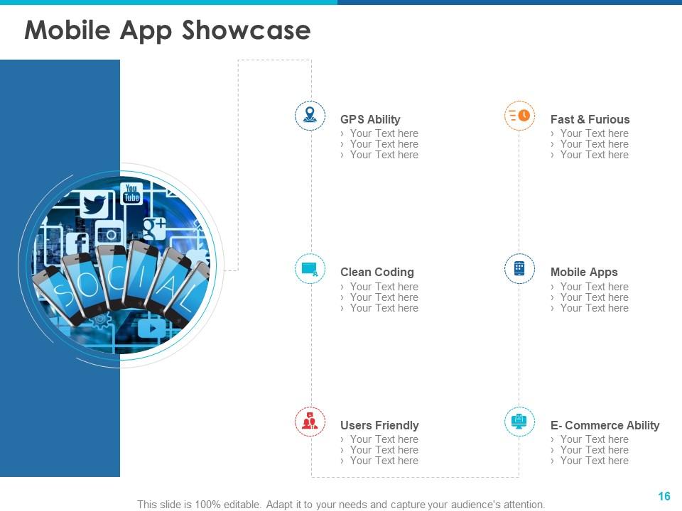
In today's hyperconnected and always-on-the-mobile world, a company's mobile application is the first thing the public wants to experience. Use this PPT Template to list all the critical benefits and features your mobile application offers. These could include speed and clean coding, which makes the app a breeze for us, and so on.
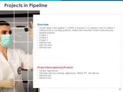
Template 7 Projects in Pipeline

This is the real deal-maker or breaker for people looking to find a profitable stock pick. The PowerPoint layout depicts this well in the two sections: overview and project description by project. The idea is to showcase, with enthusiasm and great energy, the new products in the pipeline and the expected sales and profit numbers from these. The slide also highlights how and why the projects will come onstream, contribute to positive cash flows, and lead to more significant market share or capture.
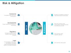
Template 8 Risk & Mitigation

Explain each of the four significant types of risk in this PPT Template, with a major mitigation step for each also listed against it. As the sample for a pharmaceutical major, the slide lists a regulatory hurdle as the company failing to secure regulatory approval on new products. Its mitigation would be to list the top reasons the approval would come through. Hence, the slide lets the stock investor understand the risk and then decide whether to buy into the mitigation the business offers.
Template 9 Company Valuation Analysis
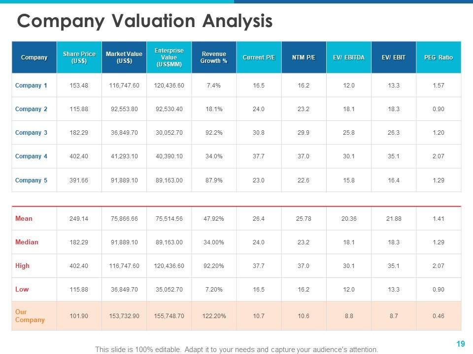
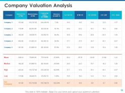
Compare the target company's share price, market value, enterprise value and revenue growth percentage against a set of other companies in the same market. The Price-to-earnings (P/E) ratio of the stock is also tallied against all these companies, as well as the mean and median of the industry. The highs and lows are also compared in each segment. The stats of your company are highlighted in another colour to showcase how your numbers fare against the others, as well as the mean and the median for the industry. There is no better guide to comparing stocks than this PowerPoint layout right here.
Template 10 Price Target
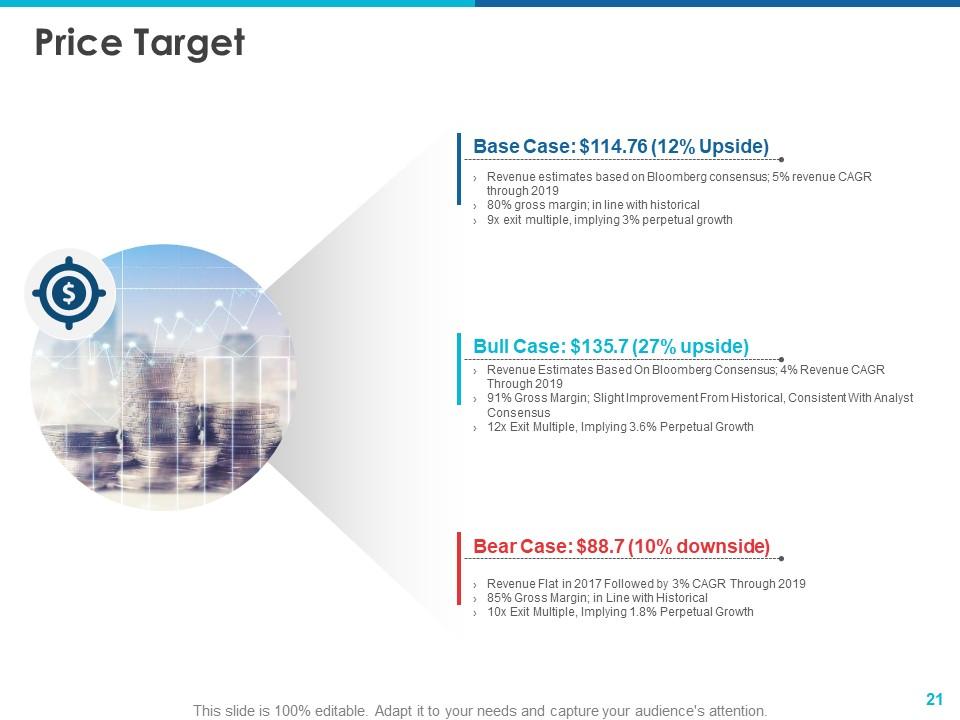
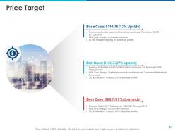
Once you decide to take a plunge in a stock, this PPT Template highlights three scenarios professionally and clearly. Use this slide to discuss the three cases: the Base Case, the Bull Case, and the Bear Case. The base and bull scenarios have an upside, while the bear case has a downside. Note how the design provides two bullet points to describe each of the situations.
*****
LEARN TO HANDLE VOLATILITY
Until investors learn to handle volatility across both sides (the high and the low), stock investing can be very damaging to their finances. The first step in handling volatility is to choose the stock you want and trust. SlideTeam's templates help you do that with ease and confidence. One such complete deck has been discussed above.
PS Here's a one-page pitch for the pharmaceutical company report that you use.
Most commonly used stock pitch deck powerpoint presentation ppt slide template with all 28 slides:
Use our Most Commonly Used Stock Pitch Deck Powerpoint Presentation Ppt Slide Template to effectively help you save your valuable time. They are readymade to fit into any presentation structure.



FAQs for Most commonly used stock pitch deck powerpoint presentation
Look, start strong with your best argument - don't bury the lead. You'll need solid financials and metrics backing everything up, plus specific catalysts that'll actually move the price. Comparable company analysis is clutch too. Honestly, most people mess up the risk section by being too vague, so be real about what could go wrong. Price targets need actual timelines - nobody wants to hear "eventually it goes up." The whole thing should tell a story that makes sense, not just random slides thrown together. End with what you want them to do next.
Hit these three slides hard. Market opportunity should show TAM expansion and trends you can actually ride - but don't go crazy with the numbers. Financial projections are where most founders either crush it or totally blow their credibility, so be realistic about revenue growth and nail down your drivers. Competitive positioning comes next - show what makes you different long-term. Always back everything with real data, not some fantasy hockey stick projection. Oh, and definitely include 2-3 growth scenarios. Investors love seeing you've thought through different outcomes instead of just betting everything on best case.
Honestly, don't overthink your financial projections - simple and realistic beats those crazy hockey stick charts that scream amateur hour. Show 3-5 years of revenue, expenses, gross margins, burn rate. The usual stuff. I've watched so many pitches crash because founders threw in wild assumptions they couldn't back up. Every number needs solid reasoning behind it. Build out three scenarios too - base case, best case, worst case. Shows you actually get that things don't always go according to plan. Oh and definitely have that detailed spreadsheet ready for follow-ups. Investors will dig deeper if they're interested.
Dude, charts and graphs are game-changers for stock pitches. Nobody wants to sit through you rattling off numbers for 20 minutes. Show revenue growth visually instead of just saying "it went up 15% last quarter" - way more impact. Break down complicated business models with simple infographics. Even basic icons help highlight your main points. I actually think the visual flow matters more than people realize; it guides them through your whole argument without them getting lost. Oh and honestly? A clean graph beats a messy spreadsheet every time. If you can show it instead of explaining it, always go visual.
Dude, biggest thing is don't cram every detail onto your slides - nobody can process that much. Lead with your thesis right upfront instead of making people dig for it. I see people get obsessed with these elaborate charts that look cool but don't actually prove anything (guilty as charged here). Skip the boring industry overview everyone's heard a million times. Jump straight to why THIS deal is different. Oh, and don't just tack on risks at the end like an afterthought. Hit them early so you look like you actually know what you're talking about. Keep it punchy.
Honestly, design is way more important than most people realize. Clean formatting shows you can think clearly and organize your thoughts - investors notice that stuff immediately. I've literally watched solid companies get passed over because their pitch deck looked like garbage. Don't go crazy with animations or anything, but consistent fonts and clear charts make a huge difference. Your content should be the star, not fighting against messy slides. Simple works best. Also, logical flow between sections keeps people engaged instead of confused. First impressions matter more in this game than founders want to admit.
Look, market analysis is what makes or breaks your whole investment story. You're proving the company sits in a space that's actually worth your money. I'd cover market size, growth trends, competitive landscape - basically show there's real opportunity here. Too many people I know jump straight to the numbers without this context, which is honestly backwards. Your TAM/SAM matters, but so do the industry headwinds and what's driving growth. Even solid companies look sketchy without good market backdrop. Keep it tight though - 2-3 slides tops and connect everything back to why this particular stock wins from these conditions.
Definitely need a solid competitive advantage slide that shows what makes you different. Skip the "amazing team" fluff - every pitch deck says that and investors are so tired of hearing it. Instead, focus on hard numbers and real proof points like proprietary tech, exclusive deals, or crazy good margins. A competitive matrix works great here. Show specific barriers that make it tough for others to copy you. The whole point is proving your advantage actually lasts and creates value long-term, not just sounds impressive.
So definitely hit the big three first - revenue growth, profit margins, and cash flow. Those are make-or-break numbers. Then add 2-3 metrics that actually matter for their specific business, like customer acquisition costs or whatever makes sense for their industry. Honestly, I see so many decks that just vomit every statistic possible and it's overwhelming. Focus on showing trends over time instead of random snapshots - investors care way more about where you're headed than just current numbers. Pick maybe 5-6 total that really show your momentum and why you're beating competitors.
Be honest about risks but smart about how you present them. Make a "Risk Factors" slide that covers the obvious stuff investors will find anyway - but here's the trick: pair each risk with your actual plan to handle it. Don't just say "lots of competition" - spell out how you're different and what competitive advantages you're building. Honestly, I've watched way too many founders try hiding problems, which just makes investors suspicious. Show them you've really thought this through and have concrete solutions ready. Investors actually respect founders who are realistic but still have their shit together.
Start with a story or problem that hooks them immediately - boring openings kill presentations. Visuals are your best friend here. Charts and clean slides work way better than text blocks. Throw in rhetorical questions to keep their brains active, and honestly? Your delivery matters more than people think. Even great content sounds terrible with flat energy. Put your key metrics upfront. Real case studies they can actually relate to work magic. Structure it logically - problem, then solution, then opportunity. That flow just makes sense. Oh, and practice out loud at least three times. Trust me on this one.
Look, VCs and angels want totally different things. VCs are obsessed with massive scale - they'll grill you on market size, unit economics, how you're gonna crush competitors. Angels? They're way more about betting on YOU personally. Show them early traction and be clear about what their money specifically does. I swear, half the angels I know invest because they like the founder, not because the spreadsheet is perfect. Do your homework on what each investor has backed lately, then tweak your pitch. VCs will go deep on the numbers while angels care more about whether you can actually execute.
Keep it to 10-15 slides tops – seriously, any more than that and people zone out. You've got maybe 15 minutes before they start checking their phones anyway. Make every slide count since there's no room for random filler. Each one should hammer home part of your investment case. I'd practice the timing beforehand so you can save 5-10 minutes for questions. That's honestly where deals get made or die. Oh, and prep some backup slides for the deep-dive stuff they might ask about. Trust me on that one.
Put your mission right up front - slide 2 or 3. Just cut the corporate BS and tell people what problem you're actually solving. I swear, half the decks I see sound like they were written by some consulting firm. Be specific about the world you want to create, not vague fluff about "synergistic solutions" or whatever. Connect it straight to your product and market. Oh, and make sure it sounds like you actually care about this stuff - investors can smell fake passion from miles away. Every slide after should tie back to that mission you set up.
Honestly, just stick with PowerPoint or Google Slides for your stock pitch. That's what investors are used to seeing anyway, and they're actually pretty good with financial charts and data. Canva's an option if you want it to look prettier, but sometimes those templates are kinda overkill for serious financial stuff. Keynote works great if you're on Mac. But real talk - the design software doesn't matter nearly as much as keeping everything clean and readable. Don't go crazy with animations or fancy fonts. Your content and how you tell the story? That's what'll make or break it. Just use whatever you're already comfortable with.
-
Helpful product design for delivering presentation.
-
Great experience, I would definitely use your services further.