


Organisation Chart Insurance Company Profile Ppt Powerpoint Presentation Gallery Aids




Try Before you Buy Download Free Sample Product
 Impress Your
 Audience
 100%
100% Editable
 Save Hours
 of Time


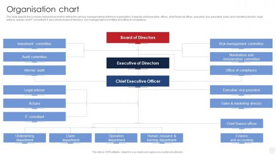
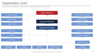
The slide depicts the company hierarchical chart to define the various management positions in organization. It depicts chief executive officer, chief financial officer, executive vice president, sales and marketing director, legal advisor, actuary and IT consultant. It also shows board of directors, risk management committee and office of compliance.
People who downloaded this PowerPoint presentation also viewed the following :
Organisation Chart Insurance Company Profile Ppt Powerpoint Presentation Gallery Aids with all 6 slides:
Use our Organisation Chart Insurance Company Profile Ppt Powerpoint Presentation Gallery Aids to effectively help you save your valuable time. They are readymade to fit into any presentation structure.





FAQs for Organisation Chart Insurance Company Profile Ppt Powerpoint
Start with the basics - job titles, who reports to who, and clear authority lines. Hierarchy from top to bottom is obvious, but also show those dotted-line relationships if you've got matrix stuff going on. Contact info helps a ton if people will actually use it as a directory. Department groupings make sense too. Photos are nice if your workplace isn't super corporate and stuffy about that kind of thing. Honestly, the biggest thing is keeping names updated - there's nothing more useless than an org chart from six months ago. Make it something people can actually use to figure out the reporting structure and reach whoever they need.
Honestly, org charts are lifesavers. No more awkward moments when you accidentally email your boss's boss instead of going through proper channels - been there, done that! New people can actually figure out who does what without asking a million questions. When you need approval or have project drama, you'll know exactly who to bug. Short sentences work. They stop all that corporate telephone nonsense where messages get twisted. I swear half the workplace confusion comes from people not knowing the hierarchy. Just make sure someone updates it occasionally or it becomes useless pretty fast.
It's basically about layers - hierarchical orgs have tons of them. You know, CEO at the top, then VPs, directors, managers, all stacked up in that pyramid thing. Flat structures? Maybe just leadership and everybody else. Flat ones honestly look kinda boring when you draw them out compared to those crazy complex hierarchical charts. But that's the whole point - fewer approval hoops to jump through means stuff actually gets done faster. I'd think about what story you want your chart to tell about decision-making flow. That usually helps me figure out which direction to go.
Dude, check if your HR system already has org chart stuff built in first - you might be sitting on a goldmine without knowing it. Tools like Lucidchart or Visio can pull straight from your employee database instead of you having to drag those little boxes around forever (seriously, who has time for that?). The charts update automatically when people quit or switch teams. Way better than redoing everything from scratch every month. You can throw in photos and customize however you want. Oh, and Teams has some basic org chart features too if you're already using that for everything else.
Honestly, org charts are lifesavers for new people. They show who reports to who and how all the teams connect - way better than trying to explain it out loud. New hires always feel overwhelmed about who does what (I mean, we've all been there). Walk through it with them their first week and maybe circle the people they'll actually work with daily. The visual really helps them get their bearings instead of just throwing names at them. Plus it's something they can reference later when they forget someone's role.
Honestly, just update it whenever big stuff happens - new people, departures, promotions, team shuffles. Most companies do quarterly check-ins, but startups? They're updating monthly since they're hiring non-stop. I'd say get changes in within 2-4 weeks max so nobody's confused about who reports to who. Set a reminder (trust me, you'll forget otherwise) and make someone in HR actually own this thing. Otherwise it becomes one of those tasks that just... doesn't happen. Oh, and if your company's growing fast, monthly might be worth it.
Honestly, just keep it super clean and simple - consistent shapes, clear lines, readable fonts. Start at the top with leadership and work down. Make those reporting lines obvious so people don't have to squint and guess who reports to who. Only put essential stuff in each box - names, titles, maybe departments. I've seen some that look like complete disasters, all cramped and messy. Nobody wants that headache. Oh and definitely keep it updated because outdated org charts are useless. One more thing - test if it prints clearly since everyone's gonna want paper copies anyway.
Dude, color coding is a game changer for org charts. Your brain just gets it instantly instead of trying to decode job titles. I usually go with something like red for leadership, blue for engineering, green for sales - whatever makes sense for your setup. You can organize by department, seniority, location, even project teams. Honestly, once you start you'll think of a million ways to use it. Just don't go crazy with like 12 different colors or it'll look like a rainbow threw up. Start with 3-4 categories and you'll be amazed how much clearer everything becomes.
Honestly, just get the software. Manual charts are such a pain - they're wrong the minute you finish making them. The good tools sync with HR automatically, so when people quit or get promoted, everything updates without you having to remember. I learned this the hard way when our old chart still showed my boss's boss for like 3 months after he left. Super awkward. With 20+ people you'll waste so much time doing it manually. Software gives you search, department filters, easy sharing. Trust me, it's worth it just for the time you'll save every month updating the thing.
Oh man, cross-functional teams totally mess with your org chart! People end up reporting to multiple managers or bouncing between departments. You'll have dotted lines connecting everything instead of those neat little boxes - it gets messy fast. Like, someone in marketing might still report to their director but also answer to a product manager for certain projects. My old company's chart looked absolutely ridiculous by the end. Just make sure you document both the main reporting lines AND the project stuff clearly. Otherwise nobody knows who's actually calling the shots on what.
Yeah so use different line styles - solid for direct reports, dotted/dashed for the matrix stuff. Most tools make this pretty easy to customize. I made this mistake once where our PM team's dual reporting looked absolutely insane with everything being solid lines lol. Colors work too, or you could throw in little labels like "functional" vs "administrative." Just stay consistent though - people need to instantly get what each line means. Oh and honestly? Pick whatever style feels clearest to you and don't overthink it.
So org charts are actually clutch for strategic planning - they show you who calls the shots and where the buck stops. You can spot your key stakeholders fast, figure out where decisions get stuck, and map out how info flows. They also expose weird reporting structures or teams that don't talk to each other. I swear, half the projects I've seen tank because someone didn't check the org chart first and accidentally went around the wrong person. Basically just treat it like your GPS when you're rolling out anything big.
Honestly, org charts are super helpful for mapping out your career moves. You can see the obvious promotion path in your department, but they also show lateral opportunities you might've missed - like how marketing people sometimes jump into product roles. Pretty useful for figuring out what skills you'd need to level up too. I'd use it to have those awkward but necessary conversations with your manager about where you want to go and when. It's basically your cheat sheet for understanding company structure and planning your next steps.
Honestly, org charts are pretty misleading most of the time. Sure, they show who officially reports to who, but they totally miss the people who actually have influence and make things happen. Cross-functional teams? Informal networks? Good luck finding those on paper. Matrix structures are the worst - the chart ends up looking like a hot mess with lines everywhere. Plus they're outdated the second someone prints them, especially at fast-moving companies where people's roles change constantly. I'd use them as a rough guide, then just ask around to figure out how things really work.
Don't overcomplicate it - that's the biggest trap. Like seriously, I've seen charts that look like subway maps because someone tried to show every tiny reporting relationship. Just focus on the main lines. Also your payroll structure isn't always how work actually gets done, so don't just copy that. Keep it updated too! Nothing screams "useless" like seeing Bob from accounting still on there when he quit six months ago. I'd probably set a calendar reminder to check it every few months. Clean formatting helps, and honestly? Sometimes less detail is way more helpful than cramming everything on one page.
-
I want to thank SlideTeam for the work that they do, especially their customer service.
-
I've been looking for a good template source for some time. I'm happy that I discovered SlideTeam. Excellent presentations must try!