


Organization chart diagram of the company secretary raise funds after market investment ppt objects




Try Before you Buy Download Free Sample Product
 Impress Your
 Audience
 100%
100% Editable
 Save Hours
 of Time


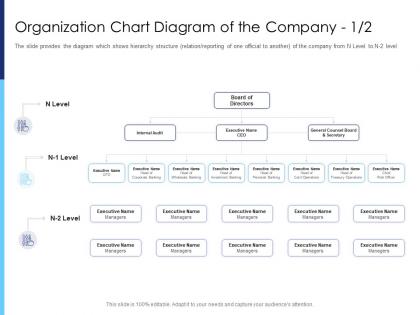
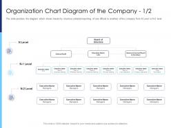
The slide provides the diagram which shows hierarchy structure relation or reporting of one official to another of the company from N Level to N 2 level.
People who downloaded this PowerPoint presentation also viewed the following :
Organization chart diagram of the company secretary raise funds after market investment ppt objects with all 2 slides:
Use our Organization Chart Diagram Of The Company Secretary Raise Funds After Market Investment Ppt Objects to effectively help you save your valuable time. They are readymade to fit into any presentation structure.
FAQs for Organization chart diagram of the company secretary raise funds after market
Okay so definitely include job titles, names, and who reports to who - that's the bare minimum. Group people by departments with some kind of visual distinction because scanning through a giant mess is annoying. Photos help too since I'm terrible with names but remember faces. Oh, and if it's internal, throw in email addresses. Make the hierarchy flow top-down in a way that actually makes sense. Honestly though? The biggest thing is keeping it updated. Nothing's more awkward than someone asking about the "VP of Sales" who quit like eight months ago.
Honestly, org charts are way more useful than people think. They stop all that awkward "wait, who do I ask about this?" confusion that happens constantly. New people can actually figure out how things work instead of wandering around lost for weeks. The visual layout makes it super obvious where bottlenecks might happen in your processes. People waste so much time just trying to track down the right person for approvals - it's ridiculous. Just make sure yours doesn't become one of those dusty documents nobody updates. Keep it current and somewhere people can actually find it.
Honestly, Lucidchart's probably your best bet - super polished and you can customize everything. Visio's solid too if you don't mind the price tag. Canva actually surprised me with how good their org chart templates look, way more modern than I expected. Already using Microsoft stuff? PowerPoint's SmartArt works fine but it's pretty bare-bones. Draw.io's free and decent if budget's tight, or check out OrgChartJS. I'd just start with whatever your team's already comfortable with - you can always switch later if you need something fancier.
So basically, hierarchical is your standard org chart - everyone has one boss, clean pyramid shape, super straightforward. Matrix gets weird because people report to multiple managers at once. You'll see dotted lines everywhere and it honestly looks like a mess at first glance. Picture someone reporting to both their department manager AND a project lead simultaneously. That's matrix territory. The easiest way to figure out which one you need? Just look at whether people have single bosses or multiple reporting relationships. Oh, and matrix works great for project-heavy companies but can be confusing as hell to navigate day-to-day.
Dude, org charts are honestly game-changers for strategic planning. They show you exactly how things work right now vs. where you need to be. You'll spot leadership gaps fast, plus see if departments aren't talking to each other (which happens way more than it should). I can't tell you how many strategies I've watched crash because nobody thought about structure first. They're also great for figuring out who actually needs to be involved in each project. Start by mapping what you have now, then sketch out what would actually support your goals. Sometimes the gap is bigger than you think!
Update it whenever stuff changes - new hires, people leaving, promotions, team shuffles. Quarterly updates are way too slow if you're growing. Just assign someone (HR person, office manager, whoever) to own it and have managers text them when changes happen. Seriously, outdated org charts make you look like a mess and confuse the hell out of new people. I learned this the hard way when we had three different versions floating around and nobody knew who actually ran marketing. Make it someone's job or it won't happen.
Since nobody can just pop over to ask questions anymore, you gotta map out who actually talks to who on projects - not just the boss chain. Honestly? Stick time zones and contact info right on there. Makes everything way less painful. Also throw in those unofficial people who aren't managers but somehow know everything and keep stuff from falling apart. I mean, half the time they're more helpful than the actual supervisors anyway. Your chart should basically answer "who handles X" instead of just showing hierarchy. Trust me on this one.
So colors and shapes totally make org charts way easier to read. I usually color-code different departments or highlight who reports to who - saves people from squinting at tiny text forever. Shapes work great too, like circles for managers, squares for everyone else. Just don't go crazy with it though. My old boss once made this chart that looked like a unicorn exploded on it, and nobody could focus on the actual structure. Stick to maybe 2-3 colors max and you'll be good. The whole point is making it scannable at a glance.
Honestly, org charts are lifesavers for new people. Shows them the whole company structure so they're not wandering around clueless asking random people for help. During orientation, walk through it with them - point out their team, who manages what, how departments work together. Trust me, it cuts down on all that "um, who handles this?" confusion by like 90%. I still remember my first job where I bothered the wrong person for weeks about IT stuff (whoops). Write little notes on their copy about what each person actually does day-to-day. Makes everything click faster.
Honestly, org charts are pretty clutch for finding skill gaps. Color-code different roles by expertise and you'll immediately see what's missing. Maybe your whole data team rolls up to one manager - that's sketchy if they leave. Look for where skills are bunched up in weird places too. Cross-training becomes obvious when you map out who knows what. I always forget how useful the visual aspect is until I actually do it. You can spot exactly where to hire next or which departments need to share knowledge better.
Don't overcomplicate it - that's the main thing. Too many roles crammed onto one chart just looks like a mess. Also, people switch jobs constantly so you gotta update it regularly or it becomes pointless fast. I learned this the hard way at my last company lol. Skip showing the informal power dynamics alongside official reporting lines because it confuses everyone. Stick with clean formatting and pick someone to refresh it every few months. Otherwise you'll have this gorgeous org chart that's totally wrong within half a year. Oh, and ditch outdated job titles immediately - nothing screams "we don't have our act together" quite like that.
Honestly, just go with a tree structure - CEO at top, then branch out by department. Color coding is your friend here (blue for marketing, green for sales, whatever). Different shapes work too if you're not into colors. Don't squeeze everything together though - I made that mistake once and nobody could read anything. White space is crucial. Make those reporting lines super obvious, especially when people work across departments because that gets confusing real quick. Oh, and keep it simple! The fancier you make it, the more likely someone's gonna get lost trying to figure out who their actual boss is.
Honestly, just keep it super clean and simple for the exec crowd. Go with a basic top-down layout - nothing fancy. Navy, gray, or those muted blue colors work best (avoid anything that looks like you threw it together last minute). Make the text boxes big enough so people can actually read names from across the room. Arial or Calibri fonts are your safest bet. Skip all the decorative stuff - execs really don't care about flashy graphics. They just want to see who reports to whom without squinting. White space is your friend here. Trust me, boring beats confusing every time when you're dealing with C-suite folks.
Honestly, org charts are clutch for succession planning. You'll instantly see who's covering what and where you're screwed if someone leaves. Critical roles jump right out at you, plus you can tell who's ready for promotions. When Sarah inevitably quits (because someone always does), you won't be scrambling. I actually think the visual part is what makes it work - way better than some spreadsheet nobody looks at. You can trace out career paths for your good people and figure out training needs before everything hits the fan.
Honestly, collapsible sections are a lifesaver for complex org charts - people can click to drill down into specific departments without getting overwhelmed. Color coding different divisions makes following reporting lines so much clearer too. Start with just C-suite and their direct reports, then layer in more detail. I've seen some brilliant "overview" versions paired with detailed ones. If your org is massive, maybe split it by function or geography? Your audience will definitely appreciate not seeing every single role thrown at them upfront. Makes such a difference.
-
Design layout is very impressive.
-
Much better than the original! Thanks for the quick turnaround.
-
Informative presentations that are easily editable.
-
Innovative and Colorful designs.
-
Great designs, Easily Editable.