


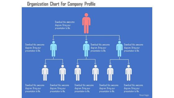
Organograma para o design plano do PowerPoint do perfil da empresa




Try Before you Buy Download Free Sample Product
 Impress Your
 Audience
 100%
100% Editable
 Save Hours
 of Time


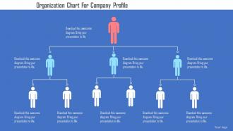
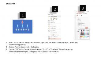
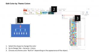
Use o organograma fornecido para o design plano do PowerPoint do perfil da empresa para criar uma ferramenta por meio da qual você possa compartilhar facilmente a estrutura organizacional da sua empresa. O gráfico de perfil da empresa fornecido é muito útil para aqueles interessados em projetar a estrutura da empresa ou projetar uma nova estrutura organizacional. O departamento de recursos humanos pode aplicar esta apresentação de PowerPoint profissionalmente proficiente para decifrar algumas informações úteis sobre a estrutura hierárquica seguida durante a indução ou o programa de orientação da empresa. O exemplo de design de slide do PowerPoint de hierarquia organizacional também transmite uma visão sobre as funções e responsabilidades praticadas pelos funcionários e empregador. Como o visual da apresentação é tão atraente, você pode usá-lo com segurança como parte de sua apresentação corporativa em grandes seminários. O conteúdo facilmente personalizável adotado por nossos designers tornou o trabalho do downloader mais fácil, permitindo-lhes executar as alterações a seu próprio critério. Nosso organograma para o perfil da empresa Flat Powerpoint Design o ajudará a descrever suas idéias. Eles adicionarão cor ao conteúdo.
People who downloaded this PowerPoint presentation also viewed the following :
Organograma para o perfil da empresa Design plano de PowerPoint com todos os 5 slides:
Controle as compulsões com o nosso organograma para o design plano de PowerPoint do perfil da empresa. Não deixe que os hábitos tirem o melhor de você.
FAQs for Organization chart for company profile
Honestly, you just need the basics - who reports to who, clear job titles, and all the main departments mapped out. Don't overcomplicate it! Add contact info so people can actually find each other. Visual-wise, keep those boxes and lines super clean and easy to follow. I've seen way too many org charts that look like spaghetti diagrams. Include everyone though - nobody wants to feel left out or confused about where they fit. Oh, and please update the thing when people move around! Nothing's worse than those ancient charts where half the people don't even work there anymore.
Honestly, org charts are lifesavers for cutting through the "who do I even ask about this?" confusion. You'll know exactly who handles what instead of sending emails that bounce around forever. New people especially love having them - saves so much awkward wandering around asking random questions. They also show you how departments actually connect, which can be pretty surprising sometimes. Like, I had no idea marketing and product worked so closely until I saw our chart. Quick tip though - keep yours updated or it becomes useless fast. Stick it somewhere obvious like Slack so people actually use it.
So there's basically three types you'll see: the classic pyramid one (hierarchical) with clear boss-to-employee chains, matrix where people report to multiple managers - these are honestly a nightmare half the time, and flat structures with barely any management layers. Traditional companies love hierarchical since everyone knows who's in charge. Matrix works for project teams that cross departments, but good luck keeping track of who you're supposed to update. Flat's perfect for startups or creative groups that hate bureaucracy. Pick whatever matches how your team actually talks and decides stuff, not what looks professional.
Dude, just use actual software for this - Lucidchart or Visio work great. Your HR system might already do it automatically too, so check that first. Way better than wrestling with PowerPoint boxes (been there, it sucks). You can share them instantly and update when people move around. The cool thing is making different versions - like executives get the big picture while managers see all the nitty-gritty team details. Updates happen in real-time which is honestly a lifesaver when you're constantly shuffling people.
Dude, org charts are like having a GPS for your company strategy. You can see exactly who makes decisions and how everything connects. Super useful when you're planning something big - just check the chart to figure out which teams need to work together and who actually has the power to greenlight stuff. I've caught some pretty ridiculous duplicate roles this way too, which saved us tons of money. They're great for seeing how workload gets spread around and where your budget goes. Honestly, I always pull mine up before starting any major project. Makes the whole "who do I need to loop in" question way easier.
Honestly, just pick whatever matches how decisions actually get made at your company. Hierarchical is your standard pyramid thing - works great when there's clear top-down authority and everyone knows who reports to whom. Matrix gets messy looking but makes sense if people have multiple bosses or constantly work across different departments. Flat structure? That's for when you barely have any management layers and everyone collaborates on decisions. I'd start by figuring out who actually calls the shots on what, then match your chart to that reality. Don't just go with whatever looks prettiest - nobody wants a confusing org chart that doesn't reflect how things really work.
Don't try to cram everyone onto one giant diagram - it becomes this unreadable mess that sits in a drawer somewhere. Keep it simple at first. Also, someone needs to actually own keeping it updated or you'll have people asking "wait, does Sarah still work here?" six months later. Skip the perfect hierarchy lines if your team works across departments anyway (which, let's be honest, most do these days). Job titles should be consistent though - that part matters. Oh, and resist showing every single reporting relationship if it makes things cluttered. Start basic and add complexity only when you need it.
Update it right when stuff happens - new people, departures, role switches, team shuffles. I made this mistake once and our chart was months behind, so new hires had zero clue who their actual boss was (awkward). Monthly reviews are fine as backup, but honestly? Real-time is way better. Get HR to text you when changes go down, or have managers give you a heads up. Trust me, a wrong org chart is worse than no chart at all - people just get frustrated trying to decode it.
Honestly, org charts are lifesavers for new people. They can see the whole company structure instantly instead of wandering around confused for weeks. New hires know exactly who handles what - no more awkward conversations trying to figure out who to bug about random stuff. You'll catch role overlaps and gaps way earlier too, which saves headaches later. I always walk through the chart with people their first week (takes like 10 minutes but makes a huge difference). Just keep it current or it becomes useless pretty fast.
Honestly, visual hierarchy is everything with org charts. You want people to instantly get who reports to who, right? Use bigger boxes for executives, smaller ones for everyone else. Keep your spacing consistent - cramped charts look terrible and nobody can read them. I'd stick to maybe 2-3 colors tops for different departments. Any more than that and it gets chaotic. Think of it like designing a good map where the main roads pop out first. White space is your friend here. Clean beats cluttered every single time.
Definitely keep it simple and consistent - same fonts, clear job titles, logical top-to-bottom flow. I've watched too many people squint at messy org charts trying to figure out who reports to who (it's painful honestly). Add email addresses if you can, super helpful. Oh and please update the thing regularly - nothing's worse than presenting someone who quit last year lol. When you're showing it, go broad overview first then zoom into departments. Have a digital copy ready to send afterward because someone will definitely ask for it.
So remote work basically flattens the whole hierarchy thing. Instead of the usual chain of command, you get more cross-functional teams and matrix reporting - like having multiple bosses for different projects. Middle managers? Half of them become kinda pointless when people can just message each other directly. Geography doesn't matter anymore either, which is wild - your boss could be in California while you're in New York. Oh, and you'll definitely see more project-based leadership instead of those rigid department silos. Just make sure all the reporting stuff is written down clearly since you can't exactly pop by someone's office to ask who's actually in charge of what.
So basically, nonprofits have a board of directors at the top instead of shareholders like regular companies do. The board oversees an executive director or CEO, and there's usually tons of committees and advisory stuff going on - honestly gets chaotic with all those volunteers sometimes lol. Private companies? Way more streamlined, cleaner hierarchies focused on making money. For nonprofits, you want to show how accountable everyone is to stakeholders and highlight those mission-driven roles. Private sector charts are different - they're all about operational efficiency and revenue. Makes sense when you think about it.
So for dynamic org charts, I'd definitely check out Lucidchart, Visio, or OrgChart first - they're made for this and can auto-sync with your HR systems. Draw.io is solid too if you don't want to spend money. The real game-changer is getting something that connects to your employee database. Otherwise you're stuck updating it every time someone quits or gets hired, which is honestly the worst. If you're already on Microsoft 365, Visio's probably the no-brainer choice since it works with everything. I'd just grab a free trial and see what feels right for how you work.
Honestly, org charts are way more useful for D&I than people think. Color-code your roles by demographics and you'll spot patterns immediately - like why your entire leadership team looks the same. Makes representation gaps super obvious. Use it to map out succession planning too, especially for getting underrepresented folks into leadership tracks. Keep it visible and update it regularly so people can actually see progress happening. I mean, it's basically a diversity dashboard but way more straightforward than those fancy analytics tools. Just don't let it collect dust in some drawer.
-
Editable templates with innovative design and color combination.
-
Helpful product design for delivering presentation.