

Organization competitive analysis harvey balls chart




Try Before you Buy Download Free Sample Product
 Impress Your
 Audience
 100%
100% Editable
 Save Hours
 of Time


Our Organization Competitive Analysis Harvey Balls Chart are topically designed to provide an attractive backdrop to any subject. Use them to look like a presentation pro.
People who downloaded this PowerPoint presentation also viewed the following :
Content of this Powerpoint Presentation
Description:
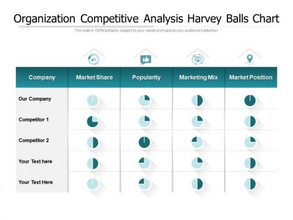
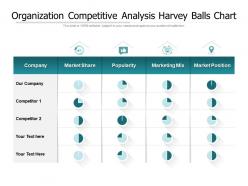
The image is a PowerPoint slide titled "Organization Competitive Analysis Harvey Balls Chart." It features a matrix for comparing different aspects of a company's performance against its competitors. The chart evaluates Market Share, Popularity, Marketing Mix, and Market Position using Harvey Balls, which are circular icons partly filled to indicate the level of achievement or completion.
1. Company: Denotes the row for the company being analyzed.
2. Market Share: Shows the company’s share of the market, compared to competitors.
3. Popularity: Reflects how well-known or favored the company is.
4. Marketing Mix: Represents the company's use of product, price, place, and promotion.
5. Market Position: Indicates the company’s competitive stance in the market.
Use Cases:
Here are seven industries where this type of analysis slide is beneficial:
1. Consulting:
Use: Assessing client companies against market competitors.
Presenter: Strategy Consultant
Audience: Corporate clients, stakeholders
2. Automotive:
Use: Comparing car manufacturers’ market standings.
Presenter: Market Analyst
Audience: Executives, marketing teams
3. Pharmaceuticals:
Use: Evaluating drug popularity and market reach.
Presenter: Product Manager
Audience: Investors, R&D teams
4. Technology:
Use: Showcasing market position of tech firms.
Presenter: Business Analyst
Audience: Management, competitive intelligence teams
5. Energy:
Use: Benchmarking against other energy providers.
Presenter: Market Research Analyst
Audience: Board members, investor relations
6. Consumer Goods:
Use: Competitor analysis for product placement and popularity.
Presenter: Marketing Director
Audience: Brand managers, sales force
7. Financial Services:
Use: Illustrating market share and position of financial products.
Presenter: Financial Planner
Audience: Advisory board, portfolio managers
Organization competitive analysis harvey balls chart with all 2 slides:
Use our Organization Competitive Analysis Harvey Balls Chart to effectively help you save your valuable time. They are readymade to fit into any presentation structure.
FAQs for Organization competitive analysis
Oh, Harvey Balls are those circle things that show progress - you know, empty, quarter-filled, half-filled, etc. Way better than cramming percentages everywhere. Perfect for dashboards or when you're presenting project updates. People get it instantly without doing math in their heads, which honestly is a win for everyone. I actually started using them instead of those messy bar charts and my boss loved it. They work great for showing team performance or quarterly results. Super clean look too. Your stakeholders won't have to squint at tiny numbers anymore.
Honestly, Harvey Balls are clutch when you're comparing stuff side-by-side - like project status or team performance levels. Perfect for dashboards where people need to spot trends fast. I always throw them in executive decks because nobody wants to decode a bunch of tiny numbers when they're scanning for problems. Quick visual = happy audience. They're also solid for satisfaction ratings or skill assessments across different teams. Oh, and definitely add a legend though - half-filled doesn't mean much without context. Way better than overwhelming people with spreadsheet data they'll ignore anyway.
Honestly, Harvey Balls are perfect when you need to show "how good" something is rather than exact numbers. Bar charts are great for precise comparisons, sure, but Harvey Balls shine for subjective stuff - like satisfaction levels or how mature different processes are. They're super visual and immediate. Stakeholders can spot patterns right away without getting lost in percentages. I mean, sometimes you just want people to quickly grasp the overall picture, you know? They're ideal for scorecards and those comparison dashboards where you're rating performance across categories. Way less overwhelming than traditional charts.
Honestly, just keep it simple - 4-5 fill levels tops or people won't be able to tell the difference. Define what your criteria actually mean upfront (like what counts as "full" vs "half"). Don't get cute with fancy colors either, black and white does the job just fine. I see people overthink this all the time. Use the same categories for everything you're comparing, and if someone's squinting to figure out what they're looking at, you've gone too far. Quick visual comparison is the whole point here. Start with your most important stuff first, then add more if you need to.
Yeah, they work for both! Qualitative is more like rating "vibes" - customer happiness, team morale, that kind of thing. Quantitative is cleaner though - you just assign number ranges to each ball level. So empty = 0-20%, quarter-filled = 21-40%, etc. Honestly? I'm way more into the quantitative approach since there's less room for confusion. Everyone knows what half-filled means when you've got set ranges. Just define your scale first - trust me, it'll save you from awkward meetings where people are like "wait, what does this one mean again?" Been there.
You've got tons of options for making Harvey Balls charts. PowerPoint and Google Slides are probably your easiest bet - just drop in circles and fill them however much you want with the shape tools. Excel's actually my go-to though since that's where my data lives anyway, saves me from copying stuff around. Google Sheets works too if you're in that ecosystem. Oh, and if you want something that looks really professional, Tableau and Power BI have Harvey Balls built right in. Super clean looking. My advice? Just make a template in whatever software your team's already using daily.
Dude, color coding is a total game-changer for Harvey Balls! I usually go with red/yellow/green since everyone already knows that logic from traffic lights. Makes executives actually understand your data instead of squinting at fill levels. You can highlight which stuff needs immediate attention or group similar categories together. Short sentences work great. Then mix in some longer ones that flow naturally when you're explaining the concept. Just don't go crazy with too many colors - I learned that the hard way when my boss couldn't tell purple from blue in our last presentation. Stick to maybe 3-4 max or it gets messy fast.
Honestly, the worst thing you can do is throw too many fill levels at people - I'd say 4-5 tops or they'll just stare at it confused. Always add a legend too, even if it feels obvious to you. I've watched people get all creative with fancy colors and patterns, but trust me, simple black fills are way clearer. Oh, and make sure you're actually comparing apples to apples - like, don't put customer satisfaction next to revenue growth in the same chart, that's just weird. Keep labels short and toss in the actual numbers somewhere if you need to be precise.
Honestly, Harvey Balls are perfect anywhere you're tracking progress or comparing stuff. Executive summaries, project updates, competitive analysis - they're so much cleaner than throwing a bunch of percentages at people. I use them all the time in strategy docs when we're comparing different initiatives or showing how we're hitting our goals. Way easier for stakeholders to scan and immediately see what's crushing it versus what's struggling. Oh, and don't forget to add a legend so people actually know what the different fill levels mean - learned that one the hard way!
Oh Harvey Balls are everywhere once you start noticing! Consulting firms use them constantly - clients love seeing project progress without diving into spreadsheets. Product managers swear by them for feature comparisons. Market research too, especially when you're stacking competitors against each other. Healthcare's another big one for patient stuff and quality tracking. They're honestly perfect when you need that "kinda, sorta, mostly" vibe instead of exact percentages. Executives can scan them in like two seconds during those marathon meeting days. Worth trying next time you're presenting - way easier for people to digest than tables of numbers.
Ok so basically you need a solid legend that shows what each fill level means. I usually go with empty = none/poor, quarter = low/fair, half = moderate/good, three-quarters = high/very good, and full = excellent. Just make sure your ranges don't overlap - like if you're doing percentages, use 0-20%, 21-40%, etc. I've definitely seen charts where someone screwed this up and had like "15-35%" then "30-50%" which is just... why would you do that? Keep your legend visible on every chart so people aren't constantly flipping back to figure out what they're looking at.
Dude, Harvey Balls are honestly a game-changer for stakeholder meetings. Instead of drowning people in spreadsheets, you just show those simple circle graphics and boom - everyone gets the comparison instantly. I've watched entire product roadmap fights get settled in minutes because the visual made it obvious which features actually ranked highest. People can spot the patterns without having to decode a bunch of numbers. Your audience will actually stay engaged instead of glazing over at data tables. Trust me on this - next time you're presenting options, swap out those detailed scorecards for Harvey Balls. The difference in energy is wild.
So have everyone share their Harvey Balls ratings first before jumping into group discussion - stops that whole groupthink thing. The partially filled ones are honestly where you'll find the best stuff. Those quarter and half-filled circles? That's your goldmine right there. Ask what specific things could bump those ratings up instead of just accepting where they're at. Oh, and make sure you're actually writing down concrete next steps while you talk, not just the ratings. The action items are what matter in the end. Otherwise you're just having a nice chat that doesn't change anything.
Honestly, just swap out those boring circles for stuff your audience actually connects with. Stars work great for performance reviews. Tech teams love battery icons. I've even seen coffee cups for office metrics (maybe a bit much, but whatever works). Colors matter too - stick to your brand or think about cultural stuff like avoiding red/green combos for international folks. Don't feel stuck with quarters either. Try thirds or fifths if your data fits better that way. The whole point is making them dead simple for people to read at a glance.
Harvey Balls actually work really well digitally! Sometimes better than paper since you can make them clickable or interactive. Just don't make them tiny - I've seen so many dashboards where they look like random specks, honestly drives me nuts. Keep good contrast for accessibility and throw in alt text for screen readers. Tooltips showing exact values on hover are clutch too. One thing that'll mess people up is inconsistent sizing across your interface. Like if a half-filled circle means 50% in one spot but something else somewhere else, users get confused fast.
No Reviews