


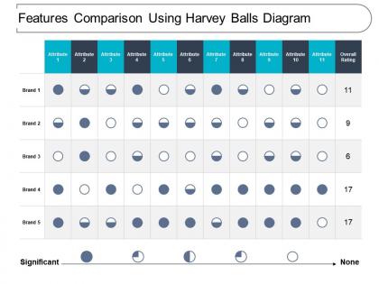
Features comparison using harvey balls diagram




Try Before you Buy Download Free Sample Product
 Impress Your
 Audience
 100%
100% Editable
 Save Hours
 of Time


Be at your charming best with our Features Comparison Using Harvey Balls Diagram. Captivate them with delightful ideas.
People who downloaded this PowerPoint presentation also viewed the following :
Features comparison using harvey balls diagram with all 6 slides:
Highlight the financial implications with our Features Comparison Using Harvey Balls Diagram. Explain the after effect of financial decisions.
FAQs for Features comparison using
Harvey Balls are circular visual symbols that display progress, completion levels, or performance ratings through filled portions ranging from empty to completely filled circles. These presentation tools streamline complex data communication by enabling audiences to quickly assess status updates, project milestones, and comparative metrics across departments, with many organizations finding that Harvey Balls enhance dashboard clarity and accelerate decision-making processes.
Harvey Balls help visualize qualitative data by converting subjective assessments into standardized visual symbols, enabling quick comparison across multiple criteria, categories, and performance indicators. Through these simple circular graphics, organizations streamline complex evaluations like customer satisfaction surveys, competitive analysis, and strategic planning matrices, ultimately delivering clearer insights and faster decision-making processes.
Harvey Balls excel when comparing performance levels, satisfaction ratings, or progress across multiple categories where exact values matter less than relative positioning. Unlike traditional charts requiring precise data interpretation, they enable instant visual comparison of project statuses, team capabilities, or customer satisfaction scores, with many organizations finding that audiences grasp comparative insights significantly faster, ultimately streamlining decision-making processes.
Harvey Balls can be extensively customized to represent virtually any metric or criteria, from performance ratings and project completion percentages to risk assessments, customer satisfaction scores, and budget utilization levels. Many organizations across healthcare, consulting, and project management find that customizing these visual indicators with specific colors, patterns, or numerical scales enhances data comprehension and stakeholder engagement significantly.
Common mistakes include using too many categories that overwhelm audiences, inconsistent sizing that confuses interpretation, poor color choices that reduce visibility, overcrowding slides with excessive data points, and failing to provide clear legends. These presentation errors undermine Harvey Balls' effectiveness by creating confusion rather than clarity, with many presenters finding that simpler designs and consistent formatting significantly enhance audience comprehension and decision-making outcomes.
Color variations in Harvey Balls significantly impact audience perception by leveraging psychological associations, creating visual hierarchy, and enhancing data interpretation speed. Strategic color choices, such as green for positive progress and red for critical areas, enable organizations to guide audience attention, streamline decision-making processes, and ultimately deliver more intuitive presentations that enhance stakeholder comprehension and engagement.
PowerPoint, Excel, and Google Slides offer built-in circle shapes for creating Harvey Balls, while specialized tools like Lucidchart, Canva, and Visio provide pre-designed templates and advanced formatting options. These platforms enable presenters to quickly visualize qualitative data through consistent, professional-looking assessments, with many organizations finding that standardized Harvey Ball templates streamline reporting processes and enhance stakeholder communication across departments.
Harvey Balls enhance storytelling by providing visual continuity across slides, creating intuitive progress indicators that guide audiences through complex narratives without overwhelming detail. They transform abstract concepts into digestible visual stories, enabling presenters to build compelling arcs around performance comparisons, project milestones, and strategic assessments, ultimately delivering more engaging and memorable presentations.
Harvey Balls integrate seamlessly with dashboards, scorecards, infographics, and presentation slides to enhance visual storytelling and data comprehension. This strategic combination enables organizations to layer qualitative assessments with quantitative metrics, charts, and process flows, with many finding that mixed visual approaches deliver clearer insights and more compelling stakeholder communications.
Harvey Balls benefit industries requiring clear performance comparisons and status communication, including consulting, project management, healthcare, manufacturing, and financial services. These visual indicators streamline complex data presentation by enabling quick assessment of metrics, progress tracking, and competitive analysis, with many organizations finding that Harvey Balls enhance stakeholder understanding and accelerate decision-making processes.
Harvey Balls offer visual simplicity and quick comprehension compared to star ratings or numeric scales, making them ideal for executive dashboards, project status reports, and performance matrices. While star ratings work well for customer feedback and numeric scales provide precision, Harvey Balls excel in corporate presentations by delivering instant visual impact without overwhelming audiences with granular detail, ultimately enhancing decision-making speed.
Harvey Balls were created by graphic designer Harvey Poppel in the 1970s as a simple visual rating system for business presentations and analysis. Originally developed for consulting work, these symbols revolutionized data visualization by enabling organizations to quickly communicate performance levels, satisfaction ratings, and progress metrics across departments, with many finding that visual clarity significantly enhances stakeholder understanding and decision-making speed.
Larger Harvey Balls create stronger visual hierarchy and immediate comprehension, while smaller ones enable detailed comparisons across multiple metrics without overwhelming slides. Strategic sizing enhances audience focus, with many presenters finding that varied scales guide viewers' attention to critical data points, ultimately delivering clearer insights and more engaging presentations.
Harvey Balls facilitate decision-making by providing visual clarity for comparing multiple options across various criteria, enabling teams to quickly identify strengths, weaknesses, and trade-offs. Through this standardized rating system, organizations streamline evaluation processes, reduce subjective bias, and accelerate consensus-building, with many finding that visual comparisons lead to more confident, data-driven decisions.
Harvey Balls can be effectively adapted for digital marketing presentations to visualize campaign performance, audience engagement levels, social media reach, content effectiveness, and competitive analysis metrics. These simple visual indicators streamline complex marketing data by providing instant clarity on KPIs, ROI measurements, and strategic priorities, ultimately enabling marketing teams to communicate results more effectively and make data-driven decisions faster.
No Reviews