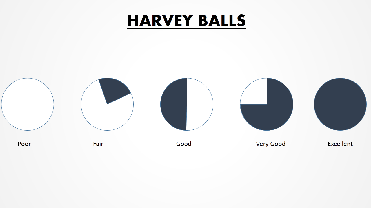
Harvey Balls are small pie charts or ideograms used to visualize qualitative information. Basically, they are small circles filled with color used in comparison tables to rate multiple competitors on certain parameters.
Why Harvey Balls? Quantitative information has always been very easy to visually communicate. Be it graphs, doughnuts and pie charts, speedometers, or other types of data visualization, large amount of numbers can easily be packaged into one column chart or a line graph. But how do you visualize qualitative information such as “ease of use”, “efficiency”, “safety”, “taste” or “quality”. That’s where harvey balls templates come in.
Who Harvey Balls? To a layman, the first question that comes in mind is “harvey balls who?” Well, harvey balls was invented by a consultant named Harvey Poppel in 1970s. While working with Booz Allen Hamilton consultancy, Harvey Poppel began to draw these for managing internal projects. Their simplicity and ease of understanding soon made it popular among other consultants and very soon, the entire field of consultancy began to employ these little circles. Because of the name of the consultancy firm where they first started being used, they are also known as Booz Balls.
The popularity of Harvey Balls has grown beyond consultancy with other industries using them as well.
Harvey Balls Use Cases in Different Industries
Many are unaware of the ways Harvey Balls can be used in their presentations. Here are some examples of businesses and brands using harvey balls in their respective industry:
Vendor Comparison
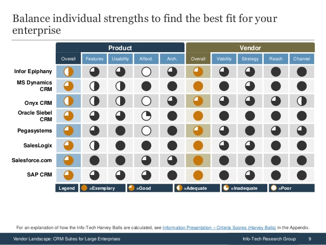
Comparison of any competitors with respect to certain qualitative parameters is best done with these small pie charts. Here is how Info-Tech Research Group analyzes CRM vendors with respect to their features, usability, affordability, architecture, and so on:
Use the above Harvey Balls Template for Comparison
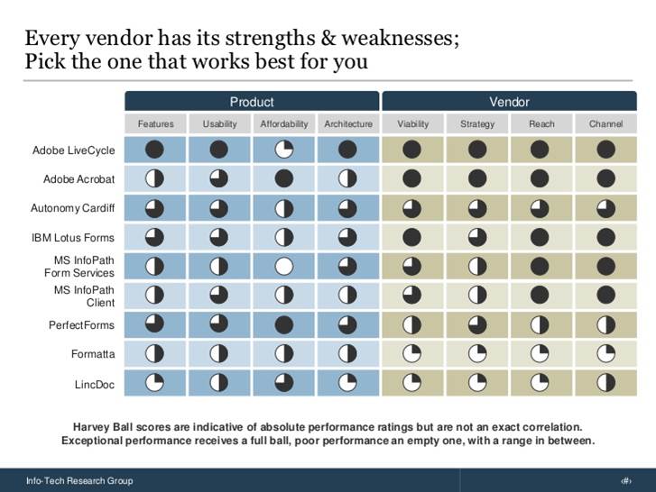
Five types of harvey balls have been used in the above table:
- Full circle signifies exemplary
- Three quarters circle signifies good
- Half circle signifies adequate
- Quarter circle represents inadequate
- Empty circle represents poor performance
Most companies limit themselves to these five variations. If you have exact percentages, you can have more variations. You would, however, need data-driven harvey ball templates. That’s why we have taken the extra pain of making each harvey ball excel-linked for you so that you can right click on the harvey ball chart, click “Edit Data” which will open the spreadsheet and make changes to the chart as per your needs.
Whenever you need to choose a vendor or third party service provider, it is a good practice to compare them over all relevant parameters and employ this easy to follow visual tool.
The research group employs harvey balls templates while assessing vendor landscape for Business Process Management (BPM) suites, small enterprise CRM software, Agile ALM (Application Life Management) tools, and so on. Here is an analysis of e-Forms solutions in the market by the same research group:
Use this Comparison Harvey Balls PPT Template
Technology Industry
Be it any industry, wherever you need to compare platforms or competitors with respect to their features, harvey balls will be a perfect data visualization tool.
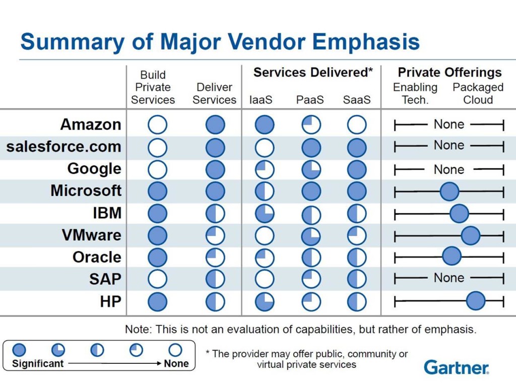
For instance, Forbes presented a graphic by Gartner that evaluates cloud vendors on the Infrastructure-as-a-Service (IaaS), Platform-as-a-Service (PaaS) and Software-as-a-Service (SaaS) structure as well as other parameters. Here is the performance of cloud vendors:
Source: Forbes
Use this Harvey Balls PowerPoint Template
All the examples we are showing here are simply to give you ideas how to visualize your data with help of harvey balls slides.
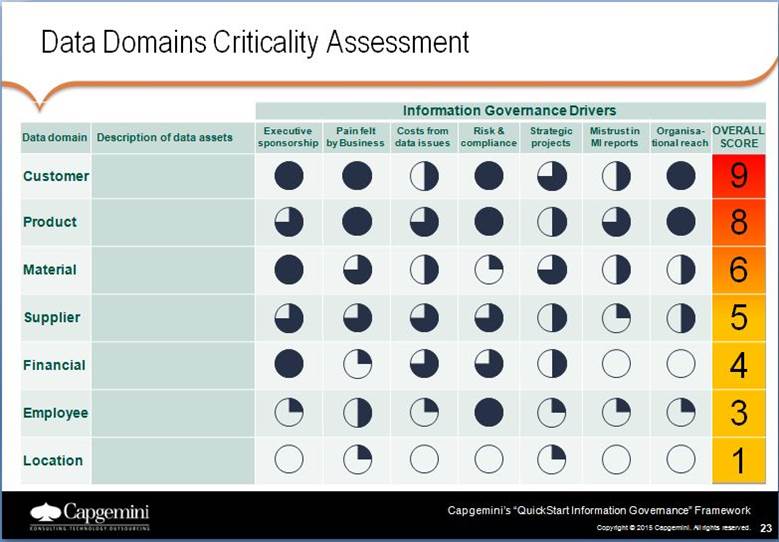
Let us check another example of harvey balls usage. This time it is Capgemini who employ harvey balls to analyze which data domains should be brought in the scope of an information governance program. They suggest organizations to measure each data domain against seven parameters and then give a rating to each domain from 1 to 10. The most critical data domains, say Capgemini, should then be included in your information governance program.
Use this Presentation Template for Assessment
Healthcare Industry
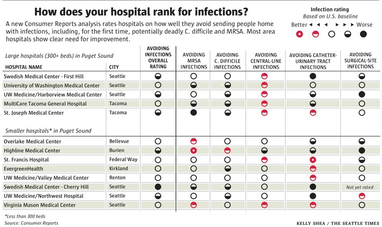
As we said before, where ratings come into play, so do harvey balls. The Seattle Times sums up the infection rating of large and small hospitals using harvey balls ranging from better to worse. The best part of their visualization is the use of two colors - red and black where red denotes good rating and bad denotes need for improvement. Readers can know at a glance that most hospitals are in need for improvement without having to analyze how full the circles are! We can use that in our presentations too.
Use this Harvey Balls for PowerPoint Presentation
Consumer Reports- Automotive Industry
Apart from consultancies that have made harvey balls a favorite visual tool, Consumer Reports are widely leveraging this simple diagram too. The above graphic by the Seattle Times had also covered findings by Consumer Reports.
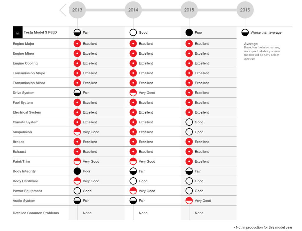
Consumer Reports is a nonprofit organization that reviews more than 5000 products every year. A very popular field of research by this organization is that of cars. Car reviews are widely read and followed by media and people. Here is a graphic by Consumer Reports reviewing the models of one car using harvey balls. The use of two colors - red and black simplify reading and understanding data.
Download this Product Review PowerPoint Template
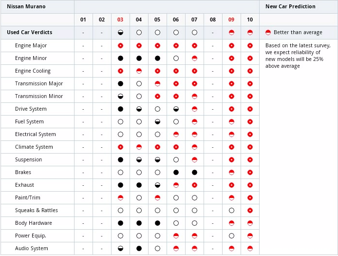
Here is another car review predicting the reliability of new car model based on the performance of the last models. Harvey balls can thus help in not just reviewing survey results but also drawing inferences from the data. A quick look at the circles reveals the trend up till now and helps make predictions based on the trend.
Source: Nissan Murano
Download this Car Review Template with Harvey Balls
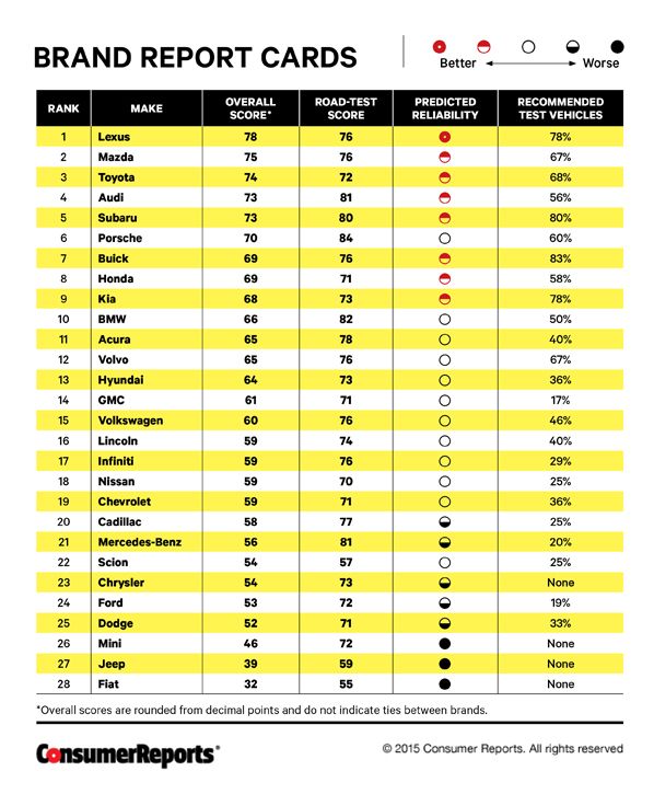
Harvey balls or booz balls can help marketers and analysers prepare effective brand report cards as you can see in the example below:
Use this Brand Report PowerPoint Template
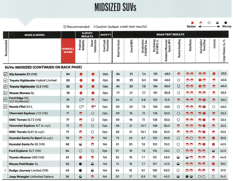
Harvey balls can also supplement your data. Things such as overall satisfaction, experience of the ride in a new car, noise level while driving, seat comfort front and back, controls in the vehicle, etc. require consumers to rate their subjective experience, hence qualitative data and representation with harvey balls. Here is a roundup of midsized SUVs using various quantitative and qualitative inputs:
Source: All Things Kia
Use this Product Review Presentation Template
Project Management
Track the progress of your projects and the percentage completion of different activities using harvey balls PPT template. Is the project running on schedule? Are resources optimum for each project? The harvey balls in the below template are excel-linked so that you can specify the exact percentage and customize the balls as per your project updates.
Download this Harvey Balls PPT Slide
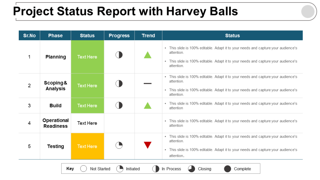
Here is a project status report slide using various data tools such as stop light colors, harvey balls, and upward and downward arrows for trends. As we said before, you can supplement your reports and tables with harvey balls to visualize progress and performance:
Download this Project Status Report Template
Lean Management
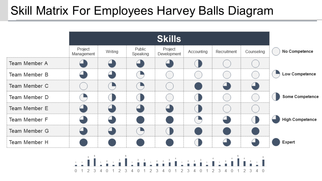
Harvey Balls are now being used in lean manufacturing presentations too for value stream mapping. One such example is its use in skills matrix of employees. Documenting information can be a tedious, time-consuming task but with these visual harvey balls templates, communicating can become such a simple task.
Download Skill Matrix Template Harvey Balls Design
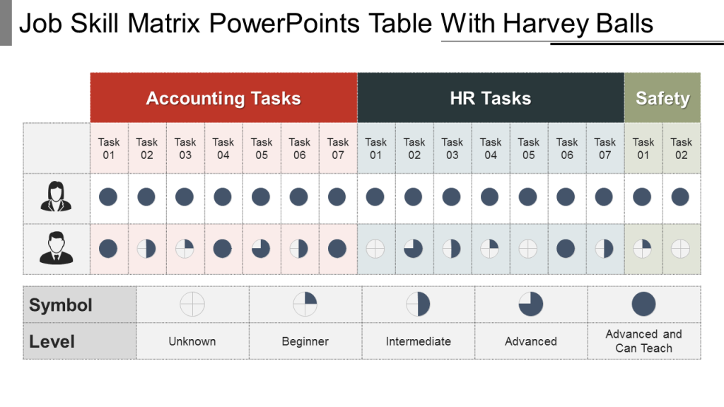
Here is another job skills matrix template that can be availed by human resource professionals to document the current skill set of their employees:
Download Job Skill Matrix Harvey Balls Table
Consulting Presentations
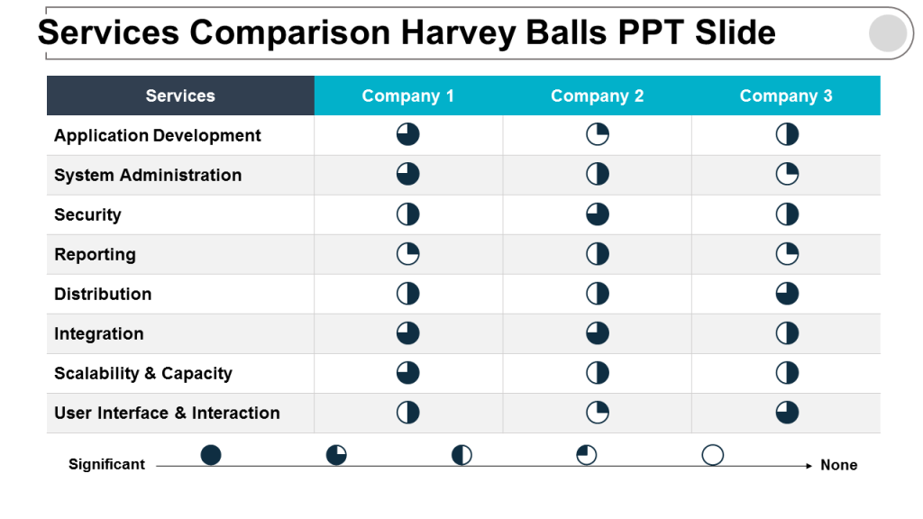
Ever since Harvey Poppel started using these circles to convey qualitative information, harvey balls became a consulting tool. It is very easy to understand at a quick glance that full moon circle represents excellent, three quarters full is good, half moon is average, quarter full is below average and empty circle as poor performance.
Download this Service Comparison Harvey Balls Template
How to Design Harvey Ball Template in PowerPoint:
We already wrote a blog on how to design harvey balls in just a minute.
There are 2 ways to design harvey balls, the first we had shared in our previous blog.
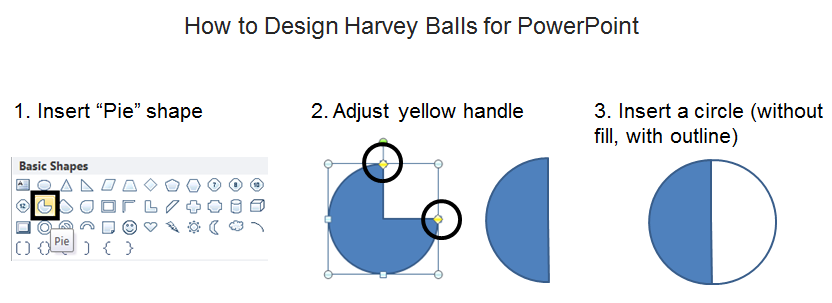
Harvey Balls Design Method #1- Insert Pie Shape
Go to the Insert tab on the PowerPoint ribbon, head over to the Shapes menu and choose the PIE shape. Move any of the two yellow handles to manually adjust the amount of fill you need (see the screenshot below). To complete the harvey balls shape, add a circle of the same size, remove its fill color but retain the outline. This will give you the harvey balls outline and complete your shape.
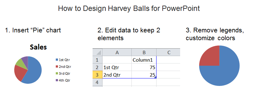
Harvey Balls Design Method #2- Insert Pie Chart
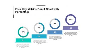
The second way to design harvey balls is to insert Pie Chart in PowerPoint. Go to the Insert tab, head over to the Charts and select the Pie chart option. By default, a pie chart with four values will open on your screen. Remove two elements to have just two values in your chart. Keep the data 75:25, 50:50 or 25:75 depending on the harvey ball variation you need.
You can change the colors in the chart as per your preferences. Right click on the chart area and click “Format Data Series” to customize fill and outline. For a blank harvey ball, you need not insert a pie chart. Simply insert a circle, remove its fill and adjust the thickness of the outline.
That’s it. Your harvey balls PowerPoint tutorial is complete. You have also seen how different industries are using these ideograms in their fields. For any qualitative data such as efficiency, taste or superiority or any other, go for harvey balls templates. They are easy to make, easy for the audience to understand and retain. Let’s thank Harvey Poppel for this invention!


![How to Use Harvey Balls in PowerPoint [Harvey Balls Templates Included]](https://www.slideteam.net/wp/wp-content/uploads/2018/10/Harvey-Balls-Templates-for-PowerPoint-1001x436.png)

 Customer Reviews

