


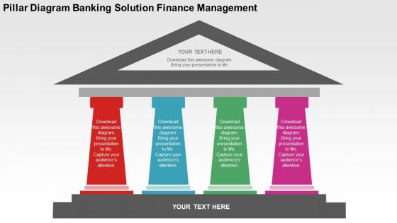
Pillar diagram banking solution finance management flat powerpoint design




Try Before you Buy Download Free Sample Product
 Impress Your
 Audience
 100%
100% Editable
 Save Hours
 of Time


Introducing our pillar design banking solution finance management flat PPT template which has been crafted by our experts after carefully analysing the vitality of finance management and its effective representation in order to attain business targets and objectives. Also, for occasions when your enterprise requires customised solutions to manage your monetary transactions these slides can be extremely helpful by providing accurate and precise information. Apart from this, these informative presentation templates are favourable not only to the organisations but also to the investors, clients, relationship managers, bankers, customers and much more. Moreover, the colourful pillars contain all the information that needs to be delivered to the viewers and the triangle on top and the base of pillars can be utilised to insert titles, subtitles or headings. All these patterns and colours are completely editable and the user can mould them in his required form. Hence, never go wrong with these truly amazing PPT illustrations. Nip it in the bud with our Pillar Diagram Banking Solution Finance Management Flat Powerpoint Design. Call a halt to any deception.
People who downloaded this PowerPoint presentation also viewed the following :
Pillar diagram banking solution finance management flat powerpoint design with all 4 slides:
Avoid having to pull your hair with our Pillar Diagram Banking Solution Finance Management Flat Powerpoint Design. Depend on them for fast action.

FAQs for Pillar diagram banking solution finance management
So basically you've got your data foundation at the bottom - customer info, transactions, all that stuff. Then your core banking systems sit on top of that. Above those you'll find business logic and risk management layers. Mobile apps and web portals live at the very top where customers actually interact. Every bank does this slightly different though, especially if they're dealing with older legacy systems (which, let's be honest, most are). Best way to review the whole thing? Start at the bottom and follow how data moves up through each layer. You'll catch integration problems way faster that way.
So basically pillar diagrams take your messy banking processes and organize them into clean vertical columns - one for each major function like risk assessment or compliance. You can finally see how departments actually talk to each other instead of just guessing. Honestly, it's a game changer for those painful status meetings where nobody knows what's happening. Short sentences work here. The visual setup makes bottlenecks super obvious, plus you'll catch redundancies that traditional flowcharts totally miss. Start with your worst process first - trust me, you'll spot the problem areas right away.
Honestly, pillar diagrams are a game changer for getting everyone to actually understand what you're talking about. Banking processes are messy - risk, compliance, operations all tangled up together. These diagrams let you map it out visually so your tech people and business folks can finally stop talking past each other. I swear they've saved me from so many pointless email chains about system changes. Next stakeholder meeting, throw one up on the screen. You'll see how much faster things move when people can actually see how everything connects instead of just... talking in circles about it.
Honestly, pillar diagrams are a game changer for getting everyone on the same page. Visual clarity is huge - way better than those dense strategy docs nobody wants to read. You'll see better resource allocation decisions and can actually track progress without losing your mind. Board presentations become so much easier too. The visual format helps you spot gaps between initiatives that you'd totally miss otherwise. I always tell people to start with maybe 3-5 pillars max. More than that and it gets messy fast. Plus stakeholders can actually understand what you're trying to do instead of just nodding along pretending they get it.
So basically, grab pillar diagrams and make columns for your big compliance stuff - Basel III capital requirements, AML protocols, stress testing, whatever. Way better than those nightmare spreadsheets nobody wants to touch. Each pillar shows the actual regulations, how to implement them, plus monitoring processes. The visual thing really helps you catch gaps between requirements and see how they all connect. Oh and start with your three main pillars first, then add the smaller pieces underneath. Trust me, it'll save you tons of headaches later when auditors show up asking questions.
So pillar diagrams are basically visual breakdowns of your bank's capital requirements across those three Basel pillars - minimum capital, supervisory review, and market discipline. They show how your capital gets allocated between credit, operational, and market risk, which honestly makes everything way clearer than spreadsheets. Great for spotting where you're running thin on capital buffers. I'd definitely bring these to your quarterly risk meetings - they make it super easy to explain capital adequacy to the board and track compliance over time. Plus you can see trends at a glance instead of digging through reports.
So basically you'd map out pillars for each major area - customer experience, data analytics, cloud stuff, compliance, whatever your main focus areas are. Each pillar shows where you are now vs where you want to be. Honestly, execs eat this visual stuff up. The cool thing is you can spot which initiatives depend on each other and figure out what to tackle first. I'd probably start with whatever customer-facing processes are most broken and then trace back to see which tech pillars need work. Makes the whole transformation feel less overwhelming when you break it down like that.
So for your banking solution pillar diagram, first figure out your main architectural areas - usually customer experience, security, compliance, data management, and integration stuff. Don't let them overlap too much or you'll confuse everyone down the road. I'd stick to 4-6 pillars tops because nobody wants to stare at a cluttered mess. Put 2-3 key capabilities under each one with clear labels. Oh, and definitely run this by both your tech people and business teams first - you don't want to build something pretty that misses the actual priorities. Trust me on that one.
So pillar diagrams basically let you see your whole customer experience laid out visually - all touchpoints, services, everything. It's like getting that overview you never had before. You'll spot gaps pretty quickly, plus see which services work well together versus the ones just hanging out alone. Honestly, it makes designing smoother customer journeys way less of a headache. The cool part is finding where you can bundle stuff or cut out those annoying friction points customers hit. Oh, and don't try to map everything at once - start with your top 3 customer segments first.
Dude, pillar diagrams are seriously useful for breaking down your bank's capital adequacy - they show minimum capital requirements, supervisory review, and market discipline all in one view. Quick way to see where you're solid vs. where things might get sketchy. Board meetings become way less painful when you can actually visualize the data instead of drowning people in spreadsheets. Your risk committee will love how easy it is to spot trends in capital ratios and communicate Basel III stuff to people who don't deal with this regulatory maze daily. Honestly, start throwing these into your quarterly reviews - makes stress testing way clearer too.
So pillar diagrams stack your banking functions vertically, then connect them with lines or arrows. Think customer onboarding → account management → lending/payments/investment stuff. It's like a visual map showing how everything connects - honestly saves you so much headache when systems start breaking each other. Color-code each pillar by business function and use different line styles for data flow vs process dependencies. Map your core services first, then add the connections. Pro tip: when one system goes down and suddenly three others are broken, this diagram will be your best friend.
Hey! Most teams I know use **Visio** or **Lucidchart** for basic pillar diagrams - both work well for mapping regulatory capital structures. **PowerBI** and **Tableau** are where it's at when you need live data from risk systems. **Draw.io** is free and does the job, though it gets messy with complex Basel stuff. Honestly, the bigger banks often go custom with **Python/R scripts** or specialized tools like **Moody's RiskCalc** for real-time reporting. I'd probably start with Lucidchart - way more user-friendly than Visio and handles most compliance visualization without making you want to throw your laptop.
So these diagrams basically map out what your bank does well versus where you're weak. Super helpful for spotting market gaps that actually make sense for you to go after - instead of chasing random opportunities that don't fit. I always tell people to look at the strong pillars first, then figure out what adjacent spaces you could realistically win in. Honestly, most banks skip this step and wonder why their new products flop. Update it every few months though, and definitely check it against what customers are actually saying. Otherwise you're just guessing.
So pillar diagrams are clutch for banking stuff when you need to compare different business units or risk buckets side by side. Way better than pie charts honestly - those get messy fast with multiple data points. Perfect for showing capital allocation across divisions or which risk areas need attention. Board meetings love them because executives can spot underperforming segments instantly. The visual hierarchy just makes sense, you know? I always forget how much clearer they are than cramming everything into spreadsheet tables. Next presentation, definitely go with pillars over traditional charts.
Honestly, pillar diagrams are a game-changer for training new banking people. You can show them how compliance, risk stuff, and customer service all fit together instead of making them read through boring manuals. Training time gets cut in half - I've watched it happen. New hires actually get why each step matters, not just what to do. The visual thing really works because banking processes are so interconnected (kind of like dominoes falling, you know?). Just map out your main workflows as pillars first. Your trainees will remember way more than if you'd just lectured them.
-
Design layout is very impressive.
-
Awesome use of colors and designs in product templates.