


Process Flowchart For Online Banking System Digital Banking System To Optimize Financial




Try Before you Buy Download Free Sample Product
 Impress Your
 Audience
 100%
100% Editable
 Save Hours
 of Time


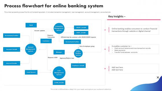
This slide represents process flow for online banking system. It includes transaction management, loan management, account management, accountant etc.
People who downloaded this PowerPoint presentation also viewed the following :
Process Flowchart For Online Banking System Digital Banking System To Optimize Financial with all 6 slides:
Use our Process Flowchart For Online Banking System Digital Banking System To Optimize Financial to effectively help you save your valuable time. They are readymade to fit into any presentation structure.





FAQs for Process Flowchart For Online Banking System Digital Banking System
Start with the obvious stuff - login verification, account selection, then your main transactions like transfers and balance checks. Security checkpoints need to be everywhere, honestly can't stress that enough. Map out the happy path first, that's way easier. Then add all the messy scenarios - failed logins, insufficient funds, timeouts, whatever could go wrong. Confirmation screens are clutch too. Oh and seriously don't forget logout functionality - I see people skip that in flowcharts all the time but it's actually critical for security. You'll want error handling paths for basically everything that could break.
Dude, flowcharts are honestly a game-changer for banking stuff. They turn all those confusing processes into simple visual guides that actually make sense. Like, instead of reading walls of text about loan applications, people can just see exactly where they are and what's coming next. Your customers won't be stressed about missing documents or wondering if they're approved yet. And bonus - your support team won't get bombarded with "what happens now?" calls all day (trust me, they'll love you for this). I'd start with whatever three processes people ask about most. Way easier than you'd think.
UX is huge for banking flowcharts - honestly, it's the difference between customers finishing what they need vs calling your support line annoyed. Map everything from their view and spot where confusion happens. Too many flows get built by tech people who forgot regular folks will actually use this stuff! Keep clicks low, show progress clearly, and make error recovery simple. Oh and definitely test with real users first - they'll catch stuff you'd never think of. Short flows win over complicated ones every time.
Start with the basics people actually use - login stuff, checking balances, transaction history, transfers between your own accounts. Bill pay and mobile check deposit are must-haves too. Oh, and password resets! Those things get hit constantly, way more than you'd think. Don't skip the error scenarios either - like when someone tries to transfer money they don't have or keeps typing the wrong password. External transfers and loan payments should definitely be in there. Account alerts too since everyone expects those now. You can always add the fancy features later, but nail these core flows first.
So I'd throw in diamond-shaped security checkpoints throughout - stuff like authentication, fraud detection, session timeouts. Make them mandatory gates before users can move forward. Color-coding helps tons (I always go red/orange because honestly, subtlety is overrated here). Background monitoring should run parallel to user actions too. When security fails? Map out those error paths - they're just as important as the happy path. Oh, and don't make security look tacked on afterward. Integrate it from the start so it flows naturally with everything else.
Don't go crazy with complexity - too many branches and you'll confuse everyone. Start with the main user paths, then add the messy stuff later. Security checkpoints are huge for banking flows, obviously. What really gets me though is how people totally ignore error handling. Like, what happens when their card gets declined? That's where users actually bail out. Test each step with real data if you can swing it. Oh, and make sure there's a clear start and finish - sounds basic but you'd be surprised how many flows just... end nowhere.
So basically you want conditional branches in your flowchart - like those choose-your-own-adventure books we had as kids. Different personas get routed based on their needs. Business users might hit an extra verification step, personal users go straight to dashboard. I always color-code the paths because honestly, it gets messy fast without it. The trick is figuring out early where your personas actually diverge - that's where you build the splits. Map out each persona's unique stuff first, then see where they overlap. Way easier than trying to force everyone through the same funnel.
Honestly, Lucidchart is probably your safest bet for banking flowcharts - it's got those industry templates and handles all the crazy decision trees. Visio's solid too if you're already in the Microsoft ecosystem. Draw.io is free which finance will love, and it actually works pretty well. Miro's awesome for when you need to brainstorm with the whole team on user flows. One thing though - definitely check with compliance first about which tools they're cool with. Getting new software approved through security can take forever and it's such a pain. I'd lean toward Lucidchart since it plays nice with most doc systems.
So compliance basically forces you to jam checkpoints everywhere in your banking flowchart. Identity verification, transaction monitoring, audit trails - the works. Honestly makes simple stuff look like a mess sometimes, but whatever. Map out your KYC requirements, AML checks, and data protection as decision points users can't skip. Don't just show the happy path either - show exactly where compliance kicks in. I'd start by listing your specific regulatory requirements first, then build the user journey around those constraints. It's annoying but necessary.
Stick with standard shapes - rectangles for processes, diamonds for decisions, circles for start/end. Color coding helps a ton! Green for good paths, red for errors. Make your text short but clear. White space is your friend - nobody wants to read a cramped mess. I swear, some people create flowcharts that look like they exploded. Keep arrows consistent and flow obvious, either left-to-right or top-down. Oh, and definitely test it on someone fresh. They'll spot the confusing bits you missed.
Don't make customer support a totally separate thing - weave it right into your main banking flows instead. Drop in those diamond decision nodes at the spots where people actually get stuck, like after login fails or when transactions go wrong. I always put "Need help?" options right after error states since that's when users are most frustrated anyway. Branch off to your support channels from there, but here's the key part - show clear paths back to wherever they were originally trying to go. Otherwise you're just creating dead ends, which honestly defeats the whole purpose.
Track completion rates and where people bail out - that's your goldmine right there. Time-to-completion matters too, obviously. I'd be watching drop-off rates like a hawk since those show you exactly where things go sideways. Customer satisfaction scores help, plus how many support tickets you're getting. Don't forget task success rates and error frequency - tells you if people can actually do what they need without losing their minds. Oh, and mobile vs desktop performance is huge for banking stuff since it behaves weird across devices sometimes. Set up analytics first, then A/B test whatever changes you make.
Get feedback from surveys and usability tests - that's where you'll spot the real problems. Support tickets are gold too. Look for places where people bail out or get lost. Those are your trouble spots. Honestly, most flowcharts I've seen try to be way too clever and assume users know stuff they don't. Break things down smaller. Use simpler words. Maybe add some visual hints? Also, what you think happens vs. what actually happens - totally different things half the time. Set up some kind of regular check-in process so you're not just guessing what works.
Mobile flowcharts need to go vertical since people scroll that way naturally. You can't cram complex decision trees on tiny screens - it gets messy fast. Desktop gives you way more room to spread things out horizontally and show detailed steps side by side. Plus mobile users usually just want quick stuff like checking balances, while desktop is where people do the heavy lifting like setting up bill pay. Honestly, some banks still mess this up and it's annoying. Keep your mobile flows simple and focus on what people actually do most. Shallow decision trees are your friend here.
Dude, that flowchart is basically your lifesaver when everything breaks. You can follow the steps and pinpoint exactly where stuff went wrong - authentication failure? Server timeout? Payment gateway being weird? Way better than randomly scrolling through endless logs (which honestly makes my eyes bleed). It shows you what *should've* happened vs what actually did. Super helpful for explaining problems to customers too without sounding like a robot. I always keep mine open during those chaotic incident calls.
-
Loved the collection. Editing the presentation was seamless with their templates.
-
Unique and attractive product design.