

Product Usage Powerpoint Presentation Slides




Try Before you Buy Download Free Sample Product
 Impress Your
 Audience
 100%
100% Editable
 Save Hours
 of Time


Educate your sales team about the product before making a sale using content-ready Product Usage PowerPoint Presentation Slides. Ensure sales team has enough knowledge about the product to create a positive impact on the customers. Get access to this professionally designed product usage PPT presentation templates to guide sales reps’ step by step. Train your employees about in and out of organization’s products and services to provide world class customer experience. Grab this professionally designed deck because it covers all the major aspects of the training such as training process, training timeline, about the product, product list, product rating, product roadmap, product comparison, product pricing, sales by region, competitor analysis, training evaluation, and more. Use product training PowerPoint presentation slideshow and help your sales team their products with confidence. Deliver high quality services and ensure customer satisfaction if sales team meet the expectations of the customers. Download product usage PPT presentation designs to educate your team about the product. Give enough knowledge about the product using product usage training PowerPoint presentation. Analyze the apparently absurd with our Product Usage Powerpoint Presentation Slides. Figure what what it could indicate.
People who downloaded this PowerPoint presentation also viewed the following :
Content of this Powerpoint Presentation
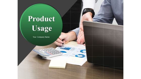
Slide 1: This slide showcases Product Usage. State Your Company Name and proceed.
Slide 2: This slide presents Product Training Outline with these points you can consider- Training Process, Training Timeline, About The Product, Product List, Product Rating, Product Roadmap, Training Evaluation, Competitive Advantage, Product Pricing, Competitor Analysis, Product Comparison, Sales By Region.
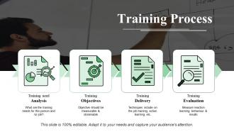
Slide 3: This slide shows Training Process with these four processes you may consider- Training need Analysis, Training Objectives, Training Delivery, Training Evaluation, Measure reaction learning, behaviour & results.
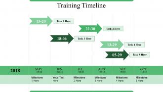
Slide 4: This slide showcases Training Timeline with the steps you can consider.
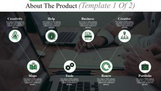
Slide 5: This slide presents About The Product (Template 1 Of 2) these following steps- Maps, Tools, Renew, Portfolio, Business, Help, Creative, Creativity.
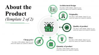
Slide 6: This slide shows About the Product (Template 2 of 2) with these stages- Cheap price, Architectural design, Originality, Quality of product, Ideas, Quantity of product.
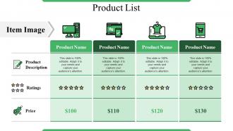
Slide 7: This slide presents Product List with these parameters- Product Description, Ratings, Price, Item Image.
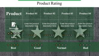
Slide 8: This slide showcases Product Rating with these options- Best, Good, Normal, Bad.
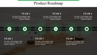
Slide 9: This slide presents Product Roadmap. You can add the data in this and use it accordingly.
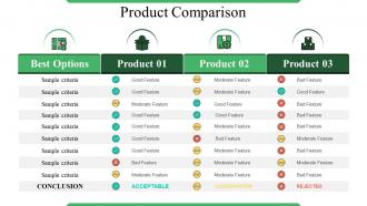
Slide 10: This slide Product Comparison with the product description and features.
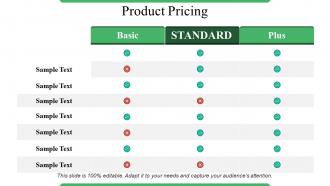
Slide 11: This slide presents Product Pricing with these three categories- Basic, STANDARD, Plus.
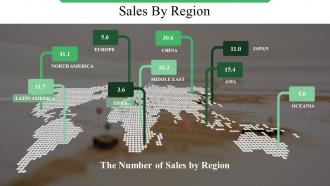
Slide 12: This slide presents Sales By Region. You can add the information and use it.
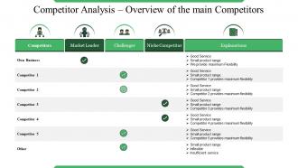
Slide 13: This slide presents Competitor Analysis – Overview of the main Competitors with these categories- Competitors, Market Leader, Challenger, Niche Competitor, Explanations.
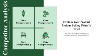
Slide 14: This slide Competitor Analysis.Explain Your Product Unique Selling Point In Brief.
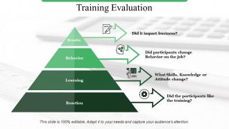
Slide 15: This slide presents Training Evaluation with these four categories- Results, Behavior, Learning, Reaction.
Slide 16: This slide shows Coffee Break image.
Slide 17: This slide displays the title Charts & Graphs.
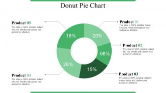
Slide 18: This slide shows Donut Pie Chart. Analyse the product comparison.
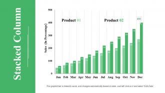
Slide 19: This slide shows a Stacked Line graph in terms of percentage and years for comparison of Product 01, Product 02, Product 03 etc.
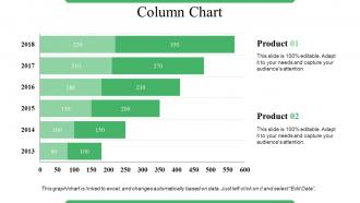
Slide 20: This slide presents Column Chart. Add your data and make use of it.
Slide 21: This slide is titled Additional Slides.
Slide 22: This slide represents Our Mission. State your mission, goals etc.
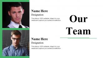
Slide 23: This slide showcases Our Team with Name and Designation to fill.
Slide 24: This slide helps show- About Our Company. The sub headings include- Creative Design, Customer Care, Expand Company
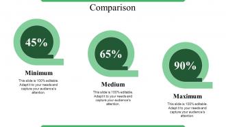
Slide 25: This slide shows Comparison of number of users and Time.
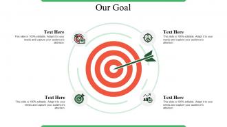
Slide 26: This slide shows Our Goals for your company.
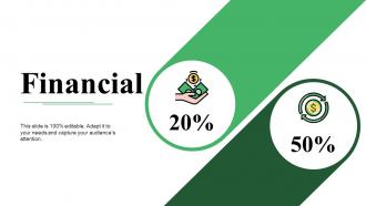
Slide 27: State your Financial score in this slide with relevant imagery and text.
Slide 28: This is a Quotes slide to convey message, beliefs etc.
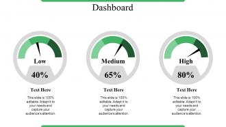
Slide 29: This is a Dashboard slide to show- Strategic System, Success, Goal Process, Sales Review, Communication Study.
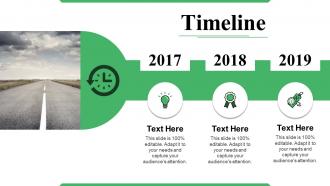
Slide 30: This is a Timelines slide to show- Plan, Budget, Schedule, Review.
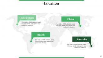
Slide 31: This is a Location slide to show global growth,presence etc. on world map.
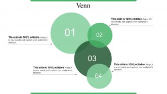
Slide 32: This slide displays a Venn diagram image.
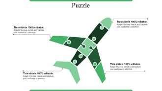
Slide 33: This is a Puzzle slide with the following subheadings- PPC Advertising, Media Marketing, Print Marketing, E-mail Campaigns.
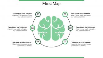
Slide 34: This slide shows a Mind map for representing entities.
Slide 35: This is a Magnifying glass image slide to show information, scoping aspects etc.
Slide 36: This is a Thank You slide for acknowledgement.
Product Usage Powerpoint Presentation Slides with all 36 slides:
Ensure everything happens by the book with our Product Usage Powerpoint Presentation Slides. Be able to institute checks and balances.





FAQs for Product Usage
Honestly, go for something super clean and minimal - your data needs to be the focus, not some flashy design. Get one with tons of slide options (charts, timelines, all that stuff) and make sure the colors/fonts look professional. Oh, and here's something I learned the hard way: test it on a projector first because some colors just disappear under those awful conference room lights. Skip anything too trendy unless you're pitching to like, a design agency or something. You don't want to be halfway through presenting and suddenly hate how it looks.
Look, templates are basically about setting the right vibe for your story. Product launch? Go clean and modern - something that builds hype as people scroll through. Case studies need more structure though, like problem → solution → results. Here's the thing most people miss: your visual choices actually control how audiences think. Bright colors and bold fonts scream "act now!" while minimal designs feel premium and trustworthy. I always tell people to pick based on the emotional journey you want, not just what catches your eye first. Pretty slides don't mean much if they're sending the wrong message, you know?
Your template needs three things: visuals that pop right away, headlines that actually tell the story, and context around your numbers - like what they actually mean. Most templates are honestly a mess with way too much stuff crammed in. Add benchmarks so people can tell if you're doing well or terrible. Include an insights section that breaks down what this means for the business, not just raw data. Oh, and always finish with what to do next. Don't just throw numbers at people and expect them to magically know the next steps.
Colors totally make or break how people see your presentation. Reds and oranges pump up energy but blues and greens feel way more trustworthy. Dark backgrounds look super sleek but honestly, they're murder on the eyes in bright conference rooms - trust me on that one. You want high contrast so text actually shows up. Finance people expect boring blues (sorry finance bros) while creative teams can get away with wilder stuff. Oh, and definitely test it on the actual screen first. Nothing worse than colors that look great on your laptop but terrible projected.
Dude, typography can make or break your presentation. Bad fonts are like nails on a chalkboard - nobody's listening if they can't read your slides. Stick to 2 fonts max and make them big enough so people in the back aren't squinting. Dark text on light backgrounds works best. Here's the thing though - spacing is weirdly important too. Cramped text looks messy and overwhelming. Use font size to show what matters most. Your title should be way bigger than your bullet points, obviously. Oh, and test your slides from across the room first! I learned that one the hard way when half my audience couldn't read anything past row three.
Honestly, start with the colors and logo - that's like 80% of making it look legit. Go into master slide view and swap out their color scheme for your brand palette. The logo swap is pretty straightforward too. Then update the fonts to match what you normally use. Stock photos are usually terrible anyway, so definitely replace those with something that actually fits your company's style. Font changes can be a bit tedious depending on the template, but whatever. Once you get the colors dialed in, everything else just clicks into place. Work through the content slides last.
Oh god, the biggest thing is people just dump paragraphs of text on every slide. Like, it's not a novel! Also don't leave everything looking like the default template - super obvious and kinda lazy tbh. I see this all the time where someone picks a random template then tries to shove their content into layouts that make zero sense. Pick something that actually fits your topic first. Then - and this is crucial - cut your text down to just the main points. Nobody wants to read an essay while you're talking anyway.
Honestly, polls and clickable stuff are game-changers for presentations. People actually pay attention instead of scrolling Instagram under the table. I've seen it work - way more engagement when they can vote on something or click through scenarios. Static slides just put everyone to sleep these days. Q&A gets so much better too since people are already mentally checked in. Don't go overboard though - maybe start with a quick poll or some clickable case studies. Two interactive things max until you get the hang of it.
Always use the same master template as your starting point - don't mess with fonts or colors on individual slides. Trust me, I've watched people create absolute disasters that way lol. Way better to make changes in the master template so everything updates automatically. Short sentences work great for this stuff. Write up a quick style guide with your fonts, color codes, and basic layout rules too. Share it with your team so everyone's on the same page. Your presentations will actually look professional instead of... well, like different people made every slide.
Templates seriously save your team so much headache. Everyone starts with the same fonts and layout, so you won't get stuck in those annoying "wait, why does your slide look totally different?" meetings. Dividing up work becomes way easier too when everyone knows the format ahead of time. Honestly, the best part is during reviews - people actually focus on your content instead of getting distracted by weird formatting issues. I learned this the hard way after too many messy group projects. Get a good template library going and your whole presentation process will be like 10x smoother.
Honestly, templates are a lifesaver when you're in a rush. They give you that polished look without spending hours obsessing over fonts and colors - which I'm definitely guilty of doing sometimes. All the design stuff is already figured out, following rules I probably don't even know exist. Sure, you can't go completely wild with creativity, but you can still swap out colors and images to fit your style. I'd say find one that feels right, then just mess around with it until it actually looks like yours. Way better than starting from scratch.
Oh nice question! So there's this filter dropdown in the main gallery that lets you sort by industry - healthcare, finance, education, all that stuff. The search bar actually works really well if you just type your job or field. They have tons of stuff, like construction plans to marketing templates. Your account settings trigger this "popular in your industry" section too, which is handy. Honestly though? Don't get too picky - I've used templates from totally different industries and just tweaked them a bit. Sometimes those work even better than the "perfect" match.
Honestly, go super minimal with tons of white space - that's what looks fresh right now. Big, bold fonts are everywhere (finally ditching those messy templates with like 50 random elements). Dark mode is basically expected at this point. Also focus on accessibility stuff - high contrast colors, clear layout hierarchy. If people are viewing it digitally, throw in some interactive bits like embedded videos or clickable sections. That always looks polished. Just pick something that feels modern but won't scream "2024" in a bad way later, you know?
Honestly, animations are a game changer for presentations. They keep people awake and actually paying attention instead of zoning out. You can guide where people look by having text fade in or graphics slide into place - way better than dumping everything on screen at once. Makes complex stuff easier to digest too. I learned this the hard way after watching too many colleagues click through static slides while everyone checked their phones. Just don't get crazy with spinning text or whatever - simple transitions work best. Start with basic fade-ins and see how it goes.
So there's actually tons of help available once you grab a template. Start with the quick-start guide first - it's way less overwhelming than jumping straight into everything else. The video tutorials are solid for the more complex features, and honestly the community forum has saved me multiple times when I'm completely stuck. Oh, and check out the "best practices" section in the template library - they show real examples of how people tweaked similar ones. Pretty helpful stuff. If you need advanced customization later, that's when I'd hit up the videos. You'll be set up in no time.
-
Content of slide is easy to understand and edit.
-
Design layout is very impressive.