

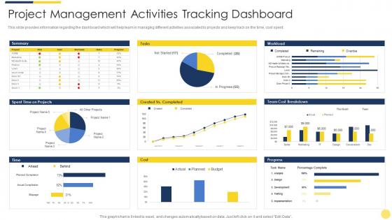
Project management activities tracking dashboard key initiatives for project safety it




Try Before you Buy Download Free Sample Product
 Impress Your
 Audience
 100%
100% Editable
 Save Hours
 of Time


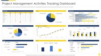
This slide provides information regarding the dashboard which will help team in managing different activities associated to projects and keep track on the time, cost spent.
People who downloaded this PowerPoint presentation also viewed the following :
Project management activities tracking dashboard key initiatives for project safety it with all 7 slides:
Use our Project Management Activities Tracking Dashboard Key Initiatives For Project Safety It to effectively help you save your valuable time. They are readymade to fit into any presentation structure.





FAQs for Project management activities tracking dashboard key initiatives for
For your safety dashboard, definitely track incident frequency and near-miss reports - those near-misses are honestly way more valuable than people think. Training completion rates matter too. Don't just look at what already happened though. Days since last incident is good for morale, plus any safety audit scores if you're doing regular checks. The trick is mixing leading indicators (like training) with lagging ones (actual incidents). Oh, and set up alerts when numbers get sketchy so you can jump on issues fast. Hazard ID trends are worth watching too.
Honestly, charts and heat maps are game-changers for safety stuff. Way better than staring at endless spreadsheets trying to figure out what's going wrong where. You'll spot problem areas instantly - like, boom, there's your hotspot. Plus your team won't zone out when you're explaining risks because visual data just clicks better. I've seen people's eyes glaze over with raw numbers, but show them a color-coded dashboard? They get it right away. Set up some automated alerts too so you're not waiting around for weekly reports when something serious pops up.
Data quality is huge here - set up automated validation and backup sources if you can. I'd go with 15-30 minute refresh intervals, that usually works well for safety stuff. Make sure your APIs have solid error handling because staring at broken charts when you need the data most is the worst. Start with your most critical safety metrics instead of cramming everything in. Oh, and definitely include timestamps and source info so people know what they're actually looking at. Nothing worse than outdated data that looks current.
So basically you get all your compliance stuff in one spot instead of digging through random spreadsheets when auditors show up. Track your incident rates, training completions, hazard assessments - whatever regulators want to see. The automated reports are honestly a lifesaver for those quarterly submissions nobody remembers until the last minute. You can set alerts before you hit non-compliance thresholds too. My advice? Map out your key regulatory requirements first, then build your dashboard metrics around those. Real-time visibility beats scrambling every time.
Dude, you HAVE to get feedback from stakeholders first. I can't stress this enough - I've watched so many dashboards crash and burn because they looked slick but showed completely useless data. Talk to everyone using it, from the guys in the field to the suits upstairs. They all need different stuff at different detail levels. Your actual users will tell you which alerts matter, how they want things visualized, what fits their workflow. Honestly, the executives might want high-level trends while field workers need real-time incident data. Do those user interviews before you build anything - trust me, it beats redesigning everything later.
So basically you dump all your safety data into this thing - near-misses, equipment logs, weather, how workers behave, whatever. The algorithms crunch through it and spit out probability scores for different accidents. It's honestly pretty wild how accurate it gets. You'll see warnings pop up for high-risk areas or when equipment's about to crap out. The system can even predict when conditions are lining up for incidents. Set up alerts so your team knows when risk levels jump. Way better than just crossing your fingers and hoping nothing goes wrong.
So you want real-time incident tracking and risk heat maps that actually show what's going wrong where. Quick filters are clutch - date, location, incident type, whatever. Visual charts beat the hell out of spreadsheets every time. I'd probably throw in trend analysis and compliance indicators too. Export options matter when your boss wants reports. Keep everything 2-3 clicks away or people won't use it. Oh, and customizable alerts that don't spam you with useless notifications. Start with whatever safety stuff your team already obsesses over, then expand from there.
Mobile compatibility is honestly a total game-changer for field teams. Your workers can report incidents and check safety protocols right from their phones instead of waiting to get back to the office. That instant access prevents so many delays and mix-ups. You'll get real-time visibility into what's happening on-site, which means way faster response times when problems come up. Teams stay connected to critical safety info even when they're out in the middle of nowhere. Oh, and start with making sure your dashboard actually works well on mobile browsers first - that's the foundation everything else builds on.
Honestly, start with automated checks - they'll catch the obvious stuff like duplicates and missing fields before it becomes a mess. Have someone do regular spot-checks too, comparing your data against the actual source docs. Standardized entry procedures are huge so everyone's not doing their own thing. Oh and definitely assign ownership - like, specific people responsible for different dashboard sections. Otherwise stuff just gets ignored and you're back to square one. The manual reviews might seem tedious but they're worth it.
Oh man, you'll love this - basically it's like a digital command center where your whole team can see safety stuff in real time. No more digging through endless email chains or wondering if the guys at Site 3 know about those new hard hat rules. Everyone's looking at the same dashboard with current incident reports, compliance numbers, all that good stuff. Honestly beats those awkward safety meetings we used to sit through. You can spot problems early, track who's actually following protocols, and set up alerts so nothing gets missed. Plus field crews get updates instantly instead of hearing about changes three weeks later.
Honestly, the two biggest headaches are messy data and getting people to actually care about your dashboard after you build it. Data's always a nightmare - different sources don't match up, people fat-finger manual entries, and don't get me started on stakeholders who hate changing how they do reports. So many dashboards just collect dust, it's ridiculous. Start with a small group first. Get them involved in designing it so they'll actually want to use it. Automate whatever data you can instead of relying on manual stuff. Most importantly though? Make sure you're fixing something they genuinely struggle with, not just building eye candy. Focus on metrics they can act on.
Use scenarios your team actually deals with - generic examples are useless. Quick sessions work better, like 30-45 minutes tops. People zone out fast in training. Start with basic navigation, then focus on the data that actually matters for your projects. Make it hands-on so they're clicking around with real dashboard data during the session. I always build in time for questions because someone's definitely gonna get stuck on something weird. Oh and definitely send them a quick reference guide afterward they can bookmark - you'll thank me later when they stop asking the same questions.
Look, historical data is your best friend here - it shows you what safety patterns actually mattered vs what you thought would matter. Pull 2-3 years of incident data first. You'll spot which metrics predicted problems, what time periods were messiest, and which project phases went sideways most often. Without this you're basically throwing darts blindfolded. The trends tell you if you need daily monitoring or just weekly rollups. Some indicators might need real-time alerts too. Find the patterns that could've helped PMs jump in earlier - that's your goldmine right there.
So a safety dashboard just puts all your incident data and near-miss stuff where everyone can actually see it. Makes safety feel less like this boring topic only management cares about. Real-time numbers are weirdly engaging – people get hooked checking the stats, honestly. Your team starts spotting patterns they'd normally miss. The visibility thing really works because people report more when they see their input actually matters and gets tracked. Oh, and location is huge. Stick it by the coffee machine or wherever people naturally gather – you'll get way more eyes on it.
Look, skipping your safety dashboard is just asking for problems. You're basically flying blind on stuff that could actually hurt people or wreck your whole project. Red flags turn into real incidents when nobody's paying attention - and trust me, nothing tanks a project faster than an accident you could've prevented. People get hurt, work stops, investigations start up, and suddenly your team thinks leadership doesn't have their back. Plus lawsuits are expensive as hell. The dashboard's useless if you're not actually doing anything with the data, so maybe set up weekly check-ins? Have someone own the follow-through when things look sketchy.
-
Excellent design and quick turnaround.
-
Unique and attractive product design.
-
Awesome use of colors and designs in product templates.