


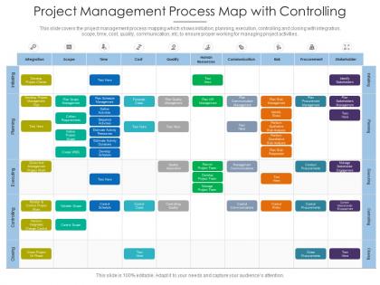
Project management process map with controlling




Try Before you Buy Download Free Sample Product
 Impress Your
 Audience
 100%
100% Editable
 Save Hours
 of Time


This slide covers the project management process mapping which shows initiation, planning, execution, controlling and closing with integration, scope, time, cost, quality, communication, etc, to ensure proper working for managing project activities.
People who downloaded this PowerPoint presentation also viewed the following :
Project management process map with controlling with all 2 slides:
Use our Project Management Process Map With Controlling to effectively help you save your valuable time. They are readymade to fit into any presentation structure.

FAQs for Project management process
Most frameworks use five phases: Initiation, Planning, Execution, Monitoring & Controlling, and Closing. Though honestly, different methodologies slice these up in their own ways. So Initiation gets you project approval and defines what you're actually doing. Planning maps out scope, timeline, resources - this phase will make or break you, seriously. Then you've got Execution where the real work happens. Monitoring runs alongside to track progress and deal with changes that come up. Closing wraps it all up with deliverables and lessons learned. Here's the thing though - these phases aren't rigid steps. They overlap and circle back constantly. Just pick whatever framework fits your company culture and use it consistently.
Process maps are honestly a game-changer because they get everyone on the same page about who's doing what. No more "wait, I thought you were handling that" disasters. They show exactly where work gets passed between people - and that's usually where everything falls apart communication-wise. Once your team can actually see how their stuff connects to everyone else's work, they'll give you a heads up about problems way earlier. I'd start by just mapping what you're already doing with the whole team. You'll probably find gaps you had no idea were there.
Honestly, Draw.io is where I'd start - it's free and doesn't make you want to throw your laptop out the window. Visio works if you already have it through work, but it's kind of a pain sometimes. Lucidchart is solid too, especially when you're working with other people on the same map. Oh, and Miro is weirdly fun if your team gets into the whole digital sticky note thing (I spent way too much time on there last week). Even PowerPoint works for basic stuff. Really depends on how fancy you want to get, but Draw.io won't cost you anything to try.
So basically, look for the big decision points and when major deliverables wrap up - those are your milestones. I always use diamond shapes because they stand out way better than regular boxes. Place them after critical stuff gets finished or when you need approvals from higher-ups. Don't go crazy with them though - I've seen process maps that look like a damn minefield with milestones everywhere. That just slows everything down. Pick the moments that actually matter for keeping stakeholders happy and tracking real progress. Think quality over quantity here.
Don't overcomplicate it - that's the main thing. I've seen process maps that look like rocket science diagrams and they just collect dust. Talk to your team first instead of guessing what they do. Shadow people if you can. Map reality, not some perfect world version that doesn't exist yet. Oh, and don't involve just management - the folks actually doing the work know where things get messy. Start with the big picture stuff, then drill down only where it's useful. Simple wins every time.
Ditch the linear waterfall stuff and go circular instead. Build your process map around sprint cycles - daily standups, planning sessions, reviews, the whole deal. Short feedback loops are everything here. I'd focus on showing how user stories move from backlog into sprints so everyone gets the flow. The weird part? You're constantly pivoting based on what you learn, which honestly felt super uncomfortable when I first switched from traditional PM. But it actually works way better. Map those adaptation points where you can change direction - that's where the magic happens. Less straight arrows, more loops and circles.
Definitely get your stakeholders involved early - they're the ones actually doing this stuff every day. What's written down officially? Usually not how things really work. These people know where the real bottlenecks are, all the weird workarounds everyone does, and what's genuinely broken. Plus they'll actually use your process map if they helped build it. Otherwise you'll end up with something pretty but useless sitting in a drawer somewhere. I'd set up interviews with them right from the start and check back in as you're mapping things out.
Process maps are clutch for catching risks early. When you lay out every step visually, bottlenecks and potential failure points just pop out - stuff you'd totally miss in a regular document. I learned this the hard way on a project last year. The flowchart format makes it super clear who's doing what and when, so you can actually plan backup strategies ahead of time. Walk through it with your team and keep asking "okay but what happens if this breaks?" Trust me, risks become obvious fast when everything's mapped out like that.
Honestly, start with the basics - timeline stuff like whether you're hitting milestones and staying on schedule. Budget tracking is obvious but critical (burn rate, cost variance, the usual). Quality metrics matter more than people think - defect rates and how happy your stakeholders actually are. Resource utilization will bite you if you ignore it, trust me. For risk stuff, track how fast you're resolving issues and how many change requests keep popping up. Don't go crazy though - pick maybe 5-7 metrics that actually relate to your project type. Everything else is just noise that'll overwhelm you.
Schedule reviews every 2-3 weeks, or after big milestones hit. Assign one person to own this - seriously, the "everyone watches it" approach is useless. When scope shifts or new people join, update the map right away. Version control everything so you can explain changes later (trust me on this one). Quick 10-minute reviews during your regular meetings work way better than separate sessions. Oh, and document what changed and why - future you will thank you when someone asks about that random process change from three months ago.
Workflows zoom in on specific tasks - like how you handle bug reports or get approvals done. Process maps are totally different though. They show your entire project from start to finish, covering everything from risk management to stakeholder stuff. Honestly, I think of workflows as the detailed view when you're trying to fix something specific. Process maps? That's your bird's eye view of how the whole thing connects. Use workflows when a particular step is broken. But if you're planning something big or need to audit your overall approach, go with the process map instead.
Honestly, process mapping is a game changer for figuring out where you're burning through resources. Map out your current workflow first - you'll probably find people waiting around doing nothing while other tasks are completely swamped. The visual aspect makes it so much easier to see what's actually happening versus what you think is happening. I always start there because you can spot the time-wasters pretty quickly. Then you can move people around, fix your timelines, or throw more budget at the right spots. It's wild how much waste you don't notice until it's laid out like that.
Honestly, just grab a basic template that fits your project type and tweak from there. Don't overthink it - I've watched teams waste weeks perfecting maps that never get used. Software projects? Focus more on sprints and testing cycles. Construction? You'll need way more regulatory stuff and safety checkpoints. Start simple, then add or cut approval stages based on what your stakeholders actually care about. Oh, and definitely test it on something smaller first - saves you from looking like an idiot later when the real project hits snags you didn't see coming.
So I'd start with swimlanes showing who's responsible for what. Then break each lane into the main phases. Diamonds work great for decisions, rectangles for regular tasks. Color coding is honestly a lifesaver when you've got multiple things happening at once - learned that the hard way. Don't stuff every single detail in there though. Focus on how things flow between steps instead. Oh, and definitely walk through it with your team using a real example. If people are squinting at your arrows trying to figure out what's next, time to simplify.
Add review checkpoints after your major phases - that's where stakeholders can jump in and suggest changes. I call them "checkpoint circles" since they loop back to earlier stages. Like if testing reveals problems, you'd circle back to design. Dotted lines work great for these (they're not always needed). Map both formal reviews like retrospectives AND informal feedback channels. Show where feedback gets captured, who handles it, and which phases can get revisited. Honestly, just start with your three biggest risk areas first - don't overthink it.
-
Excellent Designs.