


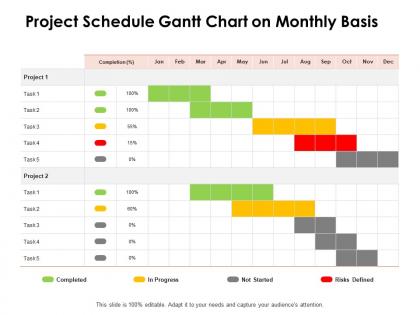
Project schedule gantt chart on monthly basis ppt powerpoint presentation deck




Try Before you Buy Download Free Sample Product
 Impress Your
 Audience
 100%
100% Editable
 Save Hours
 of Time


Initiate the job with our Project Schedule Gantt Chart On Monthly Basis Ppt Powerpoint Presentation Deck. Install the first brick of a firm foundation.
People who downloaded this PowerPoint presentation also viewed the following :
Project schedule gantt chart on monthly basis ppt powerpoint presentation deck with all 2 slides:
Install the first brick of a firm foundation with our Project Schedule Gantt Chart On Monthly Basis Ppt Powerpoint Presentation Deck. It will initiate the job.
FAQs for Project schedule gantt chart on monthly basis ppt
So for a good Gantt chart, start with your task list - break everything into bite-sized pieces. Add realistic dates and show which tasks depend on others finishing first. Milestones are huge, honestly - they're like sanity checkpoints when projects drag on forever. Make sure someone owns each task so there's no confusion about who's doing what. Your timeline should match the project length too. Oh, and pick something you can actually update easily because trust me, things will change constantly. I learned that the hard way on my last project.
Dude, Gantt charts are actually game-changers for projects. You get this visual timeline showing all your tasks and deadlines in one spot. Dependencies become super obvious too - like when Sarah's late on designs, you'll instantly see how it screws up development. I used to hate them honestly, thought they were just fancy calendars. But they're perfect for catching problems early and figuring out who's doing what. When something gets delayed, you can see exactly which other tasks get affected. No more surprise disasters or those painful "where are we?" meetings every week.
Don't cram a million tiny tasks in there - it turns into total chaos. The timeline thing is huge too. People always think everything will go perfectly, but then dependencies mess you up every single time. Like when Task A needs to finish before Task B can even start, you know? Build in some buffer time for when stuff inevitably goes sideways. Oh, and actually update the damn thing as your project changes. I've seen so many gorgeous charts that just collect dust while the real project looks nothing like what's on paper. Keep it clean, be honest about how long things take, and don't abandon it halfway through.
Honestly? Gantt charts are solid for seeing timelines and how stuff connects, but don't force it if you don't need it. I've watched people make simple projects way too complicated because they thought Gantt charts were "professional" or whatever. Sometimes a kanban board or even just a basic task list does the trick better. That said, if you're dealing with multiple moving pieces and deadlines, Gantt charts are pretty unbeatable. Network diagrams show dependencies clearer but they're a pain to read. Calendar views work great if it's mostly date-driven work. Start simple with what you actually need right now, then level up to Gantt later if things get messy.
So for Gantt charts - Microsoft Project is pretty much the gold standard if you're dealing with crazy complex stuff. Smartsheet and Monday.com are way easier to use though, especially if your team isn't super technical. Excel works too honestly, just more of a pain to set up. There's free options like GanttProject if budget's tight. Oh and Google Sheets has some decent templates now. But here's the thing - whatever your team's already comfortable with is probably your best bet. I've seen so many fancy charts that just sit there collecting digital dust because nobody actually uses them.
Honestly, I thought Gantt charts and agile were enemies too, but they can work together. Make yours super flexible - plot sprints as blocks instead of rigid deadlines. Focus on epics and big features, not every tiny task. Update it after sprint reviews when things inevitably change. Yeah, it feels weird at first since agile's supposed to be all fluid and stuff. But stakeholders love seeing that big picture view, so it's worth the extra effort. Just keep it high-level and don't stress when you're constantly tweaking it - that's the whole point.
Dependency arrows are your best friend here - just draw lines connecting related tasks to show the workflow. Most Gantt tools make this super easy, and trust me, once you start using them you'll never go back. Usually you'll deal with finish-to-start dependencies (where one task has to end before the next begins), though there's also start-to-start and finish-to-finish options. If your project gets complex, color-code the arrows - maybe red for critical path stuff. One warning though: don't create a spaghetti mess with too many lines or people will just ignore your chart entirely.
Dude, Gantt charts are honestly game-changers for team coordination. Your whole crew can see exactly who's doing what and when stuff's due. No more of those awkward "oh wait, wasn't that your job?" conversations. People can actually track how their tasks connect to everyone else's work, which is huge. When someone's running behind, others can step in or adjust their own deadlines. The accountability factor is real too - nobody wants to be the red bar on the chart, you know? We started reviewing ours every Friday and it's become our go-to for flagging problems early.
Honestly, Gantt charts are a lifesaver for figuring out who's doing what when. You'll see right away if you've got Sarah booked on three tasks the same week - major red flag there! The visual layout makes it obvious where people are sitting around doing nothing or completely swamped. I love how you can just drag stuff around when priorities change (which they always do, let's be real). Map out your team needs first, then use the chart to balance everything out. Way better than trying to keep it all in your head or some messy spreadsheet.
Honestly, weekly updates work for most projects I've dealt with. Fast-moving stuff might need daily tweaks though - especially when you're in crunch mode. I'd say start with weekly and adjust from there. The trick is not letting it become this massive chore you dread. Set a calendar reminder and actually stick to it. Trust me, there's nothing worse than realizing your Gantt chart is weeks behind reality and everyone's been working off bad info. Daily updates can work too if your project's moving at lightning speed, but that gets exhausting pretty quick.
Oh man, you'll love Gantt charts for remote work! They show exactly who's doing what and when - no more confusion about task order. Your team can check progress whenever instead of having endless status calls (thank god). The visual timeline keeps deadlines clear and helps catch problems early. Dependencies become super obvious too, which is honestly game-changing when you're not all in the same room. I'd start simple though - pick an easy tool and make sure everyone actually updates it regularly.
Yeah, Gantt charts work with pretty much any methodology if you're smart about it. For Agile stuff, I use them mainly for release planning and tracking big epics - but keep your sprint work on Kanban boards. Hybrid projects are perfect for this actually. Run Gantts for the waterfall parts like initial planning, then switch to iterative tools for development. You can even do value stream timelines with Lean approaches. Here's the thing though - don't get crazy trying to track every little task in there. Keep it high-level for the big picture stuff and use other tools for daily execution.
Ugh, Gantt charts are such a pain with big projects. One task shifts and suddenly you're updating everything else - total nightmare. They're terrible at showing resource conflicts too, so you'll accidentally overbook people left and right. The worst part? They make timelines look way more certain than they actually are. Like, where's the buffer for when things inevitably go sideways? I mean, they're not completely useless, but definitely use them with other stuff like kanban boards. Trust me on this one.
Honestly, Gantt charts are a lifesaver for events. You can see everything laid out - venue booking, catering, vendors, marketing stuff - and how it all connects. The timeline view shows you dependencies too, so when something gets delayed (and it will), you'll know what else gets screwed up. Like, you obviously can't order food without final headcount, right? I always start by brain-dumping every task, then work backwards from the event date. Sounds nerdy but you'll catch problems way before they blow up in your face.
Don't cram every tiny task in there - group stuff together and show what actually matters. Your stakeholders care about milestones and the critical path, not micromanaging details. Color code consistently (red for overdue, yellow for sketchy stuff) and throw in a legend so people aren't confused. Honestly, most Gantt charts I see look like someone threw up a box of crayons. Build in buffer time where they can see it. Oh, and never just email the thing - walk them through it! They won't get the dependencies or risks without context.
No Reviews