


Project schedule gantt chart completed project management professional toolkit ppt diagrams




Try Before you Buy Download Free Sample Product
 Impress Your
 Audience
 100%
100% Editable
 Save Hours
 of Time


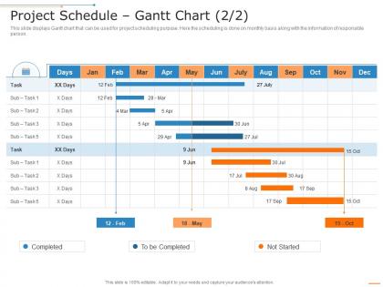
This slide displays Gantt chart that can be used for project scheduling purpose. Here the scheduling is done on monthly basis along with the information of responsible person.
People who downloaded this PowerPoint presentation also viewed the following :
Project schedule gantt chart completed project management professional toolkit ppt diagrams with all 2 slides:
Use our Project Schedule Gantt Chart Completed Project Management Professional Toolkit Ppt Diagrams to effectively help you save your valuable time. They are readymade to fit into any presentation structure.
FAQs for Project schedule gantt chart completed project management professional
So you'll want tasks down the left side and your timeline running across the top. Horizontal bars show when each task happens and how long it takes. Don't forget those connecting lines between tasks - they show dependencies, like which stuff has to finish before other things can start. I swear half the project disasters I've seen could've been avoided if people actually mapped these out! Throw in some diamond shapes for major milestones and make sure every task has an owner. Oh, and start basic - you can always add more bells and whistles once your team gets the hang of reading it.
Honestly, Gantt charts are lifesavers for seeing your whole project timeline laid out visually. You can catch bottlenecks and dependencies before they screw you over. Which tasks are blocking what? Who's drowning in work? Will you actually make the deadline? (Probably not, but hey, at least you'll see it coming.) They're great for keeping stakeholders off your back too - everyone sees progress without bugging you constantly for updates. I'd say start basic with major milestones and key dependencies. You can get fancy with details later if you want.
Microsoft Project's still the heavyweight if you need all the bells and whistles - dependencies, resource tracking, the works. But honestly? Asana and Monday.com are way more pleasant to use daily, especially if your team's collaborating. I'm basically glued to Asana at this point. TeamGantt's decent for free stuff, or you could go old school with Excel if you're into that kind of pain. Smartsheet works too for quick visual stuff. Start with whatever tool your team's already using though - no point forcing everyone to learn something new unless you really need those advanced features.
Honestly, Gantt charts are a game-changer for keeping everyone on the same page. You can see the whole timeline laid out - who's doing what, deadlines, how tasks link together. Super helpful when dependencies get messy and you need to know if one delay will screw everything else up. Plus it cuts down on those endless "where are we at?" meetings. I mean, Sarah can just look at the chart instead of asking twenty questions. Just don't be that person who sets it up and never updates it - then it's basically worthless.
Honestly, don't go crazy with the details - I learned this the hard way when I spent more time updating my chart than actually working. Make sure your tasks aren't too connected either, because one delay screws everything up. Buffer time is your best friend here. Skip the tiny subtasks and stick to big milestones instead. Your chart should give you the overview, not become another project to stress about. Update it when needed but don't be a perfectionist about it - that's just procrastination in disguise.
Yeah totally! Gantt charts can work great in agile - just don't treat them like set-in-stone schedules. I use them for tracking sprint stuff and showing how user stories connect. Stakeholders love the visual timeline aspect too. Sure, some agile purists will roll their eyes and call it too waterfall-ish, but whatever works, right? The trick is updating them constantly since priorities change like crazy in agile. Focus on epics or release planning rather than tiny individual tasks. That way you get the benefits without painting yourself into a corner with rigid deadlines.
So regular timelines are pretty much just a straight line of dates - like "finish this by March 5, start that March 10." Basic stuff. Gantt charts actually show you how everything connects though. You can see which tasks depend on others and what can happen at the same time. Way more visual. Honestly they're a game-changer when you've got multiple moving pieces because you'll spot the bottlenecks right away. Like if Task C can't start until both A and B finish, you'll actually see that connection instead of just guessing. I probably should've started using them sooner - would've saved me some headaches on that last project.
Honestly, cloud tools like Asana or Monday are game-changers for this. Your team can jump in from anywhere and see updates instantly. Pack way more detail into those charts than you normally would - time zones, when people are doing async work, who's handing what off to whom. Color-coding by person or location has saved my butt so many times. You'll need to update progress more often since you can't just peek over someone's shoulder anymore. Set up those automated deadline notifications. Oh, and build in extra buffer time because remote communication just takes longer - that's not anyone's fault, it's reality.
Break everything down into smaller pieces first - that's honestly the biggest game-changer. I've watched so many teams get burned because they thought "update the website" would take a few days, then three weeks later they're still debugging CSS. Ask whoever's actually doing the work what they think. Look back at similar stuff you've done before. Buffer time is your friend too - things always take longer than you expect. Your estimates will still be wrong sometimes (mine definitely are), but getting your team involved makes a huge difference.
Think of dependencies as your "Task A has to finish before Task B can even start" roadmap. Without them, you'll accidentally schedule stuff that can't actually happen yet - which is honestly just setting yourself up for chaos. Map out what has to happen in order first, then you can see your critical path (the domino chain that kills your timeline if anything goes wrong). Some tasks have flexibility, others don't. I always start with the absolute must-do sequences since those become your backbone. Everything else fits around them.
Honestly, Gantt charts are a lifesaver for this stuff. You can instantly see when someone's drowning in work or just twiddling their thumbs. Like, you'll catch Sarah being scheduled for three things at once before it becomes a disaster. The timeline shows exactly when you need people, equipment, whatever - so you can shuffle things around or bring in extra help. I always color-code mine by person or resource type. Makes the bottlenecks super obvious. Way better than trying to juggle it all in your head, trust me.
Dude, color-coding your Gantt chart is a total game-changer. Green for done, yellow for working on it, red for "oh crap we're behind" - you get the picture. Different colors for each department makes it super obvious who's doing what. I swear, trying to read those charts without colors is like squinting at a spreadsheet from hell. Your team will actually thank you during meetings because they can spot problems instantly instead of deciphering a mess of black text. Just don't go crazy with it though - stick to maybe 4 colors max or it'll look ridiculous.
So basically you just update your Gantt chart each week with how much stuff actually got done vs what you planned. Those visual bars instantly show you what's lagging behind - I swear it's like having x-ray vision for your project. Bottlenecks become super obvious, plus you can see which teammates are drowning and need backup. The trick is staying on top of updates though (I learned this the hard way). Check in weekly and you'll catch problems while they're still fixable instead of scrambling later when everything's on fire.
Honestly, color-coding is a game changer - use it for teams or priority levels so people instantly see what's urgent. Break big projects into swim lanes, maybe add some icons to make it less boring. Those interactive ones are pretty sweet where you can click for more details. I always think progress bars help too, gives it that visual punch instead of just looking like a giant spreadsheet. For the C-suite crowd, strip it down to just major milestones - they don't want all the weeds anyway. Oh and mini timelines work great for zooming into the messy parts. Just think about how long you've got their attention first.
Dude, seriously - dig into your old project data instead of just winging the timeline. I'm talking actual numbers from your last 3-5 similar projects, not wild guesses. You'll probably be shocked at how off your original estimates were compared to reality. That pattern recognition is gold for spotting which team members always run late or what processes consistently bottleneck. Plus you can see what external stuff screwed you over before - holidays, busy seasons, when Karen from accounting was on vacation for two weeks. Build those lessons into buffers this time. Trust me, it beats scrambling when everything inevitably takes longer than expected.
-
Unique research projects to present in meeting.
-
Innovative and Colorful designs.
-
Good research work and creative work done on every template.