

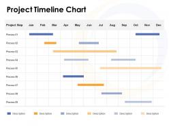
Project timeline chart ppt powerpoint presentation graphics





Try Before you Buy Download Free Sample Product
 Impress Your
 Audience
 100%
100% Editable
 Save Hours
 of Time


Get folks familiar with the field of computers with our Project Timeline Chart Ppt Powerpoint Presentation Graphics. Be able to increase digital exposure.
People who downloaded this PowerPoint presentation also viewed the following :
Project timeline chart ppt powerpoint presentation graphics with all 5 slides:
Improve digital awareness with our Project Timeline Chart Ppt Powerpoint Presentation Graphics. Demonstrate how computers are a boon.


FAQs for Project timeline chart ppt
Start with the big stuff - your major milestones and key deliverables. Map out which tasks depend on others (this part always trips people up). Be realistic about timing and throw in some buffer time because things will go sideways. Make sure everyone knows who owns what - seriously, unclear ownership kills projects faster than anything else. Mark your critical path items and any external approvals you're waiting on. Oh, and don't overthink the tool initially. Excel works fine before you need the fancy software. Keep it visual so people can actually scan it quickly without getting lost in the weeds.
So basically, timeline charts stop all that "wait who's doing what?" confusion. Everyone can see dependencies between tasks and catch bottlenecks before they become a nightmare. Your meetings actually become useful since nobody's scrambling to figure out where things stand. I swear these charts have saved my butt so many times when deadlines start shifting around - you can see exactly how one delay affects everything else. Just update it weekly and stick it somewhere accessible. Way better than constantly bugging people for updates, honestly.
Microsoft Project is probably your best bet if you want something robust, but it's kinda overkill for most stuff. Smartsheet and Monday.com are way easier to use for Gantt charts. Honestly though? Excel works fine if you're not doing anything crazy complex. Lucidchart's great for quick visual stuff, and PowerPoint works too if that's what you've got. If your team needs to collaborate, definitely go cloud-based - Asana or Trello both have timeline views now. I'd just start with whatever you're already using and see if it does the job before spending money on something fancy.
Color coding is seriously a game changer for timelines! You can instantly see different phases, who's responsible for what, or which tasks are urgent. I spent way too many hours squinting at boring black-and-white charts before I figured this out. Icons and different bar styles help too - your brain picks up on patterns super fast. But here's the thing: don't go crazy with like 12 different colors or it'll look like a kindergarten art project. Stick to maybe 4-5 colors tops and throw in a simple legend so other people can actually understand what you're showing them.
Break your project into smaller chunks and estimate each piece separately - way more accurate than trying to guess the whole thing. I always toss in 20-30% buffer time because stuff inevitably takes longer or breaks. Also, figure out what your team can actually do, not what they should theoretically handle. Everyone's got meetings and other random work eating their time. Honestly, looking at past similar projects helps tons for a reality check. And if stakeholders want crazy timelines? Push back hard. Trust me, it's better to have that awkward conversation now than panic later when everything's behind.
Honestly, just draw arrows between your task bars to show which things depend on what. Drag from one task to another - most Gantt chart tools make it super easy. I used to think this was pointless busy work, but it seriously helps you catch problems before they happen. Color-code the arrows if you want - red for must-haves, blue for the stuff that'd be nice but whatever. Make sure arrows go the right direction though, that trips people up. Start with your biggest dependencies first, then worry about the smaller ones later.
Think of milestones as your project's pit stops - they show when you've finished major chunks of work. I always set them at natural breaking points where I can actually tell if things are going well or totally off the rails. They're super helpful for catching problems before they blow up, plus stakeholders love getting updates without all the boring day-to-day stuff. Your team gets those satisfying "we did it!" moments too, which honestly makes a huge difference for morale. Just don't go overboard and create a milestone for every tiny task - you'll drive yourself crazy.
Honestly, timeline charts are a lifesaver for resource management. You can spot right away when someone's double-booked across multiple projects – super awkward when Sarah finds out she's supposed to be in three meetings at once! They also show you who's got downtime so nobody's just sitting around. When priorities shift or someone gets sick, it's way easier to move people around visually. The best part? You catch bottlenecks before they actually mess up your timeline. Just start mapping what you've got going on now. I bet you'll find conflicts you had no clue about.
Ugh, the biggest thing is people always lowball their time estimates - like seriously, just assume everything takes 20% longer than you think. Dependencies are huge too, you can't just list random tasks without showing what has to happen first. I've watched so many projects crash because of this. Don't cram every tiny detail into the visual or it'll look like a hot mess. Keep it clean. And actually update the damn thing as you go! Nothing's more useless than an outdated timeline sitting there mocking you. Oh, and buffer time - always build some in for when stuff inevitably goes sideways.
Yeah, Gantt charts are basically just fancy timeline charts. They show your tasks as horizontal bars against dates, which makes it super easy to spot dependencies and overlaps. Most PM tools like Asana or Monday will build them automatically from your task list. Excel works too if you're being cheap about it - though honestly, updating them manually is kind of a pain. The trick is actually keeping the thing current. I've seen too many dead Gantt charts floating around that nobody touches after week one. Start with your big milestones first, then drill down into details later.
Look, stakeholder feedback is your sanity check when tweaking timelines. They'll catch stuff you totally missed - like weird dependencies or deadlines that are just bonkers. I swear, every time I've skipped getting their input upfront, it comes back to haunt me later. Resource conflicts? They spot those too. The trick is actually sitting down with them regularly, not just firing off the chart via email and crossing your fingers. Trust me, it's way better than scrambling last minute when everything falls apart. Oh, and they're surprisingly good at flagging bottlenecks before they become actual disasters.
Honestly, just throw out the whole linear timeline thing with agile. Break everything into those 2-4 week sprint cycles instead. I've seen too many people try mapping agile work months ahead - it never works out like you think it will. Swimlanes are great for tracking different user stories. Your chart needs to handle constant updates though, since priorities change like every other day. Burndown charts beat Gantt charts here by a mile. Just keep tweaking it after each retrospective based on what actually happened, not what you planned.
Track your planned vs actual dates for each task - that's the big one. Critical path delays will literally make or break your timeline, so catch those early. I'd also watch your completion percentage and resource utilization rates closely. Milestone dates are obvious but people forget to actually monitor them lol. Burn-down charts are really useful for seeing remaining work versus time. Weekly reviews work best - anything more than 10% off target needs immediate attention. Schedule variance is another red flag worth tracking religiously.
Okay so first thing - shoot them an update right away, don't wait. Make a visual that clearly shows what changed, like highlight the delays in red or whatever. People hate digging through emails to figure out what's different. Always explain WHY it happened and what you're doing about it. Include new delivery dates and any dependencies that popped up. Honestly, I'd just hop on a quick call for big changes because text can come across weird. Oh and frame everything around your solutions, not just "hey we're screwed." Trust me on this one.
Honestly, timeline charts have gotten so much better lately. Gone are those awful static Excel sheets - now you've got interactive tools that actually update in real-time when stuff gets delayed. I've been using ones where you can just drag tasks around, and they'll predict bottlenecks with AI before everything goes sideways. The visual side is pretty slick too. Interactive Gantt charts with animations and all that. Most integrate with whatever you're already using - Slack, Jira, you name it. Try Monday.com or Asana if you want to see what I mean. Makes project management way less painful than it used to be.
No Reviews