


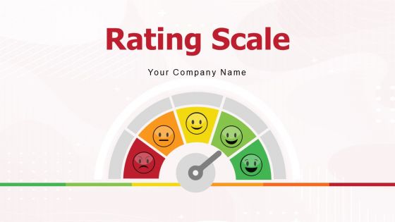
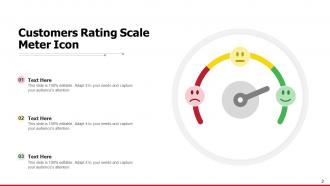
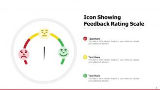
Rating Scale Meter Icon Satisfaction Services Product Quality




Try Before you Buy Download Free Sample Product
 Impress Your
 Audience
 100%
100% Editable
 Save Hours
 of Time


Our Rating Scale Meter Icon Satisfaction Services Product Quality get the data going in your favor. They ensure you deliver good decisions.
People who downloaded this PowerPoint presentation also viewed the following :
Rating Scale Meter Icon Satisfaction Services Product Quality with all 13 slides:
Great decisions emerge with our Rating Scale Meter Icon Satisfaction Services Product Quality. They ensure you arrive at the correct conclusions.
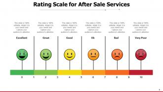
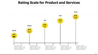
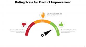


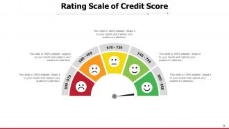

FAQs for Rating Scale Meter Icon Satisfaction
Honestly, three things matter most: clarity, relevance, and getting them actually excited about it. Ditch the jargon completely - nobody wants to decode corporate speak when they're trying to solve a problem. Show them exactly how your thing fixes their specific headache, and I mean *their* headache, not some generic one. Visuals are clutch, but what really works is when you genuinely get pumped about the solution you're offering. Let them play with demos or touch the product if possible. Oh, and leave tons of space for questions - that's where the real conversation happens. Make it feel like you're actually listening from the start.
Honestly, templates are a lifesaver because you skip all that "staring at a blank slide" torture. Your audience gets clean, consistent visuals instead of whatever design disaster you'd cobble together at 2am. Plus you can actually focus on what you're saying rather than fighting with fonts and colors. Professional layouts naturally guide people through your points - way better than random text blocks everywhere. I mean, nobody deserves to suffer through Comic Sans presentations in 2024. Just find a template that fits your vibe, drop in your content, and you're golden. Both you and your audience will thank you later.
Honestly, good visual design can totally save your presentation. Think about it - you walk into a messy room vs. a clean one, right? Same energy. When your slides actually look decent with readable fonts and solid contrast, people focus on what you're saying instead of squinting at weird layouts. Bad design just pisses people off, even if they can't explain why. Clean visuals show you give a damn about their time. My go-to advice: stick with one font, use white space (seriously, don't cram everything), and make sure someone in the back row can actually read it. Simple stuff but it works.
Honestly, feedback is like having a cheat sheet for better templates. People will tell you exactly what's broken - maybe your intros are too long or certain sections feel confusing. I always ask specific stuff instead of generic "how'd I do?" questions. Focus on pacing and clarity. After a few presentations, you'll start seeing patterns emerge. That's when you know what to fix in your template structure. The trick is being systematic about collecting feedback each time, then actually tracking those common complaints. Trust me, it beats guessing what went wrong.
Honestly, it comes down to three things that mess with your head during presentations. Confidence is huge - when you actually know your stuff inside and out, everything flows better. Then there's reading the room... ugh, those blank stares will kill your vibe so fast! The third thing? Just being comfortable with the whole setup - the room, the tech, whatever format you're using. Oh, and here's what actually helps: spend most of your energy on prep work. I know it sounds boring, but confidence really is like the foundation that makes all the other stuff manageable.
Here's the thing - when you can tweak colors, fonts, and layouts to match your vibe (or company brand), the whole presentation actually feels like *yours*. Not some cookie-cutter template everyone's seen before. You're not wrestling with a design that fights your content either, which honestly saves so much headache. Having that control just makes you way more confident when you're up there presenting. I always mess with at least the colors and fonts - even small changes make it feel totally different. You'll feel way more ownership over the final thing and less stressed about how people react.
Honestly, people just trust you more when you show them actual numbers instead of asking them to take your word for it. Charts and graphs are lifesavers too - way better than drowning everyone in bullet points for half an hour. Your audience gets that "aha" moment when they can see the evidence backing up what you're recommending. I always pick 2-3 solid metrics that actually support my main point and build everything around those. Makes the whole thing feel less like you're just winging it, you know?
You know what's wild? People literally feel better about presentations when they can actually follow along. Sounds obvious but so many speakers miss this. Your audience gets way more confident in what you're saying when it's organized well. Confusing presentations just piss people off, honestly. Short sentences work great. Then mix in some longer ones that flow naturally together. Skip the fancy jargon - nobody's impressed by words they have to Google later. Put your main point right up front, then add the supporting stuff after. Trust me, satisfaction scores go through the roof when people aren't struggling to decode what you mean.
Ugh, don't read straight from your slides - it's the fastest way to put everyone to sleep. Going over time is brutal too. Know your audience's expertise level or you'll either bore them or confuse them completely. Jumping around topics randomly kills your flow. Oh, and test your tech beforehand! I learned that one the hard way when my laptop died mid-presentation. Practice out loud and time yourself. Structure matters way more than people think. Have backup slides on your phone just in case everything goes wrong.
Stories just hit different, you know? Your audience actually *feels* something instead of zoning out. I've seen people completely change - suddenly they're leaning forward, laughing, totally locked in. That energy bounces right back to you too, which makes you way more confident up there. Complex stuff becomes way easier to remember when it's wrapped in a story. People walk away thinking "oh, I actually get this now." Honestly, the difference is night and day. Next time, try starting with something personal that ties to your main point - even something small works.
Honestly, just watch people's body language - are they leaning in or scrolling their phones? I always throw in random questions throughout to see how enthusiastic responses are. If you've got the tech, polls are clutch, but literally just pausing and going "make sense so far?" works too. Look for nodding and note-taking. The dead giveaway though? What happens when you wrap up - people bolting for the door or actually hanging around to chat? Oh, and do a quick vibe check halfway through so you can pivot if everyone looks lost.
Honestly, good visuals are a game changer - you'll see like 20-30% better engagement when you nail it. Our brains just eat up visual stuff way faster than text. Videos, images, interactive bits... they're basically speaking your audience's language. You know those awful PowerPoint decks that are just walls of text? Yeah, don't be that person. The trick is making sure your visuals actually help explain things instead of just looking pretty. I'd start by finding the most confusing parts of whatever you're presenting and figure out where a good image or video could make it click better.
Dude, audience satisfaction is literally just giving people what they came for. Like if someone orders pizza and you bring sushi - yeah sushi's great, but that's not the point, you know? People show up with expectations about what they'll learn or get out of your presentation. Hit those expectations (or blow past them) and they walk away happy, feeling like they didn't waste their time. The trick is actually asking beforehand what they want. Survey them, find out what they're hoping for, then build your content around that. Honestly, most people skip this step and wonder why their audience seems disconnected.
Honestly, post-presentation surveys are a game changer for figuring out what actually lands vs what you think works. I always get surprised by the "confusing sections" feedback – stuff that made total sense to me completely lost the audience. Ask about visual clarity, info flow, and which slides hit best. The comments help you spot patterns across different presentations instead of just winging it. Oh, and send the survey within 24 hours while it's still fresh. Keep it short though – like 3-4 questions max or people won't bother.
Dude, confidence makes or breaks your whole presentation. When you're solid up there, people actually listen instead of cringing for you. Nobody wants to watch someone who looks like they're gonna throw up, right? Plus confident speakers bounce back from screwups way better - and trust me, something always goes wrong. The audience picks up on your energy immediately. If you're nervous, they get nervous. Practice until you could probably give the talk in your sleep. That's when the magic happens and people actually believe what you're saying.
No Reviews