

Request for proposal powerpoint presentation slides


Try Before you Buy Download Free Sample Product
 Impress Your
 Audience
Editable
of Time


Incorporate this professionally designed Request For Proposal PowerPoint Presentation Slides and demonstrate an impressive solicitation for proposal to your customer. Employ this request of services bid PowerPoint template to explain your customer’s company background information and request for an appropriate bid on the company’s behalf. Attract bidders to fund the project at the lowest possible bid by employing our content ready RFP PowerPoint template. The different goals like boosting the sales and global partnership for promotion can be discussed efficiently by utilizing our ready-made RFP PowerPoint template. Describe the step-wise investment and the estimated schedule to your client so that your prospect can appoint a suitable enterprise for the accomplishment of the project. You can describe the services needed consisting of digital marketing, website building, website analytics and audit, desktop computer screen, etc. to your potential customers with the aid of our proposal PPT visuals. State the time and place for submission of a request for proposal by taking the assistance of this service request PowerPoint theme. Highlight the essential components of the proposal such as problem-solution statement, your service process, action timeline, case studies, and client testimonials with our RFP bid PowerPoint slideshow. Showcase the mission of achieving the desired goal within the investment constraint and estimated time frame. Utilizing this customizable content ready request for contract PPT theme to give a clear idea about the customized investment packages to your customers. Elucidate the client’s feedbacks to build trust with your prospects. Download our solicitation of proposal PowerPoint visuals and present an impactful proposal to your client.
People who downloaded this PowerPoint presentation also viewed the following :
Content of this Powerpoint Presentation
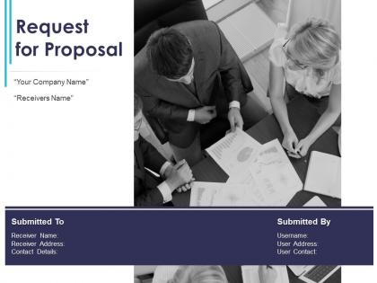
Slide 1: This slide introduces Request for Proposal. State Company name, Reciever details, User information.
Slide 2: This slide displays Cover Letter.
Slide 3: This slide displays Table of Content of the presentation.
Slide 4: This slide showcases Project Goal for Request for Proposal.
Slide 5: This slide depicts Services Required such as Digital marketing, Website building, Desktop Computer screen.
Slide 6: This slide depicts Elements of Proposal for Request for Proposal.
Slide 7: This slide is continued with Elements of Proposal for Request for Proposal.
Slide 8: This slide showcases Budget for Request for Proposal.
Slide 9: This slide showcases Anticipated Schedule for Request for Proposal.
Slide 10: This is About Us slide to showcase company specifications.
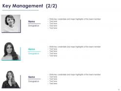
Slide 11: This slide displays Key Management with major highlights of the team member.
Slide 12: This slide displays Key Management with major highlights of the team member.
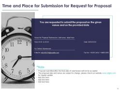
Slide 13: This slide showcases Time and Place for Submission for Request for Proposal.
Slide 14: This is Contact Us slide with phone number, company address, company logo.
Slide 15: This slide is titled as Additional Slides for moving forward.
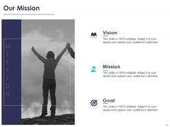
Slide 16: This is Our Mission slide with Vision, Mission and Goal.
Slide 17: This is 30 60 90 Days Plan slide.
Slide 18: This is Timeline slide.
Slide 19: This slide showcases Roadmap process.
Slide 20: This slide displays Gannt Chart.
Request for proposal powerpoint presentation slides with all 20 slides:
Use our Request For Proposal Powerpoint Presentation Slides to effectively help you save your valuable time. They are readymade to fit into any presentation structure.
-
Request for Proposal
-
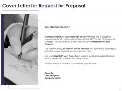
Cover Letter for Request for Proposal
-
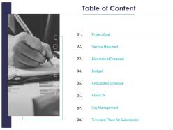
Table of Content
-
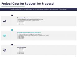
Project Goal for Request for Proposal
-
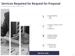
Services Required for Request for Proposal
-
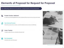
Elements of Proposal for Request for Proposal
-
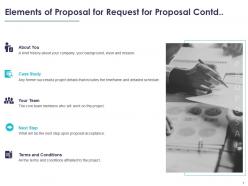
Elements of Proposal for Request for Proposal Contd
-
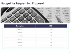
Budget for Request for Proposal
-
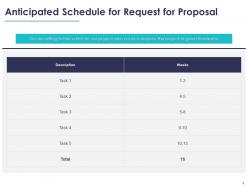
Anticipated Schedule for Request for Proposal
-
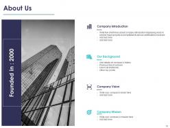
About Us
-
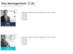
Key Management 1 2
-
Key Management 2 2
-
Time and Place for Submission for Request for Proposal
-
Contact Us
-

Additional Slides
-
Our Mission
-
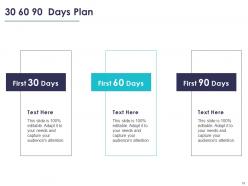
30 60 90 Days Plan
-
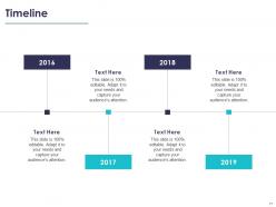
Timeline
-
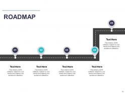
ROADMAP
-
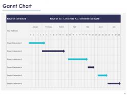
Gannt Chart
FAQs for Request for proposal
Start strong with your exec summary, problem, and solution - those slides literally make or break you. Show clear timelines and budget breakdowns upfront. Don't make them dig for your team's experience or pricing (I've watched so many good proposals die this way). Address their specific pain points and throw in real results from past projects. Keep it visual, minimal text. Your differentiator better be solid - what makes you different from everyone else bidding? Oh, and end each section with next steps. Sounds obvious but people forget and lose momentum.
Honestly, visuals are a game-changer for RFPs. Charts for timelines, infographics breaking down your process, before/after shots - they save evaluators from drowning in text walls. Can't tell you how many teams I've watched bomb because their slides looked like boring Word docs! Screenshots and team photos build trust too. One visual per slide works best, something that actually supports your point. Oh, and process diagrams are clutch for showing you know what you're doing. Just don't go overboard with decorative stuff that doesn't add value.
Ugh, the worst thing people do is cram way too much text on slides - like they're turning PowerPoint into a Word doc or something. Keep your bullet points short! Focus on what makes you different, not every single detail from your proposal. Oh, and this might sound obvious but actually answer what they asked for in the RFP. I've seen gorgeous presentations that totally missed the point. Use visuals when you can, tell a clear story about why you're the best pick, and don't forget to end with next steps.
Honestly, it's all about reading the room. With executives and stakeholders, you gotta hit them with the money stuff first - ROI, timeline, what problems you're solving. They don't care about your technical wizardry. But flip that completely for dev teams. They want the nitty-gritty - how's it built, what are the integration headaches, specs, all that good stuff. I swear, I've watched people crash and burn by getting this backwards. Just make two versions of your presentation. Sounds like extra work but trust me, it's worth it.
Dude, make those slides super scannable - tons of white space, same fonts throughout, clear headings. Bold your key stuff so it pops. I swear, half the RFPs I see look like someone just dumped a Word doc into PowerPoint and called it a day. Break up those text walls with bullets and charts. Your brand colors are fine, but skip the crazy animations - you want to look credible, not like you're trying too hard. Oh, and make sure complex info is digestible at first glance. That's honestly what separates the good proposals from the trash pile.
Dude, skip the screenshots and actually embed interactive charts right in your slides. Tableau or Power BI work awesome for this - honestly even fancy Excel beats those soul-crushing bullet points everyone uses. Make your data actually tell a story about why your solution rocks. Real-time dashboards showing costs or timelines? Chef's kiss. But seriously, test everything twice because I've seen presentations die when charts wouldn't load. Focus on maybe 2-3 key points per slide max. Oh, and avoid anything too flashy - you want impressive, not distracting.
Dude, yes - storytelling is everything for RFP slides. Nobody wants to read a boring laundry list of features. Your proposal needs to flow like you're explaining to someone why this deal makes total sense. Map out their problem first, then show how you'll fix it, then paint the picture of what success looks like. Each slide should build on the last one. I always ask myself: does this section move our story forward or am I just rambling? Trust me, evaluators can tell the difference between a real narrative and random bullet points thrown together.
Dude, timing is everything - I bombed a huge presentation once because I went way over. Super awkward. Here's what works: stick to 1-2 minutes max per slide. Got 20 minutes? Plan for like 10-12 slides tops, and that includes Q&A time. One message per slide only. Cut all the fluff - just keep your strongest differentiators. Trust me, there's always gonna be questions so build in buffer time. Oh, and definitely rehearse out loud with a timer running. You'll feel way more confident walking in there knowing exactly where you stand time-wise.
Navy blue and white is your best bet - seriously, it just works for RFP stuff. Looks professional without trying too hard. Throw in some gray for charts or whatever. I've watched people go crazy with bright colors and it always backfires, makes everything look amateur. Use dark blue backgrounds on title slides, then white backgrounds for content. Red's fine but only for important callouts. And please don't do that thing where there's like 6 different colors everywhere - it's distracting as hell. Stick to 3 colors max and you'll be solid.
Okay so for your exec summary slide - lead with their actual problem in words that show you get it. Then your solution should feel like the obvious next step, you know? I always throw a killer stat right at the top because honestly, some execs literally just skim this one slide and bounce. Four bullets max - any more and you're killing them. Use their terminology, not your fancy consultant speak. The whole point is making them go "wow, these guys actually understand what we're dealing with" before they dive into the rest. Oh and definitely include the ROI piece - that's what they really care about anyway.
Start with Microsoft's business templates - they're clean and do the job. Skip the fancy stuff from SlideModel unless you've got budget to burn. White space is your friend here. Stick to consistent fonts and your company colors. Don't fall into the trap of spending forever tweaking design details when your content matters way more. Canva's decent if design isn't your thing. Get someone else to look it over before you submit - fresh eyes catch stuff you'll miss. Evaluators honestly just want to see that you get their problem and can solve it.
Totally! I do this all the time - keep a little doc with feedback from each presentation because honestly, I forget the details otherwise. Look for patterns in what people said. Like if everyone loved your data but complained about confusing timelines, boom, you know what to fix. Also check out the Q&A questions that kept coming up. Those are dead giveaways for stuff you didn't explain well enough. I just use a simple template: what worked, what sucked, what confused people. Takes two minutes but saves me from making the same mistakes twice. Plus it's kinda satisfying seeing your weak spots turn into strengths over time.
Definitely include a timeline - it shows you actually get what the project involves and aren't just winging it. Clients need to see you've mapped out realistic phases, not random dates you pulled from nowhere. Your project management skills shine through here, plus it prevents that awkward "wait, when is this due again?" conversation later. Buffer time for revisions is key (trust me on this one). Make sure your dates actually match what they asked for in the RFP. It's honestly one of those things that separates serious proposals from the rushed ones.
Okay so here's what works for me - chunk everything up with bullet points and diagrams instead of wall-of-text slides. Nobody's got time for that. Start big picture first, then get into the weeds on later slides. Color coding and lots of whitespace will save your life, honestly. Oh and icons help too if you're not terrible at picking them. When you've got heavy data or specs (which you probably do), just summarize upfront and dump the detailed stuff in an appendix. I learned this the hard way - evaluators get cranky when they can't follow along easily. Flowcharts beat paragraphs every single time.
Break up those dense slides with quick polls or questions - trust me, nobody wants to sit through 45 text-heavy slides. Tell stories that connect to their actual problems instead of just listing features. Real case studies work way better than generic examples. Mix things up with visuals, demos, maybe even short videos if it fits. Watch their faces and body language (honestly this part is crucial). Slow down if they look confused, speed up if they're checking phones. Always tie each section back to what they specifically need and what happens next.
-
Really like the color and design of the presentation.
-
Understandable and informative presentation.
-
Unique research projects to present in meeting.
-
Very well designed and informative templates.
-
It saves your time and decrease your efforts in half.
-
Visually stunning presentation, love the content.