


Sales Recovery Powerpoint PPT Template Bundles





Try Before you Buy Download Free Sample Product
 Impress Your
 Audience
 100%
100% Editable
 Save Hours
 of Time


Our Sales Recovery Powerpoint PPT Template Bundles are topically designed to provide an attractive backdrop to any subject. Use them to look like a presentation pro.
People who downloaded this PowerPoint presentation also viewed the following :
Sales Recovery Powerpoint PPT Template Bundles with all 19 slides:
Use our Sales Recovery Powerpoint PPT Template Bundles to effectively help you save your valuable time. They are readymade to fit into any presentation structure.







FAQs for Sales Recovery Powerpoint
OK so first thing - figure out where you're at right now and what actually caused this mess. Then lay out your comeback plan with real dates, not just "we'll improve things." Financial projections are obvious but honestly, spend time on those because investors will grill you on numbers. Track specific metrics so you can prove progress. Oh and definitely check what competitors are doing - they probably gained ground while you were down. Resources needed, potential roadblocks, all that. Just make sure it tells a clear story and isn't just walls of text everywhere.
Honestly, think of your sales recovery presentation like telling a story instead of just dumping numbers on people. Yeah, the data matters, but when you turn those declining charts into actual plot points - showing where you've been, where you are, and your path forward - people actually pay attention. Your recovery plan becomes this whole narrative arc (sounds cheesy but it works). The thing is, stakeholders connect way better when there's an emotional thread running through everything. They're more likely to get behind your strategy that way. I'd start by sketching out your story first, then build slides around each part of your comeback.
You'll want to track revenue recovery rate and conversion percentages first - that's where the real story is. Customer retention and average deal size comparisons work great too, especially when you show the difference between your decline phase and now. Lead gen numbers are huge if you're rebuilding. Month-over-month growth percentages honestly make stakeholders happy even when they're tiny wins. Time-to-close improvements matter if you've tweaked your process. Oh, and definitely do before/after comparisons so people can actually see you're heading in the right direction. Pipeline health metrics round it out nicely.
Just swap out the generic stuff with data that actually matters to your industry. Like if you're in SaaS, use customer retention numbers instead of whatever random metrics they threw in there. Retail? Focus on foot traffic recovery - that kind of thing. Change up the colors to match your brand too. The templates are pretty flexible honestly. But here's what really matters - customize those recovery strategies to tactics that work in your specific market. I'd start by figuring out the 3-4 key metrics your industry obsesses over, then build everything around those. Makes it way more convincing.
Honestly, clean slides are everything here. Put your recovery timeline right up front so they see the plan immediately. Charts need to be readable - nobody wants to squint at microscopic text during a stressful meeting. Stick with consistent colors and just use bullet points instead of paragraphs. Before/after comparisons work great, plus realistic milestones with names attached to each one. Practice beforehand because they'll definitely grill you with tough questions. Oh, and end every section with actual next steps and deadlines. Otherwise it just turns into one of those meetings where nothing gets decided.
Honestly, just embed your PowerBI or Tableau charts straight into the slides - they'll update automatically with fresh data. Excel works fine too if you don't want anything fancy. Heat maps are perfect for showing regional stuff, and trend lines make recovery progress super obvious. I always go with before/after comparisons because they're impossible to argue with. Pick your strongest number first, then build everything around that story. Way better than dumping a bunch of spreadsheet screenshots on people (learned that the hard way). The whole point is making your data actually tell the recovery story instead of just existing there.
Look, competitor analysis is basically your secret weapon for figuring out what's actually working in your space. I'd grab 2-3 direct competitors and dig into their pricing, messaging, and who they're going after successfully. Stakeholders love concrete examples way more than your hunches - trust me on this one. You'll spot gaps where you can pivot or find those underserved niches everyone's missing. Oh, and don't just list features like some boring spec sheet. Focus on stuff you can actually act on. It's honestly one of the fastest ways to win back customers when you know exactly what you're up against.
So basically, it gets everyone working from the same playbook instead of having recovery stuff scattered everywhere (which is honestly such a mess). You can map out your strategy together, figure out who's doing what, and actually see progress happening. During meetings, just walk through each section as a team - people can brainstorm and you'll make updates in real time. I'd start by filling it out together in your next meeting so everyone gets their input in from the start. Way better than random docs and spreadsheets flying around.
Mix in polls and Q&As every 10-15 minutes because honestly, attention spans are terrible now. Real data visualizations work way better than just talking about recovery stats. Tell actual client stories instead of boring statistics - people connect with that stuff. One point per slide, keep it clean. Oh, and use analogies they'll actually get when you're explaining the complex recovery processes. Ask them to weigh in on scenarios or share their own experiences. Makes it feel less like a lecture. Practice those transitions so you don't sound robotic between sections.
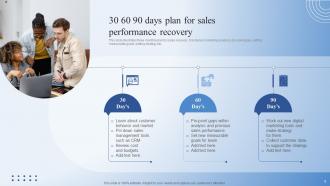
Don't sugarcoat the numbers upfront - show exactly where things stand right now. Walk through what went wrong and why, then jump straight into your recovery plan since that's honestly what everyone's waiting for anyway. Break everything down into 30/60/90 day chunks with clear owners for each piece. You'll want realistic projections too - best case, worst case, the whole deal because nobody likes getting blindsided later. Oh, and definitely map out how you'll track progress and report back. Keep it visual with charts instead of text walls. Practice the brutal questions beforehand because they're coming.
Don't overload your slides with data - people's eyes just glaze over. One main point per slide, that's it. Skip the "we'll do better" BS without actual details. What really matters is telling the story: what broke, why it broke, here's our fix. I hate when presentations get bogged down with corporate speak and flashy transitions - honestly just distracts everyone. Be specific about next steps too. Like, what's happening Monday? People need concrete timelines, not more fluff.
Don't cluster all your case studies together - spread them out! Open with a quick "we helped Company X recover" example to prove you know your stuff. Then weave in 2-3 detailed ones that actually match what your prospect is dealing with. Here's my trick: pick cases where the original mess was way worse than theirs. Makes your work look more impressive, honestly. Skip the fluffy success stories and go hard on real numbers and timelines. Oh, and after each case study, connect it back with "here's what this could mean for you guys" so you're not just storytelling.
Look, here's the thing - your recovery presentation is useless without telling people what to do next. You've just spent 20 minutes explaining the mess and how to fix it, then... crickets? That's like explaining a recipe but never saying when to put it in the oven. People need specifics: who does what, by when. Maybe it's "Sarah handles vendor calls by Wednesday" or "we need $50K approved for new equipment." I've seen too many good presentations die because nobody knew what happened after everyone left the room. Don't let yours be one of them.
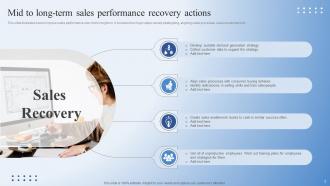
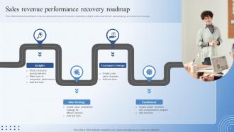
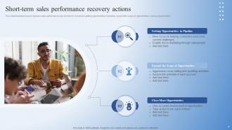
Split your template into two parts. Quick wins first - pipeline pushes, discounts, customer calls that can hit within 30-60 days. Basically your "oh shit" moves to stop the nosedive. After that section, map out the longer stuff: new markets, product tweaks, relationship building. Those take 6-12 months but actually matter more in the end. Connect how the short-term tactics feed into your bigger strategy so leadership doesn't think you're just throwing spaghetti at the wall. Don't forget specific dates and metrics for each phase.
Honestly, PowerPoint's still king in most corporate places. But Google Slides is clutch when you need to collaborate in real-time - way less back-and-forth emails. Canva surprised me lately, their business templates actually look professional now and you won't want to throw your laptop out the window trying to align text boxes (unlike PowerPoint, ugh). Prezi's cool for sales stuff if you want something less boring. Quick tip though - whatever you pick, just make sure it spits out decent PDFs for virtual meetings. I usually grab a Canva template first, then bring it into PowerPoint for final touches.
-
A beautiful, professional design paired with high-quality images and content that is sure to impress. It is a must-use PPT template in my opinion.
-
Amazing variety of PowerPoint slides. Really helpful in designing professional presentations.