


Salesforce sales force kpi dashboard snapshot ppt powerpoint presentation show sample


Try Before you Buy Download Free Sample Product
 Impress Your
 Audience
Editable
of Time


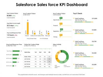
Our Salesforce Sales Force KPI Dashboard Ppt Powerpoint Presentation Show Sample are explicit and effective. They combine clarity and concise expression.
People who downloaded this PowerPoint presentation also viewed the following :
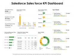
Salesforce sales force kpi dashboard snapshot ppt powerpoint presentation show sample with all 2 slides:
Give your audience a fulfilling experience. They will find our Salesforce Sales Force KPI Dashboard Ppt Powerpoint Presentation Show Sample elevating.
FAQs for Salesforce sales force kpi dashboard snapshot ppt powerpoint
Honestly, start with pipeline velocity and conversion rates by stage - those tell you if deals are actually moving. Average deal size matters too, plus how long your sales cycles run. Win/loss ratios are brutal but necessary to track. Oh, and lead response time because nobody waits around anymore. Quota attainment is obviously huge (stressful as hell but whatever). Activity stuff like calls and emails might seem basic, but they're what drives everything else. These eight will give you a solid read on what's broken and what's not.
Start with your actual business goals, then pick KPIs that match those specific objectives. Don't dump every possible metric onto your dashboard - honestly, that just creates noise nobody looks at. Put your most important stuff at the top where people will see it first. Use filters and custom reports to zoom in on what your team actually needs. Conditional formatting helps make the trends super obvious visually. Oh, and set up auto-refresh so you're not looking at stale data from last week. The key thing? Review it regularly and adjust based on what decisions you're actually making.
Dude, real-time Salesforce dashboards are a game changer. You'll catch problems right when they happen instead of discovering them weeks later when you're screwed. Like if lead conversion suddenly tanks, you can shift resources immediately. Your team stays on the same page without digging through endless reports or waiting for those boring quarterly meetings. I'm weirdly obsessed with watching the numbers update live - it's like a dopamine hit when you hit targets. Oh, and definitely set up alerts for your key metrics. That way the dashboard actually does the work instead of you babysitting it all day.
Start with solid reports first, then build your dashboards on top of them. I learned this the hard way after trying to skip that step like an idiot. Summary reports work best - group your data however you want your KPIs broken down. Clean up your filters so you're not getting weird numbers later. Honestly, the flexibility you get from this approach is huge. When something looks wrong (and it will), troubleshooting becomes way easier. Just focus on one critical KPI first. Get that report-dashboard combo working perfectly before you go crazy adding more stuff.
Okay so the biggest thing - don't cram like 20 metrics on one screen. Pick 5-7 max that actually matter. I learned this the hard way when my CEO couldn't find anything useful in my beautiful mess of charts lol. Skip the vanity stuff too, nobody cares about 15 different lead breakdowns. Make sure your date ranges are right because showing executives old data when they want current numbers? Awkward silence guaranteed. Oh and test it with real people first - what makes sense to you might confuse everyone else. Data refresh issues will bite you if you're not careful.
Honestly, garbage data will absolutely wreck your dashboard - I've watched so many good projects crash because of this. Start by setting up required fields and validation rules upfront. Picklist values help too. Duplicate records are the worst nightmare, trust me on that one. Monthly data quality reports will catch the weird stuff like incomplete entries or outdated info. Someone needs to own this process though - can't just hope it fixes itself. Clean naming conventions from day one will save your sanity later. Your dashboard's only gonna be as solid as whatever you're feeding into it.
So predictive analytics basically flips your Salesforce dashboards from showing what already went down to what's about to happen. You can forecast pipeline trends, figure out which leads will actually convert, and catch churn risks early. Einstein Analytics handles most of the complex stuff automatically - honestly pretty cool tech. Instead of always playing catch-up, you're getting ahead of problems before they mess things up. Sales forecasting predictions are probably your best starting point since those typically pay off quickest. Way better than just staring at last month's numbers hoping they'll magically improve, you know?
So basically map KPIs to what each team actually cares about - sales wants pipeline velocity and conversion rates, marketing needs lead quality metrics, customer success tracks retention stuff. The real trick? Don't build those insane dashboards with like 50 metrics that everyone ignores. Keep it to 5-7 per team, stuff that actually ties to their bonuses and daily work. Oh and make sure everything rolls up to company goals somehow. Salesforce lets you create role-based views so people only see their own numbers, which honestly saves everyone's sanity.
First thing - lock down those folder permissions. You really don't want Karen from accounting stumbling into confidential revenue stuff by accident. Give stakeholders view-only access through Salesforce's sharing settings if they just need to see reports. I'd set up automated email snapshots too since nobody actually logs in regularly (let's be real). Make different dashboards for executives vs your ops teams - they want totally different things. Oh, and add descriptions explaining what each chart actually shows. People get confused easier than you'd think. The whole point is keeping it simple so they get what they need without drowning in irrelevant data.
Dude, mobile optimization is a game changer for Salesforce dashboards. Your team can actually check KPIs during client meetings or while traveling instead of being stuck at their computers. The trick is making sure everything displays right on phones - charts need to be readable without zooming in like crazy. Real-time data access means faster decisions on the go. I'd start by checking how your current dashboards look on mobile (probably worse than you think). Then focus on the most critical metrics first. Honestly, there's nothing worse than trying to present data from a dashboard that looks terrible on your phone.
Honestly, Einstein Analytics (now Tableau CRM) is your best bet if you want serious data visualization - way better than the standard stuff. The AppExchange has a bunch of solid options too. Skuid's great for custom interfaces, ChartIO does nice charts, and there's Conga for automated reports. Warning though - you can easily go down a rabbit hole browsing all the apps on there. I'd say start with Einstein if you're doing heavy analysis. Otherwise, just search AppExchange for whatever specific problem you're trying to fix. Definitely try the free trials first - saved me from buying something totally wrong once.
Honestly, I'd go with Salesforce's built-in stuff first - MuleSoft or Data.com work great if they connect to your source. If not, you're looking at middleware like Zapier or building custom APIs. Don't try to shortcut this part though, seriously. I've watched people struggle for months because they skipped getting data properly into SF first. Once it's actually in your org as real objects, building dashboards is cake. Oh and map out which external data you actually need before diving in - saves tons of headache later.
Honestly, start with something simple like a feedback form right in Salesforce - people are already there anyway. Then maybe do quarterly surveys to your dashboard users. Track which widgets nobody clicks on because those are probably useless. Monthly office hours work great too, lets people drop by with complaints or ideas. But the thing that really works? A Slack channel where users can quickly report issues without feeling like they're filing a formal complaint or whatever. Also schedule regular check-ins with your key stakeholders. Pick one method this week and add more later.
Get everyone doing hands-on training with the actual dashboards they'll use every day. Walking through filtering data and drilling into specifics works way better than boring demos - trust me on this one. Show them how to spot trends and weird anomalies in the visuals. Quick reference guides are clutch for bookmarking later. Pick a few "dashboard champions" from your team to help with troubleshooting (saves you from being the only go-to person). The whole point is making it feel less scary and more like something they'd actually want to use daily.
UX design makes or breaks dashboard engagement, honestly. People either use your KPIs daily or completely ignore them - there's not much middle ground. Clear navigation and visual hierarchy are game changers. When users can quickly scan and understand the data, they'll actually check it regularly. Frustrating dashboards? People just stop opening them altogether (learned this the hard way). Group related metrics together and declutter what you have now. I'd bet you'll see engagement spike pretty quickly once you clean things up.
No Reviews