


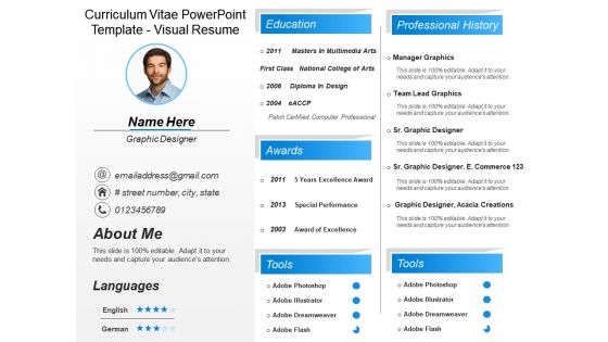
Curriculum vitae powerpoint template visual resume





Try Before you Buy Download Free Sample Product
 Impress Your
 Audience
 100%
100% Editable
 Save Hours
 of Time


Our Curriculum Vitae Powerpoint Template Visual Resume encapsulate everything good. The contents and images are all high class.
People who downloaded this PowerPoint presentation also viewed the following :
Curriculum vitae powerpoint template visual resume with all 6 slides:
Launch your campaign with our Curriculum Vitae Powerpoint Template Visual Resume. They will strive with you to acheive your goal.
FAQs for Curriculum vitae powerpoint
Start with clean contact info at the top and add a quick professional summary. For skills, try visual elements like progress bars - makes it way more interesting than boring bullet points. Timeline format works great for your work experience instead of the usual chronological dump. Just don't overdo the design because some recruiters are weirdly traditional about that stuff. Definitely include an achievements section with real numbers, not vague descriptions. If you've got portfolio pieces, throw in a small section for those too. Oh, and test how it looks in black and white first!
Honestly, color choice matters way more than people think for resumes. Blue's your safest bet - shows you're trustworthy and professional. Green works too, gives off stable vibes. I'd avoid red unless it's just tiny accents because it can come across aggressive. Purple's risky - looks creative but might be too much for boring corporate places. Black and gray won't hurt you, but they're kinda blah. Here's what I actually do though: check out the company's website first. See what colors they use and try to match that vibe somewhat.
Dude, infographics are honestly a game-changer for resumes! Recruiters barely glance at each one - like 6 seconds max - so visuals help you pop immediately. Instead of boring bullet points, you can actually show your wins with charts or timelines. Sales growth looks way cooler as a graph, you know? Just don't go overboard though. Graphic designers can get super creative, but if you're in accounting, stick with simple stuff. Oh, and definitely keep a plain text version around because those ATS systems are still pretty basic. I made one last year and it was actually fun to put together!
Honestly, less is more with creative resumes. Pick one or two accent colors and don't go crazy with fonts - HR people hate squinting to find your phone number. White space is your friend. Icons work great for showing skills instead of boring bullet points, and infographics can make your achievements pop. Just make sure you're in a field where creativity actually matters (like design or marketing). I'd still keep a boring traditional version handy though. Quick test: can someone scan it in 10 seconds and find what they need?
Graphic design, marketing, and advertising companies absolutely eat up visual resumes - they want to see what you can actually do. Tech startups are cool with them too since they're all about breaking the mold. But law firms, banks, healthcare? Yeah, they'll probably think you're weird if you send something too flashy. Honestly, it really depends on whether your job involves creative stuff or visual problem-solving. I'd definitely stalk the company's LinkedIn first though - check out how their current employees present themselves. That'll give you a good sense of whether they're the type to appreciate something different or if you should just stick with the boring black-and-white template.
Design it at 300 DPI with CMYK colors for printing, but also save an RGB version for emails. White space is your friend - cramped resumes just look amateur. Stick to standard fonts so they don't get weird on different computers. Oh, and don't make the file huge or it'll bounce back from email servers. I learned that one the hard way! Test both versions first. Always keep a plain black-and-white backup too because printers love to randomly run out of color at the worst times.
Honestly, typography can make or break your resume. Go with clean fonts like Arial or Helvetica - they won't fight with your design stuff. Use different font sizes for headers vs regular text so there's clear hierarchy. I always stick to max two fonts because more than that looks messy. White space is your friend too. You don't want everything crammed together. The whole point? Making it super easy for recruiters to scan through quickly. Sans-serif fonts are usually the safest choice since they're readable and professional looking.
First thing - ditch those default colors and pick something that fits your field. Tech? Go with blues. Design work? Get creative with the palette. Font-wise, find something that feels like you but don't get weird with it (I've seen some truly awful font choices lol). Replace the generic icons with stuff that actually shows your skills. Move your strongest sections up top since hiring managers barely glance at these things anyway. The whole point is making it yours while keeping it clean enough that someone can scan it in literally seconds.
Honestly, just start with Canva - seriously, their templates are actually decent and you won't hate yourself learning it. InDesign's obviously the pro choice if you're doing creative work, but it's kind of a beast to learn. Figma's solid too since it's free and works in your browser. Don't laugh, but PowerPoint can actually handle basic layouts way better than you'd think. I used it once when I was desperate and... it worked? Anyway, mess around with Canva first. You can always upgrade to InDesign later if you need the fancy stuff.
Honestly, visuals are a game-changer for resumes. Try adding bar charts for sales growth or little trophy icons next to your awards - that stuff actually catches attention. Numbers work way better than vague descriptions too. Like instead of "improved team productivity," show a graphic with the actual percentage increase. I usually color-code different wins - green for money stuff, blue for leadership. Timeline graphics are pretty solid for showing career progression. Just don't go crazy with it or you'll end up with something that looks like a kids' art project. Clean but eye-catching is the sweet spot.
Don't go crazy with the design - that's the biggest trap. Like, I've seen resumes that look like someone discovered every filter on Canva at once. Stick to maybe two colors max and one clean font. Here's the thing though - most companies run everything through those ATS systems first, so your beautiful design might get completely scrambled before anyone sees it. Super frustrating, I know. Graphics and fancy layouts just confuse those systems. My advice? Create your pretty version but always have a boring text version ready to submit too. Clean beats flashy every time.
Here's the deal with visual resumes - you'll need both versions. ATS systems are still stuck in like 2005 and can't read your cool graphics or fancy layouts. So make a boring text version with basic headings like "Work Experience" using Arial or whatever. Don't use tables or columns since they totally break the system. I always tell people to think of it this way: send the pretty one directly to humans who'll appreciate the design, but upload the plain text version for online apps. Otherwise your resume just becomes digital gibberish and never makes it to actual people.
Try clickable skill bars that expand with your actual projects - those look pretty slick. Short video intros work well too, though honestly some people go way overboard with flashy animations and it's just annoying. Interactive timelines are solid for showing career progression with pop-up details. Maybe add portfolio thumbnails that open to full examples? I'd throw in a contact form too. But seriously, start with just one thing first. See how employers actually respond before you go crazy with bells and whistles everywhere.
Make your visual resume tell a story instead of just listing jobs. Set it up like a timeline with your biggest wins, challenges you crushed, or those "aha" moments that changed everything. Most resumes are total snoozefests anyway, so this'll definitely help you stand out. Add little captions explaining why you made each career move - that's the good stuff hiring managers actually want to know. Use icons or colors to show how your skills evolved over time. Basically, you're creating your professional origin story. You want them dying to know what chapter comes next.
Honestly, clean and minimal is where it's at right now - tons of white space, way less random graphics everywhere. Data visualization is huge for showing off your skills (progress bars, timeline layouts, that kind of stuff). Oh and weirdly, QR codes are back? I know, I know, but people are actually using them to link portfolios now. Just make sure everything has a purpose instead of being pure decoration. Stick to maybe two accent colors, keep fonts consistent, and test that it looks decent printed in black and white. Simple stuff really works best.
-
Understandable and informative presentation.
-
Out of the box and creative design.