


Strategy house powerpoint guide


Try Before you Buy Download Free Sample Product
 Impress Your
 Audience
Editable
of Time


Strategic house PowerPoint guide PPT slide has been crafted to define the planning of the organizational process, its strategy(s), direction(s) and / or making decisions on allocating the resources of the company to pursue the strategy(s). The scope of plot platform PowerPoint shape may also be used to extend to control mechanisms for guiding the implementation of the strategy(s). As the strategic planning became prominent in corporations years ago and till today, it remains an important aspect of strategic management, therefore, by picking the blueprint cover PowerPoint presentation, the user is assisted to execute the strategies and research the sources in the analysis reports of the organization and its relationship to the environment in which it competes. Set your goals, determine your actions to achieve the goals and mobilizes the limited and precious resources to execute the actions by availing the benefits and advantages of the features and components of this template. Formulate your competitive strategy by using key elements which includes company strengths and weaknesses, personal values of the key implementers (i.e., management and the board), industry opportunities, threats and broader societal expectations also. Establish yourself as a good candidate with our Strategy House Powerpoint Guide. Convince them you have what they desire.
People who downloaded this PowerPoint presentation also viewed the following :
Strategy house powerpoint guide with all 5 slides:
Enlarge the bandwidth with our Strategy House Powerpoint Guide. Your thoughts will cover a wider range.
FAQs for Strategy
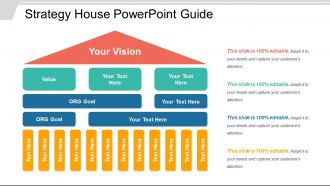
So there are basically three parts to get right: foundation, pillars, and roof. Your foundation is your core values and what you're actually good at. Then you've got 3-5 pillars - these are your main strategic priorities. The roof? That's your big picture vision. Honestly, I think of it like Jenga - if one piece is off, everything gets shaky. Foundation keeps everything steady, pillars do the heavy lifting, and the roof is where you're trying to end up long-term. Just map out what you've already got in each section first. You'll probably spot the wobbly bits pretty quickly from there.
So basically, a strategy house stops your presentation from looking like you just threw random slides together. It creates this visual hierarchy that builds up from your foundation to your main priorities - kind of like a roadmap your audience can follow along with. People remember visual structures way better than boring bullet points, which honestly makes sense. I'd put it near the beginning of your deck and then circle back to it as you work through each section. It really does turn messy ideas into something that actually flows logically. Your audience will thank you for it.
Start with your foundation - that's where your core values go. The middle pillars are for your main strategic priorities, and the roof shows your big vision. Pretty straightforward. Stick with your brand colors if you've got them, and don't go crazy with fonts. I always mess this up, but make sure people can actually read it from the back row. Different sized boxes help create some visual flow so it's not just a wall of text. White space is your friend here - cluttered strategy houses look amateur. Oh, and definitely test it on a projector first. Trust me on that one.
Build from the bottom up - core values first, then strategic pillars, vision at the top. Each piece needs to connect clearly to what's above and below it. Honestly, most strategy houses I see are just fancy wall art that nobody actually gets. Keep the language simple enough that your team can repeat it back without stumbling over corporate speak. Short test: hand someone your visual and see if they can walk through your strategy. If they can't? Back to the drawing board. The whole thing should tell one clear story, not just look impressive in PowerPoint.
Okay so visual hierarchy is huge for strategy houses - you need people's eyes to follow the logical flow from bottom to top. Start with your foundation stuff looking "heavier" visually, then let it get lighter as you move up to the big vision goals. Without proper hierarchy, it's just chaos and nobody knows what to look at first. Size, color, positioning - use all of it to make the structure obvious. People should naturally read from your core capabilities up through strategic pillars to the end goals. I always sketch this out first before touching PowerPoint (saves so much headache later).
Okay so the main thing - don't cram everything onto one slide. I've seen so many strategies that are just wall-to-wall text and it's impossible to follow. Your pillars need to be specific too, not just throwaway words like "innovation." What does that even mean? Be actionable instead. Oh and test it with someone fresh! Seriously, if you've been staring at this thing for weeks, you'll miss obvious gaps. Make sure there's a clear line from your foundation up to the vision. Keep each section tight but meaningful - you don't need your entire strategic plan visible at once.
Don't just present your strategy house - make it a conversation. Walk through each level together first. Have people guess what goes in each section before you show them your ideas. Honestly, I've sat through way too many strategy meetings where everyone just smiles and nods, then nothing sticks. Get them involved with sticky notes or polls if you're remote. Pause at every "floor" for questions and pushback. The whole point is making them feel like they're actually building this thing with you, not just getting a tour of something that's already done.
Honestly, stick to one color family - way cleaner than some rainbow mess that looks super amateur. Start with your darkest shade at the top for vision/mission stuff (navy blue works great), then gradually go lighter as you move down through your pillars and initiatives. The bottom foundational elements should be your lightest shade. I learned this the hard way - definitely test everything in grayscale first to make sure it'll actually print okay. Trust me on that one. Keep it to maybe 3-4 shades max, otherwise it gets messy fast.
Just swap out the foundation stuff to match your industry - pretty straightforward actually. Healthcare needs regulatory compliance and patient outcomes, while tech focuses on innovation cycles and scalability. The template structure stays the same though, you're basically just plugging in what matters for your field. Honestly don't overthink it (teams always do this). Start with whatever your stakeholders actually care about. Change the terminology and KPIs to reflect what drives success in your space. I'd focus on the basics first - you can always get fancier later.
Start with your core financial stuff - revenue growth, market share, customer acquisition costs. Basic profitability metrics too. Then grab the operational ones that actually matter for your strategy: customer satisfaction, employee engagement, product quality, whatever. Here's the thing though - don't go crazy tracking everything under the sun like most companies do. Pick 3-5 metrics max per pillar or your dashboard becomes total noise. Each metric needs an owner and quarterly targets. Oh, and actually look at the damn things regularly instead of creating some fancy presentation that sits in a folder forever.
So basically turn each level into a story chapter. Your foundation is the "here's where we started" part - like what mess got you to this point? The pillars become your turning points, and vision is where you want to end up. I always throw in real customer stories or employee examples instead of boring bullet points (way more engaging honestly). Each section should connect to the next like you're building toward something. Oh, and try starting sections with "what if..." scenarios - it gets people actually visualizing the outcome instead of just reading another corporate doc.
Start with master slides - they'll keep everything consistent without you going crazy. Smart guides and gridlines are lifesavers for positioning all those strategy house boxes properly. The built-in shape libraries are honestly way better than trying to create everything yourself (learned that the hard way). Use styles for fonts and colors so it doesn't look like a mess. Animation works great if you want to build up each level gradually. Oh, and definitely begin with a basic template first - you can always add fancy stuff later once you've got the layout down.
Dude, the strategy house thing is actually perfect for teams. Everyone gets the same visual to work with, which beats those boring strategy docs nobody touches. Different people can own different parts - someone handles the foundation stuff (values), another person works on the pillars (main strategies). What I love about it is everyone sees how their piece fits the whole thing. Keeps meetings focused too since you're all staring at the same framework. Oh, and definitely have each person present their section using the house - it'll get everyone on the same page way faster.
Honestly, infographics are a game changer for strategy stuff. Complex data becomes way easier to digest when it's visual instead of just boring bullet points everywhere. Your brain processes images faster than text anyway - that's just how we're wired. Stakeholders actually stay awake during presentations instead of mentally checking out halfway through dense slides. Plus you can show how all your initiatives connect to bigger objectives with flowcharts or diagrams. Visual hierarchy helps too since people immediately see what matters most. I'd swap out at least one text-heavy slide for something visual next time you present.
Honestly, just treat your strategy house like a rough draft that you'll keep tweaking. Set up review checkpoints at each level - foundation first (that's where most people mess up anyway), then work up to the pillars and roof. Your PowerPoint becomes a living doc that changes based on what people tell you. Schedule regular sessions to test your assumptions and get feedback. Document which comments led to what changes so you can see how everything evolved. The whole thing should feel iterative, not like some perfect monument you built once and never touch again.
-
Content of slide is easy to understand and edit.
-
Innovative and attractive designs.