


Target vs achievement table showing actual performance




Try Before you Buy Download Free Sample Product
 Impress Your
 Audience
 100%
100% Editable
 Save Hours
 of Time


Bake your thoughts in the oven of our Target Vs Achievement Table Showing Actual Performance. Sense the aromas of your ideas waft across the room.
People who downloaded this PowerPoint presentation also viewed the following :
Content of this Powerpoint Presentation
Nothing inspires people more than the idea of becoming the best and rising above the mediocre. One set of winners will set goals for themselves, while others will require the presence of a competitor around them to get them going. Either way, a comparison will be drawn and performances rated against the set target, at intervals. Sometimes, you require a third-party to judge your success, while, at other times, self-evaluation will offer you much deeper insights than what others would perceive. This feedback, post every assessment, is important as it will highlight the promoters and detractors of your success. For this, it's wise to maintain a sheet after such assessments to measure the success rate and aim for calculated and higher success rates the next time.
SlideTeam has chosen a practical and very easy to maintain target vs achievement tabular template to record the variation and overlap of success in your projects and day-to-day endeavors. Track performances over time, across varied intervals for assessments. Let's explore the complete utility of this PPT Design with its detailed features below.
Template 1: Target Vs Achievement Table Showing Actual Performance
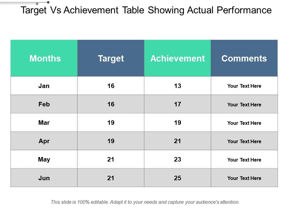
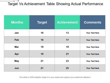
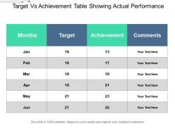
Start editing this content ready tabular design to track and record achievement rates of your projects across months. Assign a value to the most-perfect success state of your projects and mark your performance compared to the set score. Add comments to give deeper insights about the scores received and compare monthly performance in this easy-to-understand PPT Sheet.
Determine Success Rates with Simple Comparisons
Analyzing performance and comparing results can be simplified, if parameters are clear and the scoring in easy digits. This PPT Slide is perfect to draw insights and re-strategize for future projects.
PS: Compare your Human Resource Department performance with the planned goals using this PowerPoint Preset
Target vs achievement table showing actual performance with all 5 slides:
Our Target Vs Achievement Table Showing Actual Performance ensure you don't appear doubtful. Conduct yourself with a confident flair.
FAQs for Target vs achievement table
For your template, start with the obvious stuff - output volume, quality scores, how well you hit goals. Attendance and participation matter too, plus whether you actually take initiative (managers love that). If your job touches money at all, definitely track revenue impact or cost savings. The tricky part is measuring softer skills like communication and teamwork - harder to quantify but still important. Oh, and add some future-focused stuff like skill development progress. Honestly though, generic templates are pretty worthless. You've gotta customize it to what actually matters in your specific role.
Honestly, charts and graphs are a lifesaver for performance data - way better than staring at endless spreadsheet rows. People can spot trends instantly instead of getting lost in numbers. Color coding works great for flagging problem areas. Oh, and definitely put your most critical metric front and center as a big visual. Before/after comparisons are clutch too. Include some benchmarks so folks can tell if you're crushing it or totally bombing. I've seen too many presentations where good data gets buried under boring tables. Visual dashboards just make everything click faster.
So benchmarking is basically how you figure out if your numbers actually mean anything. Like, getting 500 website visits sounds cool until you realize your competitors are pulling 5,000, you know? You need something to compare against - industry averages, your past performance, maybe that one company that's absolutely crushing it in your space. Without those reference points, you're just staring at random data. I usually pick 2-3 solid benchmarks for whatever I'm tracking. The trick is finding ones that actually make sense for your situation instead of just grabbing whatever's easiest to find.
Start with your basic template but swap the KPIs for what actually matters in each field. Retail needs sales per square foot and inventory turnover. Healthcare? Patient satisfaction and readmission rates work better. Manufacturing focuses on OEE and defect rates instead. The annoying part is figuring out regulatory stuff - financial services need totally different compliance sections than tech companies do. I keep maybe 70% the same (goal setting, reviews, development plans) and customize the rest with industry benchmarks and their specific language. Oh, and definitely check what metrics companies in that industry actually report publicly. Their annual reports are goldmines for this.
Honestly, the biggest thing is don't dump like 15 charts on people at once - their eyes will glaze over. Tell a story with your data instead of just showing numbers without context. What does this actually mean for the business, you know? Also, I've seen people only show the wins and hide the messy stuff. Bad move - everyone notices and it kills your credibility. Make sure your timeframes actually make sense and you're comparing similar things when showing trends. Oh, and this might sound obvious but always end with what we should DO next, not just "here's what went down last quarter."
Honestly, data storytelling is a game changer for boring performance reports. You're basically creating a narrative instead of just throwing charts at people. Be the detective - show them the clues that led to your insights. Walk them through what caused those performance changes and how everything connects. Executives will actually pay attention because they're following a story, not scanning another soul-crushing dashboard. Structure it with a beginning, middle, and end. I know it sounds obvious, but most people skip this part and wonder why their reports get ignored. Try it on your next one - you'll see what I mean.
Three things that actually work: visual hierarchy, progressive disclosure, and storytelling with your data. Put your main insight right at the top. Then use charts that show patterns instead of drowning people in details. I always do this "so what?" test - honestly it saves so much time. If a data point can't answer that question, just cut it. Break messy datasets into smaller pieces using dashboards where people can dig deeper if they want. Lead with the business impact first. Then back it up with only the essential data that proves your point.
Look, performance data shows you what's *actually* working vs what you think is working. I've watched way too many teams make huge decisions based on hunches - total disaster. Track metrics that match your goals, then use that info to either pivot or double down on stuff. Spot the trends early. Find your bottlenecks. See where you're getting the best bang for your buck. Oh and set up regular reviews so this data actually feeds into your quarterly planning. Otherwise you're just collecting numbers for no reason.
Honestly, Google Sheets or Excel with live data connections are your best bet for real-time stuff. Tableau and Power BI work too if you want fancy auto-refreshing charts. I'd personally go with Google Data Studio though - it connects to pretty much everything and updates on its own. You can also hook up APIs from Google Analytics, Mixpanel, whatever CRM you're using. Set it up once and you're golden. Your presentations will always have current numbers without you having to mess with anything. Way better than copying and pasting data every time you present.
So first thing - make sure you're comparing the same stuff. Same KPIs, same time periods, pulling from identical data sources. Otherwise you'll get weird results that don't mean anything. I like setting up dashboards where I can see both datasets side by side - makes spotting trends way easier than staring at spreadsheets all day. Don't get fooled by seasonal stuff though, that always messes people up. You're looking for actual changes, not just normal ups and downs. Oh, and definitely make this a regular thing rather than scrambling to do it once.
Don't cherry-pick data or make misleading comparisons - that's the biggest thing. Include timeframes and any limits to your methods. I've watched teams get totally screwed when they hid bad results and leadership found out later, so just be upfront about everything. Privacy matters too if you're showing individual vs team metrics. Frame it constructively though - focus on what you can learn and improve rather than just calling out failures. Oh and transparency is huge, especially with context around the numbers. Would you want someone analyzing your performance this way? That's always my gut check.
Templates are honestly a game-changer because everyone starts talking about data the same way. No more confusion about what metrics mean or how to read the results. They standardize your data collection process, which makes comparing performance way easier – whether that's between teammates or different time periods. Plus you're not starting from scratch every damn time (been there, done that). Delegation becomes smoother since people know what format to expect. The best part? When everyone's using the same template, discussions focus on what the numbers actually tell you instead of figuring out the format.
You should definitely ask for feedback during those presentations - it transforms boring data dumps into actual discussions. Questions from the audience help you catch blind spots you totally missed. Plus you'll figure out what people actually want to see versus what you assumed they needed. Some of my best "aha moments" honestly came from weird tangent questions that made me rethink everything. Short sentences work. Longer ones let you build on ideas and show connections between different points. Don't just present and run - encourage people to challenge your conclusions too.
Honestly, it's all about reading the room. Executives just want the big picture and how it affects money - bore them with methods and they'll check out. Technical people are the opposite though, they want ALL the details about your calculations and data sources. Marketing teams are actually my favorite to present to because they get excited about good visuals and the story behind numbers. When you've got a mixed crowd, go broad first then ask if anyone wants deeper dives. I usually prep like 3 different versions of my main slides depending on who's there. Oh and always figure out what decision they're trying to make - that's your north star.
Line charts are definitely the way to go for tracking performance over time. You can actually see the patterns and trends instead of just staring at numbers. Bar charts? Total nightmare when you've got tons of data points - learned that the hard way. The cool thing about line charts is you can throw multiple metrics on there at once. Like response time and throughput together, which is super helpful. Just keep your time intervals consistent and don't forget to label everything clearly. Otherwise your stakeholders will be squinting at it like "what am I even looking at?"
-
Nice and innovative design.
-
Innovative and attractive designs.