

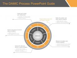
The damic process powerpoint guide


Try Before you Buy Download Free Sample Product
 Impress Your
 Audience
Editable
of Time


Awaken joy in their hearts with our The Damic Process Powerpoint Guide. Instil faith in the glory of God.
People who downloaded this PowerPoint presentation also viewed the following :
The damic process powerpoint guide with all 7 slides:
Our The Damic Process Powerpoint Guide fulfill every criteria. They contain every desirable element.
FAQs for The damic
Okay so first thing - figure out your themes, like what big categories your work falls into. Map out who's doing what and what resources they need. This gets chaotic fast if you're not on top of it, trust me. Set up regular check-ins to track progress against your goals - otherwise stuff just falls through the cracks. Oh and document everything! I know it's annoying but leadership will definitely ask for details later and you don't want to scramble trying to remember what happened three months ago.
So instead of everyone just doing their own random tasks, thematic processes get your whole team focused on the same big-picture stuff. Way more collaboration happens because suddenly everyone's work actually connects. Picture it like - instead of people rowing all over the place, they're all going the same direction. You get those regular check-ins where you're talking through shared progress, which honestly builds way more trust than I expected. Next sprint, try organizing around maybe 2-3 clear themes instead of just listing out features. The difference is pretty immediate.
Look, thematic consistency is like your brand's backbone - it makes sure every touchpoint hits the same core message and vibe. Nike's a perfect example. They hammer that "just do it" achievement angle whether it's a Super Bowl ad or some random Instagram story. Smart move, honestly. When you keep your themes consistent, people start recognizing your brand instantly and actually trust it. Your themes need to connect your values to how customers feel. Otherwise your messaging gets all over the place and confusing. Start with 2-3 core themes, then go through all your content to make sure it actually lines up.
So basically, pick one main theme early on and stick to it religiously. Your whole presentation should feel like it's building toward the same point - kinda like how every scene in a good movie ties back to the central plot (cheesy comparison but it works). Don't just throw random facts at people. Make your data, examples, everything connect back to that core message. Honestly, the hardest part is cutting stuff that doesn't fit, even if it's interesting. But when everything clicks together? Your audience will actually follow along instead of zoning out halfway through.
Look at what your characters are actually struggling with emotionally - that's where themes hide. Surface plot stuff doesn't matter as much. Mind mapping works surprisingly well (feels kinda juvenile but whatever). Try stripping away all the action scenes and asking what your story's really saying about the human experience. Also do this thing where you check if your potential theme connects to every major story element. Sounds tedious but it works. Oh, and pay attention to symbols that keep showing up - they're usually pointing toward something important. Pick whichever theme feels most honest to what you're trying to say.
So basically you dig through all your user research to spot the patterns - like if everyone keeps saying they feel overwhelmed, that's your theme right there. Group your findings into maybe 3-4 big themes first. Then design around those instead of guessing what people want (honestly this is where most teams mess up). If "rushed" keeps coming up in interviews, make your interface feel more spacious and calm. It's just connecting what users actually tell you to your design choices. Oh and definitely audit your current stuff against these themes - you'll probably find some gaps you missed.
Oh man, the classic mistake is being way too vague - like saying "customer excellence" when that could mean literally anything. Pick 3-5 themes tops, otherwise you're all over the place. The other thing that kills me? People create these themes but never assign anyone to actually own them or figure out how to measure success. Then six months later you're like "wait, what happened to our strategic priorities?" Make sure each theme actually means something specific and put someone's name on it. Otherwise it's just expensive wall art, honestly.
Visual hierarchy is your best friend here - give each theme its own color or icon so people instantly know what you're talking about. I'd make template slides for major themes with different backgrounds or accent colors. Start with a roadmap slide showing how everything connects. Honestly, audiences get lost way easier than we think they will. Recurring visual metaphors work great too - puzzle pieces for integration stuff, building blocks for foundational concepts, whatever makes sense. Short version: make it stupidly obvious which theme each slide belongs to. Your future self will thank you when you're presenting!
NVivo or Atlas.ti are solid choices if you're dealing with tons of data. But honestly? Don't overthink it at first. Spreadsheets work great for getting started - I know it sounds basic but they're surprisingly effective. Sticky notes are actually clutch for initial brainstorming too. Miro's perfect if your team's working remotely and needs that visual collaboration thing. Really depends on how much data you've got and how your team operates. Start with whatever feels natural to you. You can always move everything to fancier software once you've figured out your flow.
Honestly, culture is everything when picking themes. What clicks with audiences varies wildly by region - I learned this the hard way working on a project last year. Gaming's a perfect example: super violent stuff works fine in America but you'll need serious tweaks for parts of Asia. Even basic things like colors mean totally different things depending where you are. My advice? Do the research early and run focus groups locally before you go all-in. Nothing worse than bombing because you assumed what works here works everywhere. Trust me on this one.
So instead of just crossing your fingers for random breakthroughs, thematic processes give your team a real framework to dig into big ideas. You'll start seeing patterns between projects you never noticed before. Plus you can connect dots that seemed totally unrelated - that's honestly where the magic happens most of the time. Resources get spread way more intelligently too since you're not just throwing ideas at the wall. Oh, and make sure your themes actually solve problems your customers care about, not just cool tech stuff. Cross-functional teams attacking these themes from different angles? That's where you'll see results.
Totally doable! Break your themes into sprint-sized pieces and treat them like regular user stories. Don't try to nail everything down upfront - that's where teams usually mess up. Start rough and let themes evolve as you go. Use your retros and sprint reviews to see what's actually working with users. I'd map one theme per epic, keeps things cleaner. The whole point is staying flexible, not creating more rigid requirements (we have enough of those already, right?). Let feedback shape where your themes go instead of overthinking them from the start.
Track your accuracy rates and how long each dataset takes - that's the easy stuff. Inter-coder reliability too if you've got multiple people coding. The harder part? Whether your themes actually make sense and explain what's happening in the data. Honestly, stakeholder buy-in is huge. If they're not finding your themes useful, you're probably missing something. I'd also count how often you end up scrapping themes midway through - happens more than you'd think. Start small though. Pick like 3-4 metrics max or you'll drive yourself crazy trying to measure everything.
Honestly, feedback loops are a game-changer for theme development. Set up regular check-ins - maybe weekly team reviews - where you test your themes against actual data and stakeholder feedback. When something's not working, pivot fast. Short feedback cycles keep you from going down rabbit holes that don't matter to your audience. I learned this the hard way after spending weeks on themes that totally missed the mark. Think of it as quality control that runs constantly in the background. Without these touchpoints, you're just guessing and hoping your patterns actually mean something. The continuous refinement is what makes themes stick.
Oh dude, check out what Spotify did - they went all-in on this "audio-first" thing and it totally drove their podcast expansion. Netflix is another good one, built everything around "personalized entertainment everywhere" which honestly makes so much sense when you think about it. Patagonia's probably my favorite example though. They organize literally everything around environmental themes - products, marketing, even how they source materials. Pick whichever company matches your industry best and really dive into how they made all their decisions flow from that main theme.
-
Informative presentations that are easily editable.
-
Unique research projects to present in meeting.