


Mobile app ui ux design improvement proposal powerpoint presentation slides




Try Before you Buy Download Free Sample Product
 Impress Your
 Audience
 100%
100% Editable
 Save Hours
 of Time


Our Mobile App UI UX Design Improvement Proposal Powerpoint Presentation Slides are topically designed to provide an attractive backdrop to any subject. Use them to look like a presentation pro.
People who downloaded this PowerPoint presentation also viewed the following :
Content of this Powerpoint Presentation
Slide 1: This slide introduces Mobile App UI UX Design Improvement Proposal. Mention Client name, Submission date, User assigned.
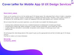
Slide 2: This slide displays Cover Letter for Mobile App UI UX Design Services.
Slide 3: This slide depicts Table of Contents of the presentation.
Slide 4: This slide showcases Project Context and Objectives.
Slide 5: This slide showcases Project Context and Objectives for Mobile App UI UX Design Services.
Slide 6: This slide shows Our Process with- Plan of Action, Scope of Services, Time Frame, Additional Service Offerings.
Slide 7: This slide depicts Plan of Action for Mobile App UI UX Design Services.
Slide 8: This slide displays Scope for Mobile App UI UX Design Services.
Slide 9: This slide showcases Timeframe for Mobile App UI UX Design Services.
Slide 10: This slide represents Additional Service Offerings for Mobile App UI UX Design Proposal.
Slide 11: This slide represents Investment details.
Slide 12: This slide represents Investment details.
Slide 13: This slide also represents Investment details. Following activities will be performed in different phases – Research, App Screen Wireframes, Interactive Prototype, Initial Mockups, UX Flow Charts.
Slide 14: This slide showcases Investment details for Mobile App UI UX Design Services.
Slide 15: This slide showcases Company Overview with- Why Us, About Us, Awards, Our Team.
Slide 16: This slide shows reasons for choosing us for Mobile App UI UX Design Services.
Slide 17: This is About Us slide with Mission, Vision and Core Values of The Company.
Slide 18: This slide represents Awards for Mobile App UI UX Design Services.
Slide 19: This is Our Team slide with Names and Designations.
Slide 20: This is Our Team slide with Names and Designations.
Slide 21: This slide shows Our Past Experience with- Client Testimonials, Case Study.
Slide 22: This slide represents Client Testimonials.
Slide 23: This slide shows Client Testimonials.
Slide 24: This slide showcases Case Study for Mobile App UI UX Design Services.
Slide 25: This slide represents Statement of Work and Contract.
Slide 26: This slide represents Statement of Work and Contract.
Slide 27: This slide depicts Next Steps.
Slide 28: This slide showcases Next Steps for Mobile App UI UX Design Services.
Slide 29: This is Contact Us slide with Address, Email address and Contact number.
Slide 30: This is Icon Slides for Mobile App UI UX Design Improvement Proposal.
Slide 31: This slide is titled as Additional Slides for moving forward.
Slide 32: This is About Us slide to showcase Company Specifications.
Slide 33: This is Our Mission slide with Vision, Goal and Mission.
Slide 34: This is 30 60 90 Days Plan slide.
Slide 35: This slide shows Timeline process.
Slide 36: This slide shows Roadmap process.
Mobile app ui ux design improvement proposal powerpoint presentation slides with all 36 slides:
Use our Mobile App UI UX Design Improvement Proposal Powerpoint Presentation Slides to effectively help you save your valuable time. They are readymade to fit into any presentation structure.
-
Mobile App UI UX Design Improvement Proposal
-
Cover Letter for Mobile App UI UX Design Services
-
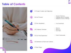
Table of Contents
-
Project Context and Objectives
-
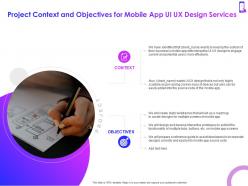
Project Context and Objectives for Mobile App UI UX Design Services
-
Our Process
-
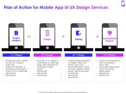
Plan of Action for Mobile App UI UX Design Services
-
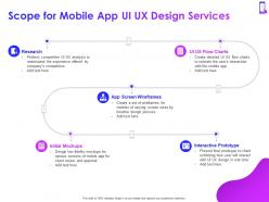
Scope for Mobile App UI UX Design Services
-
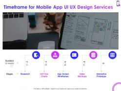
Timeframe for Mobile App UI UX Design Services
-
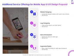
Additional Service Offerings for Mobile App UI UX Design Proposal
-
Your Investment
-
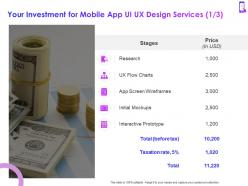
Your Investment for Mobile App UI UX Design Services 1 3
-
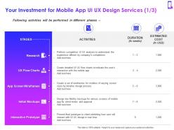
Your Investment for Mobile App UI UX Design Services 1 3
-
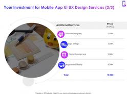
Your Investment for Mobile App UI UX Design Services 2 3
-
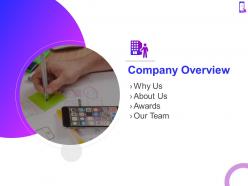
Company Overview
-
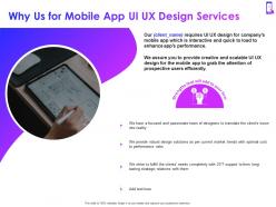
Why Us for Mobile App UI UX Design Services
-

About Us for Mobile App UI UX Design Services
-
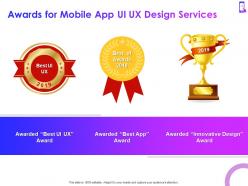
Awards for Mobile App UI UX Design Services
-

Our Team for Mobile App UI UX Design Services 1 2
-
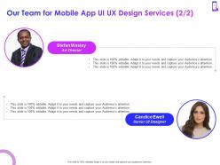
Our Team for Mobile App UI UX Design Services 2 2
-

Our Past Experience
-

Client Testimonials for Mobile App UI UX Design Services 1 2
-

Client Testimonials for Mobile App UI UX Design Services 2 2
-
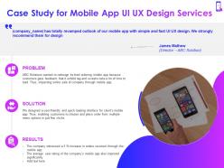
Case Study for Mobile App UI UX Design Services
-
Statement of Work and Contract
-
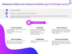
Statement of Work and Contract for Mobile App UI UX Design Services
-
Next Steps
-
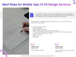
Next Steps for Mobile App UI UX Design Services
-

Contact Us for Mobile App UI UX Design Services
-
Icon Slides for Mobile App UI UX Design Improvement Proposal
-
Additional Slides
-
About Us for Mobile App UI UX Design Proposal
-
Vision and Mission for Mobile App UI UX Design Proposal
-
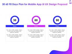
30 60 90 Days Plan for Mobile App UI UX Design Proposal
-
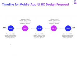
Timeline for Mobile App UI UX Design Proposal
-
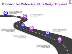
Roadmap for Mobile App UI UX Design Proposal
FAQs for Mobile app ui ux design improvement proposal
Hey! Dark mode is still killing it for engagement, plus micro-interactions and those personalized onboarding flows. Honestly, users are so impatient now - you've got maybe 10 seconds before they bounce. Neumorphism and glassmorphism look super clean if you want that modern vibe. Voice UI is everywhere too since people are lazy (myself included lol). Oh, and gesture navigation - everyone expects to swipe through everything like it's TikTok. I'd start with micro-interactions first. They're not too hard to code and you can actually see how users react right away.
So for colors, think about what emotions you want. Blue's great for trust - banks love it for a reason. Green screams success, red grabs attention for buttons you really want clicked. Orange feels super friendly and upbeat. Honestly, I've watched so many apps completely bomb because they threw every color at the wall. Stick to 2-3 main colors tops. Be consistent with what each color means - don't make green mean "go" on one screen and "error" on another, you know? Also check your contrast ratios or you'll fail accessibility hard. Every color needs a job, not just decoration.
Dude, typography can make or break your app - I've seen gorgeous designs ruined by terrible font choices. Stick with system fonts or something proven that actually reads well on phones. Size matters too - never go under 16px for body text, trust me on this. Make sure your headers are way bigger than regular text so there's clear hierarchy. Oh and white space! Don't cram everything together like some kind of text sandwich. Also check your contrast ratios or people won't be able to read anything. Honestly half the apps I use daily have this stuff wrong.
Build feedback touchpoints right into your sprint cycles. In-app surveys work great, plus user testing sessions and app store reviews - honestly, support tickets tell you the most about what's actually broken. Those quick 2-question pop-ups after users complete something are my favorite. Prioritize feedback by how often it comes up and whether it hits your main user flow. Keep a feedback backlog that feeds your sprint planning so you're fixing real problems instead of guessing. Oh, and definitely tell users when you've fixed something they complained about - they love that.
Oh man, mobile usability is such a pain point! Tiny buttons are the worst - I can never tap the right thing. Make them at least 44px or people will hate you. Slow loading drives me nuts too, so definitely optimize those images. Navigation needs to be super obvious and thumb-friendly, not some clever hidden menu thing. Forms are brutal on phones unless you really think them through. White space is your friend - don't cram everything together. Here's the thing though: simulators lie. Test on real devices because the experience is totally different. Quick audit of your current setup will probably reveal some easy fixes.
Honestly, you've gotta think about accessibility from the start - adding it later is such a pain. Make sure your color contrast is solid and touch targets are at least 44px. Alt text on images is non-negotiable, and label everything properly for screen readers. I'd definitely test with VoiceOver or TalkBack - those tools will find stuff you totally missed. Complex gestures are tricky for some users, so keep interactions simple. WCAG guidelines sound boring but they're actually super helpful as a checklist. Once you get into the habit, it's really not that complicated.
Honestly, just stick with what people already expect. Bottom navigation works great since that's where your thumb lives anyway. Make those touch targets at least 44px - trust me on this one. Don't go crazy with menu layers either, maybe 3-4 deep max before people get totally lost. Breadcrumbs are actually pretty clutch for complicated apps, even though everyone seems to forget about them. Oh, and definitely test with actual humans early on. I've seen way too many apps that made perfect sense to the designer but completely baffled real users. Quick feedback when someone taps something goes a long way too.
Okay so micro-interactions are those tiny animations that make your app feel responsive - like when you pull to refresh or a button does that little bounce after you tap it. They're honestly pretty crucial because they give users instant feedback and create this emotional connection. People feel like the app actually understands what they're doing, you know? Plus they kill uncertainty - loading spinners are perfect for this since users know something's actually happening. Just don't go crazy with flashy stuff everywhere. Keep them subtle and start with your most common actions first. Way better than having a dead-feeling interface.
Honestly, stick to 3-5 screens tops for onboarding. Don't try showing users every feature right away – that's where most apps mess up big time. Show them what matters *when* it matters. Interactive stuff works way better than boring screenshots, and definitely let people skip if they want. Oh, and throw in a progress bar so they're not wondering how much more there is. The real trick? Get them to that moment where they're like "oh, this is actually useful" as fast as you can. That's what'll keep them around.
Honestly, data viz is where it's at for mobile apps. Charts and graphs beat boring spreadsheets every time - people actually get what they're looking at instantly. Your users will stick around longer because they can finally make sense of their data without squinting at tiny numbers. Mobile screens are cramped anyway, so visual stuff just works better. I'd start with the metrics that actually matter to your audience - like, what do they really care about? Even basic progress bars can make a huge difference. Oh and interactive elements are pretty sweet too if you can swing it.
Start with typography, colors, and spacing - those are your foundation. Then tackle buttons, forms, and especially icons (seriously, bad icon choices will kill your whole vibe). Keep navigation consistent everywhere, obviously. Document it all in a style guide so everyone's on the same page. I'd focus on your most common components first rather than trying to think of every edge case right away. Also, create clear rules for text hierarchy - like what makes a heading vs regular text. The whole thing falls apart without that structure, trust me.
Honestly? User goals come first, always. Map out your main user flows and make sure they actually make sense - pretty colors won't save confusing navigation. It's like trying to decorate a house with terrible layout, you know? Once the flow works, then you can layer on the visual stuff. Clear hierarchy matters way more than people think. Keep your spacing consistent and only add micro-interactions that actually help users (not just because they look cool). Oh, and test everything early. Beautiful designs that nobody can figure out are basically just expensive art projects.
Honestly, just go with Figma - your whole team can jump in and work together without that annoying version control mess. Sketch is decent but feels kinda outdated now. If you're already paying for Adobe stuff, XD works fine I guess. Testing-wise, Maze and UserTesting are solid for getting real feedback. InVision used to be the go-to but it's pretty clunky these days. I've been doing everything in Figma lately since it covers both prototyping and basic testing flows. Plus it's free to start, so there's literally no reason not to try it first.
Dude, this stuff actually matters way more than people think. iOS users are obsessed with that clean, minimal look - you know, subtle animations and everything feels polished. Android people? They're totally different. They want Material Design with bright colors and those floating buttons everywhere. It's honestly like two completely different worlds. Your buttons, fonts, where you put navigation - it all needs to match what people expect. Think about it - users tap through native apps all day, so when yours feels "off," they notice immediately. Don't try to make one design work for both platforms. Trust me, design each one properly and your engagement will actually improve.
Honestly, focus on engagement stuff first - how long people stay in your app, if they come back, daily active users. That's your bread and butter. Then look at whether they're actually finishing the tasks you want them to (like signing up or whatever your main goal is). Oh and definitely track crashes and load times because a slow app will tank everything else, no matter how good your features are. I'd throw in some user feedback too - app store reviews, maybe a quick survey. But seriously, don't go crazy with metrics at first. Pick like 3-4 that actually matter for your specific goals and start there.
-
Unique research projects to present in meeting.
-
Best way of representation of the topic.
-
Unique research projects to present in meeting.
-
Qualitative and comprehensive slides.