


Transition plan gantt chart powerpoint slide




Try Before you Buy Download Free Sample Product
 Impress Your
 Audience
 100%
100% Editable
 Save Hours
 of Time


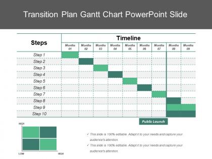
You can make a comprehensive timeline of your project using the transition plan Gantt chart PowerPoint template. The professional transition plan template is useful to plan the projects which include information about tasks, duration as well as resources. The transition plan Gantt chart presentation slide displays a variety of activities, and their precedence, against time. With just a glance at the PowerPoint Gantt chart slide, the viewers can get information related to the tasks, activity time periods, what activities overlap with each other, start and end date of the activity and needed resources allocated. The transition plan example Gantt chart is a kind of flat table chart, which is useful to illustrate your project plan in a professional way. The Gantt diagram slide is extensively used in project management as well as offers a simple to understand view to the audience. The transition plan sample Gantt chart offer a graphical view which is easy to follow as well as covers the information related to execution, completion and pending tasks of a project. Your thoughts are highly coherent. Sharpen their focus with our Transition Plan Gantt Chart Powerpoint Slide.
People who downloaded this PowerPoint presentation also viewed the following :
Transition plan gantt chart powerpoint slide with all 5 slides:
Each Transition Plan Gantt Chart Powerpoint Slide is fashioned with great care. Their designs have a distinct character.

FAQs for Transition plan gantt
So for your Gantt chart, definitely include a solid timeline with start/end dates and map out those task dependencies - like what has to finish before the next thing can start. Assign resources so people know what they're doing, and mark your big milestones. Oh, and seriously add buffer time because projects always go sideways somehow. You'll want deliverables listed out, approval checkpoints with stakeholders, plus any training sessions. Make sure it's obvious which tasks can run at the same time vs. ones that have to wait. Build in regular check-ins too - you'll thank yourself later when you can actually course-correct instead of panicking at the end.
Honestly, Gantt charts are a game-changer for this stuff. Your whole team can see who's doing what and when everything's supposed to happen. Dependencies become super obvious too - like if Sarah's running late on user training, the go-live people know right away. No more of those awkward "wait, wasn't that your job?" moments because everything's laid out clearly. When your boss asks for updates, you've got one place to point to instead of digging through a million emails. Oh, and definitely do regular check-ins with the team using the chart - catches problems before they blow up.
Honestly, the worst thing you can do is be way too optimistic about how long stuff takes - always build in extra time because something will go wrong. Don't overcomplicate your chart either, like cramming every tiny detail in there. Nobody wants to look at that mess. Dependencies are huge too - if you don't map out what depends on what, you're screwed when one task runs late and everything dominoes. I learned this the hard way on my last project actually. Also involve people in the planning instead of doing it solo, then just keep updating it as things change. Which they will.
Use diamond shapes or vertical lines for milestones - they're basically zero-duration markers for big moments like "Go-Live" or "Training Done." Bright colors work great because stakeholders eat that stuff up visually. Space them out evenly so you're hitting wins throughout the project, not just at the end. Each one needs clear success criteria though, otherwise people argue about what "complete" actually means. I learned this the hard way on my last transition project. Put them at key decision points or major deliverables. Don't go overboard - too many and they lose impact.
So for transition Gantt charts, Microsoft Project is honestly your best bet if your company already has it - the dependency tracking is chef's kiss. No MS Project? Smartsheet's pretty solid and way less intimidating, plus everyone can jump in and update stuff without wanting to throw their laptop out the window. Asana and Monday work fine but they're more for straightforward projects. Excel... look, it'll work but you'll hate yourself when things get complicated. Oh, and whatever you choose, make sure people can actually comment on the timeline. Trust me on this one - nothing worse than playing email tag about timeline changes.
Just draw arrows between the task bars to show what needs to happen first. Most Gantt tools let you drag and drop these connections pretty easily. Focus on the critical path stuff first - that's what'll actually break your timeline if something goes wrong. Color-coding helps me keep track of different dependency types, though honestly finish-to-start is like 90% of what you'll use anyway. Oh, and with migration projects especially, watch those predecessor relationships super closely. One delayed step and everything else starts falling like dominoes behind it.
Honestly, there's no magic number - it really depends on what you're working on. I usually aim for 2-4 week chunks since they hit that sweet spot where you can actually get stuff done but aren't waiting forever to see results. Bigger projects like system overhauls? You might need 6-8 weeks per phase. Simple process tweaks can be knocked out in a week or two. The trick is making sure each phase has clear goals and you've figured out what depends on what. My advice: brain dump everything first, group similar tasks together, then be realistic about how much your team can handle. Oh, and always add buffer time because something will go wrong.
Honestly, the trick is making your Gantt chart actually matter to whoever's looking at it. Don't just show everything - that's where people lose interest fast. For marketing, highlight the campaign stuff. IT gets the migration phases. Walk them through the big milestones first, then get into details if they ask. Here's what really works though: be honest about the risks upfront. Like, don't sugarcoat dependencies that'll mess with their deadlines. I always prep a few "what if" scenarios too because someone will definitely bring up concerns. Makes the whole conversation way smoother when you're ready for it.
Honestly, start with buffer time baked right into your Gantt chart - you'll thank me later. Version control is everything here. I can't tell you how many times I've watched projects blow up because everyone's working off different versions. Dependencies are tricky too since changing one thing usually messes with three other things down the line. Document why you made each change and what it impacts - stakeholders get way less cranky when they understand the reasoning. Oh, and do weekly check-ins instead of waiting until everything's on fire to make adjustments.
Honestly, Gantt charts are perfect for this stuff. You can see exactly when tasks need people and spot those awful overlaps before they bite you. Like when you suddenly need three developers but only have one available - been there, it sucks. The timeline shows you everything visually, so moving team members between phases gets way easier. I always make a resource calendar next to the project timeline. Makes planning new hires or shifting people around so much smoother than just winging it and hoping for the best.
Honestly, timeline stuff is the main thing to watch - like are you actually hitting deadlines or constantly running late? Resource tracking helps too so you don't end up with too many people doing nothing or everyone swamped at once. Those milestone checkboxes are weirdly satisfying when you get to mark them done. Budget variance matters obviously, plus how happy your stakeholders are and whether you're actually dealing with risks before they blow up. The cool thing about Gantt charts is you can spot where things are getting stuck pretty easily. I'd check in weekly - that way you can pivot when you notice trends instead of waiting until everything's on fire.
Honestly, go with cloud-based tools like Asana or Monday so everyone can see updates instantly. Set up auto notifications for milestones - trust me, people won't check otherwise. Color coding is your best friend here, makes scanning so much faster when each team has their own color. Weekly calls to review the chart together are clutch for catching problems early. Oh, and make sure it's actually useful to your team, not just some fancy chart nobody opens. The whole point is having a living document people actually want to look at.
Oh man, risk assessment is huge for Gantt charts! Basically you want to spot what could go sideways before it actually does. I'd start by listing your biggest 3-5 risks first. Then work backwards and figure out where to pad your timeline. High-risk stuff? Either tackle it early so you have recovery time, or add dependencies between connected tasks. Actually build those mitigation steps right into the chart as real tasks - don't just hope for the best. Trust me, learned this lesson the hard way when our server migration took twice as long as expected last year.
Honestly? Weekly at minimum, but when things get crazy you'll want to check it way more often. I usually do a quick Monday morning review, then circle back mid-week if stuff's blown up. Dependencies are always shifting and people love dropping surprises that wreck your timeline - it's like they plan it or something. Better to catch changes early than scramble later when everything's already off track. Set a calendar reminder though, because when you're swamped it's the first thing you'll forget to do.
Color coding is your best friend here - different streams get different colors so people can actually follow what's happening. Progress bars are clutch for showing what's moving vs what's stuck. I always throw in little icons too, like warning signs for sketchy areas or checkmarks when stuff's done. Most people zone out looking at boring Gantt charts, but add some visual flair and suddenly everyone's paying attention. Oh, and those dashboard summary boxes at the top? Total game changer. Shows overall progress percentages right up front. You want someone to look at it and immediately know if you're winning or not.
-
Great designs, Easily Editable.
-
Illustrative design with editable content. Exceptional value for money. Highly pleased with the product.