

Website review proposal powerpoint presentation slides




Try Before you Buy Download Free Sample Product
 Impress Your
 Audience
 100%
100% Editable
 Save Hours
 of Time


Improve the company's website content to boost its position and rating in the global market. Highly competitive environment demands organizations to be actively present on digital platforms. It is necessary to establish an amazing brand reputation to generate leads and convert them into the customers. To stay ahead of the competition, it is necessary to adopt modern technologies in business operations. Organically increase the visibility of your sites with the help of our Website Review Proposal PowerPoint Presentation Slides. Explain the need for a proper website assessment, critical role search, advertisement, and social media with the help of this digital mapping PPT template. Evaluate webpage performance against several parameters using this PPT slide. Present a project summary and solutions for webpage growth like site performance, architecture, SEO, and UX design by employing this digital success PPT slideshow. Assure your clients for deliverables like maximum click rates, landing page design, and effective lead conversion rate by taking the aid of this website development PPT presentation. Mention the scope of your services like social media strategy, email, branding, technology, and governance with the assistance of this digital success PPT layout. Analyze customer buying patterns and capture their response rates by utilizing our branding PPT design. With this innovative PPT graphic, you can elaborate on the different phases of website review. Allot a time frame for discovery, kick-off meeting, research, and audit by taking advantage from this PPT theme. Promise brand awareness, quality traffic, lead conversion, and customer experience to your prospective customers business with this editable proposal template. This strategic promotion PowerPoint slideshow exhibits the cost estimate and investment required for an effective and efficient marketing plan in a well-organized format. Build confidence in your customers by displaying your company's background, mission, vision, objectives, awards, and achievements. Download our website presentation ppt to highlight the client testimonials and case studies for your past projects.
People who downloaded this PowerPoint presentation also viewed the following :
Content of this Powerpoint Presentation
Slide 1: This slide introduces Website Review Proposal. State User assigned, Date submitted and Client name.
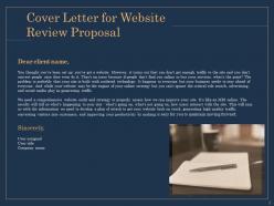
Slide 2: This slide displays Cover Letter for Website Review Proposal
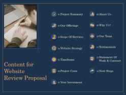
Slide 3: This slide shows Content for Website
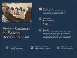
Slide 4: This slide describes Project Summary for Website.
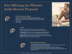
Slide 5: This slide showcases Our Offerings for Website Audit Review Proposal
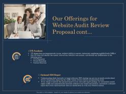
Slide 6: This slide showcases Our Offerings for Website Audit Review.
Slide 7: This slide depicts Scope of Services.
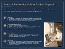
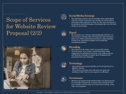
Slide 8: This slide describes Scope of Services for Website Review Proposal.
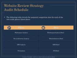
Slide 9: This slide shows Website Review Strategy Audit Schedule. The following table details the projected completion date for each of the web audit phases listed above.
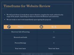
Slide 10: This slide shows Timeframe for Website Review.
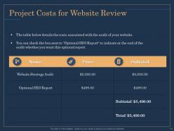
Slide 11: This slide depicts Project Costs for Website Review. The table below details the costs associated with the audit of your website.
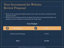
Slide 12: This slide displays Investment details for Website Review Proposal
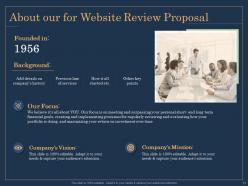
Slide 13: This is About us slide to showcase Company specifications.
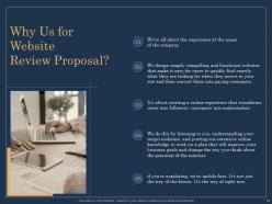
Slide 14: This slide shows reasons for choosing us for Website Review Proposal.
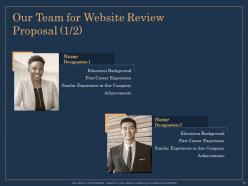
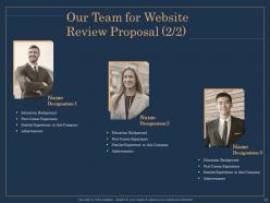
Slide 15: This is Our Team slide with Names and Designations.
Slide 16: This is Our Team slide with names and designations.
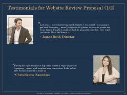
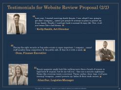
Slide 17: This slide depicts Testimonials for Website Review Proposal.
Slide 18: This slide showcases Testimonials for Website Review Proposal.
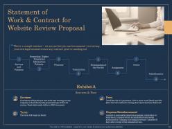
Slide 19: This slide describes Statement of Work & Contract.
Slide 20: This slide shows Next Steps for Website Review Proposal
Slide 21: This is Contact Us slide with Email address, Contact number and Phone number.
Slide 22: This is Icons Slide for Website Review Proposal.
Slide 23: This slide is titled as Additional Slides for moving forward.
Slide 24: This slide displays Our Mission,Vision and Goal.
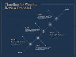
Slide 25: This slide shows Timeline for Website Review Proposal.
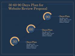
Slide 26: This is 30 60 90 Days Plan slide.
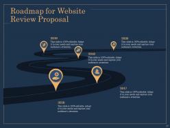
Slide 27: This slide shows Roadmap process.
Website review proposal powerpoint presentation slides with all 27 slides:
Use our Website Review Proposal Powerpoint Presentation Slides to effectively help you save your valuable time. They are readymade to fit into any presentation structure.

FAQs for Website review proposal
So basically we're doing a deep dive to spot what's broken and frustrating your users. Finding usability issues is the big one - like why people are bouncing or getting lost trying to buy something. We'll check how you stack up against competitors and current best practices (though honestly, half this stuff changes every month anyway). You'll get a roadmap that splits things into quick fixes versus bigger projects. That way you can knock out the easy wins first while planning the heavier stuff. Really it's about figuring out what's killing your conversion rates and making a plan to fix it without overwhelming your team.
Honestly, the design looks pretty solid for their audience - clean nav, works well on mobile, and the colors make sense for their industry. They put the important stuff right up front on the homepage, which is smart. That font though? Feels kinda outdated to me. Overall it matches what users expect from sites like this. Oh, and definitely run a quick survey with actual users - sometimes what looks good to us totally misses the mark with real people. You'd be surprised how often that happens.
Honestly, fast loading speeds are probably your biggest win - nobody waits around for slow sites anymore. Mobile responsiveness is non-negotiable too. Clean layouts with good white space help tons, plus make sure your navigation actually makes sense (you'd be shocked how many sites mess this up). Readable fonts and decent color contrast aren't exciting but they matter. Oh, and don't forget search functionality - people want to find stuff quickly. For your proposal, I'd definitely go mobile-first and focus hard on speed optimization. Those two things directly hit your bounce rates.
Oh yeah, super easy to find stuff. Just hit "Templates" on the main page and you can search or browse by categories - business reviews, analytics, whatever you need. Honestly way cleaner than I thought it'd be when we started using it. You can preview before downloading which is nice. There's filters too if you want specific styles. Our whole team figured it out pretty quick. One thing though - definitely bookmark the categories you use most because you'll be going back to the same ones constantly. Trust me on that one.
Dude, your site speed is probably tanking your engagement more than you realize. People bail after 3 seconds if pages don't load - I know it sounds harsh but that's just how it is now. Each extra second you're slow? That's like a 7% hit to conversions. Bounce rates go through the roof, fewer people actually browse around, and forget about sales. Aim for under 2 seconds if you can swing it. Quick win would be checking your images first - they're usually the biggest culprit. Also set up some basic caching. Those two things alone should help a ton.
Dude, mobile responsiveness can make or break your site. Most people browse on phones now, so if your layout's wonky or they have to zoom in constantly, they'll bounce immediately. Google notices this stuff too - sites that suck on mobile get buried in search results. Honestly, I've seen businesses lose so much traffic just because their mobile experience was trash. When you're checking yours, test it on real phones, not just those browser developer tools. The actual experience is weirdly different sometimes. Your conversion rates will thank you later.
Dude, your homepage is confusing as hell right now. I literally couldn't figure out what you guys even do until I scrolled around for like 30 seconds. Your headline just lists features instead of telling me why I should care - classic mistake everyone makes. The whole thing reads super generic too. What problem are you actually solving? Lead with that transformation or outcome people get, not some boring feature list. Honestly, you've got maybe 5 seconds before visitors bounce, so test a headline that screams "here's what's in it for YOU." The value prop is definitely there somewhere, it's just buried under all the fluff.
Yeah, the templates look really good! Clean and modern, works for basically any type of business. Typography doesn't strain your eyes which honestly is half the battle these days. You've got options from super minimal to more eye-catching designs depending on what vibe you're going for. Color schemes are tasteful too. Good visual hierarchy makes everything flow nicely for users. I'd browse a few different categories first - see what clicks with your brand before you start tweaking things. The design quality is solid across the board.
New templates drop every 6-8 weeks usually. They refresh the existing ones quarterly or if something breaks. The design team's been on their game with trends lately - though some of those gradient styles are kinda intense if you ask me. Your dashboard will ping you when updates come out, but I'd still check the template library monthly. Don't want to get stuck with layouts that look dated. Oh and if you need a specific style or industry template that's missing, just fill out their request form. They're pretty good about getting back to you and prioritizing stuff.
So they've got a bunch of ways to check out templates. Live previews are probably the most useful - you can actually click around and see how stuff works. There are thumbnail galleries too, plus these hover effects that show quick peeks when you mouse over. The before/after comparisons are actually pretty cool for seeing what's possible. Most templates come with sample content already loaded, which helps you picture your own stuff in there. Oh, and definitely use those filter options first to narrow things down by industry or whatever - otherwise you'll be scrolling forever. The full-screen preview mode is where you'll really get a feel for each one.
Your SEO's doing pretty well actually - 23% traffic bump in six months isn't bad at all. Main issue I see is you're sleeping on long-tail keywords that your competitors are totally dominating. Technical stuff looks decent, but honestly your page speeds are kinda slow and Google's being super picky about that lately. I'd hit the content gaps first though - do a quick competitor check to see what you're missing, then start building out those topics. Oh and your main service pages are ranking fine, so that's good news at least.
So there's actually a bunch of ways people can give feedback! Each template page has the usual star rating thing plus written comments. There's also this feedback form buried in the footer - though tbh I doubt many people scroll down that far lol. The monthly user survey is probably your best bet though, they ask specifically about template stuff and design preferences. Oh and you can always just hit up the contact page directly. I'd start with checking those survey responses since people tend to be way more detailed there.
So we price our templates around $15-25, which puts us dead center compared to other marketplaces. Envato and those premium sites hit you for $20-40, budget ones are more like $5-15. Took us ages to figure out pricing honestly - such a headache! Most people seem happy around that $20 mark though. The real difference isn't our individual prices, it's the bundle deals we do. Plus unlimited downloads for agencies, which is pretty sweet. Oh, and definitely look into subscription models since most users want ongoing access anyway rather than buying one template at a time.
Oh yeah, they've got way more than just reviews. There's FAQ stuff, plus you can download templates for basic processes. Video tutorials too - those actually helped me figure things out faster than reading everything. The community forum is clutch though, people share real tips there instead of just the official answers. Email support works during normal hours if you get stuck. Their knowledge base has troubleshooting guides but honestly? Start with the tutorial section first, it'll save you time later. That's what I wish someone told me upfront.
Honestly, your social proof is pretty lacking right now. Those two testimonials are buried in the footer where nobody sees them, and they don't even have photos or company names - makes them feel fake. You've got customer logos floating around but they're not really convincing anyone. Meanwhile your competitors are showing off detailed case studies and video testimonials right on their homepage. I'd grab 3-4 of your best success stories and turn them into proper case studies. Also, hit up your favorite clients for some better quotes with their actual info. Moving those testimonials somewhere visible would help too - like seriously, the footer?
-
Great!
-
Great
-
Great
-
Great
-
It saves your time and decrease your efforts in half.
-
Excellent products for quick understanding.
-
Awesome presentation, really professional and easy to edit.
-
Professional and unique presentations.