

Workflow Diagram Of Hospital Administration System




Try Before you Buy Download Free Sample Product
 Impress Your
 Audience
 100%
100% Editable
 Save Hours
 of Time


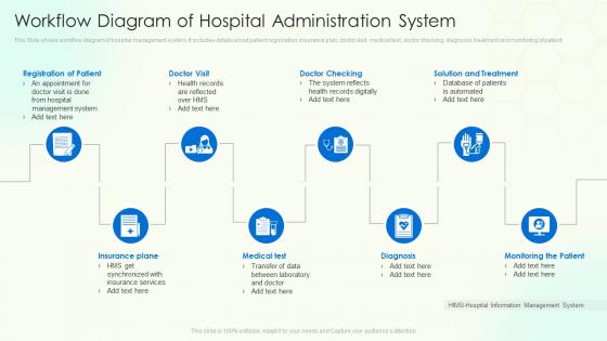
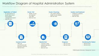
This Slide shows workflow diagram of hospital management system. It includes details about patient registration, insurance plan, doctor visit, medical test, doctor checking, diagnosis, treatment and monitoring of patient.
People who downloaded this PowerPoint presentation also viewed the following :
Workflow Diagram Of Hospital Administration System with all 6 slides:
Use our Workflow Diagram Of Hospital Administration System to effectively help you save your valuable time. They are readymade to fit into any presentation structure.





FAQs for Workflow Diagram Of
So you'll want to map out patient flow paths, decision points, and who's doing what at each step. Include time estimates too. Don't forget waiting areas and handoff points - anywhere the patient or info switches hands. Oh, and IT integration is huge since everything's digital now (I always space on that part). Honestly, just start simple. Pick one basic patient journey - admission through discharge - and nail that first. You can add all the crazy edge cases later. Focus on the big stuff: triage, diagnostics, treatment. Trust me, it gets messy fast if you try to map everything at once.
Dude, these workflow diagrams are game-changers for spotting where everything falls apart. You'll literally see patients stuck in waiting limbo or handoffs that completely bomb between departments. Honestly, once you map it out visually, the broken protocols just jump out at you - it's wild how obvious the communication failures become. The cool part? You can actually fix stuff before it hurts patients. I'd start with just one department though, don't try to boil the ocean right away. Trust me, you're gonna find some surprises lurking in there.
So for hospital workflow diagrams, most people go with Microsoft Visio, Lucidchart, or Draw.io. Visio's solid if you've got Office 365 already. Lucidchart has this really smooth drag-and-drop thing going on that makes working with your team way easier. Draw.io is free and honestly works better than it has any right to - I probably overuse it but whatever! Some healthcare teams swear by Bizagi or ProcessMaker since they're actually built for medical workflows. I'd say start with whatever your IT folks already have set up, then see if you need fancier stuff like real-time collaboration later.
You know how hospitals always have those "who's supposed to do this?" moments? Workflow diagrams totally fix that. They're like a visual roadmap showing exactly who does what and when. No more confusing handoffs or nurses wondering when lab results will be ready. Doctors can see discharge timing, admin knows their part in everything - it just makes sense. The whole team speaks the same language instead of making assumptions about stuff. Oh, and start with whatever patient pathway happens most often first. Way easier than trying to map everything at once. Trust me, it'll save you so many headaches.
Honestly, tech is what makes hospitals actually function these days. EHR systems ditched all that paperwork chaos, and automated tracking means patients aren't sitting around forever. Real-time dashboards help staff figure out what's urgent. RFID tags track equipment too - sounds boring but trust me, no one wants to spend their shift hunting down wheelchairs. The analytics part is pretty cool though. You can spot problems before they blow up and predict when you'll need more staff. I'd start by mapping out your current processes digitally, then tackle whatever's driving everyone crazy first.
Honestly, these workflow diagrams are a game-changer for training new people. Instead of dumping thick policy manuals on them, you can literally walk through how everything connects from start to finish. When I started, we definitely could've used something like this! Show them during orientation how departments link up, where the handoffs happen, and how their job fits into everything else. Super helpful for catching those confusing spots before they hit the floor and panic. Oh, and make versions that focus on just the workflows they'll actually deal with - no point overwhelming them with stuff from other units.
Honestly, the interdependencies between departments are going to make you want to pull your hair out. You've got patient flow, info handoffs, equipment stuff, and scheduling all happening at once. Everyone thinks their own process is straightforward while pointing fingers at how complicated everyone else's work is - typical office politics, basically. Timing data? Good luck with that since everything changes based on how sick patients are and who's actually working that day. The worst part is processes keep changing, so you'll be updating your diagram constantly. Start with just one patient journey instead of trying to tackle the whole hospital at once.
Honestly, regulatory requirements pretty much control how you structure your workflow diagrams. Can't just map processes however feels right - there's specific documentation points and approval steps that CMS and Joint Commission demand. Your diagrams need clear handoffs, safety checkpoints, and quality measures at every critical step. Version control is mandatory too since regulations change constantly (which is annoying but whatever). The trick? Review current regulatory standards first, then build workflows around those required touchpoints. Way easier than trying to force compliance into an existing process later. Trust me on this one.
So workflow diagrams are pretty much your best friend for finding where patients get stuck. Map out their whole journey and you'll spot the obvious stuff - registration taking forever, departments not talking to each other, that kind of thing. Honestly, discharge is usually where everything falls apart in my experience. Track one patient type from start to finish and write down every handoff and wait time. You'll be shocked at how much time gets wasted on steps that don't actually help anyone. It's like finally seeing all the chaos laid out clearly.
Start with the busiest departments and interview people from every role - nurses, docs, admin, support staff. Shadow some employees during their actual shifts (feels awkward but you'll see things they don't even think to mention). Mix different roles in focus groups because the debates get really interesting. Oh, and definitely catch the night shift people since everything works differently when management's gone home. Ask about their actual frustrations, not what the manual says they should be doing. That's where you find the real problems nobody talks about in meetings.
Set up reviews every 3-6 months and get someone to actually own each diagram. The people doing the work daily are your best bet - they spot problems you'd never see. Track changes when new procedures drop or regulations shift. Version control saves you from the "wait, which one are we using?" chaos. Oh, and do random walk-throughs where you follow the real process and compare it to your diagram. Honestly, the frontline staff feedback thing is clutch. Put quarterly reminders in your calendar right now for the critical ones and create some easy way for people to tell you when stuff's off.
So you'll want to embed those workflow diagrams right into your EHR interface as interactive maps. Each step should link to actual patient data and documentation stuff. Most modern systems have workflow modules that handle this - or you can use third-party tools if yours doesn't. Map each diagram step to real system actions like alerts, auto-filling forms, or sending tasks to different departments. Some EHRs even let you build decision trees directly in the interface, which honestly makes things way smoother. I'd start with your most critical workflows first - don't try to do everything at once. Then just work with your vendor to figure out what integration method works best for your specific setup.
Okay so workflow diagrams are actually pretty brilliant for this stuff. Map out what you're doing now first - then you'll see exactly where resources are getting wasted or stuck. Like, maybe your ER gets crazy busy at 3pm but nobody realized it was that predictable? Or certain departments are always short-staffed during night shifts. Instead of just moving people around randomly, you can actually be strategic about it. Honestly, I think most hospitals just wing it based on whoever complains the loudest. But when you can see the patterns clearly, you'll know where to send staff and equipment before problems even hit.
You gotta get baseline numbers first - patient wait times, staff overtime, med errors, satisfaction scores. Otherwise you're flying blind on whether anything actually got better. Monthly check-ins work well to compare against those original metrics. Here's what I've learned though - staff surveys are honestly more valuable than the data sometimes. They're dealing with your workflows every day and catch stuff that doesn't show up in numbers. When the metrics point to problems, just adjust the diagrams. No point being stubborn about it if something's not working.
Okay so static diagrams are basically your "how it's supposed to work" blueprint - fixed boxes and arrows that never change. Dynamic ones though? Those are constantly updating with real data. You'll see current patient loads, bottlenecks, staffing levels, all that stuff happening live. Like you can literally watch your ER fill up or track OR schedules changing throughout the day. Honestly, static ones are fine for training new people and keeping documentation, but dynamic is what you actually need for day-to-day operations. I'd say use static for initial planning, then switch to dynamic once you're running things.
-
Such amazing slides with easy editable options. A perfect time-saver.
-
The Designed Graphic are very professional and classic.