


3 productivity improvement powerpoint presentation




Try Before you Buy Download Free Sample Product
 Impress Your
 Audience
 100%
100% Editable
 Save Hours
 of Time


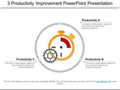
Presenting our 3 productivity improvement PowerPoint presentations and help your staff to work with the best of their abilities. This presentation slide of strategies to improve productivity in business has been created by our professional team members and helps you to review your existing workflow of the process to figure out the improvement areas. This presentation slide of tools used to improve productivity helps you to identify needed changes in the processes, equipment or technology and to see if your business has people with the right skills in the right places. This productivity improvement techniques PowerPoint presentation slideshow can be used to map out the processes by value stream mapping and figure out if there are pain points or bottlenecks spots. This template of employee productivity tracker can be used to get deep process insights, to Identifies weakness areas, and visualize the detailed insights of how your team is performing. Check out this productivity enhancement template and for more such templates you can visit our website. Our 3 Productivity Improvement Powerpoint Presentation will claim attention. They will get you the eyeballs you deserve.
People who downloaded this PowerPoint presentation also viewed the following :
3 productivity improvement powerpoint presentation with all 5 slides:
Acquaint folks with a few double edged expressions with our 3 Productivity Improvement Powerpoint Presentation. Introduce them to journalese.
FAQs for 3 productivity
Dude, visual aids are a game changer for meetings. People absorb information so much faster when they can actually see what you're talking about instead of just listening to you ramble. Honestly, I think half the reason meetings drag on forever is because everyone's confused about different things. Slides keep the conversation focused and give people something to look at - way better than staring at their phones the whole time. You'll wrap things up quicker and actually get stuff done when everyone's literally looking at the same thing. Plus it forces you to organize your thoughts beforehand.
Honestly, templates are a game changer. I used to spend forever messing around with fonts and layouts - so annoying! Now I just have like 2-3 solid templates ready to go. Drop in your content and you're done. The best part? Your stuff actually looks professional without trying too hard. I probably cut my prep time in half, maybe more. You can spend your energy on the actual content instead of making things pretty. Trust me, once you set this up you'll wonder why you didn't do it sooner.
Templates are honestly a lifesaver - they handle all the tedious setup work while you focus on the actual creative stuff. You're not starting from scratch every single time, which saves me like 2-3 hours per project. But here's the thing: you can still tweak sections, throw in whatever unique elements you want, or completely redo parts that need something different. It's kind of like having a solid recipe that you can mess around with. Just identify which parts of your work always follow the same basic pattern, then template those bits. Leave the creative sections totally open though - that's where the magic happens.
Okay so basically, good slide design = people actually paying attention instead of checking Instagram. I used to cram everything onto slides and wonder why everyone looked bored out of their minds. Now I keep text minimal and use lots of white space - makes a huge difference. Your brain digests visuals way faster than paragraphs anyway. Stick with the same fonts and colors throughout so it looks professional. Structure stuff with clear headings and bullets. Honestly, the extra time you spend making slides clean and scannable is totally worth it when people actually remember what you said afterward.
You'll want standard headers, bullet formats, and spots for objectives/deadlines/next steps. Honestly, watching people spend forever just on formatting is painful. Drop in placeholder text for common sections - saves so much back-and-forth later. Build approval workflows right into it too. The thing that actually makes templates work? Add quick examples or instructions in each section. That way your teammates can figure it out without bugging you every five minutes. Oh, and don't forget version control spots - trust me on this one.
Oh dude, you'll love this - collaborative presentation tools let everyone jump in at once instead of that annoying email ping-pong with different versions. Real-time editing means no more waiting around for Sarah to finish her slides before you can start yours. The comment feature is honestly clutch for feedback too. I used to hate when people would email me notes like "slide 3 needs work" - now they just drop comments right where they mean. Teams can actually hit deadlines when everyone's working together simultaneously. Definitely try it for your next big deck!
Okay so track two things - what happens during your presentation AND what happens after. During: are people asking questions, participating, looking engaged? The real test comes later though - did they actually do what you asked them to do? Most people get caught up in whether the audience "liked" their talk, which honestly doesn't mean much if nobody changes their behavior. Before you even present, decide what success looks like. Maybe it's "half the team starts using this new tool within a month" or whatever makes sense for your situation. Then actually check back on those goals. Way more useful than just collecting feedback forms that everyone fills out politely.
Honestly, templates are a game-changer because they handle all the design headaches for you. No more stressing about fonts or whether your slides look totally off – that stuff can seriously eat up your whole afternoon. You just plug your content into something that already works and boom, done. This gives you way more time for what actually counts: rehearsing your delivery and figuring out how to not sound like a robot up there. I learned this the hard way after spending 3 hours tweaking slide colors once (never again). Grab a decent template first and you'll have so much more brain space for practicing.
Your color choices totally change how people feel about your presentation. Red and orange pump up energy and urgency. Blues make everyone feel calm and trusting - but honestly, too much blue in that 2pm slot will put half your audience to sleep. Green screams growth and positivity, though I'd skip it for financial stuff since it might send the wrong "go ahead" message when you need people being cautious. Pick 2-3 colors that match what emotion you're going for, then definitely test them on your phone and laptop first. Background and text combos can make or break whether people actually read your slides.
Dude, templates are a lifesaver! Your team won't waste time rebuilding every single document from scratch. No more endless debates about which font to use – seriously, I've seen those conversations drag on forever. Everything looks professional and consistent without the headache. New people can actually hit the ground running instead of guessing what your company's style should be. Focus goes to the actual content, not design stuff. Start with whatever documents you're always making first.
Honestly, you've gotta match your content to who's reading it. Executives want the big picture stuff - ROI, outcomes, skip all the technical weirdness. But your dev team? They need those detailed implementation steps or they'll just bug you later anyway. I totally bombed this once by sending leadership a 10-page technical breakdown. Never again. Also switch up your tone - formal for outside people, way more relaxed internally. Pro tip: make yourself a master template you can tweak instead of rebuilding everything from zero each time. Saves you hours.
Templates are honestly a lifesaver for compliance stuff. They've got all your required sections built right in - disclaimers, risk statements, data sources, whatever. So you literally can't forget them. My old team used to waste so much time scrambling to add legal language at the last minute. Now everything's pre-approved and consistent, which auditors eat up. Oh, and your presentations actually look professional across the board. I'd start with your biggest 3-5 compliance headaches, then make template slides with placeholder text. Forces you to fill in each section properly.
Dude, you HAVE to try cloud presentation tools if you're working remotely. Google Slides or Figma are solid starting points - super easy to learn. The real-time editing is clutch because everyone can jump in at once instead of that nightmare email chain with a million file versions. Auto-save is a lifesaver too. Honestly, the commenting feature alone makes feedback way less painful than it used to be. Oh, and version history is there if someone accidentally breaks something (we've all been there). Trust me, once you make the switch you'll wonder how you survived the PowerPoint email chaos before.
Yeah, totally! Those death-by-PowerPoint sessions where everyone's staring into space? Interactive stuff fixes that. I throw in polls or quick breakout activities - maybe 2-3 times per hour - and people actually pay attention. They remember more, ask smarter questions. You can catch when someone's confused right away instead of finding out later when they screw something up. The whole thing just clicks better for people. Honestly, even simple clickable scenarios work. Skills stick faster and you won't need endless follow-up meetings. Trust me, you'll notice the difference immediately.
Honestly, don't wait until your templates are obviously outdated - build reviews into your regular routine. I'd say quarterly check-ins work well for your most-used ones. Follow some industry newsletters and LinkedIn thought leaders, maybe join a few professional groups where people actually discuss what's working. Feedly is clutch for this - I track like 15 sources without going crazy. Your team's feedback is gold since they're in these templates daily and catch stale stuff before you do. Just make a basic spreadsheet tracking last updates and next reviews. Start with your top 5 critical templates this month, then expand from there.
-
Great
-
Awesomely designed templates, Easy to understand.
-
The Designed Graphic are very professional and classic.