


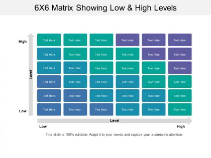
6x6 matrix showing low and high levels




Try Before you Buy Download Free Sample Product
 Impress Your
 Audience
 100%
100% Editable
 Save Hours
 of Time


Display an appropriate air of authority with our 6x6 Matrix Showing Low And High Levels. Arrive confidently at the helm of affairs.
People who downloaded this PowerPoint presentation also viewed the following :
6x6 matrix showing low and high levels with all 5 slides:
Our 6x6 Matrix Showing Low And High Levels are an economical choice. They deliver better for every buck.
FAQs for 6x6 matrix showing low
Best practices for creating effective matrix visualizations include using clear axis labels, consistent color coding, appropriate cell sizing, logical data grouping, and strategic white space. These approaches enhance comprehension by minimizing cognitive load, highlighting key relationships, and enabling quick pattern recognition, with many organizations finding that well-designed matrices significantly improve decision-making speed and stakeholder alignment.
Matrix visualizations enhance data comprehension by organizing complex relationships into intuitive grid formats, enabling audiences to quickly identify patterns, correlations, and outliers across multiple variables simultaneously. During presentations, these visual tools streamline decision-making processes by transforming dense datasets into accessible formats, with executives and analysts finding that matrix displays significantly accelerate insights discovery and strategic discussions.
Matrix visualizations excel at representing correlation data, adjacency relationships, time-series comparisons, performance metrics across categories, and hierarchical organizational structures. These visualizations enable analysts to identify patterns, dependencies, and outliers across complex datasets, with financial services using them for risk assessment matrices and healthcare organizations leveraging them for patient outcome correlations, ultimately delivering clearer insights.
Color schemes significantly impact matrix visualization readability by enhancing pattern recognition, reducing cognitive load, and improving data interpretation accuracy. Strategic color choices enable viewers to quickly identify correlations, outliers, and trends across complex datasets, while poor schemes can obscure critical insights, ultimately delivering clearer decision-making capabilities and enhanced analytical efficiency for data-driven organizations.
Popular tools for designing matrix visualizations include Tableau, Power BI, D3.js, Python libraries like Matplotlib and Seaborn, and R with ggplot2. These platforms streamline complex data representation by offering intuitive drag-and-drop interfaces, customizable formatting options, and interactive features, with many organizations finding that strategic tool selection enhances analytical capabilities while delivering faster insights and improved decision-making processes.
Matrix visualizations facilitate decision-making by organizing complex multi-dimensional data into clear, comparable formats, enabling stakeholders to identify patterns, correlations, and priorities at a glance. Through strategic frameworks like risk-impact matrices or competitive analysis grids, organizations streamline resource allocation, enhance project prioritization, and accelerate consensus-building processes, ultimately delivering faster strategic decisions and improved operational efficiency.
Common mistakes include overcrowding matrices with excessive data points, using inconsistent color scales, failing to provide clear legends, choosing inappropriate matrix dimensions, and neglecting proper axis labeling. These visualization errors significantly impact data comprehension across sectors like financial services and healthcare analytics, with many organizations finding that streamlined matrix designs enhance decision-making speed and analytical accuracy.
Interactivity can be incorporated through hover tooltips revealing detailed data, clickable cells for drill-down analysis, dynamic filtering options, zoom functionality, and real-time data updates. These interactive elements transform static matrices into engaging analytical tools, enabling users to explore patterns more intuitively, customize views based on specific needs, and ultimately deliver deeper insights and improved decision-making capabilities across organizations.
Audience analysis determines complexity levels, visual elements, and data granularity in matrix visualizations by considering technical expertise, decision-making needs, and time constraints. Through targeted design approaches, organizations create dashboards that resonate with executives seeking high-level insights, analysts requiring detailed data exploration, and operational teams needing actionable metrics, ultimately enhancing comprehension and strategic outcomes.
Cultural differences significantly affect matrix visualization interpretation through varying reading patterns, color associations, spatial orientations, and data hierarchy preferences across different societies. While Western audiences typically read left-to-right and associate red with danger, other cultures may interpret these elements differently, with many multinational organizations finding that localized visualization approaches enhance comprehension and decision-making effectiveness across diverse teams.
Innovative matrix visualizations include interactive heat maps with hover details, animated correlation matrices showing temporal changes, 3D cube representations for multi-dimensional data, bubble matrices with size-encoded variables, and dynamic comparison grids. These advanced approaches streamline complex data storytelling by enhancing audience engagement, enabling real-time exploration, and delivering clearer insights, with many organizations finding that interactive elements significantly improve stakeholder comprehension and decision-making speed.
Matrix visualizations support storytelling by revealing patterns, correlations, and relationships that might otherwise remain hidden in traditional charts, enabling presenters to guide audiences through complex data narratives with clear visual pathways. Through strategic color coding, hierarchical arrangements, and comparative frameworks, organizations across sectors like healthcare, finance, and retail can transform overwhelming datasets into compelling stories that highlight key insights, demonstrate cause-and-effect relationships, and ultimately drive informed decision-making with greater audience engagement.
Techniques include data aggregation, hierarchical clustering, color coding, filtering controls, and interactive drill-down capabilities. These approaches streamline complex matrices by grouping similar data points, highlighting key patterns through strategic color schemes, and enabling users to focus on relevant subsets, with many organizations finding that layered interactivity delivers clearer insights and faster decision-making.
Matrix visualizations adapt to mobile and web presentations through responsive design techniques, interactive filtering, touch-optimized controls, and progressive disclosure methods. These approaches streamline complex data displays by enabling zoom functionality, collapsible sections, and adaptive layouts, with many organizations finding that mobile-first design principles ultimately deliver enhanced user engagement and accessibility across all devices.
Matrix visualization's future lies in enhanced interactivity, real-time processing, and intelligent automation that can handle massive datasets seamlessly. Advanced technologies like AI-powered pattern recognition and cloud-based rendering will enable organizations across finance, healthcare, and manufacturing to uncover complex relationships instantly, while adaptive interfaces will streamline decision-making processes, ultimately delivering faster insights and competitive advantage.
-
Presentation Design is very nice, good work with the content as well.
-
The Designed Graphic are very professional and classic.