


7 productivity improvement ppt design




Try Before you Buy Download Free Sample Product
 Impress Your
 Audience
 100%
100% Editable
 Save Hours
 of Time


Presenting our 7 productivity improvement PPT design and achieve more output from the work. This workplace productivity has been creatively designed by our team of professional team members and enables your company to grow and adapt. With the help of this increase productivity at work PPT slide, you can outline the benefits of increased personal productivity because the more productive your work the more competitive you and your business will become. This productivity in business presentation template can be used to equip your team with the right tools which will help them in mastering a simple technique when they apply them on a consistent basis. You can also use this layout to improve cultural fit because employees who fit within the cultural values are likely to energize other employees. This kind of shift can result in increased motivation and productivity. Our productivity management presentation slide helps in reviewing your existing process setup and ensures the processes meet those goals and adds value. Our 7 Productivity Improvement Ppt Design are a brilliant form of communication. They enhance focused attention.
People who downloaded this PowerPoint presentation also viewed the following :
Content of this Powerpoint Presentation
Description:
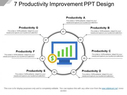
This image displays a PowerPoint slide titled "7 Productivity Improvement PPT Design," suggesting a focus on enhancing productivity. The central theme is about seven key productivity aspects, labeled A to G, each represented by a circle connected to a central circular path, implying a cyclical and interconnected process.
The text elements in the slide inform the viewer that each section is fully editable, encouraging the presenter to customize according to their needs while also engaging the audience's attention. The diagram includes a number of indicators from 1 to 7, associating each productivity aspect with a specific point in the sequence. A bar chart graphic with three bars is located in the circle labeled "02," presenting a visual representation of data associated with "Productivity B." Similarly, the dollar sign inside a circle at point "06" might be indicative of financial or cost-related considerations for "Productivity F."
The slide also specifies that the icon shown is for display purposes and can be replaced with any other icon from the provider's website, demonstrating versatility for different contexts.
Use Cases:
Now, we will identify seven potential industries where these slides can be most applicable, provide use cases, mention likely presenters, and specify target audiences.
1. Manufacturing:
Use: Optimizing production line efficiency.
Presenter: Operations Manager.
Audience: Production Staff.
2. Technology:
Use: Software development lifecycle enhancement.
Presenter: Software Engineering Lead.
Audience: Development Team.
3. Healthcare:
Use: Streamlining patient care processes.
Presenter: Healthcare Administrator.
Audience: Medical Professionals.
4. Finance:
Use: Improving financial processes and cost reduction.
Presenter: CFO or Financial Analyst.
Audience: Finance Department Employees.
5. Education:
Use: Curriculum development and teaching methods improvement.
Presenter: Academic Dean or Educational Consultant.
Audience: Faculty Members.
6. Retail:
Use: Supply chain and inventory management advancements.
Presenter: Supply Chain Director.
Audience: Logistics and Inventory Staff.
7. Hospitality:
Use: Improving customer service and operational efficiency.
Presenter: Hotel Manager.
Audience: Customer Service and Operational Teams.
7 productivity improvement ppt design with all 5 slides:
End animosity with our 7 Productivity Improvement Ppt Design. Get folks to deal with irreconcilable differences.


FAQs for 7 productivity
Effective time management techniques include time blocking, the Pomodoro Technique, priority matrix systems, batching similar tasks, and eliminating distractions through focused work sessions. These methods streamline workflow by reducing task-switching costs, enhancing concentration periods, and optimizing energy allocation, with many professionals finding that strategic time structuring delivers increased output and improved work-life balance.
Presentation templates streamline report creation by providing pre-designed layouts, consistent formatting structures, standardized visual elements, and organized content frameworks that eliminate starting from scratch. These templates enable teams to focus on data analysis and insights rather than design work, significantly reducing preparation time while ensuring professional consistency across departments, ultimately delivering faster report turnaround and enhanced organizational communication efficiency.
Visual design in presentations significantly enhances audience attention and outcomes by creating clear information hierarchies, reducing cognitive load, maintaining engagement through strategic color and layout choices, and reinforcing key messages through consistent visual elements. Well-designed presentations enable presenters to communicate complex data more effectively, with many organizations finding that professional visual design increases audience retention rates by up to 65%, ultimately delivering clearer decision-making processes and stronger business results.
Teams leverage collaborative tools to boost productivity through real-time communication platforms, shared document editing, automated task tracking, integrated project timelines, and centralized resource management. These technologies streamline workflows by eliminating email bottlenecks, reducing meeting overhead, and providing instant visibility into project status, with many organizations finding that seamless collaboration ultimately delivers faster project completion and enhanced team coordination.
Structured templates reduce cognitive load, minimize decision fatigue, enhance focus clarity, boost confidence through guided frameworks, and decrease presentation anxiety compared to freeform approaches. While freeform styles offer creative freedom, many professionals find that templates streamline preparation time, improve message consistency, and ultimately deliver more confident presentations with reduced stress and enhanced audience engagement.
Data visualization templates enhance business decision-making by transforming complex datasets into clear, comprehensible formats that highlight key trends, patterns, and actionable insights. These templates enable executives and stakeholders to quickly grasp critical information, compare performance metrics across departments, and identify strategic opportunities, ultimately streamlining the decision-making process while reducing meeting times and enhancing organizational alignment.
Effective distraction-minimization strategies include time-blocking for focused work, creating dedicated workspaces, using website blockers, implementing phone-free periods, and establishing clear boundaries with colleagues. These approaches streamline productivity by reducing cognitive switching costs, enhancing deep work capabilities, and maintaining consistent workflow momentum, with many professionals finding that structured distraction management ultimately delivers 25-40% improvements in task completion rates.
Setting clear objectives improves focus and productivity by eliminating decision fatigue, providing measurable milestones, and creating accountability frameworks that streamline task prioritization. In presentations, defined goals help speakers structure content effectively, while in daily workflows, clear objectives enable teams to allocate resources strategically, ultimately delivering enhanced operational efficiency and measurable performance outcomes.
Best practices for balancing creativity and efficiency in presentation layouts include establishing consistent templates, using modular design elements, creating reusable color schemes, implementing grid systems, and maintaining brand guidelines throughout. These approaches streamline the design process by providing structured frameworks while preserving creative flexibility, with many organizations finding that standardized yet adaptable templates significantly reduce production time while enhancing visual consistency.
Integrating feedback loops into presentation development enhances team performance by establishing clear review cycles, enabling iterative improvements, and creating accountability checkpoints throughout the process. This approach streamlines collaboration, reduces revision time, and ensures quality standards, with many organizations finding that structured feedback mechanisms ultimately deliver more impactful presentations and stronger team alignment.
Digital presentation tools enhance productivity through automated formatting, real-time collaboration, cloud-based accessibility, template libraries, and seamless integration with other platforms. These technologies streamline workflow by eliminating manual design work, enabling simultaneous editing, and providing instant updates across teams, with many organizations finding that strategic adoption reduces presentation creation time by 60-70% while improving overall quality.
Remote teams face challenges including communication gaps, reduced collaboration, time zone coordination difficulties, and decreased engagement during virtual meetings. Presentation tools help address these by enabling interactive visual communication, asynchronous content sharing, and structured meeting formats, with many organizations finding that well-designed templates and collaborative platforms ultimately streamline remote workflows and enhance team alignment.
Professionals can effectively organize presentation content by establishing a clear storyline with problem-situation-solution flow, using logical transitions between sections, and incorporating supporting data that reinforces key messages. Through strategic sequencing and visual hierarchy, speakers in consulting, sales, and executive communications deliver more persuasive narratives, ultimately enhancing audience engagement and achieving desired outcomes.
Peer feedback on presentation drafts significantly enhances project productivity by identifying gaps early, streamlining revisions, reducing rework cycles, and ensuring alignment with project objectives before final delivery. This collaborative approach enables teams to catch errors, refine messaging, and optimize content quality upfront, ultimately delivering more polished presentations while minimizing time-consuming last-minute changes.
Gamification in presentation templates encourages engagement by incorporating progress bars, achievement badges, interactive polls, leaderboards, and milestone celebrations that transform routine presentations into dynamic experiences. Through these elements, teams experience increased participation, enhanced collaboration, and improved knowledge retention, with many organizations finding that gamified presentations boost meeting attendance and drive measurable productivity improvements.
-
It saves your time and decrease your efforts in half.
-
Best Representation of topics, really appreciable.