


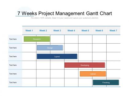
7 weeks project management gantt chart




Try Before you Buy Download Free Sample Product
 Impress Your
 Audience
 100%
100% Editable
 Save Hours
 of Time


Our 7 Weeks Project Management Gantt Chart ensure all the elements gel. The final image is guaranteed to be impressive.
People who downloaded this PowerPoint presentation also viewed the following :
7 weeks project management gantt chart with all 2 slides:
The final image generated by our 7 Weeks Project Management Gantt Chart is impressive. It ensures all the elements gel.
FAQs for 7 weeks project
So a Gantt chart is just a visual timeline showing your project tasks - when they start, when they finish, and how they connect. Think horizontal bars on a calendar. You'll instantly see what's happening when and catch any scheduling conflicts. The cool part? It shows your critical path - basically which tasks can't be delayed without screwing up your entire deadline. Most project management apps have this built in already, which is nice. I'd start with something simple to get the hang of it first. Honestly beats trying to track everything in your head or random spreadsheets.
So basically, tasks are listed down the left side and there's a timeline across the top. Each task gets a horizontal bar showing when it starts and how long it takes. Dependencies are shown with arrows connecting related tasks - like you can't paint before you prime, you know? Milestones pop up as diamonds or markers for big deadlines. The whole thing maps out your project timeline visually. I actually prefer them over those messy task lists because you can instantly see what's blocking what. Once you spot these main pieces, reading any Gantt chart becomes pretty straightforward.
Honestly, Gantt charts are game-changers for team coordination. Your whole crew can see who's doing what and when - no more awkward "I thought you were handling that" moments. Dependencies become super clear too. Like if Sarah's running behind on those design mockups, the dev team immediately knows their start date's probably shifting. Way better than those messy spreadsheets we all pretend to understand. The coolest part? Real-time updates keep everyone looped in automatically. Just set one up in whatever project tool you're using and watch the chaos disappear. Trust me on this one.
Oh man, there's actually a bunch of good stuff out there! Microsoft Project is like the gold standard but honestly it's way too much if you're just getting started. I'd probably go with Asana or Monday.com first - they're super easy to use and great for teams. Smartsheet's solid too. You can even use Excel if you're desperate, though it's kind of a pain. GanttProject is free which is nice, and TeamGantt has a decent free version. My take? Just use whatever your team's already comfortable with and see how it goes.
Dude, Gantt charts are literally perfect for this. You'll see those little diamond markers showing exactly when stuff is due. The visual aspect is clutch - no more guessing if you're on track or totally screwed. Plus you can catch delays before they happen since everything connects. I always color-code mine by how critical they are, makes the must-hit deadlines way more obvious. It's basically like GPS for your project timeline, which sounds cheesy but honestly it's true. Short tasks, long tasks - doesn't matter, you see how it all flows together.
Gantt charts are super flexible - you can tweak the timeline (daily, weekly, whatever), add color-coded categories, and set up task dependencies. Milestones and critical path stuff is where it gets really useful though. Most tools let you customize columns for assignees, priorities, completion percentages. Oh and filtering by team member is clutch when things get messy. Some people go overboard with fancy colors but honestly? Start simple. Add the complex features once your team actually knows how to read the thing. Resource allocation views are solid too if you're managing multiple projects.
Yeah, Gantt charts can work with Agile - just don't go crazy with them. I use them for the big picture stuff like release dates and epic timelines to keep stakeholders happy. Day-to-day work stays on your sprint boards though. The trick is keeping everything loose. Some teams I've worked with try to plan every tiny detail upfront and it's a nightmare when things change. Which they always do, obviously. After each retrospective, update your Gantt with what actually happened. That way it reflects reality instead of your original wishful thinking. Works pretty well if you don't overthink it.
Honestly, Gantt charts are a game changer. I was skeptical at first too, but they give you this bird's eye view that regular to-do lists just can't compete with. When one task gets delayed, you can instantly see how it'll mess with everything downstream - which is clutch when your boss starts panicking about deadlines. Your team actually gets where they fit in the big picture instead of working blind. Sure, they take a few extra minutes to set up, but once you try one you'll wonder how you managed projects before. The visual timeline thing really works.
Yeah totally! I've used Gantt charts for tons of personal stuff. My kitchen remodel would've been a disaster without one - seriously saved me from ordering cabinets before the plumbing was done. They're clutch for anything with steps that can't happen out of order. Wedding planning, home projects, even mapping out a big vacation. The visual part is what makes them work - you can actually see when you're being unrealistic about timing. Google Sheets works fine, or honestly just grab some paper and draw it out.
Most Gantt chart tools will automatically stack overlapping tasks in separate rows for you - super handy! Different colors help too if you've got multiple things running at once. Honestly, overlaps usually mean your team's being smart about timing, so don't stress about it. Just make sure you're clear on what can actually run simultaneously vs what looks concurrent but really depends on something else finishing first. Dependency arrows are clutch for showing those connections. The main thing is your chart needs to tell the real story of what's happening when.
Ugh, Gantt charts turn into a nightmare when you've got a million dependencies - it's like looking at a plate of spaghetti. One task gets delayed and suddenly your whole timeline is screwed. They're also super static, so you spend more time updating the damn thing than actually getting work done. What I'd do is use them just for the big picture milestones, then create separate mini-charts for each team or workstream. Way less overwhelming that way. Trust me, I learned this the hard way on my last project when our chart looked like abstract art.
Honestly, you need something that pulls live data automatically - don't even bother with manual updates. Monday.com and Asana are solid choices since they sync when people log hours or mark stuff complete. MS Project works too if you're into that whole enterprise vibe. The cool part is connecting them to Jira or GitHub so everything flows together. But here's the thing - your team actually has to use it consistently. I've seen too many projects where people set up fancy dashboards then nobody updates anything. Total waste of time.
Honestly, Gantt charts are a game-changer for this stuff. You can literally see who's swamped and who's sitting around doing nothing - like when Sarah's got five deadlines but Mike's calendar is empty. Super annoying when that happens, but at least you'll spot it early. The visual timeline makes it way easier to move things around and balance everything out. Dependencies are huge too - if someone's running late, you'll see exactly who else gets screwed over. I'd say update yours weekly and bring it to team meetings. Makes those workload conversations so much smoother.
Honestly, Gantt charts are game-changers because everything's visual. Dependencies and bottlenecks jump right out at you instead of being buried in those status emails everyone ignores. Color-coding is clutch - red for overdue stuff, green for done. Your stakeholders can actually see what's behind schedule and how delays might mess up other tasks. When you're presenting to executives, they get the big picture immediately without drowning in details. I mean, nobody wants to decode a wall of text when they could just glance at progress bars. It turns your boring project updates into something people can actually understand and act on.
Honestly, the biggest thing is not cramming everything into one messy view. Highlight your critical path stuff in bright colors - makes it super obvious what matters. Use consistent task names (trust me on this one) and realistic timelines because everyone can smell BS deadlines from a mile away. Dependencies and milestones are clutch for spotting problems early. If you're using lots of colors, throw in a legend. Oh, and tailor it to who's looking - execs want the big picture, your team needs the nitty-gritty details. Always export as PDF when emailing or the formatting gets wonky.
No Reviews